Designing Impact: Women-led and women-focused projects
In recognition of International Women’s Day, the RGD presents a selection of projects that centre around women’s leadership and experiences.
Across branding, publishing, digital platforms, community initiatives and public art, these projects demonstrate how thoughtful design can amplify voices, strengthen communities and support meaningful change.
The work featured here includes projects led by women creatives as well as initiatives addressing issues affecting women and girls. Together, they highlight the many ways design can foster connection, visibility and opportunity while responding to real needs within communities.
Calgary Wild FC Brand Identity by Daughter Creative
Calgary Wild FC launched with the Northern Super League, establishing a long-overdue professional pathway for women’s soccer in Canada. For years, elite Canadian players were forced to build careers abroad, navigating fragmented systems in order to compete at the highest level. As a women-led organization, the club understood that absence deeply. The initiative was not simply about forming a team—it was about creating a home team.
Through conversations with players, leadership and young athletes, one idea became clear: strength is shaped by different journeys coming together. “Wild Kinship” emerged as the strategic foundation, expressing both individuality and unity. The name signals untamed ambition and Western resilience. The crest, anchored by a vigilant owl, represents vision, protection and collective watchfulness. Together, these elements define a brand rooted in belonging, where athletes and supporters see themselves reflected and connected.


The identity combines tradition with disruption. The owl crest is bold and watchful, grounded in strength yet rendered with modern clarity. A confident wordmark and vibrant palette bring energy and visibility, designed to stand out both on the pitch and in the stands. The system was built to scale seamlessly across kits, merchandise, stadium environments and digital platforms while remaining unmistakably Wild.
The response was immediate. Players expressed pride in wearing the mark, viewing it as a symbol of presence and permanence. Supporters embraced the brand as their own, with merchandise demand exceeding projections and early social engagement signaling strong momentum. Calgary Wild FC entered the league with a fully realized identity that felt both established and fresh. By blending heritage cues with contemporary design language, the brand positions the club to grow its fan base, build lasting loyalty and confidently take its place in Canadian sport.
- Chief Creative Officer: Keli Pollock
- Associate Creative Director: Ben Gough
- Designer: April Zabos
- Design Director: Holly Gallacher RGD
- Group Account Director: Wendy Chiu
- Group Account Director: Miranda Thorne
Canadian Centre to End Human Trafficking Digital transformation & Brand refresh by Gravity
The Canadian Centre to End Human Trafficking (CCTEHT) partnered with Gravity for a comprehensive redesign of its two websites and a supporting brand refresh. The goal was to strengthen the organization’s ability to support victims and connect individuals to immediate help and critical resources across Canada.
From the outset, the project took a survivor-centred approach. Gravity worked closely with an advisory group of survivors and individuals with lived experience to guide decisions at every stage, from the initial sitemap and content structure to UX and visual design. Their insights helped ensure the platforms reflected real needs and reduced barriers for vulnerable users seeking help.
Throughout the process, this research also informed the brand refresh, shaping an identity that feels inclusive, supportive and approachable while meeting AODA accessibility standards. Gravity developed an enhanced brand system that included an updated logo suite, comprehensive brand guidelines and a range of branded templates and materials for both digital and print communications.


Across both websites, the user experience was completely restructured around a clear content strategy developed in collaboration with a dedicated content writer. For the National Hotline site, Gravity designed a custom interactive map directory that allows users to easily search, sort and filter more than 1,000 service listings across Canada in both English and French. Quick access to 24/7 support, including live chat and emergency contact options, remains visible across all device sizes so that individuals seeking help can find assistance quickly and easily.
As a women-led studio, Gravity supported a project that raises awareness and improves access to vital resources for an issue in which more than 90 percent of Canadian victims are women and girls.
- Creative Director: Emerald Lee RGD
- Art Director: Hana Lee Associate RGD
- Art Director: Laura Krauss
- Designer: Kristina Cruz-Pura
- Designer: Emma Dallaire
- Project Manager: Kellie Hadjidimitriou
- Development Lead: Simon McCaffrey
- Content Strategist, Writer and Editor: Maggie Screaton
The Lightning Circle Novel design for Tundra Book Group, Penguin Random House Canada by Gigi Lau RGD
A coming-of-age novel for teens, told in verse, chronicling the beauty, magic and transformative power of an all-girls summer camp. The author envisioned spot art throughout the interiors and had a specific artist in mind for the project. While an author's suggestions are considered, the final artist selection may take a different direction depending on factors such as budget, style suitability and availability.


For this book, the artist proved to be a perfect fit and the collaboration on the interiors and cover design was highly successful. Laura K. Watson provided beautiful, delicate spot illustrations for the interiors that complemented the emotional and intimate poems. A spot green was used to highlight these interior illustrations and connect key impactful moments in the book. The green also referenced the rugged environment of the summer camp and was carried through to the endpapers. The cover design uses a limited colour palette that captures a nostalgic summer-camp atmosphere.
- Designer and Art Director: Gigi Lau RGD
- Illustrator: Laura K. Watson
- Author: Vikki VanSickle
- Editor: Lynne Missen
- Production Editor: Bharti Bedi
- Associate Director of Production: Christie Hanson
Show Up for a Better Toronto! Campaign for YWCA Toronto and Affiliates by Sara Loos RGD
This project was created for YWCA Toronto and its affiliates to run alongside the Toronto mayoral election in 2023. The campaign aimed to encourage candidates to endorse key issues affecting vulnerable communities across the city. Sara Loos RGD developed social media graphics, digital assets for the website and a printed resource guide to support the initiative.
The campaign concept centred on creating several fictional individuals who embodied the campaign’s primary advocacy goals. This approach helped humanize complex social issues and strengthened the connection between audiences and the campaign’s message.


The visual direction emphasized vibrant colours intended to evoke optimism and energy. The design incorporated YWCA Toronto’s branded fonts and a variation of its established colour palette to reinforce the connection to the organization and highlight its long-standing advocacy work.
The concept resonated strongly with audiences, and the campaign was well received by YWCA Toronto, its affiliates and their online communities.
- Designer: Sara Loos RGD
- Project Director: Sami Pritchard
- Project Manager: Kim Quashie
- Advocacy and Communication Team Members: Katie Campbell, Hyacinth Charles and Oliver Sutherns
Pivotal Moments Book design for Ottawa Design Club & New York Design Club by Isabelle Poirier RGD
Pivotal Moments began as a collaboration between the Ottawa Design Club and the New York Design Club, co-led by founders Isabelle Poirier RGD and Caroline Sarrette. The project emerged from a shared observation: audiences connect most deeply with moments of doubt, risk and transition, yet those stories are often minimized in professional settings. Rather than issuing a public call, the founders curated contributors through referral-based outreach, conducting over 80 interviews across North America and Europe before selecting 30 creatives. The editorial direction prioritized narrative depth over portfolio highlights.
Design decisions reinforced the concept of transformation. Quotes were repeated and flipped to visualize the idea of a pivot. Produced using Xerox Iridesse technology, silver and clear dry inks create subtle shifts in visibility as pages turn. A lenticular insert introduces motion to the cover, linking the physical object to the theme of change.


The final publication spans 244 pages and positions independent publishing as a structured platform for professional reflection. By focusing on transformation rather than achievement, the book reframes how creative success is discussed within design communities. Pivotal Moments activated audiences in both Ottawa and New York, strengthening dialogue between two established creative networks. Each launch event drew more than 175 attendees, bringing contributors and audiences together in live exchange.
The collaboration between two women founders across cities reinforced the strength of cross-border creative leadership. Copies circulated through launch events and professional networks, extending the project’s reach beyond a single event cycle. The publication demonstrates how editorial design, strategic curation and physical production can operate together as cultural infrastructure rather than a standalone artifact.
- Editors, Art Direction and Curation: Isabelle Poirier RGD, Caroline Sarrette
- Editorial Design: Isabelle Poirier RGD, Caroline Sarrette, Ariane Bédard
Exhibition Design: Isabelle Poirier RGD, Caroline Sarrette, Ariane Bédard - Lead Copy Editor: Julie Jacques
- Copy Editing: Sabah Surat, Jane Curtis, Simone R. Brown, Mollie McKinley, Robynne Yokota
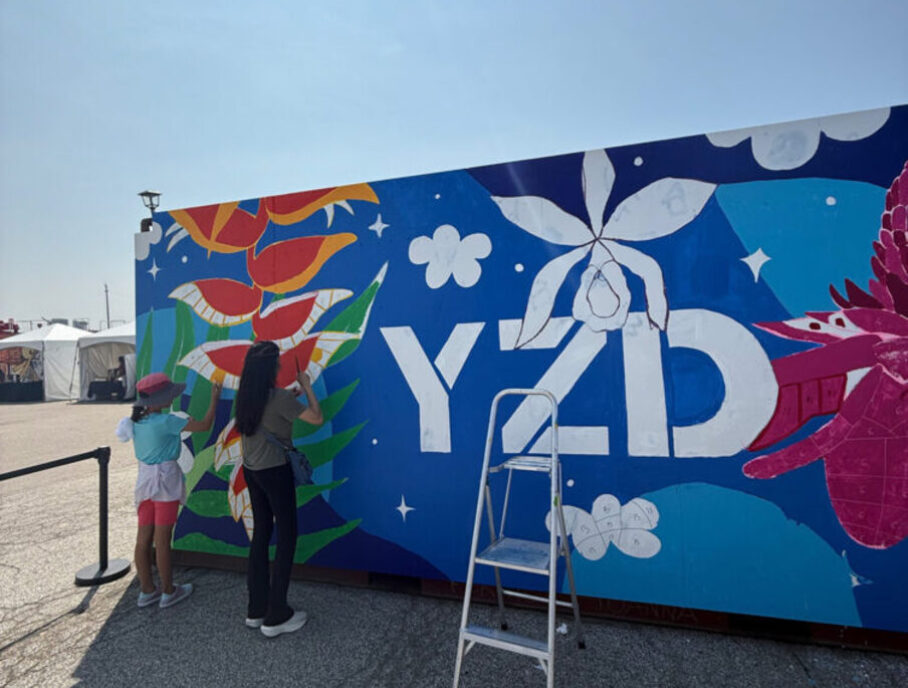
The Jungle at YZD Community engagement design for North York Arts by Andrea Rodriguez RGD
North York Arts commissioned The Jungle at YZD as part of a community-engaged public art initiative at the Downsview Airport Lands redevelopment. Andrea Rodriguez RGD was invited to serve as Project Lead and Artist with an open thematic direction, with the only requirement being the incorporation of “YZD” and the organization’s blue colour into the design. A bold, rainforest-inspired concept was developed to bring warmth, movement and vibrancy to an otherwise industrial site during a highly visible summer activation. The design was structured as a large-scale paint-by-numbers system to enable meaningful public participation. Over two days, community members were guided through the execution process, translating the original composition into an accessible and collaborative experience while maintaining visual cohesion and clarity at scale.


Completed in two days with the support of dozens of community participants, the mural transformed the site into a colourful, immersive landmark. The tropical palette and dynamic forms created an immediate visual impact, contrasting with the industrial surroundings and enhancing the atmosphere of the summer event. The paint-by-numbers structure ensured accessibility while preserving design integrity, allowing participants of all skill levels to contribute confidently. The result was both a finished artwork and a shared creative experience. The project demonstrates how community-engaged design can foster connection, ownership and cultural vibrancy within large-scale urban redevelopment.
- Project Lead / Artist: Andrea Rodriguez RGD
- Public Art Client: North York Arts
- Site Partner: YZD
Unlimited by Mila Branding by Q30 Design Inc.
The wellness industry often ignores the physiological realities of women over 40. Mila Apostolovic, a veteran coach with more than 30 years of experience, is challenging this narrative. She recognized that midlife women require a hormone-affirming approach rather than generic workout programs. The project focused on repositioning her practice toward specialized wellness coaching.
The process rejected “anti-ageing” rhetoric. Client interviews revealed that Mila herself is the key differentiator. The name Unlimited by Mila was selected to centre the brand on her influence while framing midlife as a period of vitality. Visually, the identity is anchored in bold red, a colour rarely associated with ageing women. Paired with vibrant flowers against a dark, moody background, the design subverts industry tropes to signal power and vitality. This aesthetic is reinforced by a content strategy that translates complex science into accessible insights, helping distinguish her global virtual business in a crowded market.


A content-rich website was launched, anchored by Mila’s transformation story and compelling client proof points. Built on Squarespace, the site allows easy, cost-effective updates for this solopreneur. A key focus was branding three distinct membership tiers: Elevate, Raise and Empower. Gated sections were developed, including a Member Wellness Library and exclusive content secured behind a paywall. The site features a blog and is future-proofed with e-commerce functionality for an upcoming rollout.
Beyond the website, a cohesive social media suite was delivered in Canva, enabling the brand to maintain a polished aesthetic without ongoing design overhead. The result is a seamless digital experience offering live Zoom classes and private messaging globally. Unlimited by Mila is now positioned as both an authority and an empowering partner in each client’s transformation journey.
- Creative direction: Tejashri Kapure RGD
- Identity: Tejashri Kapure RGD
- Digital design and build: Andy Kelly
- Brand collateral and social media: Kristin Steenstra
Mewinzha Ondaadiziike Wiigaming Website redesign by Design de Plume
Mewinzha Ondaadiziike Wiigaming (“long ago women birthing in home”) is a women-led healthcare clinic serving Anishinaabe women and families in northern Minnesota. Founded and led by traditional midwife Millicent Simenson and nurse practitioner Natalie Nicholson, the centre integrates scientific medicine with traditional healing and cultural practices, supporting maternal and child health in accordance with Mino-Bimaadiziwin, the Anishinaabe way of living well.
When Mewinzha connected with the design team, their website was creating barriers rather than access. Content had been oriented towards funders rather than the community, and the navigation made it difficult for the people they serve—whom they refer to as “relatives”—to find services or book appointments. Working closely with the Mewinzha team, the site was redesigned to reflect their philosophy of care: relational, culturally grounded and centred on the lived experiences of women and families.


The redesigned website is organized to maximize usability. A clear content hierarchy, consistent section layouts and intuitive booking pathways help relatives quickly find services and connect with practitioners. Integrated calendar and social tools also reduce administrative burden, allowing the team to focus more fully on their community.
Custom floral patterns and iconography draw from women’s medicines, traditional childcare practices and Anishinaabe plant knowledge, bringing warmth, familiarity and cultural safety to the digital space. The result is a site that reflects the leadership and care model of Mewinzha itself—one rooted in women’s knowledge, community accountability and intergenerational support.
- Project Manager: Maria Legault
- Creative Director / Design Lead: Jennica Robinson
- Graphic Designer: Davide Dorigo Associate RGD
- Developers:
Kim Feliciano, Intermediate Web Developer
Xiangxu Teng, Junior Web Developer
Erik McManus, Senior Web Developer - Writer / Strategist: Lisa Baer-Tsarfati, PhD
Extraordinary Women of Deloitte Campaign by Deloitte Canada
Deloitte Global approached the design team to reinvent the Extraordinary Women of Deloitte campaign, which originally came with outdated creative and tactics that did not resonate with its intended audience. The goal was to build a unified global platform that authentically represents women across Deloitte and appeals to Gen Z and Millennial professionals, particularly those in tech and leadership-track roles. The campaign needed to shift perceptions of Deloitte toward a modern, inclusive, purpose-driven brand while still aligning with global brand standards. It also had to be flexible enough for member firms worldwide to adapt for local use. The strategy centred on celebrating real experiences, elevating diverse voices and presenting Deloitte as a place where women can thrive, lead and be seen.


The final campaign delivered a complete suite of refreshed assets, including redesigned hero portraits, dynamic social graphics, homepage imagery and mobile-native video reels. Each component worked together to modernize the brand and elevate the visibility of women’s stories across Deloitte. The new visual identity—bold colour backgrounds, circular compositional elements and handwritten quotes—gave the campaign immediate recognition and emotional resonance. The assets were designed to be easily adopted by member firms globally, allowing seamless localization. Early performance surpassed expectations: the campaign generated the highest organic social engagement Deloitte had seen in more than two years, even before paid media launched. Leadership praised the work for its clarity, freshness and best-in-class expression of Deloitte’s brand, reinforcing its success internally and externally.
- Director of the Agency: Deborah Peterson
- Creative Director: Monique Ah Sue
- Creative Director: Stephen O’Connor
- Associate Creative Director, Design: Donna Graffi-Smith RGD
- Senior Graphic Designer: Julie Charron
- Associate Creative Director, Video: Jayson Chan
- Lead Producer: Kevan Byrne
- Graphic Designer: Erick Castaneda
- Production Manager: Nadia Beja
- Copywriter: Emily Castrechino
mG Artistry Brand identity & Website design by Broadbent Studio
mG Artistry is a makeup artist based in Alberta, dedicated to empowering women to feel their best in their own skin. After previous collaborations with another designer and several DIY updates on Squarespace, the brand’s online presence remained soft and disconnected from the gritty, 70s-inspired aesthetic showcased in her brand photoshoot and her passion for music. As a result, the brand identity did not fully reflect her personality or attract the intended clientele, and the booking process required frequent manual follow-ups.
To address this disconnect, a competitive analysis of makeup artists and beauty studios in the local market was conducted. The target audience was identified as edgy, authentic individuals who want to look like themselves with a touch of glam while highlighting their unique features. As part of the process, the client was actively involved in shaping the brand direction through the creation of a custom brand playlist that captured the “Fox Den” vibe.


With greater clarity around the brand’s personality and audience, a brand ecosystem was developed to reflect this energy. The responsive logo system draws inspiration from the striking typography of rock ’n’ roll albums from the 1960s and 1970s, combining a bold mid-century modern sans serif with subtle Foxy accents. The result is a visual identity that communicates creativity, brightness and confidence while moving away from the “safe” aesthetic that had previously limited the brand.
The final system includes a cohesive brand ecosystem featuring a responsive logo suite, collage-style visual identity, business cards and a custom studio decal. The Squarespace website was redesigned and paired with a custom-templated Acuity booking system to streamline the client experience.
The result is a visual identity and website that strengthen the client journey from discovery to booking. mG Artistry now has a brand presence that reflects her personality and attracts the clients the business was designed to serve.
- Creative Direction, Web Design/Development: Rachel Simms RGD
- Graphic Design: Jenna Bowes
YWCA Women of Distinction Awards Brand identity for YWCA by Rethink
For more than 40 years, the YWCA Women of Distinction Awards have celebrated trailblazing women across Canada. However, the program’s brand identity had become dated and less relevant to younger audiences. Rethink refreshed the brand to reposition the awards as a contemporary platform celebrating trailblazing women.


At the centre of the new visual identity is an iconic “W” symbol. This bold graphic dynamically expands to frame portraits of Women of Distinction Awards winners and nominees while also serving as the foundation for event signage and a toolkit of motion graphics for digital platforms. The design system’s colour palette—high-contrast purple and charcoal—reflects the strength and confidence of YWCA’s commitment to women of all ages.
The refreshed identity functions not only as a visual system but also as a platform designed to amplify the stories and impact of women leaders across generations.
- CCO: Aaron Starkman
- CSO: Sean McDonald
- Executive Creative Director, Design: Hans Thiessen RGD
- Executive Creative Director: Leia Rogers
- Creative Director, Designer: Brie Lim
- Copywriter: Jordon Lawson, Sloan Macleod
- Strategist: Anna Shkuratoff
- Producer: Claire Khan
- Motion Designer: Jesse Shaw, Leigh O'Neill
- Group Account Director: Kennedy Crawford
- Account Supervisor: Nicole Kerrigan
We're invested in you Branding identity for Vertu Capital by Humanity Agency
Vertu Capital is Canada’s first female-founded private equity firm. Its relationship-focused approach has led to strong results and a notable reputation within the industry. However, this distinctive approach also presented a challenge: how to communicate Vertu’s collaborative way of doing business while demonstrating the expertise and authority required in an industry that has traditionally been rigid and competitive.
The brand development process included extensive research and interviews with employees and investors. The goal was to better understand the elements that made the Vertu approach successful and to align the internal and external brand to reposition the organization for continued growth and a stronger presence in the private equity sector.


The new identity was developed to balance Vertu’s relationship-driven approach with the strength and expertise expected of a successful private equity fund. The concept of synchronicity became the central creative idea. Synchronicity represents the intersection of awareness, response, perspective and action. It reflects the coming together of different elements to form strong partnerships built on mutual respect and confidence.
The logo was simplified to its essential elements. By removing portions of the letterforms, the design creates a balanced flow of lines working in synchronicity. Each line plays a meaningful role, symbolizing the collaborative contribution of each member of the Vertu team. The colour palette balances warm, approachable tones with a rich, vibrant blue that reflects Vertu’s strong presence in the technology sector. An animated icon library was also developed to help visually communicate the Vertu difference across digital platforms.
- Senior Designer: Bernadette Funk
- Executive Creative Director, Design: Nathalie Cusson
- Chief Creative Officer: Carolyn Shaw
- Strategist: Jelena Derete
- Senior Production Manager: Gillian Parr
- Copywriter: Shairina Brown
- Animation: Cocoribou
- Sound Design: Notes Productions
Tags
Related Articles


Fidel Pena-Guzman RGD, Liz Wurzinger, Sebastian Abboud RGD, Catherine Charbonneau RGD


Ann Donar RGD, Sharon Lockwood RGD, Sarah Prouse RGD


