Designing the Future: Education projects by RGD Members
Education has the power to shape how we learn, teach and connect.
In recognition of the International Day of Education this January, we’ve brought together a selection of education-focused design projects by RGD Members that highlight creative exploration, process-driven thinking and meaningful outcomes.
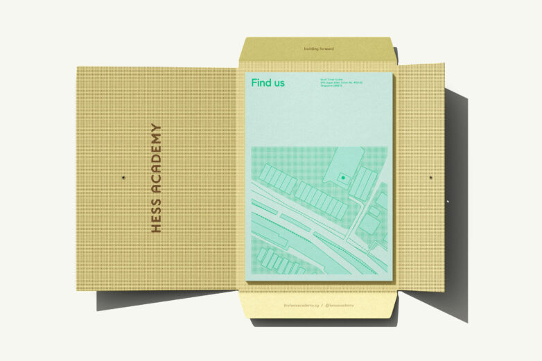
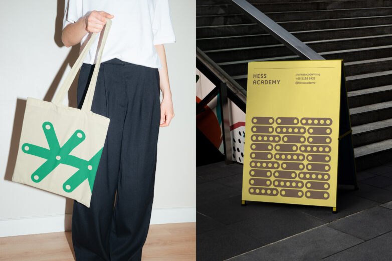
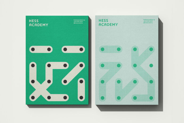
Hess Academy Brand Identity by blok design
Based in Singapore, Hess Academy is a beacon of inspiration, guiding young minds toward their full potential. blok designed an identity that reflects this dynamic impetus. The design process began with an in-depth questionnaire to reveal the project's essence and analyze market opportunities and competitive landscapes, both in Singapore and internationally. This research allowed blok to question how the space reflects modern educational values and the specific energy this identity needed to project. The result is an identity that appeals to children, parents and educators, balancing a playful, joyful quality within a structured framework. The modular system allows for a multiplicity of forms and inspired movement, expressing the elasticity of the learning process.
blok worked under a tight deadline, as Hess Academy launched just weeks after the identity presentation. Additionally, the distance between Toronto and Singapore meant the blok team could not visit the physical space. These constraints prompted them to develop a versatile system of design and signage that functions within a grid regardless of the physical environment.
The final identity celebrates Hess Academy’s progressive spirit through bright colours and an evolving visual language, mirroring the brand’s passion for discovery and exploration through education.
- Creative Director: Vanessa Eckstein RGD
- Lead Designer: Christopher Jessop
- Senior Creative Producer: Crystal Basaez
Strategy, Branding, Marketing and Website for Université de Sudbury by Design de Plume
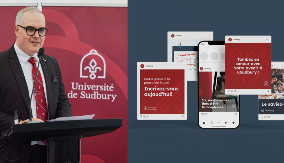
Founded in 1913, Université de Sudbury (UdeS) began a major reinvention in 2024 to re-establish itself as a French-language university “by and for” the Francophone community of Northern Ontario. To support this transformation, Design de Plume led a full rebrand, website redesign, marketing rollout and strategic communications plan. Our work began in the community—touring campus spaces, meeting with the President and Vice-Chancellor and participating in “Camp de Cocréation” and “Le Plan d’Avenir,” immersive workshops with students, parents and staff. From these sessions, three themes emerged: pride, resilience and rebirth. The university’s long-lost bell, rediscovered on Hemingway Island and returned to campus, became a symbol of this renewal. In parallel, we developed a digital-first recruitment experience, including a direct admissions landing page to support enrolment during the transition.
We created a brand system that bridges heritage and forward momentum, anchored by the bell and fleur-de-lys as expressions of Francophone identity and cultural pride. Typography and colour choices balanced academic credibility with a warm, student-facing tone. This strategy carried through a cohesive marketing rollout across social, print, recruitment materials and campus touchpoints. The website serves as UdeS’s primary recruitment tool: bilingual, mobile-first, accessible and designed to guide students from curiosity to application, with French content developed first to ensure cultural accuracy. Early results included 100+ domestic applications, 150+ international applications, CTRs exceeding industry benchmarks and strong brand recall. UdeS also secured $10.8M in provincial funding to relaunch programming.
- Consultation & Project Sponsor: Meggan Van Harten RGD, Co-CEO
- Project Manager & Multi-Team Coordinator: Maria Legault, Project Manager
- Client Services/Production Coordination: Christine Lewis
- Creative Director: Jennica Robinson, Design Lead
- Lead Designer: Ashley Wadge Associate RGD, Graphic Designer
- Lead Developer: Erik McManus, Senior Web Developer
- Digital Design Support: Lindsay Levesque Associate RGD, Digital Designer


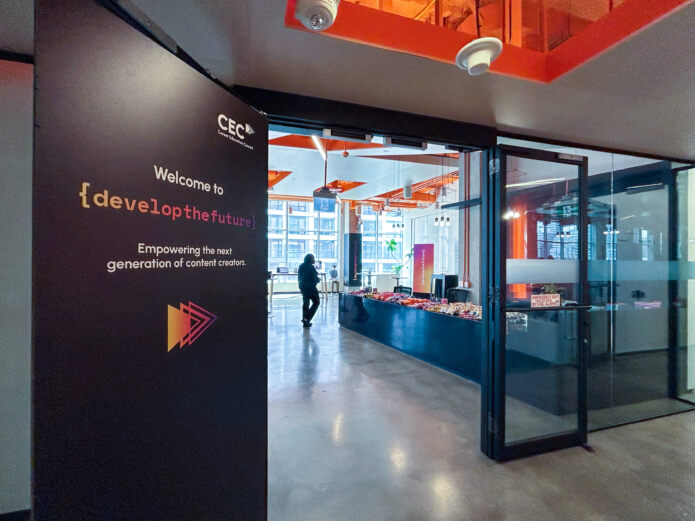
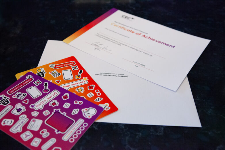
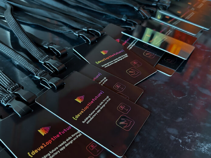
Develop the Future Conference Identity for Career Education Council (CEC) by Forge Media + Design
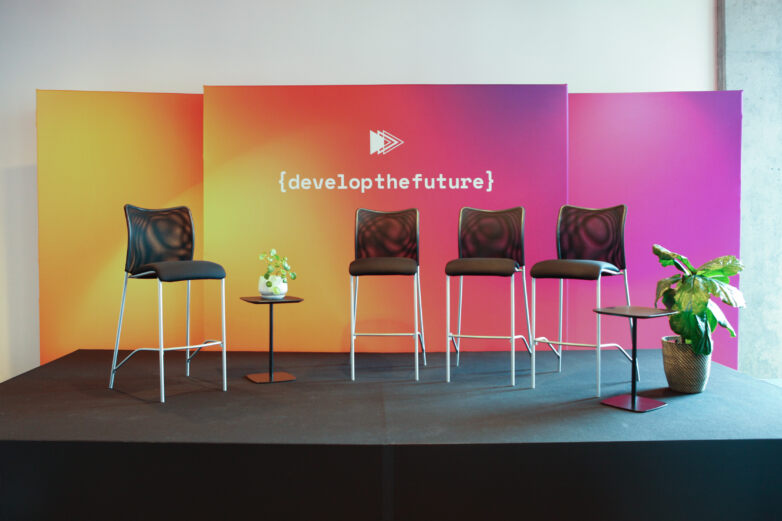
Nearly 1,000 students across British Columbia, Ontario and Quebec learned to code with Swift this year, developing app prototypes and building foundational skills. In June, students from diverse school districts gathered in Vancouver and Toronto to pitch their final projects at App Showcases, presenting their work to panels of industry judges who provided constructive feedback to help refine and advance their ideas.
Over the course of one week, six events were delivered across three provinces and in two languages, with a cohesive visual identity at every location. Forge's event graphics created an engaging, professional environment that respects and celebrates student work. Deliverables included wall graphics, backdrops, wayfinding, presentation banners, name badges, Keynote decks and branded swag.
- Creative Director: Stüssy Tschudin RGD
- Design Director: Kat Sunter Associate RGD
- Project Manager: Dana Cooper
- Senior Designer: Nick Caswell
- Senior Production Designer + QA: Luca Sanguigni


edstudiO Branding for the University of Ottawa by Q30 Design
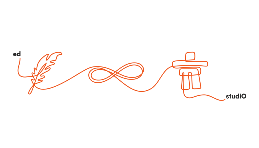
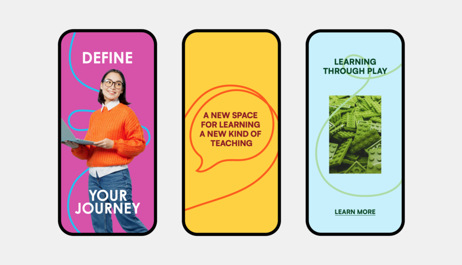
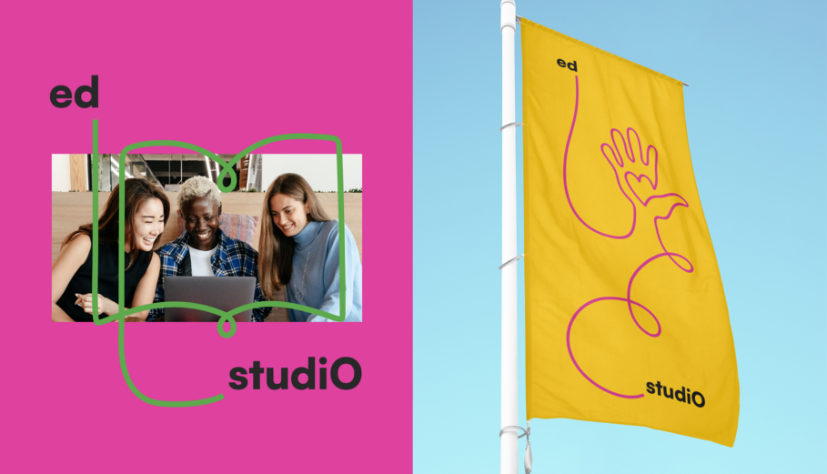
In 2023, the University of Ottawa’s Faculty of Education sought to launch a transformative creative studio designed to disrupt traditional pedagogical models. Q30 was engaged to design the brand identity for edstudiO—a space featuring zones for tinkering, gaming, media production and collaboration. The challenge was to create a visual system that felt authoritative for research environments while also being expressive, flexible and innovation-driven.
The result is an identity rooted in the concepts of connectivity and transformation. The “edstudiO” wordmark features a flexible connecting line between “ed” and “studiO,” representing the intersection of theoretical education and hands-on experimentation. The lowercase “ed” reinforces accessibility and openness, while the uppercase “O” signals the connection to the University of Ottawa. The brand system is designed as a living identity, using bold colours and adaptable visual elements that encourage creative expression within the space.
- Creative Director: Tejashri (TJ) Kapure RGD
- Designer: Jacqueline Wong RGD
Rebrand and Positioning of Algoma University by Trajectory Brands Inc.
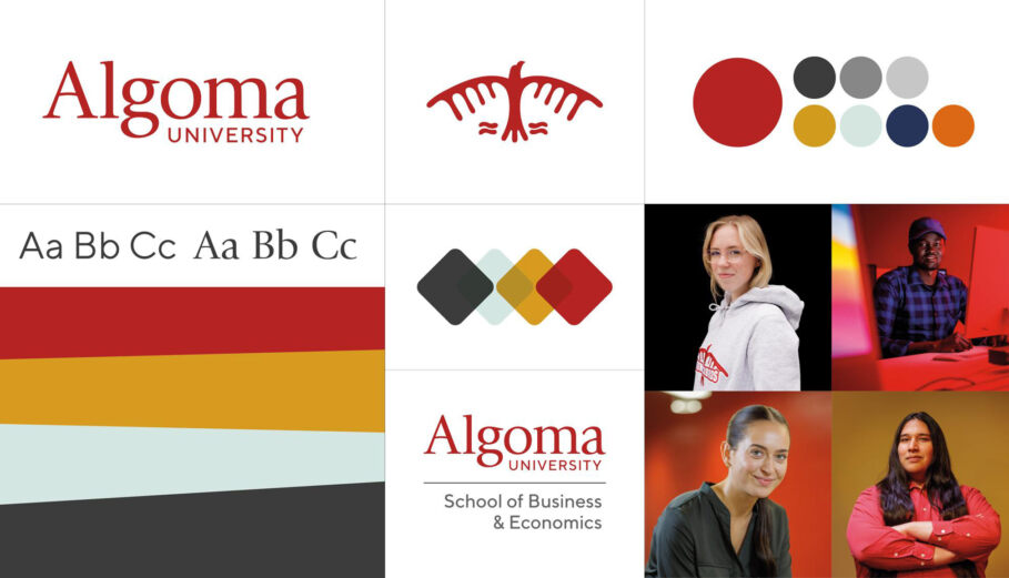
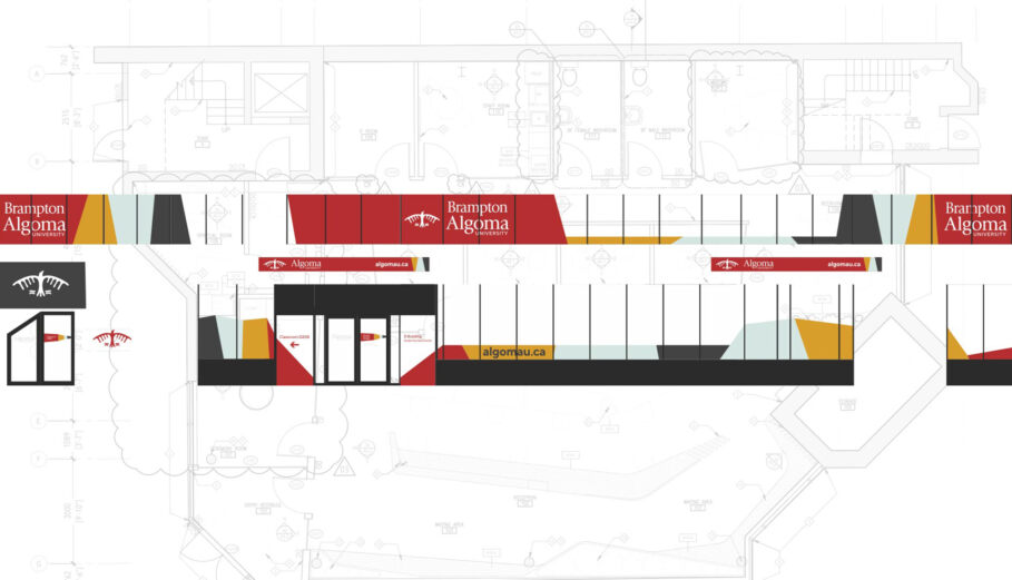
Algoma University has experienced significant growth in recent years, driven by its commitment to Indigenous and cross-cultural learning and major initiatives across its three campuses, particularly in Brampton, ON. Built on the site of a former residential school, Algoma is dedicated to decolonizing its institution—including its brand. The goal of this project was to update Algoma’s brand positioning, refresh the visual system to reflect its special mission across the entire university and create an inclusive platform to support future growth.
Grounded in extensive research and stakeholder interviews, the new brand draws inspiration from Indigenous teachings, using the medicine wheel as its foundation. The flexible visual system uses four colours as evolving windows and landscapes that reflect Algoma’s past, present and future.
Trajectory partnered with Algoma from 2020 to 2023, supporting branding and recruitment efforts. During this time, Algoma surpassed its enrolment target of 3,000 students ahead of schedule, saw a 19% increase in applications in Fall 2022 and achieved 7.8 million impressions in its Fall 2023 recruitment campaign.
Click here to view more details of this project.
- Chief Strategist: Jeannette Hanna
- VP, Brand Development: Stephen Weir
- Creative Director: Paul Hodgson
- Senior Designer: Blair Francey RGD
- Designer: Lily Chau
- Photographer: Steve Carty

Rebranding Athabasca University as North America’s Leading Open University by Trajectory Brands Inc.
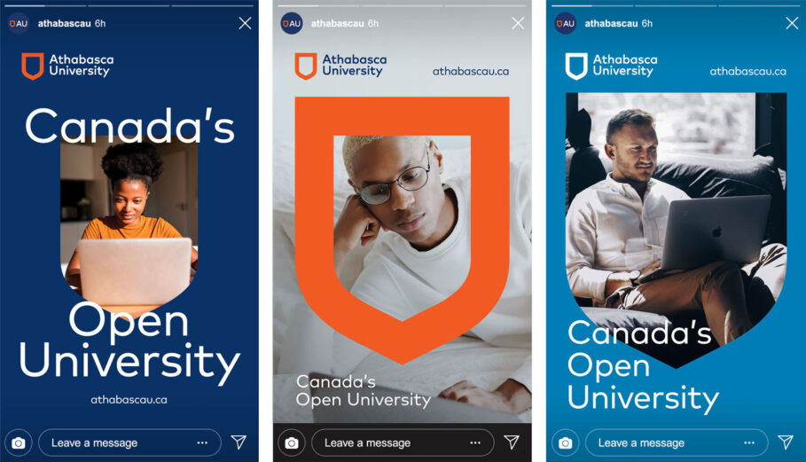
Athabasca University has been a global leader in virtual learning since the 1970s, when it launched the world’s first online MBA. As other universities expanded online offerings during the COVID-19 pandemic, AU recognized the need to shift its narrative from “Canada’s Online University” to its broader purpose as North America’s leading Open University—dedicated to removing barriers for post-secondary learners.
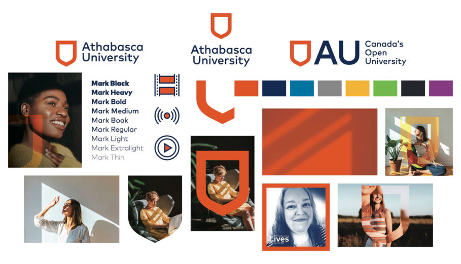
The new “anyone, anytime, anywhere” positioning speaks to ambitious learners who are often balancing work and family commitments. Athabasca’s next-generation digital platform integrates course delivery and student supports into one seamless environment. The refreshed visual identity embraces digital expression, incorporating 3D animation, audio elements and a set of more than 100 icons for institutional and program use. Multiple sub-brands were aligned to bring greater coherence to the overall Athabasca identity. The new approach to imagery reinforces AU’s promise of accessibility and flexibility for learners wherever they are.
The integrated rollout included online brand guidelines, branded apparel and gear, a digital “playbook,” and an online learning module to introduce staff and faculty to the new positioning, promise, tagline and visual system.
- Chief Strategist: Jeannette Hanna
- Creative Director: Paul Hodgson
- VP, Brand Development: Stephen Weir
- Designer: Lily Chau
- Motion Designer: Brian Banton RGD (Plan of Record)

Tags
Related Articles


Yurko Gutsulyak RGD, Rachael Seatvet RGD, Preet Soni Associate RGD, Liz Wurzinger


