Designing a Better Tomorrow: Sustainability projects

The most pressing challenges of our time—climate change, resource waste and environmental degradation—are also design problems.
The projects featured here demonstrate how design can serve as a vehicle for environmental and social accountability. From grassroots networks to national institutions, these studios are proving that meaningful, sustainable impact begins with intentional design.
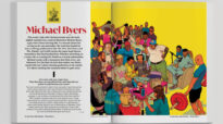
Knowledge Report of the 2nd Symposium on Supranational Responses to Corruption by Jumanah Abualkhair Associate RGD
Commissioned by the World Bank Group's Office of Suspension and Debarment, Jumanah Abualkhair Associate RGD designed the Knowledge Report for the 2nd Symposium on Supranational Responses to Corruption: Integrity in Climate Finance & Action, held at the London School of Economics and Political Science in May 2024. The symposium brought together global experts to explore how anti-corruption mechanisms can address integrity risks in climate-related projects.


The report's design relies on a structured typesetting system to ensure readability in dense material, including citations, tables and data visualizations. Custom iconography and clean layouts improve navigation and reader engagement. The cover evolved from the existing Knowledge Report series, introducing a refreshed design with a nature-inspired palette to reflect the report's climate theme. The outcome enhances the accessibility and impact of the symposium's insights, supporting knowledge sharing and advancing global dialogue at the intersection of climate action and anti-corruption.
Too Good to Waste by Ion Brand Design
The Regional District of North Okanagan (RDNO) provides waste management and water services to approximately 400,000 residents. The Okanagan's sunny climate and interconnected ecosystem make waste reduction and water conservation education particularly critical for the region. Ion Brand Design crafted a comprehensive branding and marketing strategy designed to connect with residents across multiple channels and demographics, encouraging meaningful changes in waste and water habits.


The campaign's primary demographic focus was school-age children, identified as key influencers of family habits. Rather than engaging with broader political conversations around climate change, the campaign tapped into the audience's shared pride in where they live. The campaign identifier, North Okanagan Too Good to Waste, was designed to be an agreeable statement that resonates regardless of individual viewpoints. The visual identity draws from the region's environmental beauty and outdoor recreation culture, featuring an earthy colour palette, patch motifs and park-inspired typography. A cast of local animals serves as a role model, delivering cheeky messages that encourage audiences to waste less.
Credits:
- Creative Director/Strategist: David Coates RGD
- Facilitator/Strategist: Shawn Bouchard
- Senior Designer/Art Director: Candace Pawson
- Designer: Priya Sahota
- Illustration: Richard White
- Video: Veronika Kansaka
The Climate Initiative: Action for Net Zero by Judith Lacerte RGD
Universities Canada launched the Action for Net Zero initiative to measure and accelerate climate progress across its member institutions, requiring a visual identity capable of reflecting national leadership and mobilizing collective action. Designer Judith Lacerte RGD developed a unifying system that communicates both ambition and accountability. At the core is a distinctive logo that merges two symbolic elements: a target, representing measurable progress toward greenhouse gas reduction, and a radial form inspired by wind energy, conveying movement, adaptability and renewable power.


The identity was designed for versatility, extending across digital and print applications to ensure consistency and recognition across a network of institutions. To support broad adoption, a comprehensive brand toolkit was developed, including customizable templates for social media, web and print, enabling institutions to share their commitments and progress within a cohesive, flexible framework. The result provides a strong and recognizable platform for engagement, reinforcing shared purpose while allowing individual institutions to express their unique contributions.
Credits:
- Creative Direction, Visual Identity and Design: Judith Lacerte RGD
- Strategy and Priorities: Philip Landon, Interim President & CEO, Universities Canada
- Sandra Boisvert, Assistant Director, Climate Initiative, Universities Canada
Toronto BioBuild Collective Brand System Refinement by Matt DeAbreu Illustration & Design Inc.
The Toronto BioBuild Collective (TBC) is a volunteer-led group of architects and researchers advancing sustainable building practices. As participation grew, its identity and communications risked becoming inconsistent across contributors and platforms, weakening the clarity and credibility needed to advance its mission. Rather than a full redesign, Matt DeAbreu RGD focused on stewardship and refinement, conducting a visual audit of existing materials to identify issues with legibility, logo spacing, colour application and typographic hierarchy.


The process prioritized accessibility and scalability, testing typographic systems, refining a material-inspired palette with contrast guidance and validating decisions through real-use mockups. The final deliverables included a Brand Guide, expanded logo set, email signature system and presentation template, embedding hierarchy and contrast into everyday communications. The system was implemented during a major research initiative involving six architecture firms and more than 60 volunteers, helping unify contributors around a shared identity at a critical moment of growth.
Credits:
- Creative Direction, Brand Strategy & Identity System Development: Matt DeAbreu RGD
- Founder & Strategic Direction: Alex Lukachko
Circularity Is Second Nature: Toronto Circularity Network Rebrand by Matt DeAbreu Illustration & Design Inc.
The Toronto Circularity Network (TCN) is a cross-sector initiative driving circular economy practices within the built environment. While the network had strong community momentum, its visual identity lacked the cohesion needed to position circularity as a mainstream, systems-level solution. Matt DeAbreu RGD was engaged to transition TCN from a grassroots convenor into a city-scale authority with institutional credibility.


The process began with a discovery phase to identify a need for clearer differentiation and thought-leadership visibility. The resulting strategy was anchored in a single brand belief: "Circularity is Second Nature." This North Star guided the development of a visual system rooted in reuse, regeneration and structural clarity. The final identity centres on a constructed, typographic "C" symbol — modularly assembled from reused forms to embody the core tenets of circularity, intentionally avoiding superficial environmental tropes. The framework includes an accessible typographic system and a scalable logo architecture designed for future multi-city expansions. Since launch, the identity has been integrated across social channels, the website and meetup materials, effectively shifting TCN's presence from an informal network to a credible sustainability platform.
Credits:
- Creative Direction, Brand Strategy & Identity System Development: Matt DeAbreu RGD
- Founders & Strategic Direction: Alex Lukachko; Breanne Belitski
KFOBIX & CropMind: Energia Ventures 2023 by Kathleen O'Donnell Associate RGD
Energia Ventures is a three-month intensive accelerator supporting entrepreneurs in energy, smart grid, artificial intelligence, cleantech and cybersecurity. For the Fall 2023 cohort, Kathleen O’Donnell Associate RGD served as Designer-in-Residence, collaborating with two early-stage startups over six weeks to refine their brand identities and pitch decks.


KFOBIX develops a durable nanocomposite coating that prevents icing and contamination on surfaces such as solar panels, wind turbines and vehicles. Kathleen redesigned the company’s mark to incorporate a water droplet and snowflake, highlighting the product’s ability to repel water and prevent ice formation. CropMind builds a computer-vision platform that helps fruit growers automate crop management and reduce manual labour. The visual concept for CropMind centres on the convergence of technology and agriculture, with an icon that merges a brain and seed form to symbolize intelligent crop management, with three green variations representing growth across the crop lifecycle.
Stop the PRGT Pipeline by Significant Other
For over a decade, the proposed Prince Rupert Gas Transmission pipeline (PRGT) has threatened Indigenous lands and ecosystems across northern BC. In mid-2024, the campaign reached a critical point when the provincial government ruled that PRGT had been “substantially started,” allowing it to bypass a new environmental assessment. Climate Action Network Canada approached Significant Other with an urgent brief: create a digital platform capable of explaining a decade of legal, political and environmental context while supporting a coalition of Indigenous land defenders and allied organizations.


Working under tight timelines, the Significant Other team distilled dense information into a clear narrative, reviewing campaign materials, media coverage and legal context while working closely with partners to ensure the platform reflected the perspectives of the communities leading the resistance. The resulting identity uses a restrained greyscale palette punctuated by signal orange that functions as both a warning and a call to action. A vertical orange line runs through the site as a central motif, symbolizing the proposed pipeline while acting as a structural guide through the narrative. Modular storytelling components — including timelines, maps and concise text blocks — help visitors quickly understand the history, geography and stakes of the campaign. Within weeks of launch, the site was shared by advocacy groups and featured in media coverage, becoming a key asset in public education around the issue.
Credits:
- Co-founders: John Ryan; Jacob Sharrard RGD
- Project Manager: Nicole McNulty
- Senior Designer: Noah Ortmann RGD
- Senior Designer & Creative Strategist: Christopher White RGD
- Senior Developer: Adrian Trimble
- LNG Senior Strategist (Climate Action Network): John Young
- Fossil Fuel Supply Campaigns Lead (Climate Action Network): Emily Lowan
Scout Vintage by Twin Studio
Scout Vintage is a Banff-based digital vintage boutique that curates clothing for an audience of style-conscious buyers who value one-of-a-kind pieces and care deeply about environmental impact. Twin Studio’s process began with research grounded in cultural and visual references tied to western iconography, vintage fashion and contemporary retail, establishing a strategic foundation to guide all creative decisions and ensure the brand would feel cohesive, intentional and authentic.


At the heart of the identity is the balance between western charm and contemporary sensibility. Twin Studio drew inspiration from the West’s landscapes, reimagining classic western symbols into minimalist patterns and bold visuals. The colour palette bridges tradition with modernity, combining warm, earthy tones with unexpected fresh accents. Typography is bold yet refined, reinforcing Scout’s confident identity. Together, these elements create a cohesive brand centred not only on vintage clothing but on celebrating stories, individuality and sustainability.
Credits:
- Creative Director and Designer: Lin Oosterhoff RGD
- Director of Photography and Copywriter: Georgi Silckerodt
Tags
Related Articles


Sponsored


