Branding Places and Journeys
From destinations and hospitality to airports and cultural landmarks, these projects explore how identity systems translate local stories, landscapes and histories into meaningful visitor experiences.
In recognition of the global travel and tourism sector, we’re highlighting branding work that helps shape how locations are seen, experienced and remembered.
The Royal Hotel by blok design
Dating back to 1879, The Royal Hotel in Picton, Ontario, was lovingly restored by a local family. The identity honours the hotel’s deep community roots while reimagining it for contemporary travellers. Our work extended beyond the visual identity to include the website, photography, menus, packaging, signage and architectural elements. The project’s greatest challenge was also its biggest opportunity: it took six years to complete. As interiors shifted and applications expanded, the process remained in constant flux—allowing the identity to evolve alongside the project.


Blok design approached the identity holistically, collaborating with architects GPAIA from day one. Influenced by layers of materiality and varied spaces, the team developed a visual language that weaves together history and a unique sense of place. Their scope enabled the identity to extend into the architecture itself, including custom exterior doors with abstract perforations that map the county’s landscape into metal. The crown logo is a contemporary interpretation inspired by cross-stitch traditions connected to Prince Edward County’s heritage.
- Creative Director: Vanessa Eckstein RGD
- Senior Creative Producer: Crystal Basaez
- Senior Designer: Christopher Jessop
- Web Designer: Léa Coues
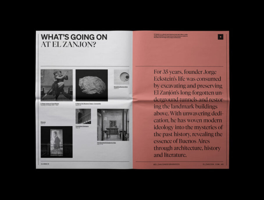
El Zanjón Brand Identity by blok design
“I was nine years old when my father, Jorge Eckstein, purchased an abandoned building in San Telmo, Buenos Aires' oldest neighbourhood, with no idea of the mysteries that lay beneath. He began restoring this beautiful but decrepit 1830 mansion, only to discover it rested above a gateway to the city's origins—a spectacular labyrinth of vaulted brick tunnels, walled off and long forgotten. He spent 38 years meticulously restoring El Zanjón. His relentless pursuit of perfection resulted in a singular work of architecture filled with love and dedication.”
Vanessa Eckstein RGD


El Zanjón was more than a design project for blok design—it was a family endeavour demanding devotion to craft and content. The team immersed themselves in textures, research and photography, seeking a deep understanding of the site’s history to identify the essence and values of a visual identity that reflects the decades spent restoring the building. They developed an identity system, digital experience and supporting content that captures El Zanjón’s distinctive architecture and its network of vaulted brick tunnels.
Rooted in place, the project’s visual language draws from layers of discovery—from the metal grid module found throughout the building to typography that references the city’s foundations. The result bridges history and modernity. Today, the museum is multi-faceted and stands as one of the most significant archaeological sites in Buenos Aires.
- Creative Director: Vanessa Eckstein RGD
- Senior Creative Producer: Crystal Basaez
- Senior Designer: Christopher Jessop
- Website by Nick de Jardine
Gander Int’l Airport Renovations by Byron Blackmore Design
Gander International Airport recently renovated its domestic baggage area, the first point of contact for tourists visiting Central Newfoundland. Byron Blackmore Design was brought on to enhance the space, with the goal of making it welcoming, distinctly local and memorable for arriving visitors. At the time of their involvement, a series of locally inspired illustrations had already been developed by project manager Jessica Waterman. Half the room featured a black-and-white patterned wallpaper using these illustrations, while the remaining space was painted stark white. Byron Blackmore Design introduced colour throughout the environment and developed a feature for the parking lot.
The palette drew from corporate brand colours, applied through solid tones and oversized halftones. Some walls feature playful illustrations of geese working at the airport, reflecting the region’s lighthearted character and offering visitors an immediate sense of local personality upon arrival.


As part of the project, the team created a compass-inspired weather vane for the parking lot to highlight the many activities available across Central Newfoundland. Icons developed for the structure were later reused, alongside additional illustrations by Jessica Waterman, to create an airport-centred map suggesting local attractions and experiences. The map was intentionally drawn from memory rather than to scale, evoking the feeling of receiving directions from a local roadside—an authentic Newfoundland experience.
- Creative Direction, Illustraton: Jessica Waterman
- Graphic Design, Illustration: Byron Blackmore
- Fabrication of Directional Signage: Leaman Signs
- Print & Installation of Interior Graphics: Gander Signs
Blue Sky City — Brand Identity for Calgary Economic Development by Daughter Creative
The project began with a central question: how can a visual language represent an entire city? Calgary required more than a logo—it needed a system capable of working across civic partners, industries, cultures and channels while maintaining coherence. Daughter Creative translated deep research into design principles, using the blue sky as a metaphor for openness, possibility and scale.
From this foundation, the team developed a modular system featuring expressive typography, generous negative space, an optimistic yet restrained palette, flexible grids and motion behaviours that adapt in tone without losing consistency. Each component was designed to function across contexts—from large-scale, out-of-home applications to social, video, wayfinding and partner toolkits—creating a shared visual infrastructure rather than a single campaign expression.


The Blue Sky City is a visual system designed to serve multiple functions simultaneously. It flexes across sectors and scales, adapts to different voices and remains instantly recognizable—using space, light and movement as core design elements that allow stories to feel expansive rather than constrained. Launched through a typographic headline campaign and connected TV, the system quickly extended across digital, out-of-home, social and experiential touchpoints. It has since been adopted as a shared visual language by Calgary Economic Development, Tourism Calgary, the City of Calgary and a growing network of civic partners. Rather than operating as a top-down brand, it functions as an open platform that designers, organizations and communities can build upon—resulting in a living identity system that unites Calgary’s many voices while leaving room for individual expression.
- Chief Creative Officer: Keli Pollock
- Executive Creative Directors: Stephanie Kochorek, Paul Little
- Design Director: Scott Wilson
- Designer: Scott Wilson
- Copywriter: Stephanie Kochorek
- Motion Graphics Artist: Ben Gough
- Account Director: Wendy Chiu
- Client: Calgary Economic Development
Y We Travel by Made by Emblem
Toronto Pearson Airport, Canada’s largest international airport, is strategically focused on the joy of travel. “Why (Y) We Travel” is an initiative that celebrates the growth, memory, thrill and discovery that travel offers as passengers move between destinations and through an evolving airport experience. Through 12 essays published in partnership with The Walrus and the Canadian Airports Council, the project explores travel through romantic and reflective perspectives.


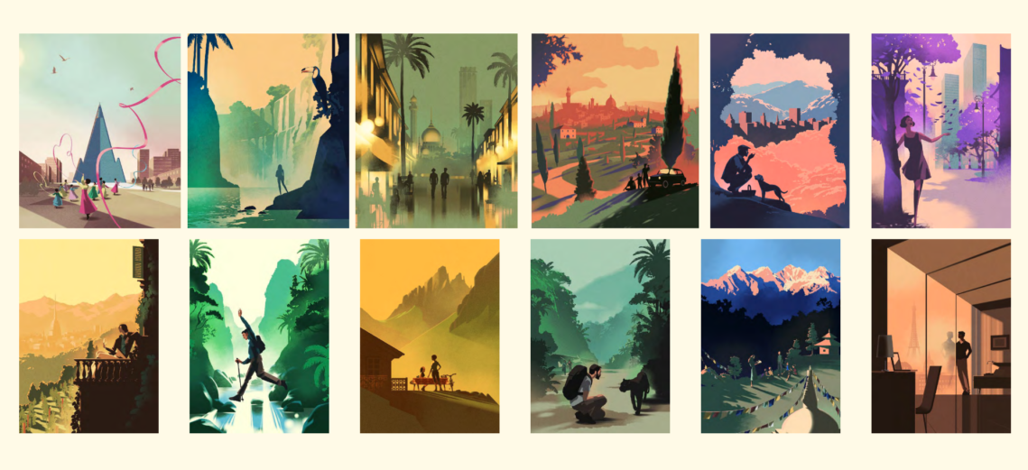
To reflect these perspectives visually, Made by Emblem drew inspiration from travel and airline posters from the 1930s to 1960s and developed a series of illustrations in collaboration with Danish illustrator Mads Berg. The result was a 360-degree campaign brand centred on storytelling rather than promotion—making it memorable, authentic and collectible. The website exceeded projected traffic by doubling expectations and the magazine received the 2025 Excellence in Airport Marketing, Communications and Customer Experience Award from Airports Council International.
- Creative Director: Erik Mohr
- Associate Creative Director: Joshua Duchesne
- Designer: Christina Kim
- Designer: Megan Drummond
- Project Manager: Marikha Saira
- Illustration: Mads Berg
Focus Travel Branding by SonVD
SonVD set out to rebrand a 25-year-old Vietnamese travel corporation with a modern, cohesive identity that reflects its expertise in water-based journeys. The new brand communicates modernity, reliability and a pioneering spirit across both river and sea travel services.


The logo centres on wave motion to symbolize water travel, combined with a flag representing leadership and exploration, all integrated into the letter “F,” the company’s initial. Beyond the logo, SonVD developed a comprehensive identity system—including typography, colour palette, patterns and applications—designed to scale consistently across touchpoints while honouring the company’s heritage and positioning it for future growth.
- Art Director: Son Vu Dang Associate RGD
- Graphic Designer: Son Vu Dang Associate RGD
- Project Coordinator: Quang Le
- Website: ViiVue
Tourisme Abitibi-Témiscamingue by Studio123
Tourisme Abitibi-Témiscamingue in Northern Québec has long aimed to attract more visitors from Ontario. Despite being neighbouring regions and easily accessible by road, several barriers have historically limited cross-provincial travel. These include a perceived language barrier for non-French speakers, the psychological divide of a provincial boundary and limited awareness of the region’s offerings. The complexity of the region’s name has also contributed to the challenge. Studio123 developed a strategy to place Abitibi-Témiscamingue on the mental map of prospective Ontario travellers by increasing awareness, highlighting shared traits between the regions and playfully acknowledging their differences.


Close, but different is a tourism campaign for Tourisme Abitibi-Témiscamingue created to encourage Ontario travellers to cross the provincial border into a destination that feels both familiar and unexpectedly different. Studio123 developed the core concept and brand voice, produced five videos and launched a dedicated website and advertising campaign to bring the idea to life.
At the centre of the campaign is Dr. David DeValdorien, a fictional anthropologist and eccentric explorer studying cultural contrasts—from the Andes to the chip stands of Québec. His “research” suggests that while Northern Québec and Northern Ontario may appear similar on a map, they are distinctly different. Blending nature documentary with deadpan comedy, the campaign positions Abitibi-Témiscamingue as a more accessible alternative to Ontario’s crowded parks—generating buzz across English-speaking Ontario and contributing to increased tourism interest.
- Creative Director: Nico Taus RGD
- Art Director: Christian Pelletier
- Project Director: Rob Roy
- Designer: Mélanie Gagné Associate RGD
- Web Developer: Cody Marcoux
Niagara Benchlands for Town of Lincoln by Trajectory Brands Inc.
Trajectory Brands Inc. developed a place brand for Lincoln, Ontario that began with defining a destination name and positioning for the region’s agricultural lands near Niagara Falls. The diversity of tourism stakeholders—including villages, fruit growers, winemakers, hospitality providers, arts organizations, heritage sites and green spaces—made establishing a unifying name essential. The resulting marketing identity, Niagara Benchlands, celebrates the area’s food and beverage culture, agricultural heritage and natural landscape. Positioned as Niagara’s “other natural wonder,” it distinguishes the Benchlands from the Falls and surrounding destinations. The identity system is designed to adapt to both local communities and international audiences and evolves with the seasons. The program includes online guidelines and promotional tools.
Implementation formed a key part of the initiative. The Town of Lincoln adopted a multi-year strategy that included a tourism launch event, seasonal festival programming, defined audience personas, digital communications tools, pop-up retail concepts, environmental graphics and wayfinding. Inspired by the region’s topography, the identity system incorporates linear elements that reflect the area’s “bench” terrain. It scales from a global destination brand to a local pride campaign, including the “We’re all in Lincoln” initiative, as well as hyper-local adaptations for surrounding villages and hamlets.


As a tribute to the area’s natural assets, the identity was designed to evolve with the seasons. The brand guidelines catalogue elements ranging from topographic devices to four seasonal colour palettes, as well as standards for accessibility and photography. Applications also include a set of original icons. The Niagara Benchlands toolkit features templates, usage guidelines, web and social media content, merchandise and banners. The multi-year implementation roadmap includes defined audience personas, a pop-up retail concept and environmental graphics and wayfinding mock-ups.
- Strategist: Jeannette Hanna
- Account Director: Stephen Weir
- Creative Director: Paul Hodgson
- Senior Designer: Blair Francey RGD
Tags
Related Articles


Michael J. Young RGD


Sponsored


