Emerging designers and students design mock projects with help of RGD mentors — Fall 2025

The RGD Project-Based Mentorship Program connects emerging designers and students with seasoned RGDs to enhance networking and portfolio development.
This article features the work of the Fall 2025 cohort of the Project Based Mentorship Program. This program brings together RGDs and other Senior Designers with 8 or more years of experience, Associate RGDs and Student RGDs to collaborate on mock design projects. The projects featured below span multiple design disciplines which include branding, UI/UX, design for social good and placemaking.
Interested in leading a team for a future mentorship round? Fill out this form
NAVI
NAVI is a speculative technology company designing a wearable AI assistant that seamlessly integrates into daily life. Unlike voice-activated devices that react to commands, NAVI anticipates user needs through contextual awareness—learning habits, gestures and emotional cues to offer subtle, proactive support. The brand seeks to embody intelligence, empathy and trustworthiness in a way that feels both futuristic and deeply human.
The Navi logotype was designed to balance digital intelligence with human warmth. Subtle pixelated characteristics reference the visual language of digital systems, signalling Navi's identity as an AI. At the same time, the letterforms take cues from a serif italic style, introducing a softer, almost handwritten quality that reflects Navi's human-centred purpose. Rounded corners were applied throughout the type to soften the rigid geometry typically associated with digital aesthetics. This helps the mark feel more approachable and less mechanical. The result is a logotype that sits between technology and humanity, expressing Navi's core philosophy: an AI that is thoughtful, restrained and designed to support people without overwhelming them.

Mentor:

“I was very impressed to watch this team grow over the course of this assignment. The goal, for me, was to expose the team to different processes for approaching an ambiguous design problem. To start the project, we did an exercise that included a product definition workshop that sketched out why the product existed, how it behaved and when it showed up in the world. We explored naming, tone of voice and the brand's visual language. Each step of the way, the team actively engaged in the process by contributing ideas and supporting their teammates. Each person stepped out of their comfort zone to explore unexpected conceptual territories and then to bring those ideas to life through illustration, typography, motion design and product design. Each of these designers—Helen Nguyen Associate RGD, Mya Rock, Hyeri Jeong and Hazel Nguyen—have a promising career ahead of them and I look forward to seeing more of their work out in the world soon.”
Brian Banton RGD
Mentee:

“This mentorship has been such a meaningful experience. I've learned a lot about branding design through Brian's guidance and through collaborating with peers on the project. It was both challenging and exciting, and it pushed me to think more deeply about strategy, storytelling and how design can communicate ideas in a more intentional way. I also gained a better understanding of how research and experimentation play a big role in shaping strong branding. I'm really grateful for everything I've learned and would love to participate again in the future!”
Helen Nguyen Associate RGD

“This program was a very valuable experience for me. As a recent grad, I wanted more real-world experience, especially in a collaborative setting. Over the 12 weeks, I stepped out of my comfort zone and refreshed my skills in motion design, UX design, mood boarding and planning. Brian was an incredible mentor. He was knowledgeable, humble and always encouraging. He gave us valuable insight into what the industry is really like and was very easy to work with. I also had the chance to learn from my fellow mentees, who were all very talented and brought different approaches to design problem-solving. I highly recommend this program to any emerging designers seeking industry-level experience.”
Mya Rock
VIA Rail Canada
VIA Rail Canada is the country's national passenger rail service, connecting people and communities from coast to coast. While the service is well-established, it faces strong competition from other modes of travel—cars, buses and airlines—and must find new ways to attract riders, particularly younger travellers and those who may not consider the train as their first travel choice.
The VIA Rail experience re-design project uses design thinking and experiential graphic design principles to enhance the travel experience—ultimately appealing to new audiences and ensuring existing clients continue to use VIA Rail's services. The team focused on branding Toronto's Union Station, elevating micro-experiences throughout the journey and strengthening VIA's brand persona across elements.

Mentor:

“I had the pleasure of mentoring Kexin, Maddy and Leen. The success of the project reflects a blend of natural talent, hard work and true collaboration—with clear growth at every stage of the design process and a genuine sense of fun throughout. They're a great group of emerging designers who consistently push themselves, support one another and show real dedication to their craft.”
Raymond Cheah RGD
Mentees:

“As a recent grad trying to find my footing in design, this experience helped me reconnect with my passion. The connections I made with other designers guided me in ways I didn't expect, and I came out of it feeling much more confident, especially in presenting my ideas and working collaboratively.”
Leen Bakri Associate RGD

“The program was an excellent opportunity to collaborate with fellow designers on a topic that genuinely interested me. The structure, feedback and insights our mentor brought to the process were invaluable in keeping the project on schedule and ensuring an amazing outcome. I would highly recommend the program to other student and early-career designers as a way to build connections, develop skills and create meaningful design work.”
Madeline Belford Associate RGD

“As someone coming from a non-graphic design background, this Program was invaluable in connecting me with other designers and allowing me to participate in a design and branding project. Ray was an amazing mentor, with a lot of great insights into the process and the ways of thinking about experiential design. It was amazing to work alongside such enthusiastic designers and learn from them. It was also great to be able to see how my skills in interior design translated to the project.”
Kexin Zhang Student RGD
Uncommon Futures
The Uncommon Futures Podcast visual identity was developed to challenge the conventional narrative of entrepreneurship as a linear path to success. Designed for individuals aged 20 to 35 navigating career uncertainty, the project positions entrepreneurship as a nonlinear, evolving journey shaped by experimentation, failure and personal insight.
The objective was to create a distinctive identity system that stands apart from the highly polished, aspirational aesthetic typical of entrepreneurship media. Instead of relying on hype or motivational clichés, the design emphasizes clarity, structure and subtle wit, delivering an "aha" moment that reflects the intelligence and curiosity of its audience. Experimentation is treated as a core feature of both the brand and its visual expression, reinforcing the idea that progress is built through testing, iteration and discovery rather than fixed outcomes.
Grounded in a value-driven approach, the identity focuses on communicating benefits over features by fostering trust, encouraging exploration and making the audience feel "inside" the brand rather than experiencing it as passive consumers. The system avoids trend-based styling in favour of a timeless, adaptable visual language that can evolve alongside the podcast.
By aligning with the brand's core promise of honest storytelling, practical insight and shared understanding, the design supports a more authentic relationship between the podcast and its listeners. The result is a cohesive identity that reinforces the idea that there is no single path forward, only meaningful ways to navigate what comes next.

Mentor:

“What stood out was how the process allowed a broad set of ideas to evolve and connect over time. As designers we were exposed to each other's creative insights, their work evolved alongside them. Rather than forcing a direction early, the work began to inform itself, with those connections ultimately guiding the project to its final design.”
Scott Ferguson RGD
Mentee:

“Working with our team allowed me to really flex my design abilities, especially overseeing an intensive branding project from scratch. I'm grateful to Scott for guiding us through the James Webb Young's creative process, as it is an exciting new tool in my designer skillset. With the creative process, we got to see our insights merge and evolve even before drafting iterated concepts. The end result is a clean and cohesive visual identity, ready for real-world application.”
Danielle Martin Associate RGD
Distro Disco
Distro Disco is a volunteer-run mobile free store that redistributes material resources to anyone in need in Vancouver. The team built them a hypothetical brand system, marketing website and app prototype to make their current organizational efforts more efficient, while allowing other community members to more easily contribute and participate in whatever capacities they can.
As it stands, Distro Disco doesn't have an explicit brand identity, but what the team loves about them is that they partner with local artists. The team created an expansive and accessible brand system that maintains a playfulness and grassroots feel with hand-drawn iconography and a lively display typeface.
Distro Disco uses Instagram and a monthly email newsletter as their only channels to engage with the public. They manage their internal communications via Discord and tasks via Google Workspace. The team wanted to create a digital-first solution that consolidates all the tools they need into one easy-to-use app.
Ji Woo was the Design Manager in charge of the art direction of the brand and UI design system. Caitlin spearheaded branding, illustration, iconography and copywriting. Doğa led the UX research, shaped the UI strategy and coded the prototype. Gracelle was their industry mentor.

Mentor:

“It's been an absolute pleasure to be stretched as a leader and inspired as a creative by this talented group of designers. I'm impressed by their penchant for good design, hard work and willingness to learn and adapt to the ebb and flow of branding and app-building processes. As a result, we accomplished what we collectively set out to do for Distro Disco. I envision success for each of them in this industry!”
Gracelle Mesina
Mentees:

“From research and ideation through to completion, the project helped build my understanding of the whole design process. Working with Gracelle, Ji Woo and Doğa, we built out an in-depth brand system and a detailed app centring on mutual aid. Our mentor, Gracelle, was incredibly kind, encouraging and pushed us to create a great product. I truly enjoyed my time in this program and was able to add a great project to my portfolio.”
Caitlin Valdez Student RGD

“This was a very meaningful project to work on. Gracelle brought so much to this as our mentor. Her feedback was precise, she understood the work deeply and she pushed us to think harder and grow as designers. Caitlin and Ji Woo made it easy to show up and do great work—I couldn't have asked for a better team. Really grateful for this project and proud to have it in my portfolio.”
Doga Cimen Student RGD

“As a freelance designer used to working solo, this team project was a refreshing and meaningful challenge. Collaborating with Caitlin and Doğa, and practitioners dedicated to the local community gave me perspectives I wouldn't have gained otherwise. I learned so much from Gracelle, especially around what it means to lead a team and build the design system from start to finish. I'm truly glad to have been part of this. It has helped me grow into a more collaborative designer with a much broader perspective.”
Ji Woo Lim Associate RGD
Everwell Hydration Co.
The mentorship team undertook a website redesign for Everwell Hydration Co., a fictitious Canadian provider of commercial workplace hydration solutions. The project focused on applying a strategic UX process from discovery and information architecture through wireframing and visual design.
Participants learned to interpret Google Analytics data, analyze competitor websites and extract key insights from a client discovery call to inform information architecture and brand strategy. Recognizing that not every redesign includes direct user research, the mentorship emphasized alternative ways to gather meaningful data to guide decisions.
The team developed a revised sitemap, conducted a content inventory and DUCK analysis (Delete, Update, Create, Keep), created a Design Requirements Document and editorial guidance and produced wireframes to validate user flow. A new logo and two high-fidelity mockups were also designed to explore visual direction.

Mentor:

“This was my first time participating as a mentor in RGD's project-based mentorship program, and it was a rewarding and insightful experience. Natasha and Jingwen demonstrated strong dedication, persistence and enthusiasm throughout the project, and it was especially encouraging to see their confidence grow as they began to think more strategically and clearly articulate the rationale behind their work.”
Aaron Neilson-Belman RGD
Mentee:

“This was an excellent experience that provided a solid introduction to web design, including working with WordPress, using Figma and understanding the strategic thinking behind redesigning a website. Aaron brought extensive knowledge to the table, offering valuable tips, clear explanations and thoughtful reasoning behind best practices. Whenever challenges arose, he was patient and supportive, taking the time to guide me step by step and mentor me through the process.”
Natasha Murji Associate RGD

“It has been an enjoyable and rewarding experience to participate in this mentorship. I gained valuable hands-on web design skills and had the opportunity to connect with talented peers in the field. Aaron's mentorship was outstanding. He guided us patiently step by step, sharing practical techniques and real-world insights into web design. I'm truly grateful to have worked with such a creative and supportive team on this project.”
Jingwen Chen Associate RGD
GreenLight
The visual identity for GreenLight was designed to reinforce the campaign's core promise: creating safe, low-pressure, real-life connections through shared interests and hobbies.
Green was established as the primary brand colour, drawing from the universally understood language of traffic signals — green as an invitation to proceed. This choice reinforces approachability, openness and emotional safety, aligning with GreenLight's goal of reducing the barriers and anxieties often associated with dating events. To deliberately differentiate GreenLight from conventional dating platforms, red, orange and yellow were excluded from the palette. These colours are frequently associated with urgency, rejection, warnings or gamified swipe culture. By removing them entirely, the visual system shifts away from pressure-driven interactions and instead supports calm, organic connection. Secondary accent colours were used sparingly to support visual hierarchy, as well as the use of purple to indicate LGBTQ+ members. The result is a palette that feels modern, welcoming and appropriate for an in-person experience centred on authenticity.
Typography on the wordmark was selected to show playfulness and approachability, allowing messaging to feel direct and inclusive across a wide age range within the target audience. Font weights and scale were used strategically to establish a clear hierarchy across posters, social media carousels and merchandise, ensuring event details are easily scannable at a distance while remaining consistent across platforms.
A playful illustration system, anchored by the Spark icon, was introduced to act as a visual conversation starter. These icons represent moments of connection through shared love languages, mutual hobbies or simple curiosity. They also add a layer of warmth and personality to the brand. The Spark icons function both aesthetically and behaviourally. They visually cue approachability and provide participants with a low-risk way to initiate interaction, reinforcing the idea that connection can begin casually and organically.
Image choices focus on authenticity and inclusivity. Photography and illustration were selected to reflect diverse participants engaging in shared activities rather than posed or idealized dating scenarios. This reinforces GreenLight's positioning as an alternative to online dating, where interactions often feel performative. By showing people actively participating in hobbies, the visuals emphasize that the event experience itself is the connection; romantic outcomes are a possibility, not a requirement.
The brand system was designed to be flexible yet consistent across posters, social media carousels, event signage and merchandise. The GreenLight campaign shows how intentional colour, typography and asset systems can do more than promote an event — they can actively shape how people feel, behave and connect.

Mentor:

“As Creative Director for this mock project, my goal was to develop a brief that felt distinct from traditional student assignments that addressed a real-life challenge many single people face: how to step away from dating apps and build meaningful connections in real life. Most importantly, I wanted the concept to feel genuinely fun and engaging for my mentees to work on. I led the strategic visual direction, mentoring two emerging designers as they translated the creative brief into a cohesive and scalable brand system across digital, print and experiential touch points.
Over the 12-week program, Lisa and Caidence collaborated closely on the GreenLight visual identity. We began by unpacking the creative brief, aligning on timelines and brainstorming conceptual directions. Each designer presented initial ideas, including logo concepts, colour palettes and imagery, which we reviewed together, combining strengths from both into a unified creative direction. The team created vector logos in Illustrator, developed branding guidelines in Figma and applied the visual identity across print and digital platforms. Midway through the process, we paused refining our concept to present our work-in-progress during Project Review Nights, sharing our work with the RGD panel and fellow participating teams.
This experience allowed us to refine the work based on feedback and develop essential professional soft skills such as presenting, articulating design rationale and communicating ideas clearly. These capabilities are just as critical as craft in real-world practice. The final outcome demonstrates how a clear creative strategy rooted in psychology, behaviour and accessibility can translate into a meaningful real-world activation. I'm proud of what we accomplished together and hope the team carries forward the learnings from brand development to cross-platform applications in their future practice. I love the GreenLight concept and am incredibly happy with how the designers brought it to life.”
Dominique Ng
Mentee:
“Working with Dominique and Caidence, I learned a lot about designing a brand and activation. This experience pushed me to think more strategically and helped strengthen both my design thinking and communication skills.”
Lisa Kim Associate RGD
Play Plastics
The initial brief focused on designing materials for Arboris, a modern home goods company replacing extractive materials with regenerative, recoverable alternatives. After extensive research and interviews with professionals in the plastic recycling business, the focus shifted toward education—identifying an opportunity to extend this thinking and these values to youth in schools.
The work evolved into exploring how repurposed plastic waste could serve as a hands-on learning tool to teach junior and high school students about the circular economy and the impact plastic waste has on the environment.
The visual direction was informed by research into plastic waste and reuse. A speckled background references shredded plastic prepared for remoulding. Blue and green subtly reference recycling processes and environmental themes without overtly greenwashing. The logo combines cursive with a bold typeface, which reflects the idea that the project is addressing a serious issue while remaining engaging and playful for students.

Mentor:

“I was so impressed with the team and how they tackled this increasingly complicated assignment together. I aspired to bring in a systems-thinking and sustainability perspective to what at first seemed like a straightforward design problem, and challenge them to think beyond a simple object redesign. They went above and beyond, fully exploring the multiple mapping and research activities I kept throwing at them, interviewing industry service providers and potential audience for their product and thoughtfully digging deep into the complexity of what they were creating. They expanded the boundaries of the initial concepts and integrated a community and socially activated component to build skills and knowledge. The team was engaged and dedicated despite pressing academic requirements, and showed up with not only creative skills, but professional project management and collaboration abilities. It was a pleasure to not only work with them all, but to witness their work together.”
Emma Segal RGD
Mentees:

“I'm so grateful for this experience. I had the chance to collaborate with talented designers from other programs and learned so much from our mentor, Emma. She is a true force in sustainable and responsible design, and is deeply committed to educating others on these important topics. This experience changed the way I think about design, and opened my eyes to the range of meaningful work designers can be a part of.”
Carla Sutton Student RGD

“Sustainability is something I have been interested in, but my knowledge was limited and I was not aware of how much of an impact designers could make when it came to sustainable design, even in technology. I am deeply grateful to Emma for leading us through this project, and her guidance has helped me shape the way in which I approach research, design and asking for feedback. This project has opened a new avenue for me, which I aim to integrate and pass on in my design journey. It was amazing working with and getting to know my team members, Carla and Luiza, and I wish them success with their goals!”
Uswa Ahmed Student RGD

“As a student, most of my college projects were individual, so this opportunity expanded my learning not only in graphic design, but also in teamwork and sustainability. I believe these are essential qualities of a strong professional: the ability to collaborate, work collectively and remain curious about diverse topics. I'd like to express my sincere thanks to our mentor, Emma, and to my teammates, Carla and Uswa, three attentive, dedicated and respectful designers who made this experience even more meaningful. Here's to a future with greater care for our planet and a deeper appreciation for art, design and human-made work.”
Luiza Passos Barboza Student RGD
Laneway Pantry
This project centred on a fictional Toronto-based social enterprise running community fridges, subsidized produce boxes and food skills workshops. The challenge: replace a static PDF impact report with a mobile-first, scrollytelling experience that could actually move funders, grocery partners and volunteers to act.
Working from real Canadian food insecurity data, the mentees designed a digital report that blends data visualization, personal stories and clear calls to action—built to WCAG 2.2 AA standards with a visual language grounded in accessibility and plain language. The work spans narrative architecture, interactive prototyping, data visualization systems and social shareables for LinkedIn, Instagram and email.
More than a design exercise, the project asked emerging designers to think like communications strategists: how do you make evidence feel urgent? How does a cost-per-meal stat land differently than a household story? The result is a prototype that demonstrates how impact reporting can earn trust, build partnerships and make a case for expansion without losing the humanity at the centre of the work.

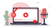
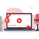
Mentor:

“Impact reports often tend to bury the lead under charts no one reads. We wanted to flip that. The prompt I gave the team was essentially: what does it feel like to need this service, and how do we make a funder feel that before they see a single number? Food insecurity in Toronto is well-documented but is still under-felt. That tension is exactly where good design can do something useful. Arash and Yuuri brought real curiosity and generosity to the work. They came with ideas, took feedback seriously and pushed the project further than the brief required.”
Jacob Sharrard RGD
Mentees:

“I had a lovely time working alongside Jacob and Yuuri as we brought the concept of Laneway Pantry to life, and I'm super proud of what we were able to accomplish together. This project gave me an opportunity to brush up on my Figma skills as well as learn how to purposefully design for the nonprofit sector, something that I hadn't had the chance to explore previously.
I really appreciate the opportunity that this initiative provided me to share my perspective with Jacob and Yuuri and learn from their experiences and perspectives as well. Laneway Pantry really turned out to be an amalgamation of all of our individual talents and I'm excited for everyone else in the RGD to check it out!”
Arash Nouri Associate RGD

“Bridging the gap between raw data and human dignity pushed me to think differently about my work. This mentorship allowed me to refine my visual storytelling through constant iteration and expert feedback—something rarely available to solo freelancers.”
Yuuri Suzuki Associate RGD
Phoenix
The goal of this project was to create Phoenix, a tool for warehouse managers who are stuck "firefighting" problems all day because they can't see what is happening on the floor in real time. The team designed the "Perfect Shift" strategy to break their workflow into three easy steps: Monitor, Investigate and Report. The goal is to make it easier for them to stay in control of the floor without the stress of paperwork at the end of their shift.

Mentee:

“A huge thank you to my mentor, Miriam Smit, for showing me the ropes of professional UX thinking, and to my partner, Horasha Smith, for his support and collaboration throughout the program. I've learned so much about teamwork in design from both of you.”
Ronald Gieng Associate RGD
Ember: A Wellness Experience App
This project included the development of a brand identity and mobile app interface for a start-up wellness platform that helps users discover and book unique spa and sauna experiences. Offerings range from luxury Nordic spa circuits to down-to-earth barrel saunas, sauna tents and home-built retreats.
The goal was to create a cohesive visual identity and intuitive app experience that makes self-care feel accessible, authentic and easy to integrate into everyday life.

Mentor:

“As mentor on this project, I supported a small team through the development of Ember's identity and mobile app concept. We started with two mentees and transitioned to one, yet both demonstrated an impressive level of collaboration and creativity from December through March. Behind the visuals was thoughtful persona research and brand archetype work that informed the design direction.
For me, it was also a meaningful opportunity to reflect on the skills designers need beyond the craft itself—how we guide teams and clients through a project from start to finish, navigate challenges along the way and ultimately deliver work we're proud to present. I'm incredibly proud of Zhanna and Gerard; they were a pleasure to work with and are both talented designers.”
Shannon Hewlko
Mentee:

“Being part of this program was an invaluable experience. Shannon is an amazing teacher and designer. She helped me develop stronger brand-building, storytelling and presentation skills. I learned to think more strategically about my design decisions and ensure that I could justify each one through research, not just feelings. This mentorship also taught me to communicate my ideas more confidently and approach projects with a more professional, client-focused mindset, preparing me for real-world design challenges.”
Horizon Energy+
This energy drink is for health-conscious, active individuals who value natural performance and clean energy. This branding project emphasized the power of cohesive visual storytelling to connect with a wellness-forward target audience, combined with an outdoorsy adventurer, from the day-trip hiker to the backwoods trekker. As part of the launch strategy, a pop-up experience was envisioned to introduce the brand and its four refreshing flavours: Northern Nectarine, Southern Strawberry, Western Watermelon and Eastern Elderberry.
The team collaborated to create a cohesive and engaging visual identity that covers a variety of touch points. This included packaging for each of the flavours as well as OOH billboards, brochures, branded promotional products, vehicle wrap and a pop-up experience showcasing the Horizon Energy+ brand itself. Digital assets such as social media posts and digital ads were also created to extend the brand's presence across online portals.

Mentor:

“I had the privilege of mentoring four talented young designers to create a well-rounded product brand from ideation through to launch. It was interesting to see how they interpreted the brief and see their ideas take shape while I was able to provide real-world context and challenge them to think beyond the screen to consider the broader impact of their design decisions. It was a pleasure collaborating with this team, and I hope it was a valuable experience for them to explore the many moving parts and details that go into a complete brand campaign.”
David O’Connell RGD
Mentee:
“As Design Manager, I really enjoyed working with everyone in the creation of the branding and packaging for Horizon Energy Plus. Each member of the team brought their own unique perspectives and talents, all of which culminated in a project we are all proud of. I'm glad I was able to be part of such a challenging and rewarding experience that has helped my growth as a designer.”
Alejandra Martínez Casas Associate RGD
Valley Harvest Food Hub
Under the guidance of RGD designer Wade Thompson, Valley Harvest Food Hub was born. The new food donation centre celebrates local growers, supports communities and makes good food accessible across the Ottawa Valley. Through innovative solutions and strong partnerships, the food hub creates pathways from farm to table and helps rural producers thrive.
The goal for this project was to create a visual brand identity for the new food donation centre. From the logo to the official brand guidelines, the aim was to create a unique look for the donation centre by focusing on elements that call back to the unique landscape of the valley while also representing the resilient, active and diverse people who belong in this community.

Mentor:

“Branding for non-profits doesn't tend to elicit the same level of enthusiasm from emerging designers, so this project came about to try and instil a bit of excitement for something as weighty as food insecurity. Being able to utilize some insider knowledge, it was a worthy challenge to design something that appealed to not only potential donors but also food bankers who would theoretically use this fictional hub as well.
Both Phoenix and Martina jumped in enthusiastically and created an eye-catching and ultimately worthy visual representation for this new non-profit organization. It was a fulfilling experience to impart some of my day-to-day food banking knowledge and help instil a sense of what dealing with clients in non-creative fields might actually look like for the mentees in future positions—a skill that no one quite prepares you for as an early career professional.”
Wade Thompson RGD
Mentees:

“As someone who currently works with non-profit clients, working on Valley Harvest Food as a Design Manager/Creative Director was an exciting challenge. Working alongside and reporting to a seasoned designer like Wade was incredibly rewarding. His feedback pushed my growth as a leader and shaped many of our creative decisions.
Working alongside Martina was equally fantastic! She brought amazing creativity, strategic problem-solving and a positive attitude to the project. Together, this mentorship has strengthened my leadership skills and reaffirmed my passion for purpose-driven design. Super proud of our team for all the hard work and endless hours on this project!”
Phoenix Mounce Associate RGD

“I really had fun working with Wade and Phoenix to conceptualize the visual identity for this food hub. It's my first time working for a non-profit organization, so there were definitely some new things I had to learn, especially when it comes to prioritizing a much older audience as the main target. Wade was very helpful when it came to giving us feedback and design advice, which helped set the expectations needed for the target audience.
Phoenix was also really helpful as the design manager. She definitely hard-carried the team, especially when it came to workflow and organization of files. Couldn't have asked for a better team for this project!”
Martina Revalde
Program Credits
Logan Chapman RGD, Angela Drupsteen Associate RGD, Roxanne Hammond Associate RGD, Samiksha Makhjiani RGD, Rupsha Mutsuddi Associate RGD, Preet Soni Associate RGD