Designing for Indigenous reconciliation, culture and community

From reconciliation action plans to diplomas issued in nine Indigenous languages, design shapes how institutions and communities recognize, celebrate and sustain Indigenous identity in Canada.
The projects featured here span brand identity, information design, community communications and government documents. Together they show how thoughtful design can honour living cultures, support self-determination and make space for Indigenous voices at every scale—from a union's national strategy to a single graduate holding a credential in their own language.
Northwest Territories High School Diploma Redesign
The Northwest Territories is home to 11 official languages, including nine Indigenous languages. For graduating students, receiving a diploma that does not reflect their language or identity is a quiet but meaningful omission. The Government of the Northwest Territories set out to change that—commissioning a redesign that would transform the high school diploma into a credential that recognizes and celebrates the languages and identities of its Northern students.

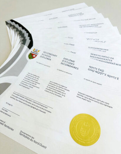

Led by Adele Bisaillon RGD, the initiative spanned two years and involved extensive collaboration with Indigenous language secretariats, translators, education partners and government stakeholders. Reconciliation and Indigenous language revitalization were central goals throughout the design process, guiding decisions alongside the practical work of balancing government standards, accessibility requirements, language accuracy and cultural sensitivity while ensuring equal representation across all 11 official languages. The result is a customizable diploma system: every graduate can now receive their credential in the official language most meaningful to them, including any of the territory's nine Indigenous languages. A certificate holder featuring the Great Seal of the Northwest Territories, translated into all 11 languages and a gold-embossed seal complete the graduation package. What was once a standardized document has become a personalized symbol of language, identity and achievement—and through design, a contribution to the long-term visibility and revitalization of Indigenous languages in the North.
Credits
- Creative Direction: Adele Bisaillon RGD
- In-house Designers: Adele Bisaillon RGD and Sean Crowell
- Client: Government of the Northwest Territories
Iikaakiimaat: Bow Valley College Indigenous Framework by the Creative Team
Bow Valley College sits in proximity to where the Bow and Elbow rivers converge—a confluence of waters in Calgary that carries deep symbolic significance for the Indigenous students who attend the College. The broader region makes up Treaty 7 territory in Southern Alberta, and the College's Iniikokaan Centre, meaning "A Buffalo Lodge for all Nations," provides programs and services dedicated to Indigenous student success.


In the spirit of reconciliation and to honour the varied traditions of the College's Indigenous student population, a working group was formed in 2023 to compile a comprehensive framework document with contributions from Elders and Knowledge Keepers representing all Treaty 7 Nations. The Creative Team at Bow Valley College was then tasked with presenting these shared understandings in a cohesive booklet. There was universal agreement among working group members that the photography should call attention to the natural world—sky, water, fields and mountains—so the College's in-house photographer spent three days photographing culturally significant landmarks across Southern Alberta.
The printed document was introduced at the Blessing Ceremony of a new Indigenous outdoor green space in 2025.
Credits
- Creative direction: Josh McInerney RGD
- Graphic design: Patrick Brooks
- Photography: Ryan Hetherington-Keys
- Printing: Kallen Printing
- Client: Bow Valley College
Gamzook'aamin aakoziwin
Gamzook'aamin aakoziwin—Anishnaabemowin for "We are fighting the sickness together"—is a partnership between the Saugeen Ojibway Nation (SON) and Bruce Power dedicated to producing and marketing cancer-fighting medical isotopes. Because of the cultural, social and scientific significance of the initiative, the visual identity needed to honour Indigenous knowledge and speak to multiple audiences: SON members, government partners, the healthcare community and other Indigenous communities exploring similar collaborative pathways.


The branding approach was community-guided and collaborative from the beginning. The project name was developed by Polly Keeshig-Tobias, a Knowledge Keeper, language speaker and SON member—a contribution that grounded the initiative in Anishnaabemowin and reflected shared responsibility from the outset. To visually represent the Partnership, artist and SON member Emily Kewageshig was engaged to develop the logo. Her design symbolizes the diversity of people working together toward healing: figures encircled in a ring, representing the global reach of medical isotopes. With the name and logo established, Bruce Power's in-house design team expanded those elements into a full brand system—visual guidelines, collateral materials, merchandise, presentation tools and social media assets—collaborating closely with SON partners throughout to ensure cultural accuracy and alignment with community expectations.
The Partnership has landed on a design system that successfully reflects its core values: collaboration, respect, cultural authenticity and shared purpose. The Anishnaabemowin name has become a powerful conversation starter, sparking curiosity and prompting audiences to learn more about the work behind it.
Credits
- In-house designers: Stacey Hill, Dustin Pringle, Erin Grandmaison RGD and Kathleen Scott RGD
- Project name: Polly Keeshig-Tobias (Knowledge Keeper, language speaker and SON member)
- Logo design: Emily Kewageshig (artist and SON member)
- Client: Bruce Power / Saugeen Ojibway Nation Partnership
Deloitte Canada Nation Building — APTN Bears' Lair TV Commercial
Bears' Lair is an Indigenous business reality series on APTN where First Nations, Inuit and Métis entrepreneurs pitch expansion plans to a panel of Indigenous business leaders. Deloitte Canada's 30-second spot, developed for the series, introduced their Nation Building practice to Indigenous business audiences—positioning Deloitte Canada as a connector between Indigenous Nations, governments and corporate Canada, with the emphasis placed on empowerment and collaboration.


The creative centred on visualizing connection through the landscapes of the country. Animated lines of light travel across coast-to-coast geographies, each location chosen to symbolize the diversity and strength of Nations across Canada. The custom linework was also designed to reference the Indigenous cultural practice of smudging, rooting the visuals in Indigenous ways of knowing. To ensure cultural authenticity, all illustrated animals were created by Indigenous graphic designer Summer Bird, who researched natural animal movement and produced multiple sketch cycles so each creature animated with care and accuracy. Colour grading and atmospheric effects were refined to establish a tone that felt proud, emotive and respectful — culminating in a closing hero scene featuring an abalone moon. The spot received positive feedback from leadership, partners and community members alike.
Credits
- Agency Director: Deborah Peterson
- Associate Creative Director, Video: Jayson Chan
- Director/Lead Producer: Kevan Byrne
- Associate Creative Director, Copy: Andrew Gale
- Associate Creative Director, Design: Donna Graffi-Smith RGD
- Illustration and Indigenous Graphic Design: Summer Bird
- Animation: Yoho Yue
- Sound design: Peter Yake
- Client: Deloitte Canada
Expanding Horizons: Deloitte Canada's Renewed Reconciliation Action Plan
Deloitte Canada’s renewed Reconciliation Action Plan (RAP) required more than an update—it called for a visual system that honoured the foundation laid by the original while signalling genuine forward movement. The result is a design language built around the theme of expanding horizons: horizon-inspired gradients, sun motifs and yellow circular forms that together convey hope and progress.
At the heart of the renewed RAP is a hero illustration by artist Joe Tapaquon, whose gradient circle represents life force, spirit and a guiding north star, while connecting to Deloitte's circular brand language. The bear and buffalo—symbols of courage and respect—express the shared steps forward, their visible eyes a direct reference to the Two-Eyed Seeing Approach that guided the RAP's development. Four stars at the top represent Deloitte's four north star pillars: inclusion, education, employment and economic empowerment, also referencing Indigenous teachings around the number four as a symbol of interconnectedness and full perspective.


The design process began with a meaningful act of artistic continuity. Joe Tapaquon collaborated with Nyle 'Miigizi' Johnston—the artist behind the original RAP illustration—to thoughtfully reintegrate tobacco plant and star people motifs from that earlier work into the renewed piece, honouring the journey Deloitte Canada has been on and the lineage of the project. Indigenous graphic designer Summer Bird digitized Joe's artwork in close collaboration with both artists to maintain cultural and artistic integrity throughout. Fireweed imagery was added for its symbolism of resilience and renewal, and typography evolved to bold all-caps headings with italicized endings to express bold aspiration and ongoing progress.
The campaign delivered a full suite of materials: the complete RAP report, a Deloitte.ca landing page with accompanying infographic, social media cards and a print advertisement—making the commitments accessible to internal teams, Indigenous partners and the broader public alike.
Credits
- Agency Director: Deborah Peterson
- Associate Creative Director, Design: Donna Graffi-Smith RGD
- Indigenous Graphic Designer, Lead: Summer Bird
- Indigenous Artists: Joe Tapaquon (Cover), Nyle 'Miigizi’ Johnston (Original RAP Artwork)
- Senior Production Designer: Jessica DeVaal RGD
- Associate Creative Director, Copy: Andrew Gale
- Art Director: Kevin Calaguiro
- Copywriter: Emily Castrechino
- Client: Deloitte Canada
Voices of Indigenous Youth on Reconciliation — Report Series
As part of its Reconciliation Action Plan, Deloitte Canada pledged to seek collaborative opportunities to support Canada's reconciliation journey. In partnership with Indigenous Youth Roots (formerly CRE), a national Indigenous youth-led organization, Deloitte Canada co-hosted Indigenous Youth Advocacy Week (IYAW) in 2022—connecting Indigenous youth with government leaders to share ideas on federal policies and explore careers in advocacy. That week became the foundation for this five-volume report series, addressing four issues identified by First Nations, Inuit and Métis youth as critical to reconciliation: education, mental health, environment and Indigenous sovereignty.


Deloitte Canada’s Indigenous leaders were embedded throughout the design process: an Indigenous graphic designer shaped the visual system, each volume featured an emerging Indigenous artist from a different nation across coast to coast to coast and an Indigenous author guided the narrative and framing. The result is a visually connected series that balances evidence, lived experience and actionable guidance—designed to inform, inspire and mobilize key actors across sectors. Corresponding social assets extend the series' reach, while the approach itself captured exactly what the report is advocating: respectful collaboration and representation.
Credits
- Agency Director: Deborah Peterson
- Creative Director: Monique Ah-Sue
- Art Director: Jordan Bamforth RGD
- Illustration and Indigenous Graphic Design: Summer Bird
- Indigenous Artists: Damien Bouchard, Atheana Picha, Natashia Allakariallak, Shianne Gould, Dani LaValley
- Senior Production Designer: Jessica DeVaal RGD
- Associate Creative Director, Copy: Andrew Gale
- Copywriter: Emily Castrechino
- Client: Deloitte Canada / Indigenous Youth Roots
A Northern Heart: The Atuqtuarvik Story
To mark its 20th anniversary, Atuqtuarvik Corporation commissioned A Northern Heart: The Atuqtuarvik Story, a trilingual anniversary publication celebrating the organization’s history, the entrepreneurs it has supported and its role in Nunavut’s economic development. Rather than focusing solely on the corporation’s milestones, the book highlights the broader story of Inuit entrepreneurship and the communities, businesses and leaders who have shaped Nunavut’s economy.
The publication was developed through close collaboration between Atuqtuarvik Corporation, the writer and the design team. Research involved reviewing archival photographs, historical documents, organizational records and community stories to create an accurate and meaningful account of the organization’s 20-year journey. The editorial design needed to accommodate three languages while maintaining clarity, accessibility and a strong visual hierarchy. Generous white space, consistent margins and a thoughtful typographic system created an open reading experience that allowed the stories to take centre stage.


The resulting publication uses photography, personal narratives, historical imagery and archival materials as the primary design elements. A visual language developed in collaboration with the client reflects the openness and scale of the North while creating space for the voices and experiences of the people behind Atuqtuarvik’s impact. Through accessible multilingual design and narrative-driven storytelling, the book preserves an important chapter in Nunavut’s history and creates a lasting record of Inuit economic development for future generations.
Credits
- Project management: Terry Rudden
- Creative direction: Fe Wyma RGD
- Graphic design: Fe Wyma RGD, Andrea Ledwell and Nafisa Anarkali
- Client: Atuqtuarvik Corporation
Piqalujaujaq Gathering House, Qikiqtarjuaq, Nunavut
The Hamlet of Qikiqtarjuaq commissioned NVision, in collaboration with HofK, to develop the visual identity and interpretive experience for Piqalujaujaq Gathering House, a community gathering space and visitor centre in Qikiqtarjuaq, Nunavut. The project included a logo, interpretive signage and a table display describing the Inuit seasonal cycle. The goal was to create a welcoming environment that celebrates the community's relationship to the land, culture and history while serving both residents and visitors.
The project was designed with the community, not simply for the community, through consultation, relationship-building, listening and guidance from local priorities and Inuit Qaujimajatuqangit (IQ). Artwork commissioned from local artist Mathew Kilabuk inspired the design of the seasonal table display, while the logo draws from the distinctive form of the building. A carefully selected Latin typeface complements the accompanying Inuktitut syllabics, creating a cohesive visual identity that reflects the community's language, culture and sense of place.


The visual identity and interpretive program create an experience that celebrates the culture, history and landscape of Qikiqtarjuaq while providing a gathering place for Elders, community gatherings and cultural connection. At the same time, as the northern gateway to Auyuittuq National Park, the facility serves residents and visitors alike, providing interpretation and visitor information that connect people to both the community and the surrounding landscape.
Interpretive displays guide visitors through stories of the natural environment and Inuit cultural development, concluding with the community's vision for the future. Artwork and artifacts created through the local artists' and craftspeople's cooperative are integrated throughout the space, reinforcing authentic community voices. The logo, signage and seasonal table display create a cohesive visual identity that honours Inuit knowledge, celebrates local creativity and reflects the community's enduring relationship with the land.
Credits
- Art Direction and Project Manager: Chris Grosset
- Graphic Design: Fe Wyma RGD
- Illustrator: Mathew Kilabuk
- Exhibit Design and Fabrication: Kevin Davies
- Agency: NVision Insight Group
- Client: Hamlet of Qikiqtarjuaq
Indigenous Youth Roots Branding and Website
After more than 15 years of growth, Canadian Roots Exchange recognized that its name no longer reflected its mission or the Indigenous youth it served. "Exchange" was no longer central to its work, and "Canadian" did not resonate with all Indigenous youth. As the organization expanded its focus on national programming, mentorship and youth leadership, Design de Plume was brought on to support a full rebrand—encompassing naming consultation, visual identity, brand guidelines and a website redesign.
The process was grounded in Indigenous protocols and youth leadership from the start. A full-day, in-person engagement session brought together youth-led discussion, storytelling, an offering of Tobacco, a shared feast and a ceremony led by Elder Grandmother Isabelle Meawasige. From that gathering, the name Indigenous Youth Roots emerged—reflecting themes the youth themselves named: growth, cultural connection, ancestry and strength.


The resulting identity was designed to feel as energetic and grounded as the organization it represents: bold enough to carry a national presence, warm enough to welcome youth in. At its centre is a beadwork and star-inspired flower representing Indigenous youth from all four directions. Its fractal forms speak to knowledge passed through generations, while earth, water and fire tones reflect connection, growth and renewal. These ideas extend across typography, illustration, colour, layout and sub-brand applications, creating a flexible foundation for IYR's future work. The website was built with both Western and Indigenous perspectives on accessibilit—considering not only navigation and usability, but clarity of language, culturally meaningful visuals and reduced cognitive load. Together, the brand and site support IYR's national programming, grants, mentorship and leadership work while honouring the self-determined futures of Indigenous youth.
Credits
- Consultation and Project Sponsor: Jennifer Taback RGD, Co-CEO
- Creative Direction: Jennica Robinson
- Graphic Design: Lauren Polchies, Ashley Wadge Associate RGD, Davide Dorigo Associate RGD
- Digital Strategy and UX Design: Lindsay Levesque
- Web Development: Xiangxu Teng, Erik McManus
- Name and Brand Strategy / Project Management: Lisa Baer-Tsarfati
- Website Project Management: Maria Legault
- Print Materials Coordination: Manju Davis
- Engagement Activities: Julia Taback
- Client: Indigenous Youth Roots
Advancing Accessibility Standards through Inuit Qaujimajatuqangit
Nunavummi Disabilities Makinnasuaqtiit Society (NDMS) supports, advocates, educates and provides resources for Nunavummiut with disabilities. Their research work increases awareness of all aspects of life for Nunavummiut with disabilities across the territory. In 2023, NDMS approached Hopgood Creative to create culturally sensitive infographics, data visualizations and illustrations that could tell that story with honesty and care.


Michelle Hopgood RGD creatively directed illustrator Amy Ryu to bring Eeta to life—a persona of a young woman with a disability living in Nunavut. Through her story, the project depicts the challenging medical travel journey that is common to Nunavummiut with disabilities accessing healthcare within and outside their territory. Culturally sensitive storytelling was central throughout: every visual decision was made to reflect the lived reality of Nunavummiut rather than impose an outside perspective. The final solution is a 4-page spread featured in NDMS's research report. The society said the work captured the struggles, frustrations and emotions of Eeta's journey—a document that advocates with accuracy and empathy.
Credits
- Infographic design: Michelle Hopgood RGD, Hopgood Creative
- Illustration: Amy Ryu
- Client: Nunavummi Disabilities Makinnasuaqtiit Society
CBTU Indigenous Reconciliation Action Plan (IRAP)
Canada's Building Trades Unions have been engaged in reconciliation work for over a decade, beginning with a 2017 commitment to act on the Truth and Reconciliation Commission of Canada's Call to Action #92. The IRAP represents the next major step: a national, structured framework for advancing Indigenous participation, leadership and economic opportunity across the union.


TWall Design worked as a creative partner with Mokwateh, an Indigenous-owned consultancy, which led the substantive engagement work—conducting a comprehensive review of internal documents, examining union and local initiatives and carrying out multiple rounds of interviews with Affiliates, Provincial Councils, Board members and Indigenous organizations. The design work translates that depth of research and community engagement into a document that is both authoritative and approachable, fitting for a milestone publication that will guide CBTU's reconciliation commitments going forward.
Credits
- Design: Trevor Wall RGD, TWall Design
- Creative partner and Indigenous engagement: Mokwateh (Indigenous-owned consultancy)
- Artwork: Angie Saltman
- Client: Canada's Building Trades Unions
Niskamoon Community Banners
Niskamoon Corporation works alongside the nine Cree communities of Eeyou Istchee to support initiatives that strengthen community well-being and foster meaningful connections across the territory. To support outreach and event participation, they needed a suite of communications materials that could represent each community individually while reading as a coherent series.


Design is Yummy developed nine roll-up banners with authentic representation and accessibility at the centre of every decision. Regional landscape photography was carefully curated to celebrate the distinct character of each territory, while a custom colour palette gives every community its own visual identity within a unified system. Clear information hierarchy and wayfinding principles keep the banners visible and easy to navigate across a variety of public settings. Community names appear in both Cree syllabics and English alongside contact information for Local Officers. A flowing graphic element runs through the series, allowing the banners to function as individual community assets and as a unified whole—celebrating diversity while reinforcing the connections that unite all nine communities across Eeyou Istchee.
Credits
- Creative direction: Elana Rudick RGD, Design is Yummy
- Graphic design: Pam Menegakis and Jessica McDonald Associate RGD
- Client: Niskamoon Corporation
Niskamoon Annual Report 2024-25
For more than 20 years, Niskamoon Corporation has worked alongside Cree land users and beneficiaries to develop and oversee projects that address the impacts of hydroelectric development in northern Québec, supporting traditional ways of life while fostering sustainable partnerships across the nine Cree communities of Eeyou Istchee. The 2024–25 Annual Report marked two milestones at once: Niskamoon's 20th anniversary and a decade-long creative partnership with Design is Yummy. That dual anniversary called for an approach grounded in continuity, collaboration and connection, and Design is Yummy translated two decades of progress into a cohesive visual narrative that honours Niskamoon's history and the rich cultural heritage of the Cree Nation while looking confidently toward the future.


The design centres on forward momentum while respectfully honouring the past. A flowing ribbon motif, inspired by Niskamoon's logo, weaves throughout the report to symbolize the connection between land, community and progress over time, with each section building on the last to reflect how past achievements continue to shape the future. Niskamoon's signature red and blue anchor the report, while accents of yellow were introduced to celebrate the organization's 20th anniversary and convey optimism for the years ahead. Vertical pagination along the page edges further supports intuitive navigation.
The result is a report that feels grounded, purposeful and celebratory. Distributed across the nine Cree communities and published online, it serves as an important tool for communicating achievements, sharing progress and maintaining transparency with the communities Niskamoon supports.
Credits
- Creative Direction: Elana Rudick RGD
- Graphic Design: Pam Menegakis and Jessica McDonald Associate RGD
- Photography: Réal Courcelles, Brendan Forward, Theresa MacLeod Loon and Jimmy Sam
- Agency: Design is Yummy
- Client: Niskamoon Corporation
The Prose of Indigenous Inclusion in Toronto's Creative Media Industry: A living guidebook
Canada’s media sector provides a rich ecosystem for stories to nourish our diverse landscapes. The SHINE Network Institute and POV Film facilitated a research project to learn what it takes to ensure Indigenous creatives are a part of it. “The Prose of Indigenous Inclusion in Toronto’s Creative Media Industry: A Living Guidebook” centres Indigenous creatives' collective knowledge and lived experiences to understand what supports they need to flourish.


The research was grounded in Indigenous methodologies and guided by an Indigenous Youth Advisory Committee. Victor Szeto RGD and Nyle Miigizi Johnston collaborated with the project team to produce visuals that centre Indigenous traditional knowledge and help show how the media sector mirrors river systems. The project culminates in a 25-page report and a dedicated online landing page that offers downloadable materials, additional resources, and partner recognition.
Credits
- Creative Direction: Dr. Zoey Roy
- Graphic Design: Victor Szeto RGD
- Lead Researcher: Dr. Zoey Roy
- Research Assistant: Talia Cowan
- Illustrations: Nyle Miigizi Johnston
- Project Managers: Jennifer Podemski and Biju Pappachan
- Clients: SHINE Network Institute and POV Film
Nisga'a Language and Culture Website
For many Nisga'a people living away from the territory, access to language and culture has been disrupted across generations. Residential schools severed the transfer of language, leaving many without the ability to speak their mother tongue, while urban living and adoption have further limited access to land-based learning. The Nisga'a Lisims Government's Language and Culture Department engaged Roodenburg Design Consultants to create a dedicated platform for language revitalization and cultural connection—built especially for those seeking to reconnect who face uncertainty, unsure where to begin or how to participate respectfully.
Roodenburg Design Consultants worked closely with Elders, cultural advisors and department staff to understand how language is lived, shared and accessed across the Nation. That engagement shaped a site structure that prioritizes clarity, openness and cultural grounding. Graphic imagery and textures are informed by Nisga'a forms, patterns and relationships to land, translating references to plants, fish and woven structures into a cohesive digital experience rooted in place.


Designed to support a range of users, from first-time learners to knowledge-keepers and Elders, nisgaalanguage.ca focuses on reducing hesitation and encouraging participation. In its first 90 days, the site recorded 1,400 active users, 14,000 events and 1,300 new users, with the Resources and Learning Nisga'a sections emerging as primary points of engagement alongside strong interest in culturally significant content such as Hoobiyee. Within a population of close to 5,000 Nisga'a members, these results point to strong engagement and establish the platform as a meaningful tool for ongoing language revitalization and cultural connection.
Credits
- Sr. Creative Director: Rod Roodenburg RGD
- Communications & Strategy Lead: Raquelle Roodenburg
- UX Design Lead: Sam Odiahi
- UX and Design QA: Adam Flynn
- Graphic Designer: Karen Gao
- Development Lead: Cole Nakatani (Ideahack)
- Video Editing and Creative Direction: Jurriaan Eversdijk (Norvell Jefferson)
- Client: Nisga'a Lisims Government, Language and Culture Department
Tag
Related Articles


Michael J. Young RGD


Jennifer Taback RGD, Ashley Wadge Associate RGD


Dean Mitchell RGD
Sponsored


