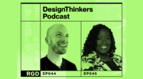
Typography as visual voice with Ariane Spanier
Episode 6 — DesignThinkers Podcast, Season 4

This episode features Ariane Spanier, a Berlin-based graphic designer and creative director whose work sits at the intersection of typography, culture and editorial design.
In her conversation with Nicola Hamilton RGD, Ariane reflects on finding her way into the cultural institution space, the expressive power of typography and what it means to design with a personal accent—one shaped by upbringing, education and years of experience.
She also speaks about her role as creative director and co-editor of fukt, a contemporary drawing magazine, and the freedom and responsibility that come with running your own publication.
This episode is for anyone thinking about their own voice as a designer—how it forms, how it evolves and how to trust it.
Working in the cultural sector
The conversation begins with how Ariane found her way into working almost entirely within the cultural sector. It wasn't a strategic decision so much as an organic one, beginning in art and design school, where she designed catalogues and publications for artists and professors she got to know.
That early momentum carried on into her professional life and the cultural sector has remained her home ever since.
Ariane's poster work


A shared vocabulary
Ariane describes the value of working with clients who share a design vocabulary—where conversations about the work are richer and more collaborative, even when those clients have sharply formed opinions of their own.
"There is more of a mutual understanding of what we’re doing. We have the same vocabulary, to speak about and to talk the same language in a way." — Ariane Spanier, Principal Creative Director at Ariane Spanier Design
What she looks for in those relationships is openness—a sense of trust that develops before any barriers are put up.
Ariane's poster work


“Sometimes clients, they want something from you as a person. They want something that maybe looks a little bit like you have done before, almost like you would think of an illustrator or an artist—some want that personal touch in it and in the design.”
Ariane Spanier, Principal Creative Director at Ariane Spanier Design
Paula Rego—The Personal and the Political


Type with an Accent
A central part of Ariane’s DesignThinkers Vancouver talk, Type with an Accent, is the idea that typography is never just a container for words—it is itself a form of expression, carrying atmosphere, texture, feeling and meaning that can run parallel to, or even counter to, the text it holds.

“There’s so much expression and look in typography, and therefore feeling or atmosphere—through texture and appearance and behaviour. Typography can say something that the word or the words may oppose—it can open up even new meanings.”
Ariane Spanier, Principal Creative Director at Ariane Spanier Design
Faust Themenjahr 2025 — Klassik Stiftung Weimar
This thinking comes through vividly in her identity work for the Klassik Stiftung Weimar’s Faust Themenjahr 2025—a year-long cultural program across museums, archives and public spaces throughout Weimar centred on Goethe’s Faust. The identity renders the single word Faust in every possible typographic voice simultaneously: blackletter, script, bold sans-serif, refined serif, compressed, expanded, printed, hand-drawn—all colliding across colourful panels, a book cover, outdoor columns, tote bags and a full exhibition interior.
Inside the Schiller-Museum, giant wave-shaped panels carry quotes from Goethe’s text in mixed typefaces, each one chosen to reflect the mood and weight of the words. Visitors move between them as through a landscape of language—typography not as decoration, but as interpretation.


Rules and instincts
Ariane grew up with typographic rules—her father is an industrial designer with strong views on type, and her design education was grounded in precision and craft. But her relationship to those rules has shifted considerably over the years. When asked if there are rules she would never break, her answer is an immediate "No!"
"I don’t think there are really rules. But if I want people to read texts, I make them readable for them. I don’t want to be an asshole who presents them something where, after a few lines, they’re just too tired." — Ariane Spanier, Principal Creative Director at Ariane Spanier Design
What guides her process instead is instinct—a deliberate practice of not overthinking the first response to a brief.

“I often try to take something that comes out immediately. These are almost unconscious ways of reacting to a new brief. There’s usually some filters, some radar, some sensors that have gotten something right or wrong.”
Ariane Spanier, Principal Creative Director at Ariane Spanier Design
KSW — Sprache


Borders Bauzaun
One of the most striking examples of Ariane’s work is Borders Bauzaun, a large-scale typographic installation wrapping the construction hoardings around Berlin’s Kulturforum district. Running hundreds of metres along active construction fencing beside the Neue Nationalgalerie and the Berliner Philharmonie, the project turns infrastructure into a public statement—each panel a bold, colour-blocked declaration about borders, belonging, identity and longing.


Designing with an accent
The Borders Bauzaun project connects directly to one of the most compelling ideas in the conversation, Ariane’s framing of design style not as style at all, but as an accent. Growing up in East Germany, she was acutely aware of how accents mark people, and how much pressure there can be to neutralize them.
"After the wall came down, it was always a little bit like—my God, do you hear immediately that that person is from the East? And people wanted to get rid of that." — Ariane Spanier, Principal Creative Director at Ariane Spanier Design
She draws a parallel to the design world’s long obsession with neutrality, questioning whether it is ever truly possible, or simply one more form of cultural agreement.
“Accent is more layered. There are time layers and there are cultural layers and relations to others. There are so many reasons for why we design how we design. We get never really rid of our history and of our upbringing—and I think this is something that makes us who we are.”
Ariane Spanier, Principal Creative Director at Ariane Spanier Design
fukt magazine
The conversation closes with a discussion of Ariane’s work as creative director and co-editor of fukt, a contemporary drawing magazine now in its 23rd issue. Published once a year, fukt has become known internationally for its typographic covers and its tactile, often surprising physical details.
The Sound issue has clear varnish lines printed across the cover that produce different tones when a fingernail is dragged across them. The Nature issue has cut-out leaves that can be pulled free, turning each copy into its own small bouquet. An earlier faces issue featured what looked like a pencil smudge on the cover—intentional, permanent and something customers would reach out to wipe away before realizing it was part of the design.
"Type is drawn and typefaces are drawn. So the element of the process and how it’s created is very, very similar. Words and drawing are very close for me." — Ariane Spanier, Principal Creative Director at Ariane Spanier Design
Each new issue raises the bar. And once something has been done—the musical lines, the cut-out leaves—it’s done. It can’t be repeated.

“You always set a kind of new bar, or you put a check on something that you have done and that you can’t really do again. So it’s always a little bit nerve-wracking.”
Ariane Spanier, Principal Creative Director at Ariane Spanier Design


Tag
Related Articles
Sponsored


