At First Sight: The Edmonton Oilers logo
Written by John Naboye Associate RGD, Funday
Studies show that your core memories become more detailed around the age of six. Well, that’s exactly what happened when I watched my hometown hockey team, the Edmonton Oilers, lose in Game 7 of the 2006 Stanley Cup Finals to the Carolina Hurricanes, but let’s back track a bit.
Growing up in and around Edmonton, you couldn’t avoid the Oilers logo no matter where you lived, worked or played. As a kid, I collected hockey cards, mini sticks, stickers, books and even random (sometimes bootleg) merchandise. And while I enjoyed looking at the other 29 NHL logos at the time, I was always biased towards the Oilers' logo. In hindsight, it’s become clear how my love for the team (alongside my fixation on NHL logos) influenced and inspired my path into design.
Logo origins
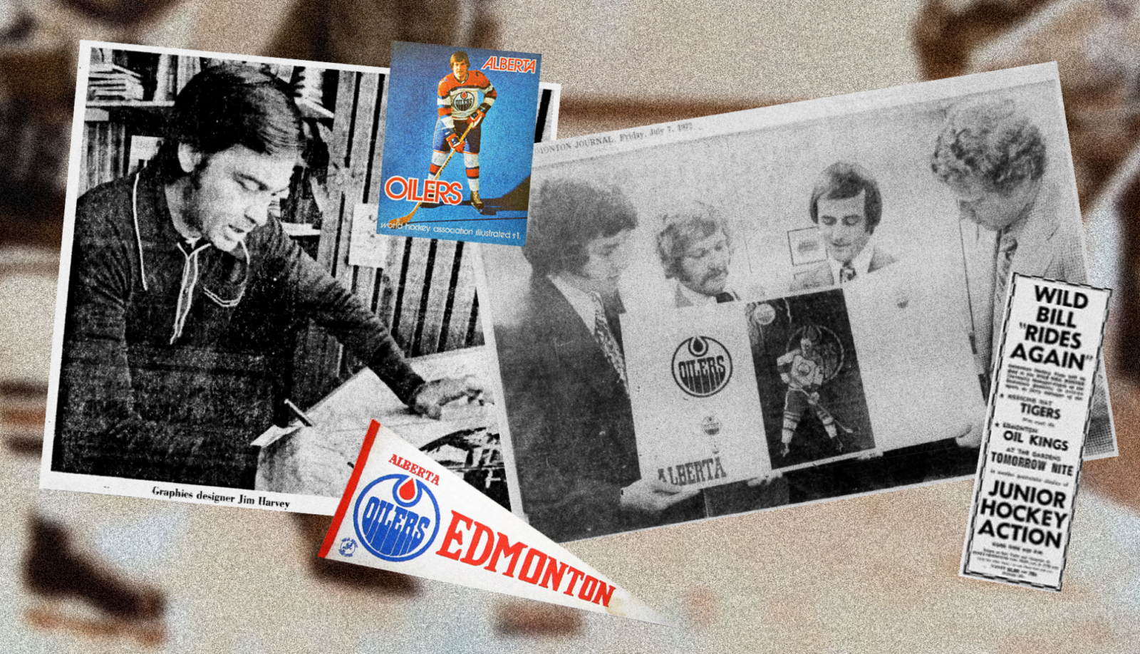
Before joining the NHL, the Oilers competed in the World Hockey Association (WHA), where they were one of the league’s 12 founding franchises. The team’s original owner, Bill Hunter, previously owned a junior club in the 1950s and 1960s, called the Edmonton Oil Kings. The Oil Kings had a nickname among fans: the Oilers. Hunter adopted this moniker for the WHA’s inaugural season in 1972 and retained it when the franchise later joined the NHL.
From a visual identity perspective, there is no official documentation from the team on who designed the logo. However, the YouTube channel Dive In Canada has a great video breaking down this mystery. The fingers (and one comment) point toward graphic designer James “Jim” Harvey and ad agency FWJ. Bill Hunter also played a role in shaping the identity, later confirming that the logo was inspired by the Gulf Oil logo, which intentionally shared the same colour scheme. Hunter hoped this visual connection would help attract Gulf Oil as a corporate sponsor, but a deal ultimately fell through. The company’s chair reportedly did not want to appear as though Gulf Oil was copying Imperial Oil, a longtime sponsor of Hockey Night in Canada.

Design choices
I could not find any other documentation on the logo’s original design rationale. However, like most sports logos, its meaning is relatively self-explanatory and rooted in symbolism. The oil drop at the top symbolizes the energy industry, and the condensed typography mimics oil slowly dropping down the crest. The aforementioned Gulf Oil logo heavily influenced the colour choice, which initially had little direct association with the city of Edmonton itself.
Viewed through a design lens, there’s a modernist, yet distinctly '70s groovy vibe to it. It’s simple, has character and alludes to heritage. But what I appreciate most about the logo is the use of complementary colours and how they naturally support one another. This simplicity also allows the logo to be reinterpreted, as seen in the themed logos from recent years. While I can confidently say I won’t be designing the next Oilers logo (in part because they won’t be changing it anytime soon!), these are the qualities that continue to influence how I approach visual identity concept explorations to this day.

A timeless icon
While many teams around the league have undergone major logo redesigns over the years, the Oilers are among the few teams that have kept the same logo throughout their history. Nostalgia, ownership and on-ice success have played significant roles in this. When examining the team’s colours and jerseys throughout the years, it’s clear that they had a bit of an identity crisis. However, when you put all of their primary logos together, the foundation of the original logo design remains intact.

As a child, I didn’t think much about the logo from a design perspective, but it was one I loved to draw from memory. Today, I see it as a classic ’70s mark that has stood the test of time, strengthened by both success and nostalgia. I’ve seen opinions online suggesting the logo feels outdated, arguing that it “screams” 1972. However, this beloved mark carries a deep history, making evolution of the greater brand identity the smarter approach versus a logo overhaul. Designers usually aim to create work that lasts, and I’m sure Bill Hunter and Jim Harvey thought the same way. Still, it’s fascinating to consider that a logo initially designed with a potential sponsorship in mind would go on to become a timeless icon.


Sponsored


