Top 5 Information Design Projects
Written by Michelle Hopgood RGD, Hopgood Creative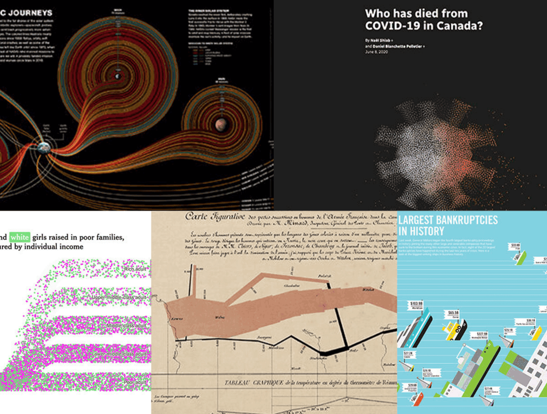
Information design is in a state of explosion; there is so much data that it is impossible to select the top five. Instead I have chosen information design projects that are creative and inspiring while adding realism and perspective to their subjects.
Cosmic Journeys, an update of Fifty Years of Space Exploration

If you’ve ever wondered about where we’ve travelled in space then look no further than this infographic. I first saw this in Isabel Meirelles’ Design for Information, a great resource and introduction to information visualizations. You can spend a lot of time looking over this graphic and gleaning more and more information about humans in space.
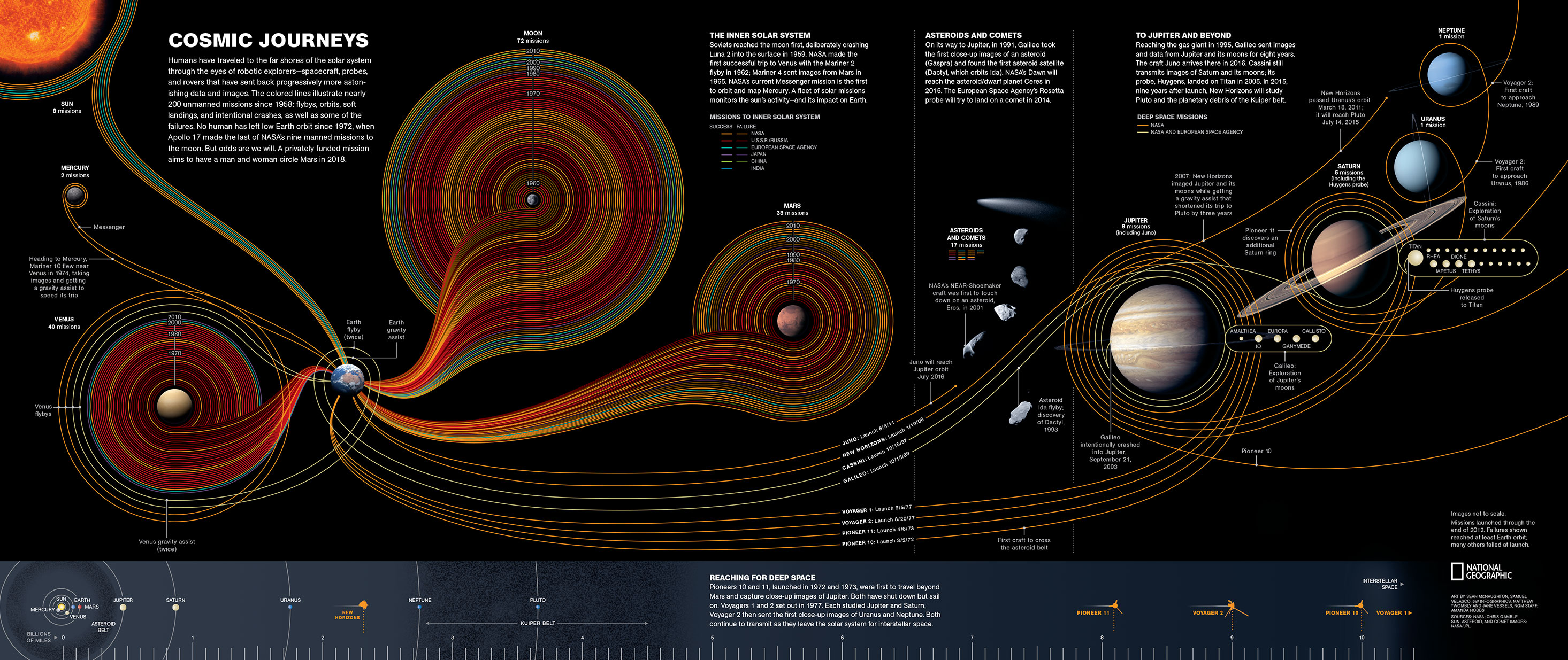
Who has died from COVID-19 in Canada? (CBC Radio-Canada)

Data journalism is a great mode for bringing data to life through interactivity. Radio-Canada did an amazing job with this data by really putting the numbers into perspective. The stats of the COVID-19 crisis can be very scary, especially when they are skewed. I feel like this interactive presentation of the numbers was a great opportunity to add a realistic perspective to the uneasy statistics and, I really hope they update it!
If you’re curious, here’s the link to the full interactive presentation
Income mobility (The New York Times)

Now more than ever is the data represented in these interactive infographics relevant. The New York Times team who put these graphics together provided clarity, perspective and impact to a topic that can be difficult for people to understand. It visually shows the economic impact of race and how difficult it is for some members of our society to maintain or achieve upward income mobility. Make sure to check out the full article because it has more interactive infographics than I was able to showcase here.
To read the full article and see the interactive infographics: “Income Mobility Charts for Girls, Asian-Americans and Other Groups. Or Make Your Own.” by Emily Badger, Claire Cain Miller, Adam Pearce and Kevin Quealy, The New York Times (March 27, 2018)
Napoleon’s campaign to Russia, 1812–1813 (Charles J. Minard)

A shout out to an information design pioneer, Charles J. Minard, who was able to capture Napoleon’s journey through space and time in a single graphic through the use of scale, distance and colour.
The main feature of this infographic depicts the journey and the size of Napoleon’s army (422,000 soldiers) when he began his campaign to Russia in 1812. As Napoleon proceeds towards Russia the dark tan line gets steadily thinner, representing 100,000 troops on the far right. When Napoleon finishes his campaign in 1813 the black line (10,000 soldiers) is very thin compared to when they started their journey. An additional element at the bottom of the page, Minard highlights the time of year and the temperatures.
Check out National Geographic’s article on Charles Minard
An updated English translation of this graphic can be found here
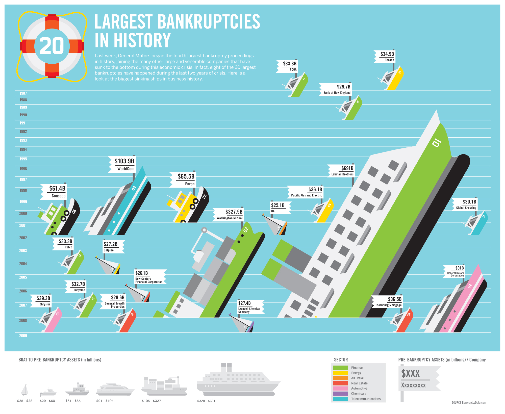
The Largest Bankruptcies in History (GOOD)

I love this infographic, it is both creative and informative. The data is depicted through a hierarchy of detail. The pre-bankruptcy assets in billions of each company is represented by the size of the sinking ships and white flags that state the actual value and company. It is colour-coded by sector and the rank of most amount lost is indicated by the number on the side of the ship. The legend/key is clear and simple, guiding the reader through its story.
Back in 2009 when I was starting my career in information design it blew me away and despite its data being outdated it continues to inspire me. The info design nerd in me would love to see an updated version.
Click here to see a larger version of this infographic
Certified and Provisional Members who are interested in contributing content to the RGD website via Resource Lists, Top 5s and more are invited to email Rushika at pr@rgd.ca.

Michelle Hopgood RGD
Hopgood Creative
Michelle is Founder, Creative Designer and Information Specialist at Hopgood Creative. She helps researchers, academics and thinkers use the power of design to explain complex ideas. With over 15 years of experience in design, information, knowledge and information management, Michelle brings a unique perspective to clients and business. Michelle was a Design Educator at Seneca College teaching information design. She holds a diploma from Sault College, a Bachelor of Design from OCAD University, and a Master of Information from the University of Toronto. Michelle was a recipient of RGD’s In-House Design Awards 2016 and a speaker at DesignThinkers TO 2019. She has an unshakeable commitment to making complex ideas beautiful to help her clients get media attention, teach courses and reach a wide audience.
Tags
Related Articles


Ruth Farrugia RGD


