Six environmental organizations inspiring through design
Written by Laura Stein RGD
The alarm is sounding louder than ever for addressing the climate crisis but this year I see reason to be hopeful: more and more designers are getting involved in environmental discussions and action.
As designers, we are critical players in capturing attention, telling stories and generally getting people on their feet. I’m sharing a few environmentally focused organizations that use design in a very purposeful way with the hope that it will inspire you too. The organizations all have the same ultimate goal—to mitigate environmental destruction—but they use a variety of strategies and aesthetics. Which confirms for me that there is no one way to design for a movement—collective action needs many different voices, inspired by many different things.
Design Declares
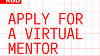
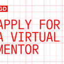
Starting with this new UK organization because they are focusing on designers like us. Design Declares encourages design studios from across different disciplines to sign on and to declare a climate emergency together. Joining groups like Music Declares and Architecture Declares they state, “As part of the global declaration movement, we commit to harnessing the tools of our industry to reimagine, rebuild and heal our world.” They have outlined eight “Acts of Emergency” and provide resources for designers to meet those acts in their daily practices. Type-driven in their communications, Design Declares shows up austere and urgent, black and white and all caps. Because the name is open-ended (Design can declare many things), the mark can rotate through different ideas. One billboard simply states “Design Declares: #themostimportantbriefofourtime.”
Extinction Rebellion
As a group who brings together a broad swath of people for street action and non-violent civil disobedience, Extinction Rebellion takes the opposite approach. Colourful, theatrical, they create a sense of pluralism and pranksterism with their very visual actions and communications. The movement's already iconic symbol, the hourglass inside a circle, fits the street art, paste up sensibility. The bright pinks and blues contrast with the more sedate greens of an older environmental movement. The action pictured here was held last year outside a Shell Oil office. One hundred Rebels held brightly coloured placards with a Shell staff person’s first name asking them to join XR. “Stuart: please join us” “Tariq: please join us”. A bright green fireman’s-style jumping sheet invited employees to “Jump Ship”. Quintessentially XR.
Clive Russell, one of the founding members of the arts group, said, “For XR, we looked backwards. We looked at the Suffragettes; we looked at the arts and crafts movement; we looked at the Bauhaus. We asked ourselves, how do we create a similar consistency today while also allowing people to bring their own thinking to protest art?” Their combination of visual exuberance and urgency is probably a key reason XR has grown so quickly.
Atmos.earth
Atmos is both a printed magazine and digital platform that explores climate and culture. The two different streams, The Frontline and The Overview, are “devoted to ecological and social justice, creative storytelling and re-enchantment with the natural world.” Images are critical here—the photography is gorgeous—the palette is muted and lovely. Topics range from what we can learn from lichens, to how our relationship with horses has altered history, to a profile of a young activist in Poland. Each story feels like an immersion, urging us to explore unexpected aspects of our world as well as how the climate crisis has impacted it.
It’s Freezing in LA!
Another printed magazine with a very different feel and a focus on illustration and data visualization. Their mission is to “help untangle the environmental tensions and choices that humanity must navigate by platforming as many different perspectives as we can find.” Each issue is centred around a theme, such as Health, Regeneration and Borders. The exclamatory title is taken from a Donald Trump quote: “Ice storm rolls from Texas to Tennessee—I’m in Los Angeles and it’s freezing. Global warming is a total and very expensive, hoax!”. They play fast and loose with layout rules and bring together a wide variety of writers, illustrators and data visualizers, giving it a chaotic and collective feel.
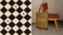
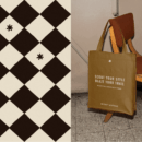
PlasticFree
A new membership platform for designers bringing together innovations, case studies and producers centered around material alternatives to our plastic-soaked universe. The PlasticFree team analyzes and assesses, with notes on origins, properties, development stage, uses to date, etc.—everything you would want to know to incorporate a new plastic-free material into your design project. The visual language is almost futuristic—I love the material “orbs”—and the website feels and acts more like an editorial space exploring the possible than a database of substrates. The creative team knows their audience and understand the importance of designing an easy and compelling experience for designers. Currently, it is searchable by beauty, food and beverage, textiles and packaging but the platform is growing all the time and we’ll see new categories soon.
Clean Creatives
Closing out with another organization whose target audience is designers, along with advertising and PR agencies. Clean Creatives’ purpose is to end our reliance on fossil fuels by cutting off the fossil fuel industry’s mouthpiece. They state: “Every misleading story about climate change begins with an agency working for the fossil fuel industry.” Among other actions, they ask agencies to sign a declaration stating that they will not work with fossil fuel clients. Duncan Meisel, Executive Director of Clean Creatives, told us that they thought carefully about their logo and general design, wanting to ensure that their most important audience, people in the creative industry, would feel affinity with it. The distinctive typographic and bitmapped CC for their badge, extra wide headline face, pink and yellow gradients seem to be working (along with their actions)—the organization has garnered a lot of attention in the last year.
It feels like these organizations are defining a new era for environmental activism. They are responding to their constituents, their cultures and their sensibilities in new ways in an all-important effort to bring us all on board. The cultural tipping point is near.
Laura Stein RGD
Laura Stein RGD, Chief Creative Officer at Bruce Mau Design. BMD is a research-based design studio delivering inventive and rallying design across all the places where people connect. Home to an international community, BMD works across borders and cultures, helping organizations at every scale grow, transform and deliver indelible experiences. As Partner and Chief Creative Officer and long-time advocate for collaboration, Laura provides overall creative and strategic direction across a variety of project types, from a museum in Abu Dhabi to a greenway in Austin to a global performance brand based in Tokyo.
Related Articles


Sponsored


