Made for the Next Generation: Youth design showcased

Design shapes how young people learn, play, heal and belong. This month's feature gathers projects by RGD Members that put children and youth at the centre of the brief.
The projects featured here span brand identity, exhibit design, event experience, web design, social media and print toolkits, for clients ranging from children's museums and school infrastructure nonprofits to grief-support foundations, STEM equity organizations, public health initiatives and outdoor apparel brands. Together, they show how thoughtful design can make institutions, spaces and campaigns feel more welcoming, accessible and alive to the kids and families they serve.
Growing Healthy Places Brand Identity by Gravity Inc.
Ophea partnered with Gravity Inc. to develop the identity for Growing Healthy Places: Mississauga, a collaborative initiative led with 8 80 Cities, Brock University and Novo Nordisk Canada. The project centres on improving children's health and well-being by increasing access to physical activity, nutritious food and community environments in underserved urban neighbourhoods.
Gravity began the process by gathering insights and perspectives from partners and collaborators. From these conversations, the team distilled a set of guiding values and principles that informed the look and feel of the brand, resulting in a versatile system applied across all print and digital platforms.


The identity is formed from a collection of components that reflect communities coming together: a "g" that represents both the program name and the concept of growth, alongside a distinct figure that symbolizes an individual in action. Vibrant, bold geometric and organic shapes create a strong sense of energy and optimism, and a fresh colour palette paired with mix-and-match shapes lets the brand translate easily into icons, background visuals and playful touches to photography, already helping the program build a sense of connection and belonging within the communities it serves.
Credits
- Creative Director: Emerald Lee RGD
- Art Director: Hana Lee Associate RGD
- Designer: Kristina Cruz-Pura
- Designer: Emma Dallaire Associate RGD
- Project Manager: Kellie Hadjidimitriou
Children's Trust Website by Mangrove
The Children's Trust of Massachusetts is a nonprofit organization dedicated to addressing the root causes of child abuse and neglect by strengthening the systems that support families. Its previous website was difficult for staff to manage and hadn't been built with mobile users in mind, making it harder to keep resources current and accessible for the families and communities who depend on them.

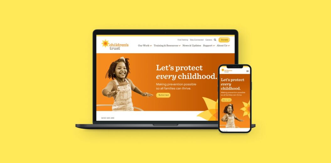
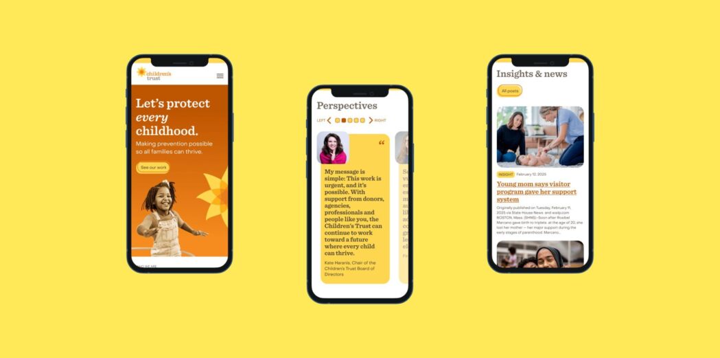
Mangrove was brought in to design and build a new website that would give the Children's Trust team more control day-to-day while creating a smoother experience for visitors. The creative team partnered with agency True North to align on content strategy and copywriting, then built a custom WordPress site using a flexible, block-based design. Accessibility was central throughout: the team tested colour contrast, refined brand colours for readability, and built the site to meet WCAG 2.2 Level AA standards.
The new site pairs a polished design with practical, staff-friendly tools. A block-based design gives the Children's Trust web team full control over their pages while keeping a cohesive look and feel, and a friendlier backend makes routine updates much easier to manage without outside help. The new site keeps resources current, accessible and easy to find.
Credits
- Creative Director: Andrew Boardman RGD & Daniel Brown
- Designer: Karen Niedzwiecki RGD
- Project Manager: Marcella Bechtel
- Account Manager & Content Strategy: True North
DBBIA Eggstravaganza 2025 Festival Identity by Jumanah Abualkhair Associate RGD
The Downtown Brampton Business Improvement Area (DBBIA) had a mission to enhance the business district's appeal and activate downtown Brampton through an Easter Festival in 2025. The goal was to establish a compelling festival identity to attract families, encouraging them to explore the city's downtown core and support local business.


The approach hinged on creating something that would stand out from traditional Easter branding, prioritizing vibrant colours and bold, inviting typography. The identity is inspired by egg-painting motifs, resulting in a flexible visual system with on-theme icons that each represent a participating business in the festival's Scavenger Egg Hunt. This way, local businesses were more deeply reflected in the branding and integrated into the festival collateral. The identity was well-received with the 20 businesses participating in the festival hunt and an estimated attendance of 2000+ kids and families.
Credits
- Creative Agency / Designer: Jumanah Abualkhair Associate RGD
- Content & Marketing Strategy: Downtown Brampton BIA
Orquestas y Coros de Grupo México Identity by Daniel Esqueda Design
For more than a decade, Grupo México has fostered its Orchestras and Choirs program (Orquestas y Coros de Grupo México), offering thousands of children and young people the opportunity to discover music not merely as an artistic discipline, but as a vehicle for personal and social growth. Today, over 2,000 youth aged 5 to 22 across mining regions in Mexico and Peru participate in this life-changing effort, completely free of charge, a program that builds discipline, solidarity and teamwork and inspires members to give back through community volunteering.


Daniel Esqueda Design was entrusted with creating a unified visual identity to anchor all communication touch points for the program. Drawing directly from musical elements, the circle, the concept of human voices in a choir and a colour palette inspired by the surrounding landscape, the identity honours the unique mining communities where the program thrives while resonating equally with children, young musicians, parents and community leaders.
Through this cohesive visual ecosystem, Daniel Esqueda Design transformed a collection of regional music groups into a single, proud cultural movement, a brand experience that instills a sense of belonging, dignifies participants' efforts and carries the program's transformative message across every touchpoint.
Credits
- Creative Director / Designer: Daniel Esqueda Guadalajara RGD
- Design: Mario Maya
- Design: Heriberto Borja
- Motion Design: André Esqueda Guerrero
- Photography: NortePhoto
2026 Ignite Gala Identity by Design Is Yummy
Myra's Kids Foundation provides free, year-round support to grieving children and families following the loss of a loved one. Ignite, its annual fundraising gala, ensures programs remain accessible to families at no cost. For the 2026 gala, Design Is Yummy developed an event identity and environmental experience spanning signage, storytelling touchpoints, sponsor recognition, branded materials and an entrance activation, with the creative centred on connection, reflection and community, inspired by the foundation's summer grief camp.


The entrance activation reimagined the camp's luminary ceremony, inviting guests to honour a loved one through a lantern dedication. A glowing dock, water-inspired lighting and natural shoreline elements created an emotional entry experience that, together with event branding throughout the venue, connected guests to the children and families at the heart of the foundation's work.
Design Is Yummy transformed an industrial event venue into an immersive environment, with the illusion of a floating dock, illuminated lanterns, an indoor shoreline and layered lighting creating an immediate emotional connection to the foundation's summer camp. Large-scale banners featuring camper photography and quotes brought young voices into the experience, while close collaboration between the design, production and event teams brought the vision to life for a diverse audience of grieving families, donors, volunteers and community members.
Credits
- Creative Direction: Elana Rudick RGD
- Graphic Design: Pam Menegakis
- Graphic Design: Jessica McDonald Associate RGD
- Event Photography: PBL Photography
- Poster Displays: AFIX
London Children's Museum Rebrand by sagecomm
For 45 years, the London Children's Museum has been a well-known and well-loved cultural and educational institution in Southwestern Ontario, connecting families to play and to each other through its interactive exhibits and engaging staff. The museum's move to 100 Kellogg Lane in London, Ontario, gave it a chance to re-emerge and re-introduce itself to children and families, donors, partners, media and the general public, while supporting critical fundraising goals. Its visual brand needed to evolve to match the innovative design of its new space.


sagecomm undertook an extensive rebrand, starting with research and discovery through staff and member interviews, facilitated sessions, reviews of existing data and marketing materials and competitor analysis. The resulting brand position, key messages and content development informed a refreshed visual identity and creative system, carried across a full suite of collateral and materials inside and outside the museum.
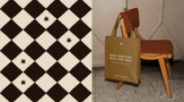
The new brand is inspired by and anchored in play, curiosity and discovery. The logo balances structure and playfulness while honouring the museum's history and evolution, its stars appearing in evolutionary stages to represent children playing and growing together. A vibrant colour palette differentiates the museum's seven exhibits while maintaining visual cohesion, and a series of custom illustrations brings imagination to life in an organic, playful nature. Wayfinding signage carries the brand into the space while prioritizing accessibility, positioning the museum to keep offering children and families countless learning opportunities and lifelong memories.
Credits
- Senior Strategist and CEO, sagecomm: Lindsay Sage
- Vice President Strategy & Operations, sagecomm: Megan Winkler
- Creative Director: Alyssa Westman
- Senior Specialist, Marketing Communications: Sarah Emms-Pilon
- Senior Designer: Sarah Walker
- Multimedia & Website Specialist: Selena Wells
- Executive Director, London Children's Museum: Kate Ledgley
- Director of Marketing & Communications, London Children's Museum: Mira Noordermeer
- Photography: LR Studios (Lydia Trafford), Jordan Lyall Photography
NCSI Identity & Website by Mangrove
The National Center on School Infrastructure (NCSI) is a U.S.-federally funded technical assistance centre dedicated to improving U.S. public school buildings and grounds, connecting state and local school district leaders with the resources they need to modernize their facilities. NCSI required a new brand identity and website that matched the ambition and credibility of its mission, striking enough to command the attention of policy makers and educators, yet approachable to audiences as diverse as facility managers, district administrators, state leaders and federal partners.
Mangrove began with intensive discovery sessions to understand NCSI's mission and audiences, then developed the identity through three structured rounds of proofs: black-and-white early concepts, followed by colour renditions and type treatments, then a final round of refinements based on client feedback, before translating the identity into a custom WordPress site built to function as a scaleable national resource hub, with custom API integration for dynamic resource delivery and accessibility built to meet WCAG 2.2 Level AA guidelines.


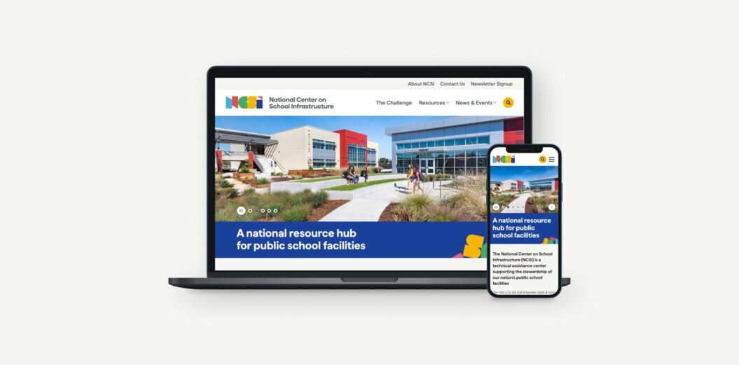

The result is a striking brand identity that uses vibrant colours and geometric building blocks inspired by elementary school classrooms and architecture, a visual echo of NCSI's mission to improve the spaces where children learn, paired with a flexible digital foundation that gives NCSI staff the tools to publish content and grow the site over time, working toward a future where every child has access to a sound public school facility.
Credits
- Creative Director: Andrew Boardman RGD
- Art Director: Karen Niedzwiecki RGD
- Designer: Daniel Lamb RGD
- Project Manager: Marcella Bechtel
Planet Stonz Social Media Campaign by Hangar 18 Design Continuum
Stonz makes outdoor shoes, clothing and accessories for babies and young children who are adventurous, go-getters and explorers, allowing them to fully experience the outdoors in rugged gear they don't have to worry about.


To bring that mission to life, Hangar 18 Design Continuum created Planet Stonz, an award-winning social media campaign of videos and reels that parody nature shows, featuring babies and toddlers fully immersed in exploring their world and interacting with nature. Every location was pre-scouted and shot around Vancouver's Lower Mainland. When shooting fell in summer, the team improvised winter shots using leftover ice shavings from a rink clean-up as a pile of snow for a toddler to climb.
Storytelling and human connection with the outdoors were key to the campaign's appeal, strategically highlighting the ruggedness and waterproof qualities of the gear and keeping kids free to play in puddles, mud or snow while staying dry and comfortable.
View the Stonz campaign video on Vimeo.
Credits
- Creative Director: Dean Ponto
- Designer: Vida Jurcic RGD
- Project Manager & Stylist: Lyndsey Jackson
- Videography, Photography & Editing: Chen Productions (Matthew & Flora Chen)
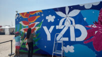
Visions of Science Identity by Camilo Saenz RGD
The primary goal of this project was to reenvision the visual identity of Visions of Science to create a deep sense of belonging for youth, historically left out of the STEM equation, bridging the gap between high-level organizational strategy and community connection, and making STEM feel accessible, authentic and exciting.
The process involved researching elements of urban culture, including sports, music and street style that appeal to the organization's target youth and translating its methodology for social change into a visual language that stayed deeply rooted in STEM while remaining culturally relevant to its four distinct program streams.


The solution is a dynamic "visual equation" that merges community culture with STEM, using a colour palette defined by the visible spectrum of light where distinct frequencies match the goals of each program stream. Bold typography, authentic youth photography, gritty textures and high-contrast graphics transform the brand into something that loudly communicates impact and connection, making the organization's spaces feel inclusive and relevant to the lived realities of the youth it serves.
Credits
- CEO: Eugenia Addy
- Campaign Photographer: Ebti Nabag
- Sr. Manager, Content: Camilo Saenz RGD
- Specialist, Content Capture & Communications: Gebel Ceesay
- Manager, Communications & Digital Engagement: Tallie Garey
Soccer in Schools Program Identity by Kidzsmart Communications & Daniel Asel Design
Canada Soccer partnered with Kidzsmart Communications and Daniel Asel Design to create a school program that would grow access to the sport and foster a welcoming community. Centred on a Playbook series featuring national team players, the program included age-specific, segmented content for students from kindergarten to grade nine, pairing skill-building activities and player profiles with school curriculum.


Each Playbook was translated into seven languages to reach communities across Canada, particularly families new to the country; alongside English and French, content was translated into Mandarin, Cantonese, Punjabi, Spanish and Tagalog, ensuring the program was accessible and relevant to a wide range of students.
Schools across Canada gained curriculum-connected print and digital resources that kids found both fun and educational. Canada Soccer called the partnership collaborative and creative, one that turned casual fans into engaged ones and, in the lead-up to the 2026 World Cup, the Soccer in Schools program helped new Canadian families feel part of the Canadian soccer community.
Credits
- Creative Director: Daniel Asel RGD
- Art Director: Stacey Hamilton
- Graphic Designer: Max Beauchesne
- Strategic Account Director: Jasmine Kafka
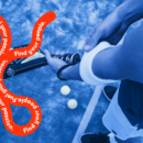
Stand Up, Speak Out Toolkit by Hangar 18 Design Continuum
PLEA Community Services' Children of the Street division is dedicated to preventing the sexual exploitation and human trafficking of children and youth in British Columbia, working through education strategies, public awareness initiatives and family support. Hangar 18 Design Continuum was challenged with creating a toolkit that could be distributed both digitally and as a print piece.


Working within PLEA and Children of the Street's set graphic guidelines, Hangar 18 pushed the approach to be a bit more edgy and raw to reflect the nature of the kit, while still looking professional. Type was used as a visual element throughout in unexpected ways, alongside a bold, dynamic graphic approach that retained PLEA's brand circle theme; for the digital version, live links to useful resources were peppered into the spreads.
Designed to engage students in conversations about toxic masculinity in our society, the Stand Up, Speak Out Toolkit is a valuable resource for educators, parents and young people.
Credits
- Design and Production: Vida Jurcic RGD and Caroline Zhang
- Project Management: Dana Jurcic and Jen Graham (PLEA)