
Beauty as an entry point with Valentina D'Efilippo
Episode 4—DesignThinkers Podcast, Season 5

This episode of the DesignThinkers Podcast features Valentina D'Efilippo, an information designer, creative director and author known for translating dense, unwieldy datasets into visual stories that move people—flowers standing in for a century of wars, a dandelion holding the shape of the #MeToo discourse on Twitter.
In conversation with the RGD's Past-President, Nicola Hamilton RGD, Valentina talks about deciding what a dataset reveals and what it hides, why she reaches for beauty and metaphor even when the numbers are devastating and a recent project where she painted a mark by hand for every lost Palestinian woman, child, press and medical worker—alon,largely in silence, over sixteen hours, shared live on Instagram.
This episode is for designers, journalists and anyone who's ever had to decide how to represent a data set—and felt the weight of that choice.
An accidental first data project
Valentina trained as an industrial designer in Turin before moving into visual communication in London. Long before "data visualization" was a term anyone used, her graduate thesis on gender stereotypes in children's literature was already doing it. HarperCollins found the thesis and paired her with data journalist James Ball to co-author The Infographic History of the World—a collaboration she's called an "arranged marriage" between two disciplines that didn't naturally speak the same language.
"When something like that knocks on your door, you better actually look at what is behind the door." — Valentina D'Efilippo
Data is not gospel
"Data is not gospel." It's a line Valentina comes back to more than once, and it sums up most of what she believes about the job: a designer doesn't just render a dataset; they decide what it means.

“Deciphering a data set is a huge responsibility because data does carry this kind of scientific or arrogant tone. We see the numbers, this is the ultimate truth. But actually how the data was collected, what is there, but also what is missing, is important. Questioning the methodology in which it was initially gathered is all our responsibility as communicators, as designers, as people that are actually looking at data to find solutions or answers.”
Valentina D'Efilippo
She talks about how easily that responsibility slips once you've spent weeks living inside a dataset.
"You become the expert of the dataset—you feel like everybody's gonna understand it. So stepping back and getting some fresh eyes before publishing is so important."
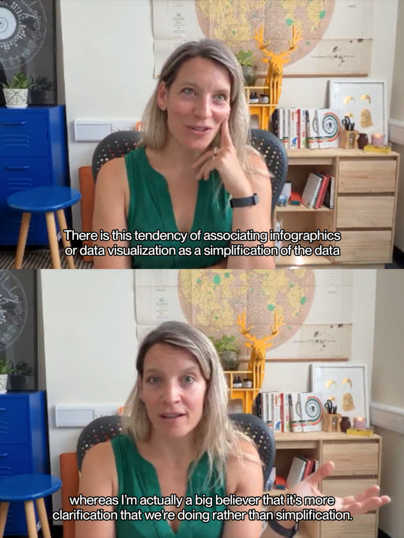
She draws just as careful a line around what "clarifying" actually means, since it's easy to mistake for simplifying.
Giving data a voice
Asked how she actually gets from a spreadsheet to something a room can feel, Valentina breaks it down into two things she says she always considers.
That first part is perceptual, almost physiological.
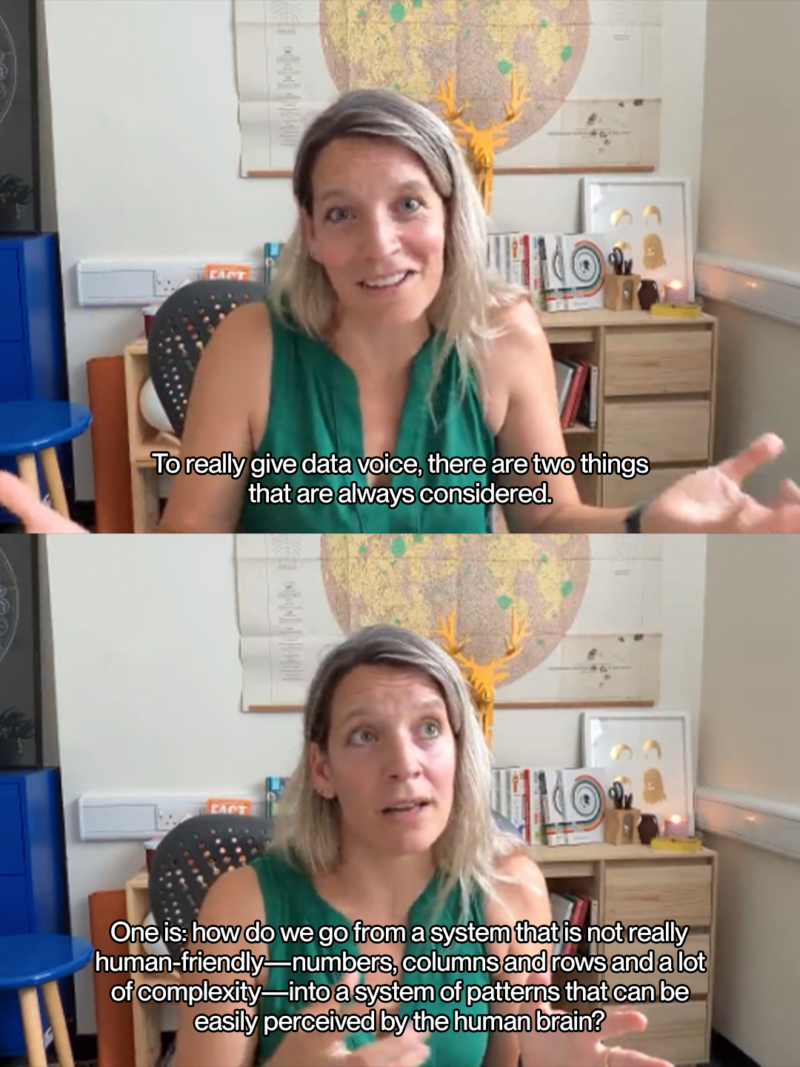
"There is a lot of understanding of visual perception, pattern recognition and how the visual cortex functions to see scales and magnitude."
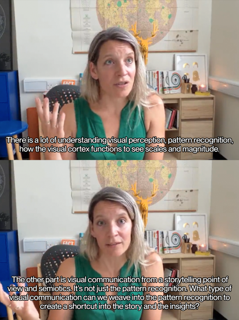
The second part isn't about perception at all. It's narrative.
When the metaphor comes first
Valentina usually lets a visual metaphor grow out of the data itself. MeToomentum—a look at the themes and global reach of roughly 200,000 tweets tied to #MeToo across the movement's first six months—was the exception. She started with the metaphor: a dandelion, a plant treated as a pest for how easily it spreads but also, botanically, a complex and beautiful flower long tied to endurance and change. The project's three visualizations are built around the plant's actual anatomy.
There's a similar instinct at work in Poppy Field, a self-initiated 2014 project that turns a century of wars into flowers, where stem length, bloom size and colour all carry real data. It opened with the line:


“The First World War was initially dubbed the war to end all wars. Sadly, the world has witnessed more than 200 conflicts in the 100 years since. Poppy Field reflects on the human cost of war from the beginning of the 20th Century.”
Valentina D'Efilippo

Painting the dead, one mark at a time
Late last year, Valentina went back to a piece of Poppy Field on Instagram Stories, to revisit one the longest poppy stems, Israel vs Palestine. Over more than 16 hours, in silence, she made a mark by hand for each of the 34,624 lives of Palestinian children, women, journalists, medical workers lost two years after October 7, roughly half of the 68,000 total deaths recorded at that point. The number today is likely above 73,000. She painted it live, and shared the experience online.
"The problem with big numbers is that they just don't hit us. We get so used to them."
Valentina ties the beauty of these pieces to access, not comfort—a way of getting people to actually look.
"Beauty gives me a way, a framework to approach something that otherwise would be really hard to look into. It's almost like giving people permission to step into something that otherwise would not invite a lot of people in." — Valentina D'Efilippo
Teaching the thinking, not just the how-to
Valentina has run the Guardian Masterclass since 2013, and her enterprise training—for clients including the Financial Times, Google, Spotify and Pfizer—now sits alongside her own Data Storytelling Academy. She's taught this material to Guardian masterclass attendees, corporate teams who wouldn't call themselves creative and kids at the Barbican, and she keeps the workshops deliberately tool-agnostic so the room isn't distracted by software.
She says the tools have gotten much easier to teach over the years, but the thinking behind them is the part that still takes real work to pass on.

“The how-to has become much easier. The foundation is really about the thinking, the strategy, the problem solving—how you connect the dots and how you approach the translation.”
Valentina D'Efilippo
Related Articles


Sponsored


