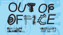
5 identities given life through motion
Written by John Naboye Associate RGD, Funday
When crafting a brand identity, designers often leave motion design off the table. This could be due to anything from budget constraints or some other lack of resources.
There’s nothing wrong with NOT having motion, as many brand identities are beautifully-crafted without it. An identity can still embody a sense of movement even in static applications. For instance, it could be suggested through textural type or patterns. If the design allows for this, it would lay the foundation for a motion opportunity; or in other words, a selling point to have fun with motion!
Let’s get into it and look at how motion can elevate and give life to a brand identity—even if its core mark is as simple as a shape.
44th National Magazine Awards
Rethink | Canada

Starting our list is Rethink's award-winning identity for the 44th National Magazine Awards. The identity is centred around the printed magazine in its most distilled form: the spine. Rethink uses the spine in a way that makes you wish you had thought to. We see the spine being used in simple, abstract animations, where it is given character through the tilting and physics-based animations of the magazines falling onto each other. It’s important to note that this identity wouldn’t have been successful without the backbone of the spine (pun intended). Combine that with the elegant motion design and language and you have an award-winning identity!
Utah Jazz: Brand in Motion
Studio Dumbar/DEPT | The Netherlands

Motion design can be used to enhance the sports fan experience. This was the case for the NBA’s Utah Jazz. I’ve seen many NBA logo rankings online and the Utah Jazz’s logo is often ranked low. While this is understandable if you look at the history of sports logos (which are often more expressive and illustrated), you have to take a step back and view the identity as a system. Rotterdam-based Studio Dumbar/DEPT, known for its award-winning brand and motion identities, took note (no pun intended) and gave life to the Jazz’s visual experience with a kinetic identity inspired by jazz rhythms. The result is a dynamic and flexible motion toolkit that contains various patterns, effects, typography and even 3D basketballs. It’s quite loud, and I mean that in a good way. The maximalist execution is very fitting for a team in the NBA.
Sundance Film Festival
Porta Rocha | USA

Heading to NYC, one of the epicentres of design, we find Porta Rocha and its identity for the Sundance Film Festival. Inspired by cinema’s standard 16:9 widescreen aspect ratio, Porta Rocha created a mark that functions as a framing device to highlight the films and stills from the festival’s archive. If we take a step back, we see that the simplicity of the identity doesn’t focus on the design but rather on the art of filmmaking. What makes this identity work for me is how it adapts itself to various sizes and formats. The branding also doesn’t overpower the footage that it lives on and the adaptable frame can extend outwards, becoming a bounding box that type and imagery can live within. In addition, the motion language that the type and frame feel like they’re gliding on ice. This contrasts well with the film footage it's paired with, which often has harsher cuts and blurry movements.
Jaberi Dance Theatre
Underline Studio | Canada

Sometimes, the motion design and language of a brand can be subtle. This was the case for Underline Studio’s Jaberi Dance Theatre identity. Building upon the discipline, the brand is centred around beautiful images of dancers combined with minimalist, sans-serif type that moves subtly but elegantly, allowing the viewer to focus on the art of dance. It’s kind of like the type is “dancing” in their respective spots. It’s also quite evident that the type moves along a grid. This creates various possibilities that can be adapted to different applications, such as on a tote bag presented in the case study.
Natural History Museum
Pentagram & Nomad Studio | UK

Finishing out the list is Pentagram and Nomad’s energetic, type-focused and—most importantly—motion-first rebrand of the Natural History Museum. The simple yet expressive mark already embodies a sense of movement with its radial formation of NHM, representing the energy of a ripple effect that pulsates from the centre. Just like the previous identities, Pentagram and Nomad built the NHM brand in a way that shifts the focus to the discipline. The NHM mark was created with movement in mind. We see suggested movement in the various static applications (found in the case study) where the repetitive formation of NHM expands and retracts itself. The execution works for me because it creates a sense of movement even in static applications. The repetitive formation of NHM expands and retracts itself through static banners, social posts, and even their membership card.


Sponsored


