Designing for a Healthier Canada
Design shapes how people experience care, from the moment a family opens a strategic plan to the way a national campaign confronts a difficult diagnosis. This month, we feature projects by RGD Members that put health and wellness at the centre of the brief.
The projects featured here span brand identity, editorial design, advertising and environmental graphics for clients ranging from a unified family-services agency and a national rare-disease network to a community health centre, a hotel gym, a beach-volleyball facility, a national health education campaign, a naturopathic wellness clinic and a childhood cancer charity. Together, they show how thoughtful design can make care feel clearer, warmer and more human for the people who need it.
A new brand for sand, sport and community by sagecomm
The Beach Hangar was created to meet growing demand for high-quality volleyball spaces in Southwestern Ontario. The entrepreneurs behind Forest City Sport & Social Club and Summit Sports partnered with London International Airport to build Ontario's only tournament-calibre, six-court indoor beach facility: 23,000 square feet designed for year-round competition, recreation and community.
With an entirely new facility and concept, The Beach Hangar needed a brand that could build awareness, attract competitive and recreational players and rally the community around the destination. sagecomm began with research and discovery, including one-on-one discussions, group engagement sessions and a community survey, alongside conversations with Volleyball Canada, London International Airport and Tourism London. These insights informed a brand position centred on social fun, friendly competition, community and fitness.


The Beach Hangar's visual identity balances two sides of the experience: competitive play and social fun. A bold, modern typeface creates an energetic foundation, while uppercase and lowercase treatments differentiate competitive and recreational messaging. Inspired by the hangar itself, the primary badge incorporates a volleyball that evokes both sun and sport. Following launch, the system expanded to include sub-brands, including The Starting Lineup, Beach Hangar Champs and The Blue-Con Beach Bar.
Credits
- Senior Strategist and CEO, sagecomm: Lindsay Sage
- Vice President, Strategy & Operations, sagecomm: Megan Winkler
- Creative Director: Alyssa Westman
- Senior Specialist, Marketing Communications: Kaleigh Siegner-Robertson
- Senior Designer: Sarah Walker
- Multimedia & Website Specialist: Selena Wells
- Photography and Videography: LR Studios (Lydia Trafford)
- Co-Founder, The Beach Hangar: Kyla Woodcock
- Co-Founder, The Beach Hangar: Dave Ward
A unified, bilingual brand to promote help, hope and healing by sagecomm
CFSD emerged from the unification of several longstanding family-serving organizations in Durham Region: Safety Network Durham, Rose of Durham and Catholic Family Services of Durham. The challenge was to create a modern master brand and refreshed sub-brands that preserved the trust and recognition of each organization while establishing a cohesive, future-focused identity.
The system needed to serve distinct audiences, accommodate a bilingual service mandate for some services and prioritize accessibility for people seeking support during challenging moments. sagecomm began with stakeholder engagement to understand the values and perceptions associated with each organization. A comprehensive brand audit identified opportunities for alignment and elements to retain, evolve or reimagine.


The resulting identity system centres on a new CFSD master brand and refreshed or net-new identities for its three service divisions. Accessible typography, a refined colour palette and an abstract icon inspired by elements of each division create a contemporary master brand symbolizing unity, shared purpose and collective impact. Each sub-brand maintains its own character while connecting visually to CFSD: Rose of Durham is nurturing and approachable, Renewal Psychotherapy Durham is calm and reflective and Safety Network Durham is warm, welcoming and modern.
Credits
- Senior Strategist & CEO, sagecomm: Lindsay Sage
- Vice President Strategy & Operations, sagecomm: Megan Winkler
- Creative Director: Alyssa Westman
- Senior Specialist, Marketing Communications: Sarah Emms-Pilon
- Senior Website Specialist: Lyndsay Fearnall
- Senior Designer: Sarah Walker
- Multimedia & Website Specialist: Selena Wells
- Executive Director, CFSD: Elizabeth Pierce
Choosing Wisely Canada brand identity by The Agency of Love and Logic
Choosing Wisely Canada, a national initiative of Unity Health Toronto, addresses a behavioural challenge rather than an awareness gap. The goal was to encourage more thoughtful decisions around tests and treatments within a healthcare culture shaped by established practices and patient expectations, while giving the brand clinical authority without sounding like protocol.
The strategy established a dual voice: educator and challenger. One grounded in clinical evidence, the other encouraging physicians to reconsider established habits and make more intentional choices. Rather than reinventing, the design team worked to understand what had already been defined, then brought it into form with a system shaped by one guiding idea: to reduce overuse.


The visual identity translates Choosing Wisely Canada's strategy into a system built on clarity, restraint and purpose. At its centre is the dash, a simple graphic expression of the organization's focus on doing less when less is appropriate. Medical-inspired iconography brings authority and relevance without making the system feel overly clinical, while a flexible grid allows campaigns to speak differently to clinicians and patients while remaining clearly connected to the brand.
Credits
- Creative Director: Belle Williams
- Senior Designer: Nata Nagovitsyna
- Strategy Director: Rachel Teoh
- Managing Director: Samantha Olivera
Inbloom Health Brand by Hood & Searle Design Inc.
The goal was to show how Inbloom Health empowers people on their healthcare journey. Inbloom is a modern healthcare clinic that offers services in naturopathic medicine, IV therapy, acupuncture and traditional Chinese medicine, along with free health education through online resources including guides, meal plans and webinars. The visual identity needed to be clean, modern and approachable, appealing to the clinic's target audience while positioning it for future growth and expansion.


Hood & Searle created 24 hand-drawn flowers for the identity, with variation in each flower symbolizing that every individual's health journey is unique. To balance the clean, modern typography and composition of the visual identity, the team embraced the imperfection of the human hand for contrast. The website design focused on creating an easy-to-navigate space for both Inbloom's services and education resources that works across all devices, resulting in a fun and colourful site with contemporary typography, hand-drawn service icons and an easy-to-browse home for blogs and online resources.
Credits
- Creative Director: Brandon Hood
- Art Director: Aidan Searle RGD
- Graphic Design: Aidan Searle RGD and Brandon Hood
- Web Design: Aidan Searle RGD and Brandon Hood
- Web Development: Muhammad Dilshad Khaliq
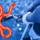
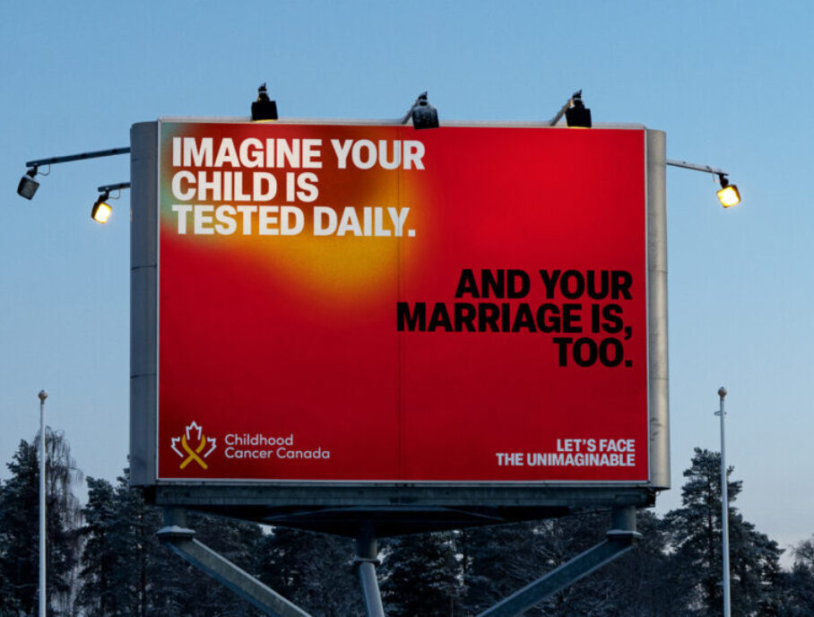
Let's Face the Unimaginable by The Garden
Cancer is the leading disease-related cause of death for children in Canada. Today, 10,000 families are caring for a child with cancer and despite its devastating impact, pediatric cancer remains a public blind spot, receiving just 7% of the national funding allocated to adult cancer. Childhood Cancer Canada commissioned a national platform to confront that blind spot directly.
Childhood cancer is hard to look at, which is exactly why it's overlooked. It's a reality so difficult to digest that people distance themselves from it and lean on the only words they can find: "I can't imagine". "Let's Face the Unimaginable" twists this reflexive response into a rallying cry, urging Canadians to push past their own discomfort and sit with the profound, often unseen impact cancer can have on an entire household, from diagnosis to recovery and beyond.


For years, photography has dominated this category, used to elicit sympathy or contrive hope. This campaign subverts expectations with a more restrained approach, stripping imagery away entirely: the creative leads with language, posing stark scenarios and leaving the rest to the audience's imagination. As a visual throughline, the system draws on real CT and MRI imagery, with gradient "hotspots" that subtly echo the devastating, clinical reality behind the words. The campaign sparked a national conversation around childhood cancer, earning coverage from major Canadian news outlets and nearly 50 million total impressions.
Credits
- Co‑Founder & Chief Creative Officer: Shane Ogilvie
- Co-Founder & Chief Strategy Officer: Shari Walczak
- Executive Creative Director: Lindsay Eady
- Executive Design Director: Adriana Ivory RGD
- Senior Art Director: Mriga Suchdeva
- Senior Copywriter: Nuala Murray
- VP Client Leadership: Kendell Edney
- Business Lead: Delaney Brough
- Strategist: Sabesh Balasingam
- Project Lead: Mariana Leon Franco
- Studio Director: Jamie Morren
Mid-Main Rebrand by Hangar 18 Design Continuum
Mid-Main Community Health Centre is a family practice and travel clinic with a multidisciplinary team managing individual healthcare needs. Mid-Main had been on Main Street in Vancouver for many years, and its old logo reflected that history rather than the new, modern building and facility the clinic was moving into a block away. Hangar 18 created a new minimalist logo that embodies personalized care and interaction while looking clean and clinical.
Since both medical doctors and dentists work in the building, the two practices were differentiated by colour, reflected in the logo and stationery packages. The modern, iconic representation of people is neither gender- nor race-specific, encompassing the whole Community around Main Street.


The logo represents people and community while also forming an "M" where the two figures come together, standing in for the two professions: medical and dental. The sleek new branding works seamlessly across signage and all other mediums.
Credits
- Project Management: Lyndsey Jackson
- Logo Design: Vida Jurcic RGD
- Design & Production Team: Vida Jurcic RGD and Matea Cumpf
- Printing: Marine Printers
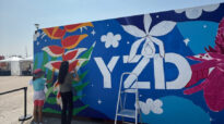
Moxy Montreal Gym Graphics by Design Is Yummy
Moxy Montreal Downtown wanted to create a dynamic guest experience that reflected the city's local flavour while staying true to Moxy's bold, playful brand. Design Is Yummy created witty, typographic graphics across the gym, sauna and fitness centre bathrooms, transforming everyday spaces into playful, local and distinctive brand moments.
The text is bilingual, reflecting Montreal's unique cultural landscape. On the chalk wall, messaging inspired by the city's never-ending construction brought a distinctly local sense of humour to the space. The gym called for something louder and more energetic, while the sauna and bathrooms took a more functional approach, turning privacy and visibility into opportunities for branded design moments.


The gym features a massive 67-foot bilingual typographic mural designed to inspire and energize, alongside a cheeky chalk wall referencing Montreal's famously never-ending construction. In the sauna, branded frosted decals provide privacy while reinforcing the Moxy identity, and large-scale decals outside the fitness centre bathrooms turn a functional necessity into an unexpected visual moment. Together, these design moments transform practical hotel spaces into memorable parts of the guest experience.
Credits
- Creative Direction: Elana Rudick RGD
- Graphic Design: Pam Menegakis
- Graphic Design: Jessica McDonald Associate RGD
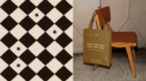
Quartz by Hangar 18 Design Continuum
A new wellness medical spa and aesthetics clinic was opening in White Rock, BC in 2022. Quartz offers naturopathic care, injectables and IV therapy. Entirely female-run, it provides a downtown Vancouver experience in an area that is mostly rural. Hangar 18 worked with the owners, three sisters who teamed up with a medical doctor partner, in a collaborative process throughout naming and design.
The client chose the name "Quartz" for the healing properties of the mineral. Hangar 18 designed an icon paired with custom typography that symbolizes the divine feminine in a way that is clean, friendly and memorable, representing both the facets of a quartz crystal and a heart.


A three-pronged colour palette was established to provide a system that might be used for private label packaging at a later date, as well as to create flexibility for applications. The rose quartz colour was adopted as the main brand colour. Hangar 18 created all the brand elements, brochures and both exterior and interior signage, and the creative directed the look of the initial website.
Credits
- Project Management: Lyndsey Jackson
- Logo Design: Vida Jurcic RGD
- Designer Team: Matea Cumpf and Vida Jurcic RGD
RareKids-CAN Strategic Plan 2025–2029 by Emma Tarswell RGD
RareKids-CAN is a national network working to improve access to pediatric rare disease clinical trials and innovative therapies. Following its first year, the network shifted from supporting individual projects toward addressing systemic barriers to research and treatment access across Canada.
The design challenge was to make this complex strategic evolution understandable to researchers, clinicians, policymakers, partners, patients and families. The 16-page publication was structured as a narrative, moving from the challenge and RareKids-CAN's collaborative model through its strategic shift, three priorities and intended impact. Editorial pacing, typography, photography, colour, statistics and information hierarchy balance detailed scientific and regulatory content with accessible storytelling.


The final Strategic Plan transforms a complex national strategy into a clear, visually engaging roadmap. Three strategic priorities are presented through consistent layouts that organize technical initiatives into concise, accessible information, while bold statistics communicate the urgency behind the work: 75 percent of rare diseases manifest in childhood, yet fewer than 5 percent have an approved treatment. The publicly available plan gives researchers, policymakers, institutions, partners, patients and families a shared understanding of RareKids-CAN's direction and intended impact.
Credits
- Creative Direction, Design & Communications Strategy: Emma Tarswell RGD