Top 5 sustainable brand systems
Written by Amelia Nash RGD, School of Visual Arts — Masters in Branding
The conversation around sustainability in design has evolved considerably over the past decade. We've moved beyond simply choosing recycled paper stock and soy-based inks—though these choices still matter—to something far more systemic and profound.
Today's most forward-thinking brand systems embed sustainability into their very DNA, treating it not as an aesthetic overlay but as a foundational principle that shapes every decision, from typography to colour palettes to the digital infrastructure that brings these identities to life.
What makes a brand system truly sustainable isn't only what it says about the environment, but how it functions as a living, breathing entity designed for longevity, adaptability and minimal waste. The best examples show that sustainability and exceptional design aren't opposing forces but complementary ones, each elevating the other to create something more meaningful than either could achieve alone.
Patagonia
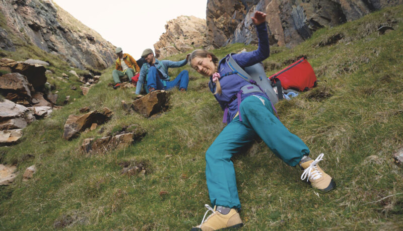
Consider Patagonia's brand system, which has become something of a north star in this space. What's remarkable is the company's commitment to environmental activism and how its entire visual ecosystem reflects those values through restraint and purposefulness. Their typography is utilitarian; their photography is honest rather than aspirational; their colour palette draws directly from the natural landscapes they seek to protect. But the genius lies in the system's flexibility: it can scale from a tiny garment label to a billboard without requiring excessive materials or complex production processes. Every element serves multiple functions and nothing is superfluous. This isn't minimalism for minimalism's sake; it's design efficiency as an expression of environmental responsibility.
Tentree
Tentree, the Vancouver-based brand, offers a compelling Canadian perspective on sustainable brand systems built around radical transparency and measurable impact. For every item sold, they plant 10 trees and their entire visual language makes this commitment tangible and trackable. The brand system transforms abstract environmental promises into concrete data visualization—their labelling clearly communicates water, energy and emissions savings for each product, turning every garment into an educational touchpoint. The typography is clean and contemporary; the earthy palette feels authentic rather than performative; the photography celebrates both product and planet without veering into the usual greenwashing territory.
What's particularly sophisticated is how they've embedded impact tracking directly into their digital ecosystem, creating a brand experience where sustainability isn't a side note but the primary narrative thread running through every interaction.

Petit Pli
Petit Pli demonstrates how innovative material thinking can fundamentally reshape a brand system. This UK-based company creates expandable children's clothing using pleated, recycled fabric that grows with kids across multiple sizes, addressing one of fashion's most wasteful categories. The brilliance lies in how their brand identity, designed by NB Studio, extends the core product innovation (the pleat-and-fold concept) throughout every touchpoint.
The typography echoes the geometric precision of the pleating; the colour palette is playful yet restrained. And perhaps most impressively, their packaging is made from the tissue paper left over from the pleating process itself, which then folds into children's toys. This is circular design thinking at its finest: waste from one process becomes the material for another, which then transforms into play value. The brand system doesn't just talk about sustainability; it performs at every level, proving that technical innovation and delightful design can coexist beautifully.

Notpla
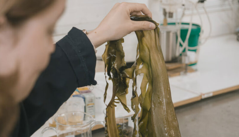
Notpla (sidenote, I’m obsessed with the name referring to "Not Plastic") takes material innovation even further, creating packaging from seaweed and plants that biodegrade in weeks rather than centuries. Their brand system faces a fascinating challenge: how do you make experimental material science feel accessible and urgent without becoming intimidating or overly technical? They've succeeded by building a visual language that balances scientific credibility with playful optimism.
The typography is modern and approachable; the photography alternates between macro shots of their bubble-like packaging and aspirational lifestyle contexts; the colour palette, blues and greens that reference both ocean and innovation, feels fresh rather than predictable. What's most wow-worthy is how the brand system positions their packaging not as a compromise or an alternative, but as the obvious future. There confidence in the design choices suggests this isn't fringe experimentation but the new standard. The voice is conversational yet informed, making complex bioengineering feel like common sense rather than rocket science.
Tony's Chocolonely
Tony's Chocolonely demonstrates how a brand system can make complex ethical issues feel urgent and actionable. Their deliberately "unequal" chocolate bars, divided into irregular chunks, serve as a constant, tactile reminder of inequality in the cocoa industry. The vibrant colours and bold typography create feels of energy and optimism rather than the guilt often associated with ethical consumption. Their packaging uses recyclable materials and includes detailed supply chain information, but it's the brand's voice—irreverent, honest, urgent—that transforms what could be a dry sustainability message into something genuinely engaging. The entire system is designed to spark conversation and inspire action, proving that sustainable brands can be joyful and disruptive rather than earnest and subdued.

What unites these five brand systems is their holistic approach to sustainability.
They recognize that every design decision, from the weight of a business card to the hosting of a website, carries environmental implications. They build flexibility into their systems so brands can evolve without requiring complete overhauls. They prioritize innovation in materials and processes, demonstrating that sustainable design often requires rethinking foundational assumptions about how products are made, packaged and experienced.
Most importantly, they understand that sustainable brand systems aren't just about reducing harm; they're about reimagining what brands can be and do in the world. For designers, particularly those of us working in Canada, where innovation often happens quietly but powerfully, these examples offer a roadmap toward a practice where aesthetic excellence and environmental responsibility aren't competing priorities but inseparable aspects of the same vision. The future of branding isn't just green—it's systemic, intentional and built to last.

Amelia Nash RGD
School of Visual Arts — Masters in Branding
Amelia Nash is a Canadian-born designer, brand strategist and creative director based in New York City. With over 12 years of experience, she specializes in crafting bold, sustainable brands that inspire, educate and connect. Her approach combines creativity with analytical insight, diving deep into data to transform ideas into unforgettable visual narratives. She currently works as the Brand & Marketing Manager for the School of Visual Arts Masters in Branding program. As a Senior Staff Writer for PRINT Magazine, Amelia explores the realms of branding and design, sharing her expertise with a broader audience. She is also a certified member of the Association of Registered Graphic Designers (RGD), Canada's largest professional organization for graphic designers, where she serves on the Education Committee to empower and inspire designers through educational initiatives. Amelia's work has been recognized with multiple accolades, including the prestigious Best in Show for Best Visual Appeal - Aesthetics at the 2024 w3 Awards. Her dedication to open, equitable design practices and her passion for collaboration drive her to uncover the extraordinary in every detail. Beyond her professional endeavours, Amelia’s boundless curiosity fuels her fascination with a myriad of things, from seeking the perfect gin and tonic to immersing herself in colour swatches and finding inspiration in the intricate details of the world around her. To explore her latest articles, visit PRINT Magazine. For more about her work and to connect, visit her website.


