Top 5 deliciously edible food covers
Written by Elyssa Biringer Associate RGD, Super Proper
As a designer and unapologetic book lover, I’ve noticed a tasty trend taking over bookshelves and “most anticipated” fiction lists: food-forward covers that look good enough to eat.
Often gracing thriller, mystery or fiction novels—mostly about women—these designs tap into the sensory pull, symbolic richness and sheer visual charm of food. More and more, designers are serving up covers that feel fresh, smart and are a treat for the eyes. And honestly? I’m hooked. I read a few of these purely based on the cover, and the rest are stacked on my TBR like a plate of pancakes waiting for syrup. If you’re hungry for great design, feast your eyes on five standout covers that prove you can judge a book by its (mouthwatering) cover.
Devouring Tomorrow by Jeff Dupuis and A.G. Pasquella
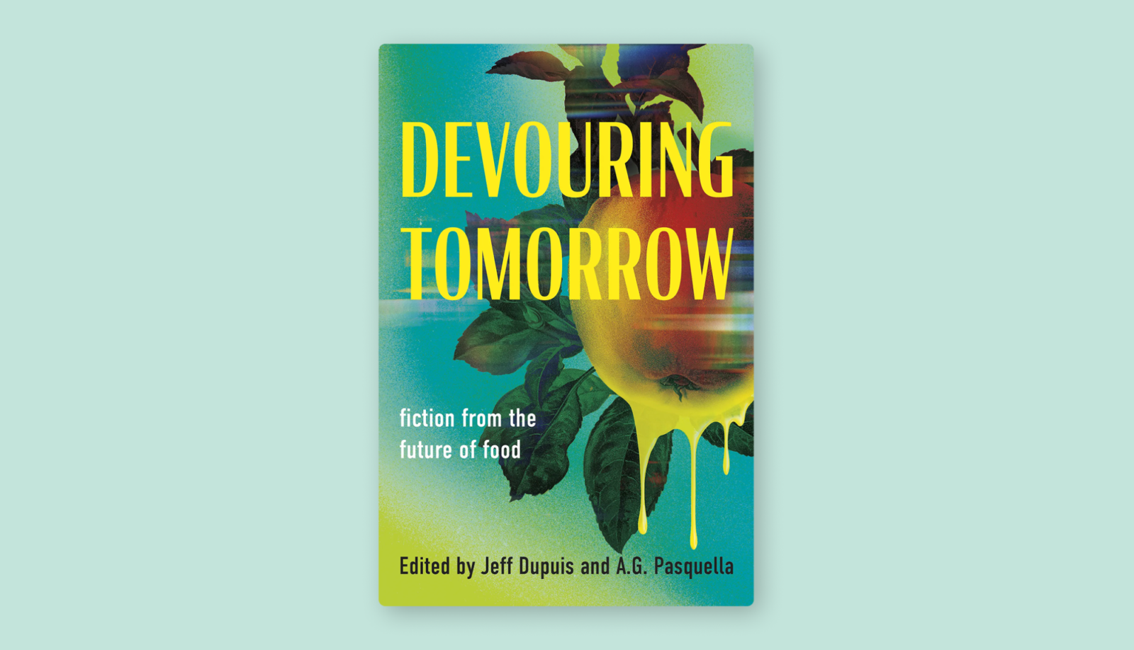
Designed by Karen Alexiou, this Canadian indie cover lives in the uncanny valley between food and futurism. A glitchy red apple, dripping with unnatural yellow goo, straddles the line between delicious and disturbing. The design taps into the collection’s speculative themes and ethical unease around agriculture and sustainability. It’s rare to see a cover that so instantly communicates tone, genre and thematic depth. Karen pulls it off with bold restraint, delivering something as visually unsettling as it is intriguing.
So Thirsty by Rachel Harrison

The cover of So Thirsty is what first inspired this whole list. Illustrated by @galactixy_illustrations with design and art direction by @heart_shape, it makes a simple wine glass feel hypnotic. The deep red “wine” spills out in a sharp, grainy, hand-painted style that feels both luxurious and sinister. The cocktail pick adorned with a crescent moon and tiny bat gives it just the right touch of vampy glamour. Set against a stark black background with sharp typography, the glossy, saturated red of the drink practically glows in a way that you can almost taste it. It’s a cover that blends horror and indulgence into one seductive image: bold, bloody and beautifully designed to demand your attention.
The Safekeep by Yael van der Wouden

Designed by Grace Han, with artwork by Rob Ritchie and art direction by Alison Forner, this historical fiction cover whispers rather than shouts—and that’s exactly what makes it stand out in today’s market. There are so many book covers with bright colours, a few of them on this list, but The Safekeep takes a different direction by leaning into the quiet elegance of Dutch Golden Age paintings, keeping in line with the book’s Dutch setting. The cover features two ripe pears painted in muted natural tones with a single bead of water glistening like a tear on one of the pears, hinting at the emotional themes of the novel. To contrast the softness of the image, the designer’s use of modern sans-serif typography gives the cover a subtle contemporary edge. It’s quiet, restrained and full of feeling.
The Lamb by Lucy Rose

Joanne O’Neill’s design is a deliciously unsettling contradiction. Front and centre is a vivid slab of raw lamb. It is bold, unignorable and almost aggressive in its presence. Surrounding it are delicate botanical illustrations that look lifted from a 19th-century botanical textbook: wild herbs, foraged berries, soft florals. It’s a beautiful setup that helps soften the central image—until you notice the tiny teeth hidden among the leaves. The black background heightens the drama, making the reds from both the meat and berries feel even more intense. It’s a cover that hits you in the face, seduces you with beauty and finally comes back for more as it hints at a more sinister story. For a novel that delves into appetite, innocence and moral ambiguity, this cover nails the tone. It’s strange, striking and leaves an odd taste in your mouth in the best way.
Greta & Valdin by Rebecca K. Reilly

If you haven’t had enough green and pink combos after Wicked, let me introduce you to Greta & Valdin’s cover, designed by Clay Smith, with art direction by Alison Forner. This cover is pure, juicy fun. The bubblegum pink backdrop paired with a netted bag filled with hyper-saturated limes feels almost cartoonishly edible, like something out of a Wes Anderson movie’s grocery aisle. It’s deceptively simple: a torn net with fruit that is moments from tumbling out, hinting at the dynamic between the brother and sister duo at the heart of the story. The true brilliance lies in the composition of the cover, with bold typography on all sides, nicely framing the playful central image. Tucked inside the bag, the ampersand adds a clever layer, not just linking the two names but also becoming a part of the scene. Smart, playful and just the right amount of absurd, this one is impossible to ignore and kind of impossible not to crave.

Elyssa Biringer Associate RGD
Super Proper
Graphic designer bringing creativity and a dash of fun to every project. Her passions lie in motion, web design and development, all while prioritizing accessibility as a fundamental design principle.
Tag
Related Articles


Michael Richardson RGD, Amanda DeVries RGD, Carolane Godbout RGD, Laura Prpich RGD, Lin Oosterhoff RGD


Sponsored


