Crafting Culinary Identities: Rebranding stories from the food world
Written by Michael Richardson RGD, Jacknife, Amanda DeVries RGD, Eye Candy Design, Carolane Godbout RGD, Super Studio, Laura Prpich RGD, Caribou Creative and Lin Oosterhoff RGD, Twin Studio
Creating a brand identity in the food industry that reflects quality and authenticity is essential. This article showcases examples that redefine expectations.
Where the Buffalo Roam Saloon
By Twin Studio
Where the Buffalo Roam Saloon is a Canmore-based cocktail bar inspired by the wild spirit of Hunter S. Thompson and Alberta’s western heritage. The bar serves seasonal dishes made with locally sourced ingredients and unique craft cocktails.

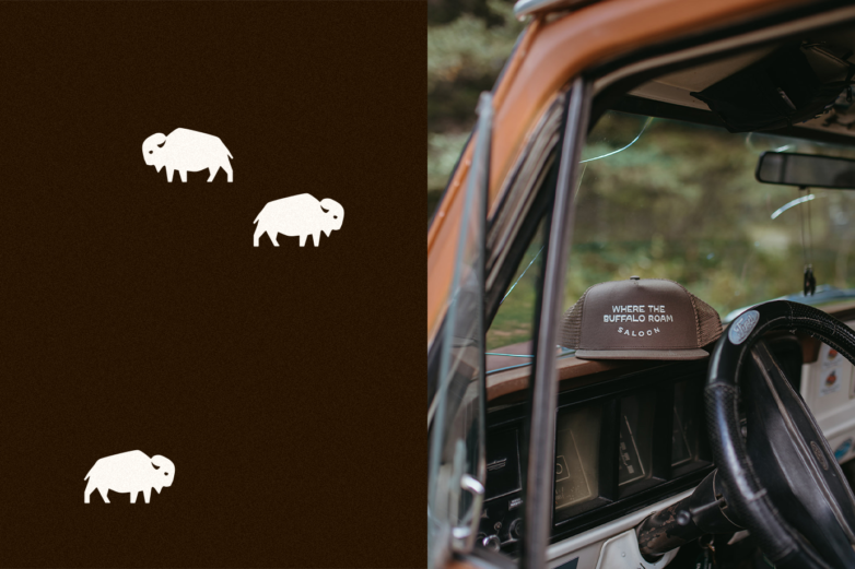

"The biggest challenge faced was making the brand stand out in a town with a competitive food scene while capturing the spirit of the West without resorting to clichés. Twin Studio’s process is rooted in strategy. It is all about uncovering what makes each brand inimitable, and for Where the Buffalo Roam, that meant honouring an old-school attitude while still showcasing their refined approach to dining and libations. The minimalist design reflects the bar’s craftsmanship and local roots, creating a space where Canmore’s past and present story collide, inviting patrons to stay, drink and skip the small talk," shares Lin Oosterhoff RGD and Georgi Silckerodt.
Laneway Coffee & Kitchen
By Caribou Creative
"Laneway Coffee & Kitchen is a multi-roaster café and restaurant serving high-quality hand-crafted coffee, incredible sandwiches and elevated comfort food. Located in the heart of Cumberland on Vancouver Island, owners Avelyn and Kellen reached out to me for a brand identity that coincided with their ethos—the aim was to bring the specialty coffee industry to the Comox Valley in an approachable way and serve incredible, local and comforting food to our community," says Laura Prpich RGD
"The process of rebranding Laneway involved a structured, community-focused approach to creating an authentic brand identity. Starting with in-depth research into Laneway’s vision, audience and local competition, we developed an identity that emulated Cumberland's forest creatures and designed a 'cougar mascot' that could be reinterpreted throughout their branding."
"The brick-and-mortar space was new, so every aspect of the design was considered, from light fixtures to wall colours and signage to handle fixtures. There was an intentional process to it all. Key elements like the logo, colours and patterns were explored and refined through feedback to ensure alignment with Laneway’s unique personality. The final design was consistently applied across signage, menus, packaging and digital platforms, with brand guidelines to maintain cohesion. This thoughtful, phased approach allowed the brand to resonate deeply with its community and evolve with time," offers Laura.
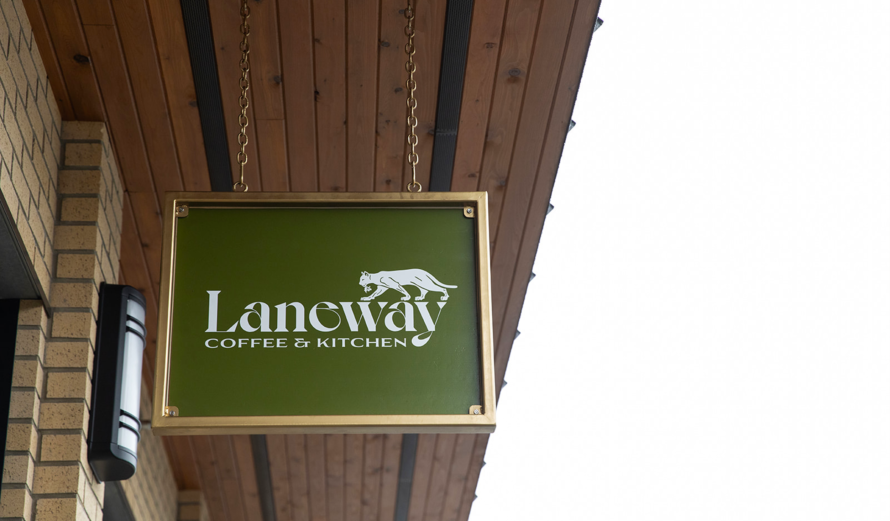
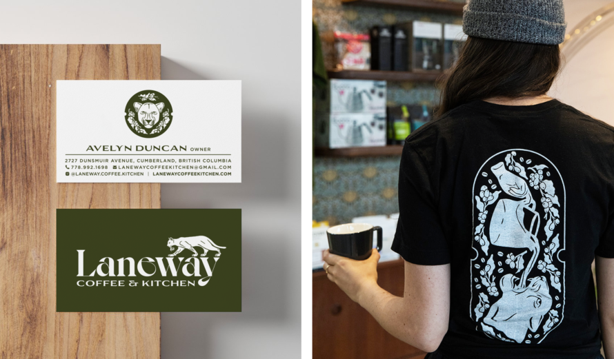
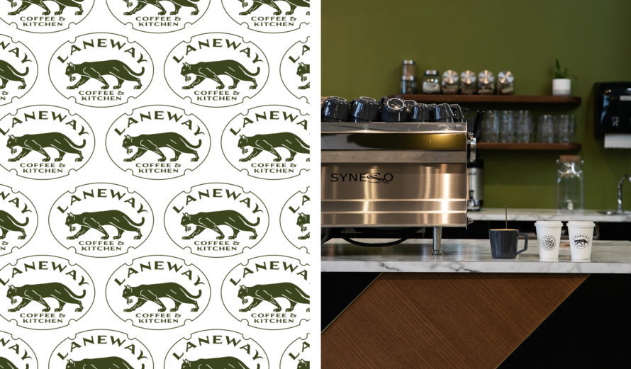
"The Kitchen is a multi-roaster cafe and restaurant serving high-quality hand-crafted coffee, incredible sandwiches and elevated comfort food. Located in the heart of Cumberland on Vancouver Island, owners Avelyn and Kellen reached out to me for a brand identity that coincided with their ethos—the aim was to bring the specialty coffee industry to the Comox Valley in an approachable way and serve incredible, local and comforting food to our community." says Laura Prpich RGD
Rose Bakery
By Super Studio
"For Rose Bakery, we crafted an identity that honours the bakery’s deep roots in place and tradition. Tasked with the client’s vision of a compass logo, we transformed this challenge into a design of minimalist shapes inspired by dough-scoring marks that subtly evoke both a compass and the bakery’s artisanal spirit." shares, Carolane Godbout RGD.
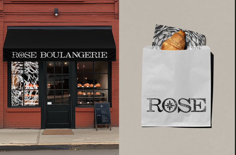
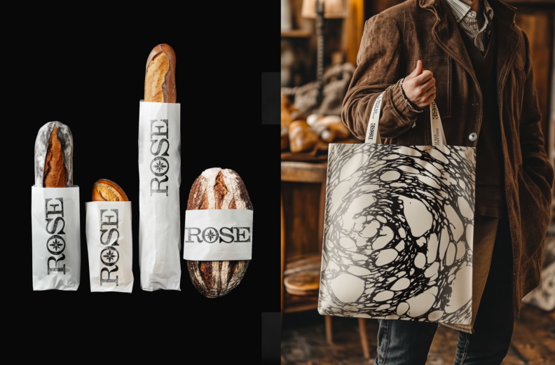

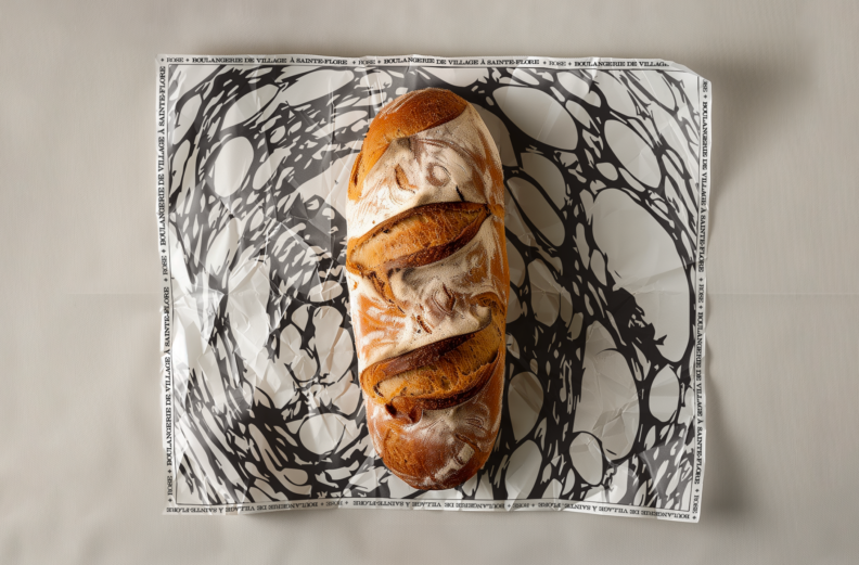
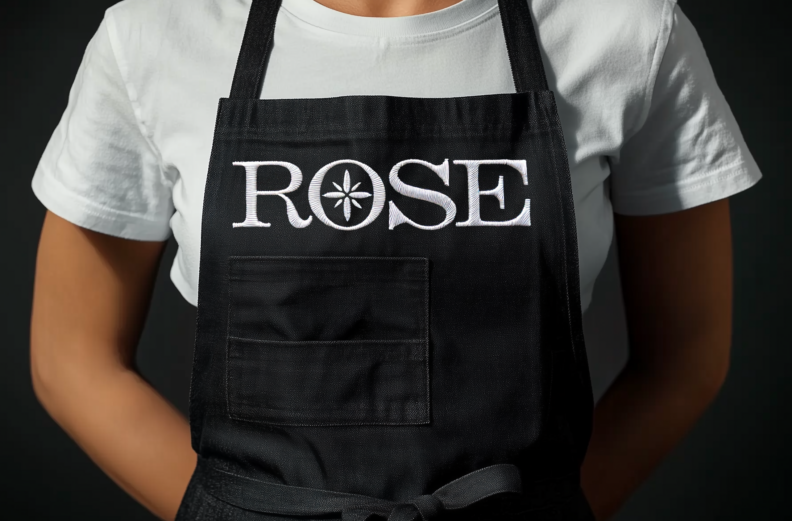
"The tagline, "Guided by Taste, Rooted in the Land," reflects not only the baker’s commitment to local ingredients and ancestral methods but also establishes Rose Bakery, nestled in the village of Sainte-Flore, as a destination in itself. Textured patterns created by inking and rolling bread slices lend the brand a handcrafted authenticity, celebrating its sense of place and heritage." highlights, Carolane Godbout RGD.
Streamliners Espresso Bar
By Amanda DeVries RGD
In a small city where the only option is commodity coffee (think seven Tim Hortons for 60,000 people), I was approached to create branding for a new coffee shop featuring directly traded specialty coffee.
Because 3rd wave coffee is an unfamiliar concept in this region, we needed to convey the premium quality of the shop while staying relatable to the city's history, which the general population is already familiar with.
Credits of photography: Erin Grace Harder
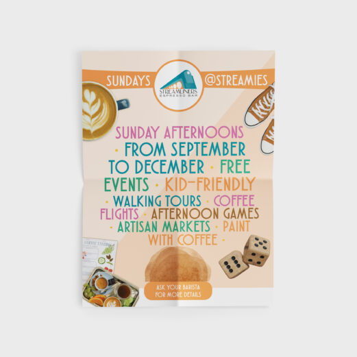
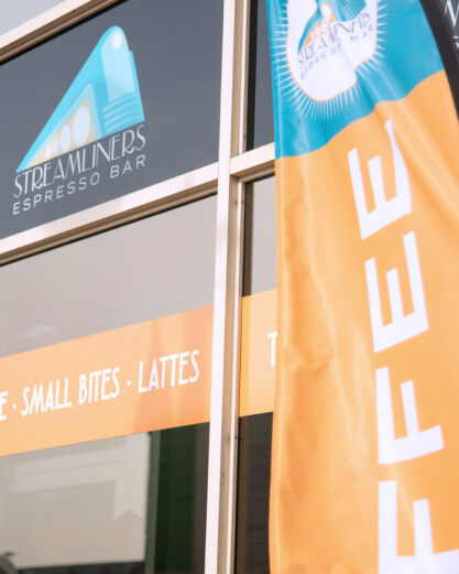
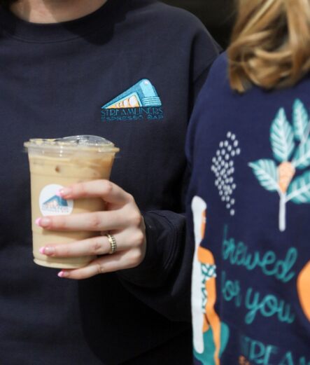

Drawing from the city's deep heritage, which includes its roots in the train industry, the name Streamliners was chosen. This name harks back to the fabulous Art Deco period and lent itself to a strong aesthetic and bold colour palette.
Business cards, gift certificates and merch are easily followed. In 2020, we introduced a design system for a new line of coffee blends sold exclusively at the shop. In 2022, Streamliners also launched a cold brew and iced latte to rave reviews. Having become the focus of many community-driven initiatives, the shop is an iconic establishment in the downtown core.
Wilbur Mexicana
By Jacknife
"Wilbur Mexicana is in the Fast-Casual segment, offering a higher-quality dining experience than typical Quick-Service Restaurants (QSR) in Canada. Founders Will and Baird Cumberland focused on unique dining rather than authenticity in Mexican cuisine. Partnering with Jacknife, they created a bold brand identity that merges chemistry, design, and Mexican culture.
The name “Wilbur” references Professor Wilbur Scoville, known for the Scoville Scale measuring pepper heat, which aligns with the brand's fresh perspective. The visual identity replaces traditional symbols with elements like hexagons and found art in a striking yellow and black palette. The wordmark is inspired by the 1970 Mexico World Cup typography and playful illustrations of Professor Scoville in various humorous scenarios." Discusses Mikey Richardson RGD.
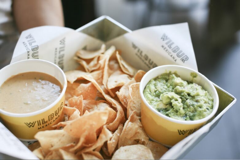
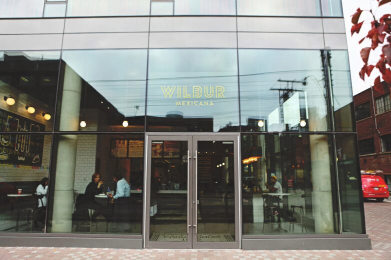
"To move away from typical design clichés, the visual system incorporates elements where chemistry, design, and Mexican culture intersect, using hexagons, line work, and found art from apothecaries and old comic books in a bold yellow and black palette.
Wilbur Mexicana faced challenges in building authenticity without a deep connection to Mexico. Jackknife had to develop an identity that resonated as credible yet differentiated from more traditional Mexican eateries. This demanded a creative approach honouring the cultural essence yet staying distinctively unique and contemporary. Achieving this involved heavily emphasizing visual storytelling through chemistry and design—a route that required a well-defined brand narrative to avoid feeling disjointed in the Canadian market." shares Mikey Richardson RGD.

Michael Richardson RGD
Jacknife

Amanda DeVries RGD
Eye Candy Design
Amanda DeVries is the principal and creative director of Eye Candy Design, a boutique branding and packaging design firm that creates fresh, iconic work for food and beverage companies. She has nearly 20 years experience as a brand consultant, art director and graphic designer. Amanda spent the first 10 years of her career in Ottawa, where governmental agencies kept her busy but not terribly inspired. In 2010, her family moved to southwestern Ontario to start an organic vegetable farm and this presented her with the opportunity to work directly with entrepreneurs and business owners. She also enjoys sharing her knowledge through various teaching gigs and mentoring younger designers. She is the mother of 3 children who share her love of good food, vintage shopping and travel.

Carolane Godbout RGD
Super Studio
For 2 decades, Carolane has been perfecting her design and branding practice throughout the agency world by creating immersive brand platforms and experiences for exceptional businesses in the realms of food, beverage, retail, and hospitality. With the launch of Super Studio, she is now focusing on the industries she masters and the success of the clients who choose to become her collaborators. In addition to her work at Super Studio, Carolane is an investor in emerging businesses and creative ventures, leveraging her expertise to support innovative projects and help shape their growth and success.

Laura Prpich RGD
Caribou Creative
Laura Prpich is the founder and creative director of Caribou Creative, a graphic design studio based in the Comox Valley on Vancouver Island. With 25 years of experience, she specializes in branding, packaging, illustration, and web design, collaborating with independent businesses that prioritize sustainability and a more circular economy. Since launching Caribou Creative in 2010, Laura has created award-winning designs featured in publications like How Magazine, Hello Canada, Apartment Therapy, and The Dieline, and has served as a judge for the Juno Awards. Her approach blends strategic thinking with a deep commitment to eco-conscious design.

Lin Oosterhoff RGD
Twin Studio
I’m Lin Oosterhoff, brand designer and creative director, born and raised in the Netherlands. Dutch minimalism taught me to strip things back to what matters. Living in Canada taught me to design with care and intention. As co‑founder and creative director of Twin Studio, a female‑founded design and photography studio in Canmore, AB, I bring that mix of bold simplicity and thoughtful purpose to every project. We believe in less is more: less BS, more character. My focus is on building fresh, fearless brands for mountain people—whether it’s an outdoor adventure label or a hospitality business shaking up its scene. I love partnering with clients who are passionate about their work and eager to stand out.
Tags
Related Articles


Michael Richardson RGD, Michael Kelar RGD


Catherine Vendryes, Manager, Content & Communications at LG2


