
What do you collect?
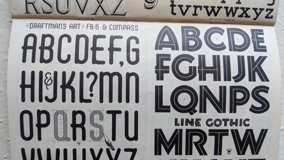
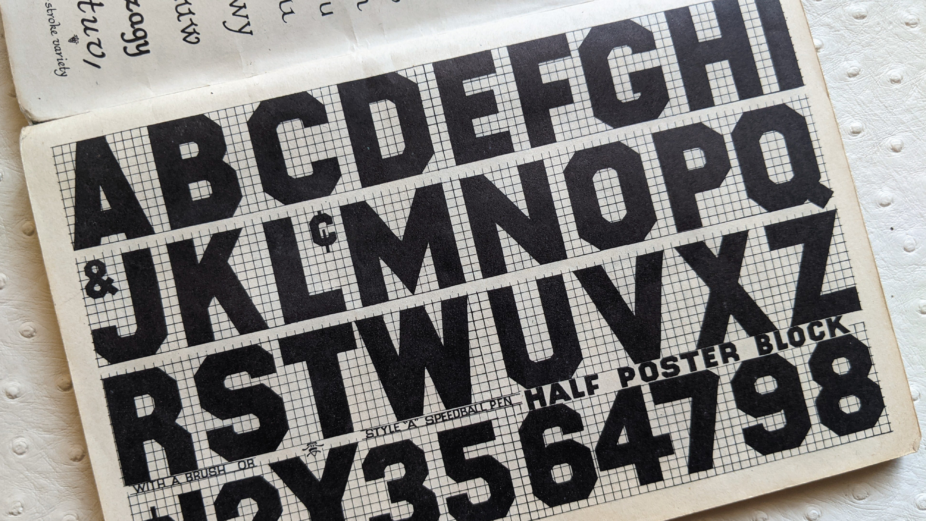
I collect old type specimen books. I especially like the ones that feature hand lettering, sign painting or are published pre-1980. My collection began when my mother gave me a Speedball pen and nibs and a Speedball pen textbook. It’s a “How to hand letter” showing different styles of type that you can emulate by following the instructions on how to hold your pen and manoeuvre it to create the desired strokes. “Speedball Steel Brushes”, as they were called, are a product that’s almost a century old, and the Speedball Pen Text Book by Ross F. George was published semi-annually in the 1920s through to the 1940s and was constantly being updated. I can’t find a date on mine. Sometime in the late 60s or early 70s, I covered it with holiday gift wrap and plastic to preserve it, and now it’s too fragile to unwrap. This booklet is definitely what started my passionate love of type.
When did you start?
That Speedball book is what started it. I’ve been collecting type specimens since around 1970, but it’s very difficult to come across original publications organically. I don’t like to order them online—it’s too easy and not fun, plus way too expensive, so my collection is modest. There’s nothing like the hunt and discovering a tactile typographic treasure on a thrift store or antique bookstore shelf.
How does your collection inspire you as a designer?
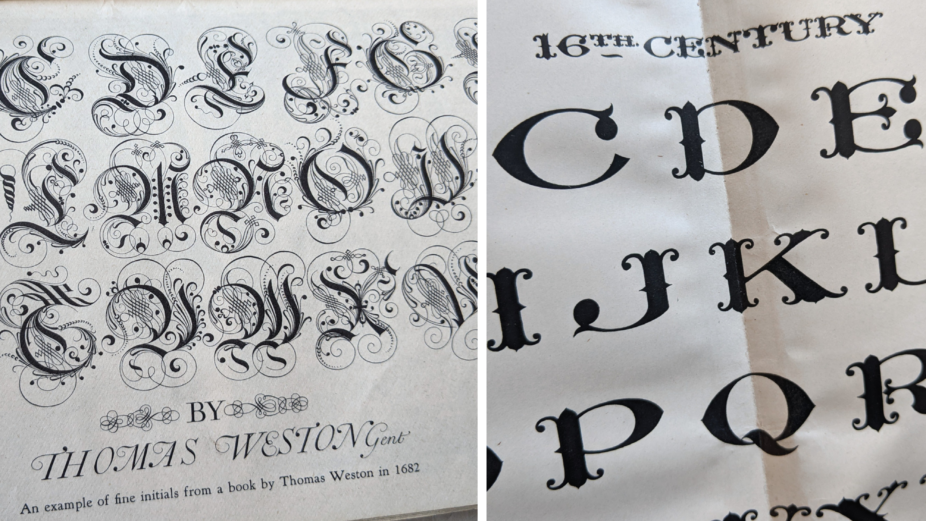
The Speedball book especially inspired me as a young girl, just as I was beginning to explore a career in design. Flipping through its pages was magical. My favourite typeface, being fond of Art Nouveau at the time, was Uncial Gothic, which I often traced for my high school report covers. Seeing the beautiful diversity of typefaces that were all once painstakingly crafted by hand is truly amazing and inspiring.
What is your favourite item in your collection?
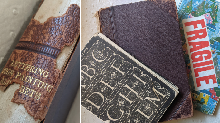
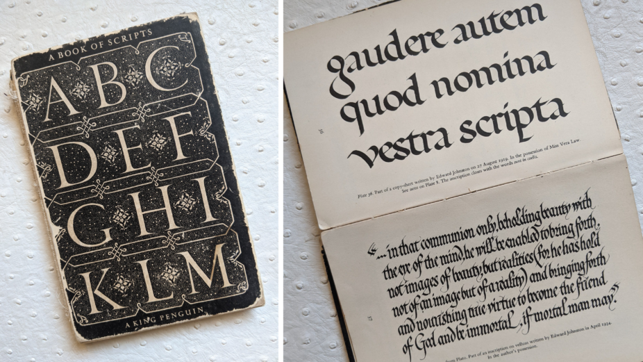
Besides my precious Speedball book, The Book of Scripts by Alfred Fairbanks is a gem. Published by Penguin Books in 1949, it’s not so much a type specimen book, as it is a historical guide to scripts and typefaces from a diverse array of cultures. The cover is an adapted design by Jan Tschichold from a 1547 design by Juan de Yciar. I also recently acquired Elements of Lettering, published in 1899 by the Colliery Engineering Company. It has a crumbling leather-bound cover and contains two other “books” titled, Lettering and Sign Painting and The Formation of Letters, added in 1902, so I most definitely own the 1902 edition. I love them all, but my heart belongs to the Speedball book.
An item you aspire to have in your collection?
I have always been on the lookout for the original 1957 Neue Haas Grotesk (Helvetica) specimen book. I love Helvetica and the timeless quality it has. It’s like your favourite classic black boots. It’s all in how you wear them. And although Helvetica has had a bad rap due to some unfortunate applications, the beauty of it is in the usage and how you pair it. Just like those black boots, it goes with almost anything. Maybe one day I will stumble upon this elusive specimen book on a dusty bookshelf somewhere!
Vida Jurcic RGD
Vida Jurcic RGD is a founding partner and Co-creative Director of Hangar 18 Design Continuum, an award-winning Vancouver design and branding firm with a legacy of strategic solutions spanning two decades. She has been an in-house art director/designer at the Hudson’s Bay Company and Woodwards Department Stores and has worked at various advertising agencies, including DDB and BBDO. She has judged many regional and national design competitions and sat on scholarship juries including the BC Arts Council. In addition, Vida currently teaches at the IDEA School of Design, Capilano University and has taught at Vancouver Film School and Langara in the past. She is an avid design history buff and part-time musician/Morris dancer.


