Top 5 tiny figma features that make a big difference
Written by Noah Ortmann RGD, Significant Other
Yes, Adobe Photoshop was the best available tool for interactive design at one point. It had layers, pixels, drop shadows, what else could you really ask for?
Our design tools have come a long way since those prehistoric times. From Sketch to Adobe XD through to Figma, they’ve evolved to better reflect the language and technologies of the web. Features like variables, components, tokens and auto-layout allow us to bring our designs closer to the in-browser experience.
Since our studio switched to Figma as our primary digital design tool three years ago, I’ve spent a good chunk of my time diving deep into its capabilities—mocking up wireframes, rigging prototypes, building design systems and collaborating with my team. There’s no shortage of resources and tutorials for Figma online, but, for this article, I wanted to shine a light on some lesser known features that I use on a regular basis.
Collapse your layers, see the forest from the trees

We all name our layers, right? If you’ve got a complex design with a lot of open groups and layers, hold Opt (Alt) while clicking your layer name to collapse the whole group. Closing a never-ending list of nested layers is a great way to get a top-level view of the document structure and admire your squeaky clean file.
Sweat the details and adjust your text underline styles

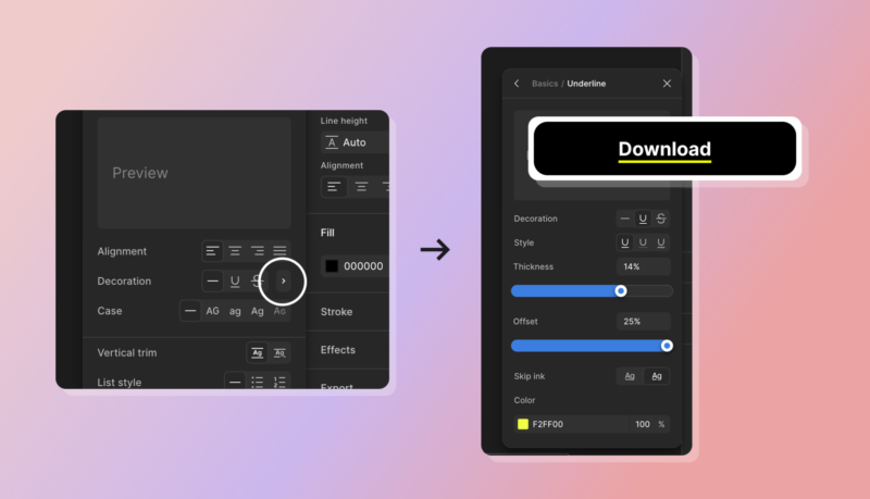
With CSS you can easily set the colour or offset position of a text underline. Figma has matching capabilities, but they’re a little tough to find. First, click the Type settings button, then the right caret icon next to the strikethrough icon. From there you can fine-tune your underline settings, add colour or adjust how far the underline appears from your text. This can be a great way to extend your brand or design to the smallest of details.
Snap the section edges around your content, bring order to chaos

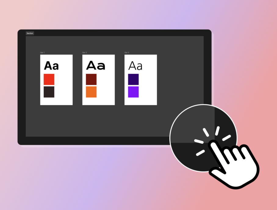
If you’re grouping a bunch of pages or elements with sections (Shift + S), you can automatically reduce the unused space around that section by double-clicking the edge or corner. The section borders will snap to fit around the objects within it. This comes in handy when you want to clean up your artboards before sharing or presenting to a client.
Quickly check your text contrast

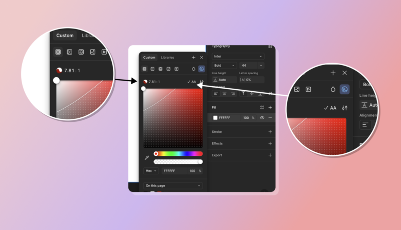
I feel like Figma should have an audible alarm go off whenever you set text contrast lower than AA standards. It’s a little more subtle, but you can check your colour contrast ratio directly within the colour panel. Here’s hoping for more built-in accessibility features in the future.
Re-order your prototype links

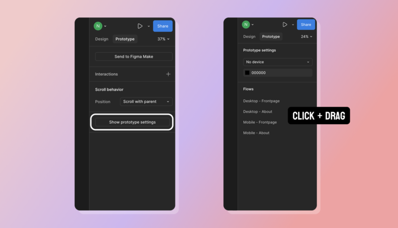
If you have a lot of prototype flows, you can edit the order of the list by clicking on the Prototype tab, then the Prototype Settings button. This is great when you need to walk clients through a lot of pages, and you want to maintain a logical order or if you’re sharing prototype links.
Design tools move quickly, and it can be overwhelming to stay on top of every little change.
By the time this article is published, there’s a non-zero chance Figma has already changed all the shortcuts I referenced and redesigned their interface. All of my hardwork, ruined. But if you add these things up, your design workflow might be a little more organized, accessible and detailed. Your developer will thank you.

Noah Ortmann RGD
Significant Other
Noah Ortmann is a Senior Designer at Significant Other, where he specializes in UI/UX, digital design and front-end development. With over 12 years of experience, he brings a user-focused and accessible approach to creating clear, intuitive digital experiences for organizations across culture, public service, and the private sector. His self-published design projects for Avro Design Company have been featured in the National Post, CTV News, BlogTO, Mental Floss, Bloomberg’s CityLab, and CBC Radio One.


