
Top 5 rebrands that required more than design
The courage before the brief

We talk about great rebrands the way we talk about great films after they’ve won awards, as if the ending were always inevitable.
In hindsight, we see the elegant system, the precise rationale, the visual language that somehow says everything at once. What we rarely talk about is the moment before the brief: the room where someone looked at a collapsing business, an embarrassing legacy or a terrifying blank canvas and said, yes, let’s tear it down and build something true.
I wanted to explore brand rebirths from within my lifetime and highlight those I feel executed a strong comeback through strategy. The five rebrands below are not the five prettiest. They are the five that required the most courage—not from designers, but from the organizations that permitted designers to go all the way. Because a rebrand is never really about a new logo; it is about a company deciding, with full awareness of the risk, who it is actually going to be.
Apple (1997) — Burning the map
In early 1997, Apple was 90 days from bankruptcy. Its product line was a thicket of overlapping models that even its own executives could not explain. When Steve Jobs returned as interim CEO, he cut 70% of the product lineup and turned to a single, destabilizing question: what do we actually believe?

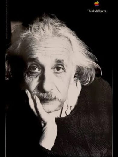
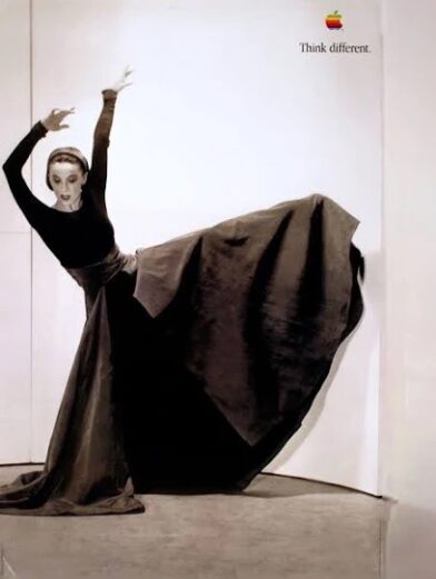
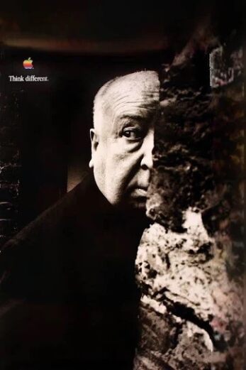

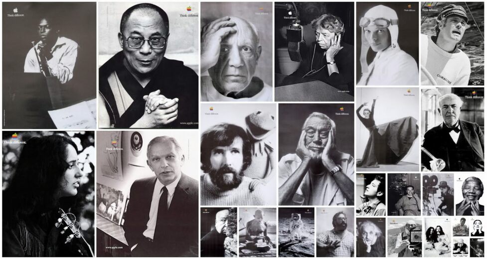
The answer—that passionate individuals can change the world—became the scaffolding for one of the most consequential brand systems ever built. The Think Different campaign, developed with TBWA/Chiat/Day, did not mention a single product. It made a philosophical declaration instead, anchored in black-and-white portraits of history’s misfits and dreamers. But the campaign was not the rebrand. The rebrand was an internal decision to organize the entire company around that belief, making every product, every retail experience and every piece of packaging an expression of the same idea.
The most underrated decision Jobs made was not the iMac or the campaign. He insisted that the slogan be "Think Different" as a noun, not an adverb. That difference is everything.
The lesson for designers is uncomfortable: the work that saved Apple was upstream of design. It was a leadership decision to stop competing on specification and start competing on meaning. The visual system followed—brilliantly—but it followed.
Burberry (2001–2014) — Reclaiming the Icon
By the early 2000s, Burberry’s signature check had become a liability. Over-counterfeited, overexposed and, in the British press, associated with a demographic the brand had never intended to court, the check was appearing on everything from dog beds to stadium seats under a thicket of loosely managed global licenses.
What Rose Marie Bravo began, and Angela Ahrendts and Christopher Bailey completed, was not a visual refresh. It was an organizational restructuring disguised as a brand transformation. Angela revoked 23 licences, collapsed Burberry’s fragmented sub-brands into a single global identity and appointed Christopher Bailey as the creative authority whose office every consumer-facing decision had to pass through without exception. The check was not eliminated; it was rationed. Scarcity returned value.






Simultaneously, Burberry became the first luxury brand to live-stream its runway shows, betting on digital platforms while competitors were still skeptical of them. By 2014, under Angela and Christopher, revenues had more than doubled to over £2 billion.
Burberry is the case study for what happens when a brand treats its heritage not as nostalgia but as controlled supply. The check was always the equity. The courage was in restricting it.
The design lesson here is systemic: brand equity is not built; it is governed. The bravest thing Burberry did was say no to its own licensees, to its own sub-brands, to its own short-term revenue.
Old Spice (2008–2010) — Weaponizing Vulnerability
Old Spice had a problem that most legacy brands share but few acknowledge openly: it was associated with the past. Consumer research conducted by Procter & Gamble and Wieden+Kennedy confirmed what everyone already sensed: younger men associated Old Spice with their grandfathers. The brand was, culturally, a punchline.
The strategic insight that changed everything was not about the product or packaging. It was a single data point: more than 60% of men’s body wash purchases are made by women. The audience for the rebrand was not who they were selling to; it was who was doing the buying.

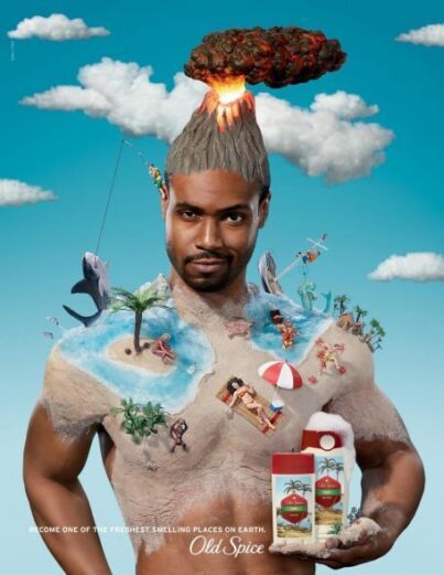
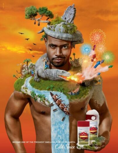
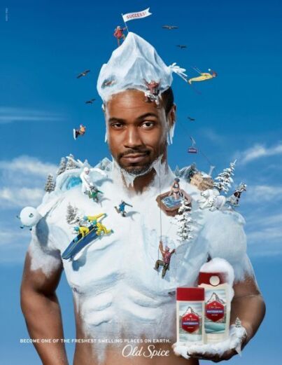
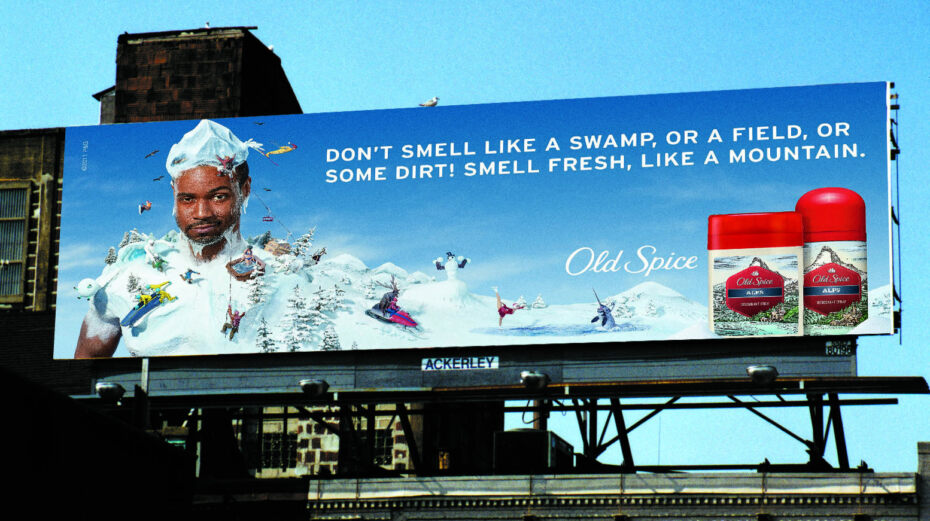
“The Man Your Man Could Smell Like” campaign, launched in February 2010, addressed women directly with absurdist, self-aware humour that made the brand’s own outdatedness part of the joke. The campaign was first released online, rather than on television, allowing organic momentum to build before broadcast. By May 2010, body wash sales had increased 60% year-over-year. By July, they had doubled.
Old Spice did not escape its reputation. It became the creative premise. That is an entirely different kind of courage—the kind that requires laughing at yourself in public.
The systemic dimension was the follow-through: 186 personalized video responses to fans and celebrities, produced in two and a half days, embedded the new brand voice across every digital touchpoint simultaneously. It was not a long-tail campaign; it was a brand system launching at speed.
LEGO (2004) — The Courage to Contract
In 2003, LEGO was losing about a million dollars a day. The company that had defined creative childhood play since 1932 had innovated itself into irrelevance. Afraid of digital disruption, LEGO had expanded into theme parks, clothing lines, in-house video game development and a sprawling product catalogue of more than 13,000 unique brick types. It had forgotten what it was.
When Jørgen Vig Knudstorp became CEO in 2004—the first non-family CEO in the company’s history—his opening diagnostic question was radical: what is LEGO’s core? The answer: a system of interlocking bricks that enables unlimited creativity. Everything else was sold, closed or licensed out. SKUs were reduced from over 13,000 to under 7,000. The theme parks were sold to Merlin Entertainments. Design teams were restructured to work within constraints rather than outside them.

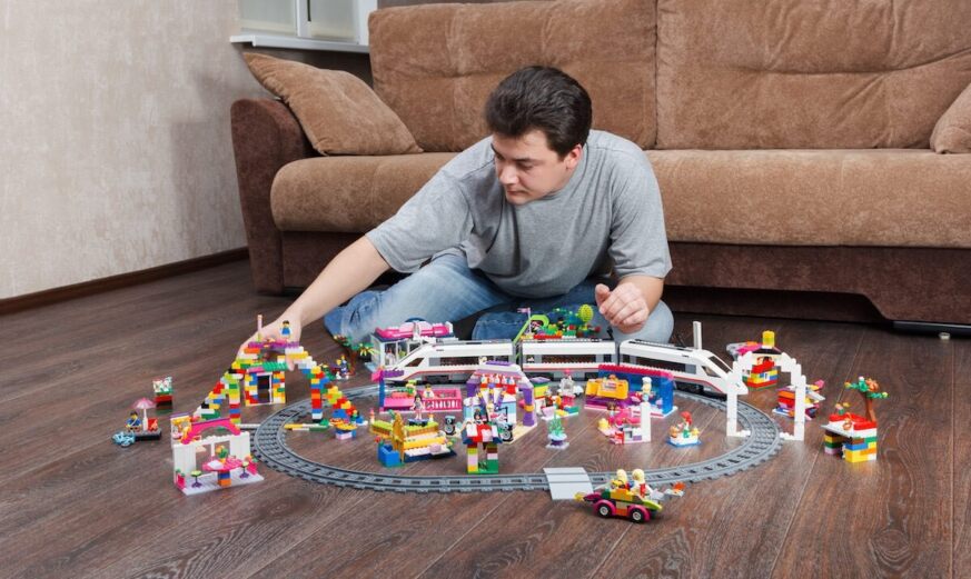

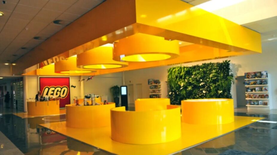
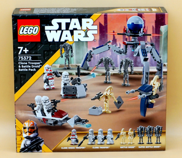
Within two years, LEGO returned to profitability. By 2015, it had surpassed Mattel to become the world’s most valuable toy company. By 2024, it reported revenues of $10.8 billion. LEGO’s rebrand was an act of subtraction. In a field that celebrates addition—more capabilities, more brand extensions, more visual language—the bravest move was to become less.
For brand practitioners, this is an underappreciated model. Most rebrand briefs ask how to expand. LEGO asked how to clarify, and clarification, done with conviction, turned out to be the more powerful strategy.
Canada Goose (2001–2017) — Making It Here
In 2001, Dani Reiss took over a small Toronto outerwear company founded by his grandfather in 1957, inheriting the question every North American manufacturer faced at the time: stay or go. The math was not subtle. Labour was cheaper overseas, margins were thinner at home and the prevailing wisdom held that no one checks the label. One by one, competitors left for Asia. Dani made the opposite decision and committed to building every parka in Canada.
It was not a patriotic gesture, and it was not, at first, good business. Retailers balked at the jacket prices and the company struggled to make payroll. But the constraint Dani accepted became the asset he had been looking for. In Europe, where the brand found its first real audience, “Made in Canada” read the way “Made in Switzerland” reads on a watch: place and product inseparable, origin doing the work a logo cannot. The jackets landed not in the outdoor aisle but between Prada and Gucci. The framing was the cleanest articulation of the strategy: function, pushed far enough, becomes luxury.


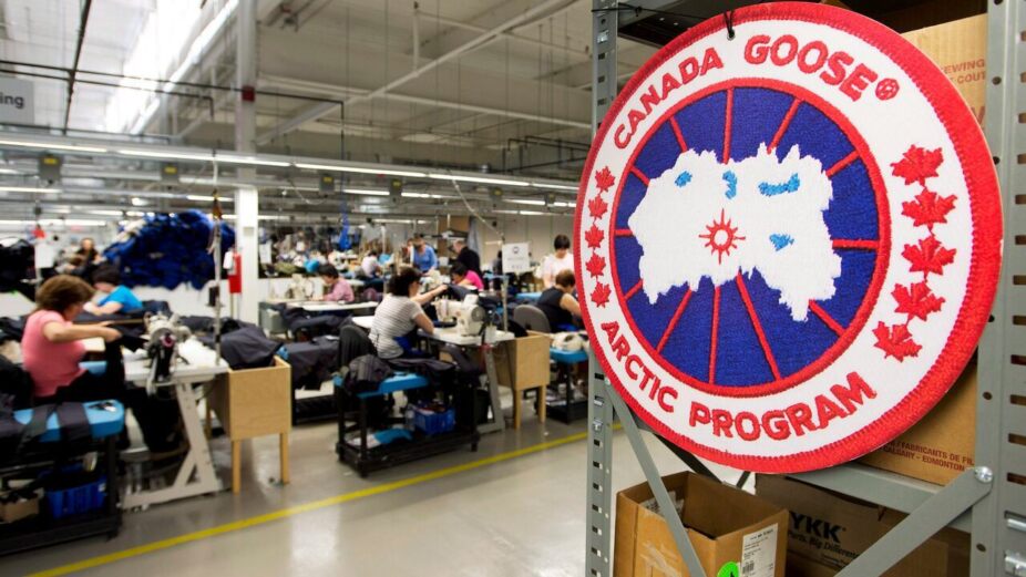
What followed was systemic, not cosmetic. Staying meant building one of the largest cut-and-sew manufacturing bases in the country—the exact infrastructure competitors had spent a decade dismantling. The revenue traces the arc: a company doing a few million dollars a year when Dani took the helm priced its 2017 IPO as a luxury peer and, within a few years, crossed a billion. The brand of Canada—wholesome, capable, built for the cold—was always the equity. The courage was in refusing the cheaper option long enough for the rest of the world to notice.
The lesson is the one the offshoring spreadsheet never captures: where a thing is made can be the most strategic and defensible decision a company makes. Canada Goose did not market its way to luxury; it manufactured its way there, and let the brand catch up. In 2021, it began phasing out fur, pledging to end fur purchasing that year and fur production by the end of 2022, though its parkas still rely on down.
Honourable Mention: Target (Late 1990s–2000s) — Refusing the Race
When Walmart introduced its price-match guarantee in the late 1990s, it handed every other discount retailer an existential choice: compete on price against a company that had structurally engineered its entire operation to be the cheapest, or find a different reason to exist.
Target’s decision was neither obvious nor safe. Rather than fighting on Walmart’s terms, Target repositioned itself around something discount retail had never tried to own: design. Partnering with architects and designers—Michael Graves, Isaac Mizrahi, and eventually dozens of others—Target created exclusive, limited-edition collections that were not cheaper versions of luxury goods, but genuinely well-considered products at accessible prices.


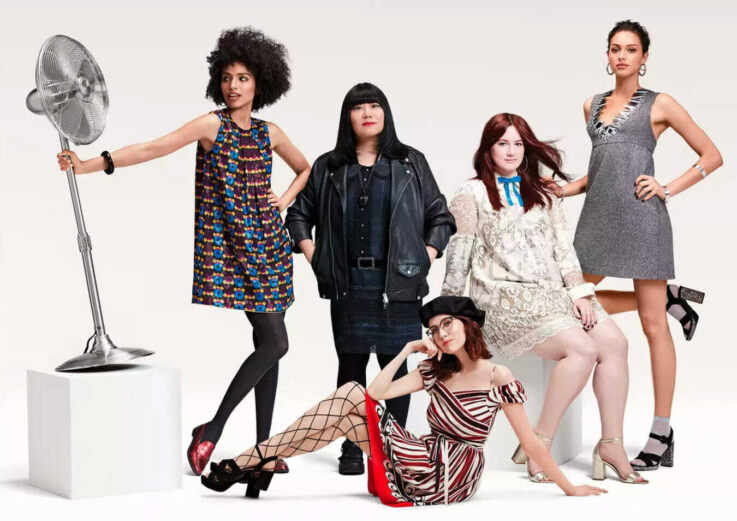
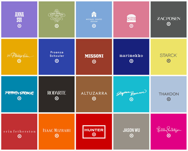

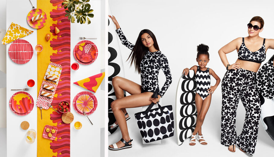
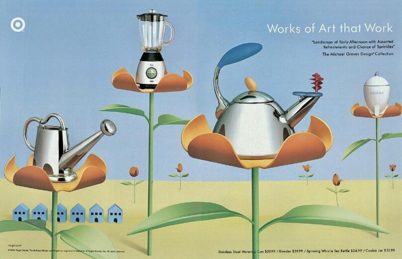
The brand system that followed touched everything: store lighting, fixture design, packaging, advertising and the curated sense of discovery inside the aisles. The nickname “Tar-zhay,” the faux-French affectation consumers invented to describe the experience, was not manufactured. It was earned. The company had built an identity so distinct that consumers developed their own private language for it.
Target’s rebrand was a refusal. It refused to compete where it could not win and built an entirely different battlefield. Sometimes the most strategic word in branding is no.
What makes Target’s transformation genuinely systemic is that “cheap chic” was never just a campaign. It was an operating principle that shaped sourcing, store design, talent acquisition and every shopper touchpoint. The visual identity was the surface of something much deeper.
The Underrated Variable
When we look across these brand cases, a pattern emerges that design schools rarely teach: every one of these rebrands was preceded by a decision unrelated to aesthetics. Apple chose meaning over product. Burberry chose scarcity over revenue. Old Spice chose vulnerability over dignity. LEGO chose constraint over expansion. Canada Goose chose country over cost. Target chose difference over competition.
The design work that followed each of those decisions was, in many cases, extraordinary. But it was made possible by organizational courage and by leadership teams willing to accept short-term costs, public criticism and genuine uncertainty in exchange for the possibility of something true.
As designers and brand strategists, our value is not only in making things beautiful or coherent. It is helping clients understand that a rebrand is a commitment, not a campaign. The brief matters. The budget matters. The system matters. But the most important question is the one asked before any of that: Do you have the courage to mean it?

Amelia Nash RGD
School of Visual Arts — Masters in Branding
Related Articles





Sponsored


