Award for Packaging Design (Series)
Award Sponsor: Weaymouth Creative
Winners (Tie): Jordan Richert and Keira Schick Student RGD
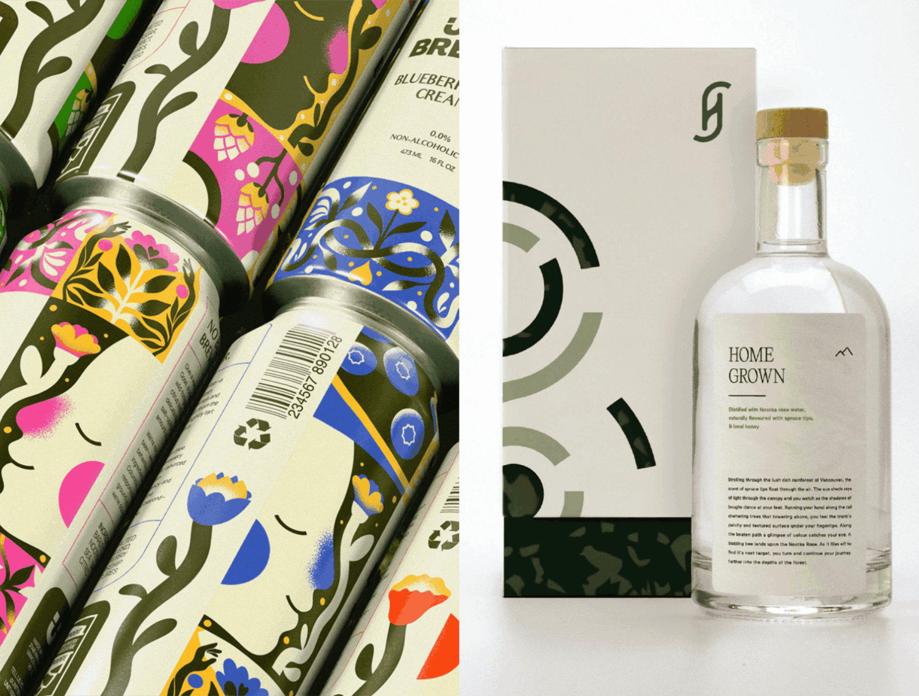
Winning Projects (Tie): Unity Brewing: Sustainable Non-Alcoholic Beer by Jordan Richert
Award Sponsor: Weaymouth Creative; School: Capilano University, North Vancouver, BC; Educator support: Dominique Walker
Unity Brewing is designed for sober and sober-curious adults who value the ritual and community of sharing a drink but feel disillusioned by the sterile, greenwashed world of non-alcoholic beverages. The target audience includes wellness-conscious drinkers and socially minded consumers who care about sourcing, makers and the values behind their choices. The project’s goal was to challenge dominant visual and ethical norms in a market where vague wellness claims often mask unsustainable practices and major conglomerates dominate shelf space. Research into mindful drinking behaviours revealed a gap between sterile corporate aesthetics and heavy-handed sincerity, leaving out consumers seeking honesty without moralizing. Unity Brewing responds with a flexible, illustrated identity system that intertwines British Columbia botanicals with intimate moments of connection. The result is a brand that is playful yet principled, inviting rather than lecturing and reframing “doing better” not as an add-on but as the baseline for consumer culture.

Winning Projects (Tie): Heartwood Gin Packaging by Keira Schick Student RGD
Award Sponsor: Weaymouth Creative; School: Capilano University, North Vancouver, BC; Educator support: Dominique Walker
Heartwood is a high-end Vancouver restaurant rooted in the valley of mountains and the heart of the woods. Its audience includes restaurant customers and individuals seeking an escape from daily life, drawn to the tastes of foraged, seasonal ingredients from the Pacific Northwest’s land, roots and tide. Extending the dining experience, Heartwood introduced three gins—each reflecting land, roots or sea—to transport drinkers into nature. The design draws on macro-patterns inspired by natural forms, considering how magnification through a glass bottle changes perception. Patterns are printed on the back of each label, allowing vibrant colour to shine through the clear gin. A swirl motif symbolizes a tree trunk with an open centre that emphasizes the elemental core. Packaging extends the system with distinct yet cohesive colours and patterns for each gin. The inner box reveals a full pattern, so pulling the bottle out feels like drawing it directly from its environment.

Honourable Mentions
- Oatitude by Kelly Chen, OCAD University, Toronto, ON
- Flora, Fauna & Fungi by Maddie Fish, Conestoga College, Kitchener ON
- Miliano’s Unlikely Pairings In-House Pasta Sauce by Brendan Hurt Student RGD, Capilano University, North Vancouver BC
- Bare – Sustainable Skincare by Emily Norris-Jones, LaSalle College, Vancouver, BC
Judges
- Alvaro Carrillo, Director, Brand Strategy and Design at Staffbase, Vancouver, BC
- Logan Chapman RGD, Creative Director at Brooks Creative House, Sault College, Sault Ste. Marie, ON
- Olivia Dynerowicz RGD, Graphic Designer at Blue Sea Foundation, Kitchener, ON
- Yurko Gutsulyak RGD, Creative Director, Designer at Gutsulyak.Studio, Toronto, ON
- April San Juan RGD, Creative Director at CT Studio, Vancouver, BC
- Brent Roth RGD, Chief Creative at Creativesphere, Waterloo, ON
- Jennifer Weavymouth RGD, Creative Director at Weaymouth Creative, Toronto, ON
Sponsored


