Police Association of Ontario (PAO)
Social Good Award

EARNSCLIFFE STRATEGIES
Toronto, Ontario, Canada

The Police Association of Ontario (PAO) rebrand marked a pivotal transformation after nearly two decades with the same visual identity. The objective was to create a brand system that balanced professionalism and humanity while equipping teams with practical tools to connect more effectively with members, stakeholders and the public.

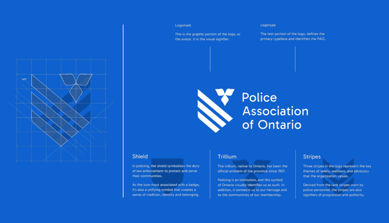
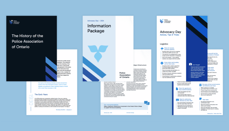
Earnscliffe Strategies designed the new visual identity to align with the PAO’s values, its evolving role in labour advocacy and the digital-first demands of modern communication. It is anchored by the “tri-shield” logo, which represents people and place with shield and trillium motifs. The Swiss style of typography and grid-based layouts convey an institutional tone and strong visual style that was implemented seamlessly across all platforms. Since launch, the rebrand has boosted PAO’s visibility and credibility, strengthened its advocacy and improved member engagement. Widely adopted, it empowers PAO to tell a modern, authentic story of today’s policing landscape.
Credits
Creative Director: Patricia Lacroix
Art Director: Andrea Suarez
Senior Designers: Tiera Taylor, Quinton Massimo


