House of XM
Branding Element Award — Logo/Wordmark

Key Vision Design
Oakville, Ontario, Canada

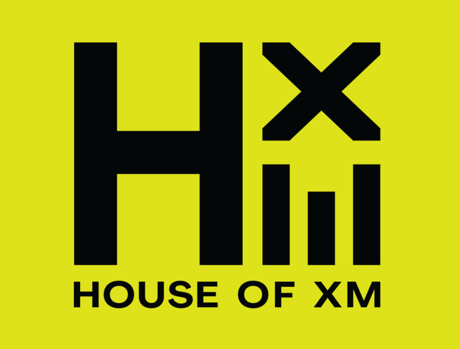
The transformation from Prime to House of XM marks a bold new era for the experiential marketing agency. This rebrand isn’t just a name change; it’s a statement. The new logo speaks volumes: strong, confident lines anchored within a square frame signal a brand that’s grounded yet ambitious. Look closer, and you’ll discover a clever hidden gem—the negative space between the X and M forms the silhouette of a house. It’s a subtle nod to the brand’s name and ethos, offering a satisfying “aha” moment for those who notice it.

KeyVis elevated the rebrand even further by crafting a mini visual identity system. A fresh, vibrant colour palette paired with deconstructed logo elements injects energy and flexibility into the brand’s expression. This revitalized visual language empowered HXM to hit the ground running in 2025, securing multiple new clients and setting the foundation for what’s next.
Credits
Creative Director & Designer: Karl Chen RGD


