Blumstein Brewing Co.
Element Award — Packaging

BROOKE NELSON DESIGN
Darlingford, Manitoba, Canada

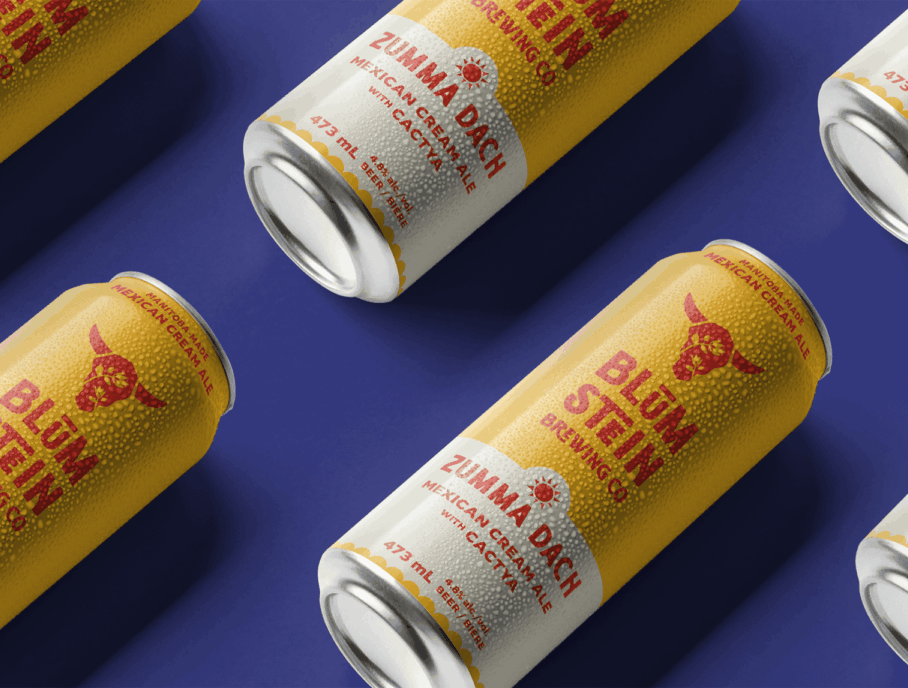
Blumstein Brewing Co. is a craft brewery located on a former dairy farm in the rural, Manitoba village formerly known as Blumstein. Rooted in Mennonite culture and prairie life, the brand seeks to inspire curiosity, evoke laughter, foster community and celebrate local heritage through its beers.
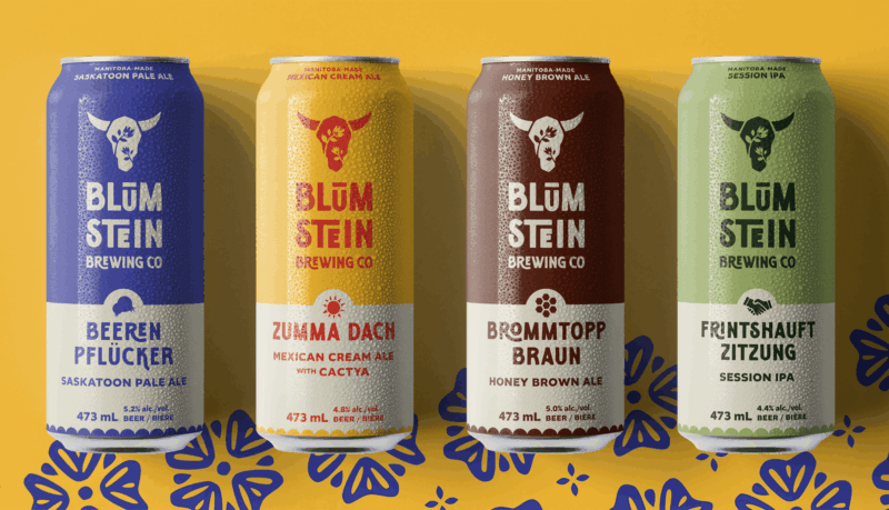
The branding reflects both the farm’s origins and the brewery’s playful nature. A cow skull adorned with flowers honours its dairy-farm legacy and the village name “Blumstein,” which translates to “flower-stone.” The hand-crafted feel of the typography and colour palette draws from vintage milk bottle and crate designs.

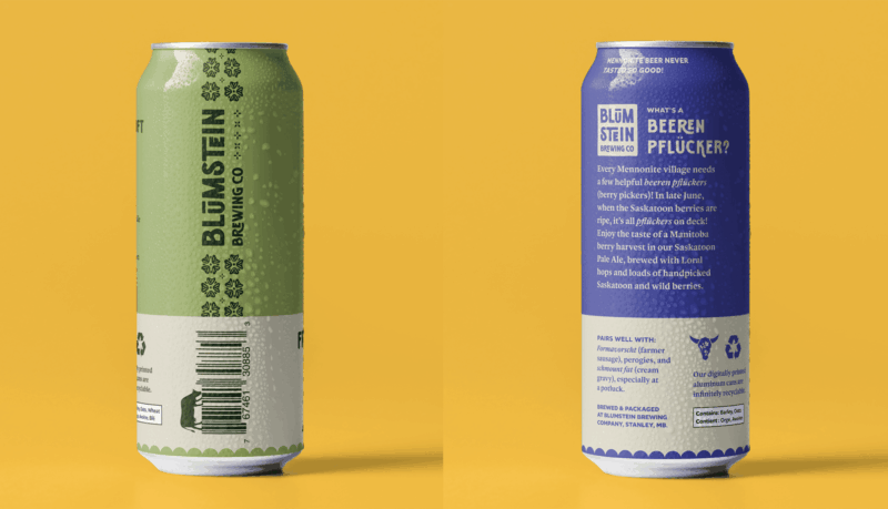
The can designs are bold and graphic, showcasing Mennonite-inspired patterns, German beer names alongside English translations and unique flavour icons for easy recognition. The vibrant and grounded colour combinations reflect both farm life and the distinct flavours of each beer. Humorous definitions, cheeky pairings and whimsical details—such as a cow grazing on the barcode—transform each can into a small exploration in Mennonite culture.
Since launching, Blumstein Brewing Co. has been warmly welcomed by locals and visitors alike, sparking pride, curiosity and conversation. It has quickly become a distinctive and beloved part of southern Manitoba’s craft beer scene.
Credits
Designer: Brooke Nelson
Copywriter: Mark von Riesen


