Top 5 Scottish movie posters with powerful typographic identity
Written by Wendy Tabor RGD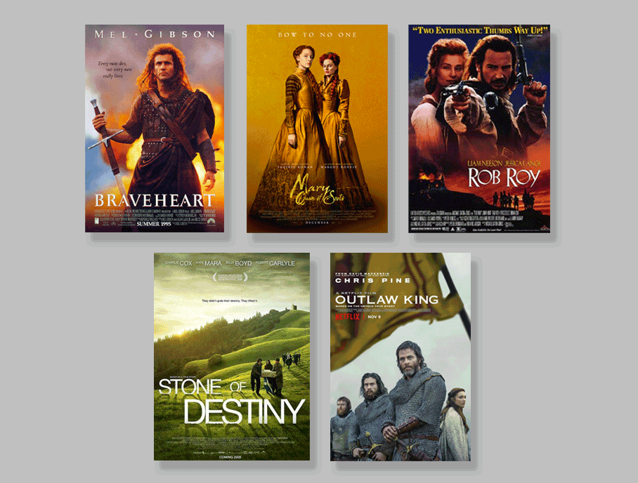
Scotland is a nation known for its spirited people, dramatic landscapes and rich storytelling tradition. From the rugged Highlands and stormy island shores to the storied streets of Edinburgh and Glasgow, its settings often feel like characters in the films shot there.
I've long admired Scotland and its people. The passion, the storytelling and the deep connection to their homeland and nature are just a small part of what makes the country so appealing to me. For graphic designers, Scotland’s layered past offers a powerful canvas. Through typography and visual identity, designers bring new meaning to its stories.

Braveheart (1995)
Creative liberties aside, Braveheart is still a much-loved film about freedom, with all the ingredients of a good historical epic: an underdog hero, sweeping battles, romance and plenty of emotion. The logo, though it varies slightly across different posters, is based on the classical typeface Trajan Pro, a common choice for films with historical themes. One small detail stands out: in the uppercase "A" letters, the crossbars are replaced with small triangles. This might be a nod to carved Roman lettering, but it could also suggest something more. The Battle of Stirling Bridge, Wallace’s most famous victory, took place at a key point where the Highlands and Lowlands meet. The triangle shapes might subtly reflect that connection, hinting at the unity and geography behind the story.

Mary, Queen of Scots (2018)
The marketing and promotion for this film about two royal cousins and rivals was guided by Focus Features. The company created a few posters for the movie, and the logo works seamlessly across all of them. The custom logo feels hand-made with a parchment texture, as if written with a quill. This tactile quality is rare in movie logos, adding historical depth that aligns with the film’s themes. A noteworthy typographic detail is how the descender of the lowercase "y" in Mary connects elegantly to the lowercase "f," subtly mirroring the intertwined fates of the queens themselves.

Rob Roy (1995)
Liam Neeson leads this story of loyalty to family and community, even at significant personal cost. While multiple logo designs appeared throughout the film’s marketing, this analysis focuses on the one featured in this key poster. Inspired by Koch Antiqua, the logo breaks from the polished Roman-style elegance typical of historical films. Its rougher, more organic feel aligns with the grit and nobility of the film, set in the Scottish Highlands. Rooted in German book typography, Koch Antiqua lends the logo a novel-like quality rather than a blockbuster feel, hinting at moral complexity beyond the battlefield.

The Outlaw King (2018)
Set after the Battle of Stirling Bridge, The Outlaw King follows Robert the Bruce’s fight against English rule as he rises from outlaw to leader of a Scottish army. His brutal rebellion helped define Scottish identity and the themes of the story are echoed in the film’s branding. The logo relies on the simplicity of Copperplate. Its wide uppercase letterforms keep it prominent, while fine serifs anchor it in tradition. By choosing Copperplate, the designers balanced clarity with symbolism. The typography feels strong and determined, reinforcing the idea of Scotland’s enduring fight for sovereignty.

Stone of Destiny (2008)
This film tells the lesser-known but deeply symbolic true story of young Scottish nationalists who, in the 1950s, stole the Stone of Scone from Westminster Abbey. The modern, sans-serif logo distinguishes the film. By integrating the logo into the landscape, it becomes an active storytelling device—part of the scene, not just layered on top. The broken-up composition places emphasis on Destiny, highlighting the true theme: not just a heist, but the return of something to where it rightfully belongs.
From bold, mountain-like letters to textured scripts that feel like old handwriting, Scottish film logos reflect the nation’s history. While designers often start with familiar fonts, Scotland’s past offers endless ways to adapt them. Small changes in spacing, shape or connections between letters make each logo feel more personal and closely tied to the story.

Wendy Tabor RGD
Do you know the expression, "Variety is the spice of life?" I continue to live by that every day. Since 2014, I have explored the many beautiful facets that graphic design, instructional design, and marketing have to offer.
I have created a space for myself through generalism in highly regulated industries like finance, healthcare, and technology. Working in these kinds of industries, I have learned the unique art of taking highly technical information and translating it through visuals into engaging material that many people can understand.