Top 5 Movie Posters of the Decade
Written by John Godfrey
Wandering past the eye-catching movie posters of the ‘80s is what got me interested in graphic design at the age of 5. Since then I have started a movie poster design studio, Chargefield, but theway movie posters encapsulate an entire film in a 27x40” sheet of paper is still as captivating to me now as it has ever been.
Year after year, movie posters walk the complex line between art and commerce: the art and design of the poster itself, the art of filmmaking and the commercial pressure to market the film in a profitable way. This complicated mix has been known to create some formulaic posters, banking on the success of previous similar films, but each year there’s a plethora of beautiful, creative and original posters showcasing excellent graphic design and art direction. The 2010s were no different, with a wide selection of notable posters which made this Top 5 of my favourites very difficult to assemble!

Inception (2010)
Designed by Ignition / LA
Movie posters for summer tentpole films can sometimes be the most formulaic. Some stereotypical styles include: the giant profile photo of the lead, too many superheroes filling all available space and the ubiquitous floating heads (sometimes with cars!). Unlike these tropes, Inception was able to cover the bases of both the star power of the leads, which would easily sell tickets, as well as something more conceptual by featuring the groundbreaking visual effects of the film and the “folding city” motif. The end result is a mind bending poster sure to catch your eye.
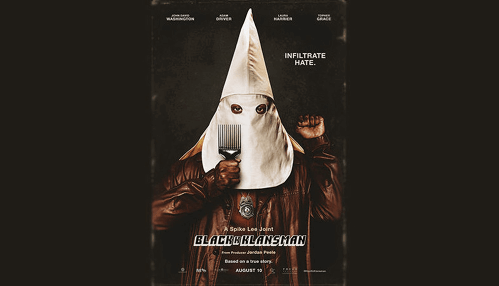
BlacKkKlansman (2018)
Designed by Gravillis Inc.
This poster really conveyed everything about both the subject matter and the tone of the film. While dealing with serious topics such as racism and infiltrating organized hate groups, the film was also able to navigate into comedic territory in a way that felt natural and maintained tonal balance. Likewise through the use of juxtaposition, this poster features the ironic imagery of a Ku Klux Klan hood in contrast with: a raised black power fist, an afro pick and a police badge dangling around the hero’s neck. Provocative, comedic and frightening, this poster will stop pretty much anyone in their tracks.

Devil (2010)
Designed by InSync Plus
Devil brought a whole new meaning to “contained horror”, trapping a group of strangers in an area as confined as an elevator for the majority of the film. This predicament would be no more than a “case of the Mondays” type situation, if not for the fact that one individual in the elevator happens to be the devil in human form. The poster effortlessly combines the everyday mundanity of a lobby elevator with the satanic, using the familiar image of passing light between the crack of an elevator’s doors (going down, natch) reflected on a floor to create the image of the inverted cross. Notably absent is any of the actors' faces, who are relatively unknown in a wide release film. Instead, the poster wisely banks on concept and the strength of powerful iconography to pique interest. It’s enough to make you want to take the stairs.
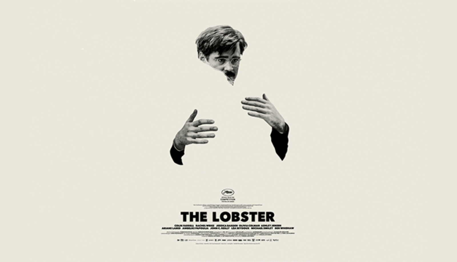
The Lobster (2015)
Designed by Vasilis Marmatakis
The Lobster takes place in a world similar to ours, except single people are taken to a hotel where they have 45 days to meet a romantic partner or be turned into an animal and released into the wild. As absurd as the premise sounds, this black comedy feels very grounded and is presented with low key subtlety. In a sea of vivid colour at the multiplex, the French New Wave simplicity of the striking black and white poster stands out. The imagery features Colin Farrell embracing a silhouette which creates a blank void within himself (a secondary poster featuring Rachel Weisz portrays the other half of the embrace). The apprehension on Farrell’s face betrays his true feelings in what would otherwise appear to be a tender moment. The poster does an excellent job of capturing the tone of the film in a manner that is so artistic, the image could easily hold its own in a gallery.
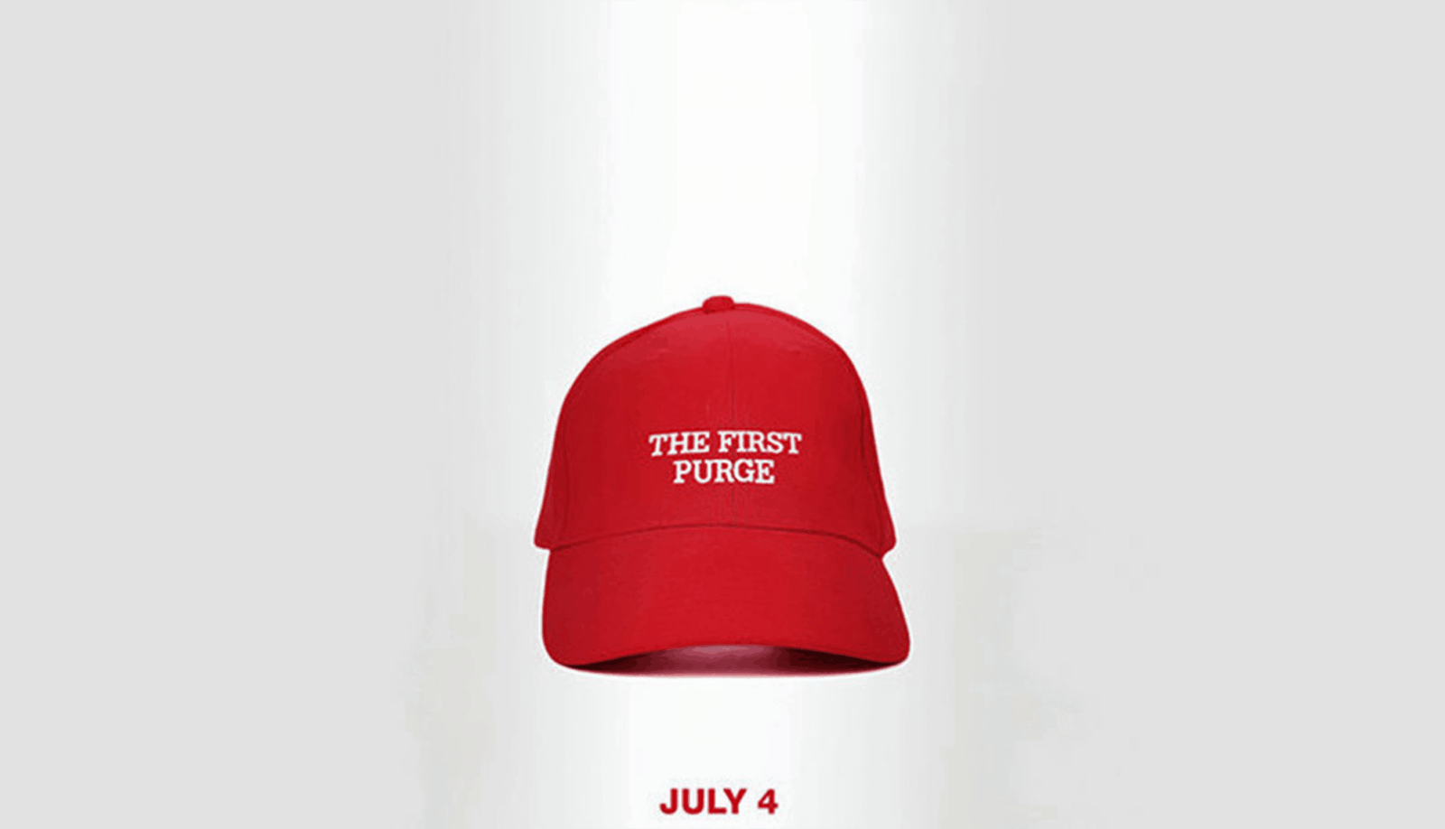
The First Purge (2018)
Designed by LA
The horror genre at its best is able to tap into social ills, turning them into onscreen monsters that forces audiences to confront ideas they might not usually have. George A. Romero’s Night of theLiving Dead and Dawn of the Dead, tackling the themes of civil rights and an overly consumerist society respectively, are two of my favourite examples of horror cinema disguised this way. In contrast, the teaser poster for The First Purge pulled no punches with its simple but evocative approach. It inextricably linked the ubiquitous MAGA hats of Donald Trump’s presidential campaign to the world of The Purge, where all crime is legal for one night a year. In the film (a prequel and the fourth film in the franchise), the socioeconomic and political subtexts of previous films are now clearly in the forefront, showcasing just how quickly a country can turn and encouraging the viewer to reflect on the current course of the nation. Love it or hate it, the poster is able to communicate so much with so little: a red hat on white background.

John Godfrey
Tags
Related Articles


Rupsha Mutsuddi Associate RGD


Sponsored


