The 10 best design moments of 2022
Written by Nicola Hamilton RGD, Issues Magazine Shop
By Dominic Ayre RGD, Partner, Creative Director at Hambly & Woolley Inc.
OK, let’s be honest. How many of you laughed when you saw that title? Most of you, I assume.
This title is about as bad as the dozens of ‘Design Trends for 2023’ articles out there. Let me clear this one up for you. This is MY ‘10 Best Moments in Design’ (in no particular order). It is a truly subjective list and don't be surprised if you shake your head ALL the way through reading it. It is not all design either. As you go down my list, I hope you'll be introduced to, or reminded of, some really interesting and engaging things that from the past year*.

Kurppa Hosk: Tugg Visual Brand
I was so happy when I saw this design system for the first time. (I have studied it A LOT since.) Tugg is a Swedish fast food chain that Kurppa Hosk recently rebranded. A few times in this article I will use the phrase, "it has to be seen" and this is the first time. The typography alone is magnificent. It flashes back for me to the work of Designers Republic. The type is accompanied by an amazing colour palette and 3D graphic mascots of food and condiments making the system super playful. Tugg City is a pretty awesome place.

Wedge: Canada Dry Packaging
Packaging is a world in which I'm not much involved but I appreciate the super-talented designers who work in this field. I find with great packaging often it does all the talking, as is the case with Wedge’s rebrand of Canada Dry. From the mathematical redrawing of the Mercator lines in the shield and the beautifully-crafted characters of the main typeface to the clean, direct colour system, these cans are a throwback and super-fresh all at the same time. All cards on the table though, when it comes to ginger ale, I do prefer Vernors.

Everything, Everywhere, All At Once
Yes, this is a film. Arguably the single best ‘designed’ film in a long time (maybe since my other favourite, Sorry to Bother You. IYKYK). If you have seen this movie then I probably don’t need to say a word. For those of you that haven’t, I am taking the easy way out and saying (again): ‘it has to be seen to be believed’. An old art director of mine was meeting with a student. The student asked; ‘What books would you advise design students to read?’. He answered that there were three books. The dictionary (?), Dr. Suess’ Ohhh the Places You’ll Go and Alice in Wonderland. Add Tame Impala as your soundtrack and that might get you close to Everything, Everywhere, all at once. An amazingly layered look at the immigrant story, mother/daughter relationships, institutional struggles and all told using a metaverse framework. Watch the trailer.

Morag Myerscough: The Future Belongs To What Was As Much As What Is
On the stage at DesignThinkers there are not many people quite as inspiring as Morag Myerscough. With her vibrancy, both in her personality and her clothes, she lights up a stage with her charm and natural story telling. It was amazing this year to hear her expand on the story of the installation she created at Hadrian’s Wall to mark its 1900th year. Morag worked with poet Ellen Moran and the local voices to create the words that clad the outside of this modern interpretation of one of the original Roman gatehouses.

KH: Looking at Your Pager
Yes, I am a fanboy. Kieran Hebdan, AKA Four Tet, has never disappointed me in all my years of following his musical career. Here, under his initials KH, he drops a fun 4/4 electronic track that is just such an odd Earworm. This is music Dom, not design… true, but it is the video that is done by another design hero of mine, Trevor Jackson, that I draw your attention too. An ASCII visualizer is by no means unique or new (definitely not new), but by just using the simple yellow field and characters timed to flex with the baseline, this is an example of time-based design at its best.

Fisk: Toro y Moi’s Mahal Album
I was definitely going to included an album cover. At one point I was going to cheap out and say this choice was just ‘album covers’. Hooray!!! I felt that was too easy so I went back through the music I have been listening to this year and Toro y Moi’s Mahal jumped out because I remembered I found it through design. With a sound rooted in 60’s and 70’s psychedelic rock accompanied his usual hip hop influences FISK decided to take advantage of that and play with patterns and animations that look like Mac visualizers of the 90’s. It is rare that an album has a ‘system’ per se but Mahal’s look and feel is based in the visual language of Powerpoint, Macpaint, bumper stickers, cheap disposable cameras and ‘everyday’ typography. Mahal has so many reference points that you kind of have no option but to just sit back and let it happen sonically and visually.

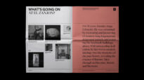
Issues Magazine Shop
I recognize that there might seem to be an element of nepotism in this choice but I promise that Nicola Hamilton, President of this fine Association had no involvement in my decisions. I have been working in design in Toronto for close to 30 years and in that time I have seen some amazing book and magazine stores come and go (Pages on Queen anyone?). What happens when those places close? It doesn’t mean we can’t get some of the magazines we love elsewhere, but what it means is that we lose a connection. Issues sells magazines but more importantly it is a hub. Issues is a place of pure wonder. Issues has brought back a sense of exploration and fanaticism to the design retail experience (only in Toronto for now, sorry). The Issues team encourage you to stop and chat about your love of the written word, design joy, obsessions with print and anything else that makes up a great conversation.

GrandArmy: Analog: Shift Visual System
Heshaka Jaywardena, Senior Design, Brand at Hambly & Woolley introduced this to me just a few weeks ago. When I first looked at the wordmark I didn’t quite join in with Hesh’s celebration but as I started to peel the onion I began to understand the complexity of what GrandArmy had done for this New York based vintage watch reseller. The use of typography is so well thought out. The balance of a classic Sans and Serif romance is expert. The multiple monograms are bonkers yet beautiful. The mix of illustration with insitu photography give the watches (and other collectibles) a sense of playfulness and joy. Masterfully done brand work.

Design Threads Report
I read A LOT of design-based publications and books each year. I think that all of us do. I specifically say design-based because I don’t really read books on ‘graphic design’, rather books that talk about the effect of design on our world. It isn’t hyperbole for me to say that Design Threads is one of the best publications, online or in print, I have read this year. I always view a publication that is trying to balance humor and depth while also presenting challenging opinions as a great thing. PORTO ROCHA, a New York branding agency and Float, a research hub partnered to interview dozens of designers and create an immersive website that is tackling some of the questions we struggle with each day.

Mimi Lien: PARADE
So much of our design inspiration comes from screen or the printed page that it is a ‘real’ moment when you can stumble upon design in an outdoor public place. Under the Gardiner Expressway in Toronto there is an event area called 'The Bentway'. This summer as I was out I walked into the middle of PARADE, an installation by artist Mimi Lien. PARADE took the concept of STREET and literally flipped it into the space above me. Using general, utilitarian objects (pylons, road chevrons, safety mirrors) Mimi Lien and her collaborators turned these ignorable items into a ballet of wonder. With bikes and graphic signs moving on tracks in this industrial concrete background, the whole artwork made me feel light and inspired about the everyday textures of the city.
*It is of course tough to think about 2022 in more lighthearted ways above with the war in Ukraine still continuing. This year I have met, talked and listened to a few people for whom this terrible time is affecting them closer to home. My thoughts, like many of us, have been with those people and their friends and families directly touched by these terrible events.

Nicola Hamilton RGD
Issues Magazine Shop
Nicola is an independent art director and graphic designer who specializes in editorial design. She’s obsessed with magazines, so much so that she opened Issues Magazine Shop, a retailer of independent magazines, in July 2022. Her work has been internationally recognized by the D&AD, the Society of Publication Designers and the National Magazine Awards, among others. Nicola is also the co-founder of The Scaries Project, an artistic exploration of the emotional realities of being creative and a part-time design educator.
Related Articles


Vida Jurcic RGD


Sponsored


