Think about this. In today’s society there are often more logos around us than people. As designers, we often notice that some are more beautiful, or some work better to communicate their brand. Of those that succeed, some even endure for decades. A select few go on to become cherished icons, evoking powerful emotions like pride, loyalty and status.
1. Cancer Care Ontario Logo — Inspiring loyalty

One of my favourite logos was designed by team member Susan Mosdell RGD, when she was working at the agency OVE.
Here’s what Susan had to say:
“I have always been fascinated by the idea of taking two different ideas and combining them tocreate elegant forms and memorable solutions that are easily reproduced in print and digital applications. The negative shape of the “O” creates the positive form of the “C” and the “O” reinforces the name, while the simplified shape of the trillium, Ontario’s flower, completes the identity to communicate holistic cancer care in the Ontario government’s healthcare sector.”
A number of years ago, I got a glimpse into the loyalty this logo inspired. I was meeting with Cancer Care of Ontario to discuss a new project. At the time they were undergoing yet another government logo identity change, and all the offices had to adapt to the new logo identity — one that critics later named the “three men in a hot tub” logo.
When meeting with the staff, the previously loved logo was still etched into the glass board room walls, and they told me how much they were so sorry to see it being replaced with the new one. Their office needed to remove any distinction from the Ontario brand. The change was understandable from a political viewpoint. However, my clients still preferred to use the original and beloved business cards and were reluctant to use the new logo.
That’s the power of a great logo.
2. Unilever Logo — Taking a risk
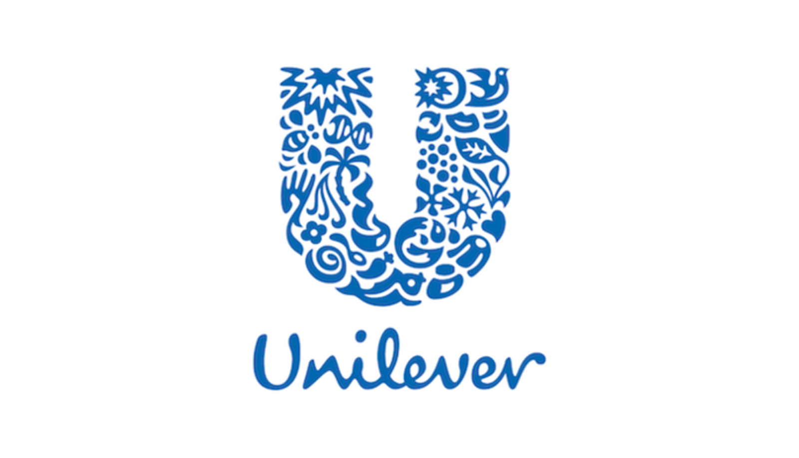
Unilever is an Anglo Dutch company with a large group of well-known brands within the areas of nutrition, hygiene and personal care. They appointed Wolff Olins, a brand consultancy agency, tohelp create a new brand for the company, clearly expressing its vitality mission.
Working with team Creative Director Lee Coomber, Wolff Olins created twenty-five playful and yet meaningful icons, all intricately woven together to form a “U.”
When this logo was introduced in 2004, it broke the mold for the common approach to logo design. It was what inspired me when creating the Musicians’ Pension Plan of Canada logo. It took risks, and through its success it has rewritten the rules for corporate logo design. Learn more about the logo at Unilever icons explained.
3. Musicians’ Pension Fund of Canada Logo — Building pride

As noted above the Unilever logo was the inspiration for this design. As Creative Director, I worked with designers Amy Li and Alison Birtles Fraser. The goal of this logo was to unify the organisation across Canada and express the vitality of all 14,000 plus members.
When the project was complete, the Executive Director told me, and anyone in earshot, how much she personally loves this logo. Over eleven years later, they are still an ongoing client, and they are still using the logo.
In the 2008 RGD Design at Work competition, we were honoured to see this logo win the judges pick for Brand Logo Identity. That same year we officially opened our studio, and it was a great start to win this award and our client’s heart.
4. Roots Canada Logo — Growing identity

The iconic ROOTS logo has always been a favourite of mine and Susan’s for its beauty and sincerity. The company brand goal when it was created was to promote its quality athletic wear, a healthy, active lifestyle and respect for nature. Designed by Robert Burns and Heather Cooper in the 1970s, it features Canada’s iconic beaver and the 1922 Cooper font.
It is a testament to the logo’s timelessness that it is still in use and loved by the design community today.
It has been worn by Olympic athletes, celebrities and various politicians around the world. For nearly half a century it has been synonymous with the Canadian culture, and it continues to do so today.
5. CN Logo — Moving Canadians since 1960

At 59 years old, the CN logo shows no signs of aging. It still looks like it could have been designed today.
The story goes that in 1960, Canadian designer Allan Fleming sketched out his design on a cocktail napkin while sitting on a plane bound for New York. So began a legend of Canadian design. Here is a wonderful link to learn more of the CN Logo evolution.
On a personal note, I had the pleasure of working with the University of Toronto Press employees whose previous boss was Allan Fleming. The designers at the time were Antje Lingner, Will Reuter and Laurie Lewis, all award-winning book designers themselves. They all spoke highly of Allan Fleming. It was a loss to the design community when Fleming died at the young age of 48, on December 31, 1977.
The CN logo lives on as one of the most recognized logos in use in Canada today. That is endurance.
Tag
Related Articles


Sponsored


