On Oct 12, the RGD hosted a webinar featuring Emmanuelle Goodier and Wendy Lockyer from Accessibil-IT, where they shared practical lessons on designing documents with accessibility in mind. Below, we share key takeaways.
Pre-design Stage
Accessibility cannot be an afterthought.
Questions to ask your clients before you start the work:
What compliance standard does the document need to meet? Depending on who your client is, they will need to meet compliance under WCAG Section 508, AODA and/or PDF UA.
- Are there any font requirements that could lead to accessibility issues?
- Are there brand colours or any other colours that when mixed together might present an accessibility challenge?
- Who will write the alt text for graphics and images?
- What accessibility testing tool do they use, if any?
Design Stage
The following areas to are critical to design for accessibility:
Layout:
Whether it's visual or cognitive challenges, the key is to reduce potential barriers to a person reading the content. Always use linear logical layout when creating a document.
- Clear and logical reading order
- Clear hierarchy of elements
- Avoid clutter
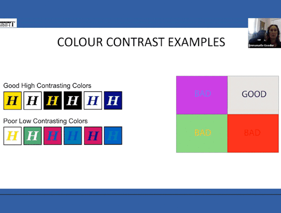
Use of Colour:
Colour is a main area of concerns when it comes to accessibility. There are two key points to keep in mind for accessibility in colours—colour contrast and use of colour in graphics.
- To determine contrast between text and background and the contrast between adjacent objects and colours, decide if you will be complying by WCAG AA or AAA standards. The requirements are different for each of these standards.
- You cannot use colour on its own to convey any meaning or make any distinction in the document. Instead, you can use colours combined with shapes or patterns, labels, data tables under graphics and maps or white or black lines between colours to separate the elements and make a distinction.
- Bar graphs should have textures or patterns to differentiate between the different bars, white stroke in between.
- Maps are tricky when it comes to accessibility. Use different shapes and icons to denote each data point.
- Each graphic element needs to be given alternative text so that assistive technologies can explain the graphic (say, a map) to the user. Keep the alt text as short as possible. The user cannot go back and forth and will have to hear the entire description again if they don't understand a portion of it.
- A link requires a double identifier—A distinctive colour plus an underline.
Font:
- Sans serif fonts are preferred, but you can still use serif fonts. Legibility is key.
- Use consistent style for the hierarchy of the document.
- Colour contrast of the font with the background must be taken into consideration.
- Avoid cursive and decorative fonts.
Tables:
A table can present major obstacles to a screen reader user when it's not designed properly. The screen reader reads a table by reading the row header, then the column header and then the data for each of the cells presented.
- Make it as simple as possible for the user to be able to read through.
- As a rule, you cannot use vertical text in column headers or row headers.
- If you're using shading in the table, make sure it passes the colour contrast test.
- For tables with data points, make sure that the Unicode characters are accurate.
- Blank data cells are allowed, but not blank headers because that creates a barrier for the screen reader.
- Only use data tables for data and not as a tool to aid in the layout of a design.
- A table can go over multiple pages, but when it does, repeat the column headers on each page.
Post-design Stage
Once all the accessibility requirements are met with and the design is final, you move to the remediation part of making the document accessible.
- Create paragraph style and create export tags.
- Set a reading order. This is crucial because if you don't, InDesign will create its own reading order which will always be left to right and top to bottom.
- Add alt text to images, column headers to tables, Artefact decorative objects, assign Metadata to the document, create table of content, set link destinations.
- Export the document in the smallest size file. It is helpful to know if the client's website has any size limitations.
- Remove crop and bleed marks and ensure that the fonts are embedded to avoid issues when exporting to PDF.
- Test the PDF—manually verify reading order tags, run automates testing tool and verify alt text as well as link destinations.