10 ways to check if your website is accessible

Accessibility is an integral property of good design because it directly connects with the site's usability. It allows people with all abilities, including those who suffer from vision, hearing, mobility, cognition, speech or other disabilities, to use products and benefit from them.
With 15% of the world's population experiencing some form of disability, according to the United Nations, 1 in 10 visitors of your website will have some disability. Accessible design creates a better experience for all user groups—not only for people with disabilities. Everyone benefits from inclusive design.
Lawsuits over digital accessibility for people with disabilities have been rising in recent years. As the Wall Street Journal mentioned, U.S. lawsuits alleging that digital products were inaccessible to people with disabilities rose 64% in the first half of 2021 from a year earlier.
Types of Accessibility Testing
Automated
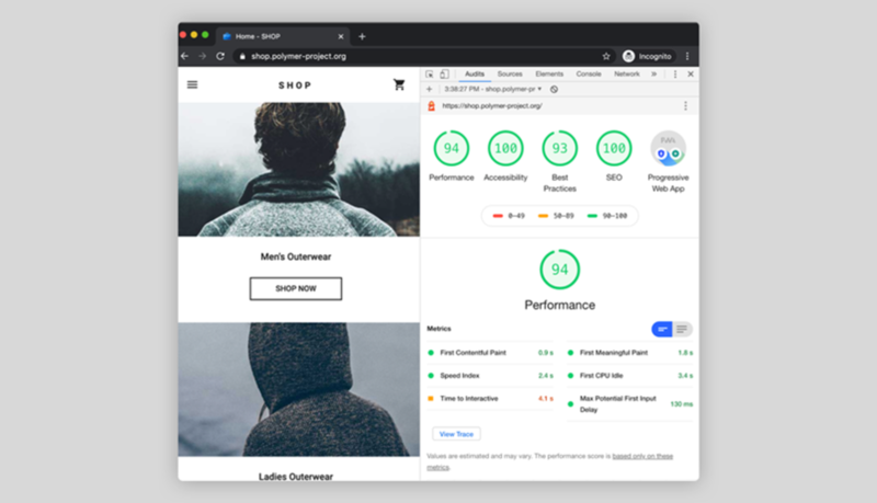
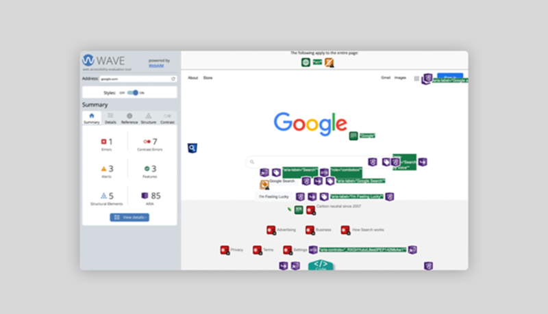
When you conduct automated testing, you use online tools or browser-based extensions to scan a website and identify common accessibility issues.
Examples of automated testing tools:
Manual
Manual accessibility testing means conducting human analysis of a website to identify problems that only humans can track. For example, it's hard for automated testing to detect if the animated block of text moves too fast, preventing users from reading it. Manual testing is typically included in a quality assurance checklist, a list of actions that QA specialists complete to ensure that a product being released to the market doesn't have severe issues.
When a hybrid model of both automated and manual testing is used, one type of testing complements the other.
Best practices for checking the accessibility of a website
Begin by checking it against the Web Content Accessibility Guidelines (WCAG), which cover many areas of web design—from layout design to animation to audio effects.
The website accessibility checklist provided below was created based on the WCAG guidelines.
1. Does it use descriptive titles, links and functional controls?
A well-written title clarifies what the page is all about to both visitors and search engines.
Avoid creating generic links that don't give visitors a clear idea of what they'll see when they click on the link. Write more descriptive links using the title of the page that the link leads to. For example, if linking to a contact page, a descriptive link could read, “contact info.”
Button descriptors or CTAs should always describe their purpose with an actionable label. Avoid using generic labels like "okay" for buttons.
2. Does it allow content to be resized up to 200%?
People with poor eyesight will likely use browser zoom to increase the size of text on the page. WCAG suggests that text should be able to be resized up to 200% without assistive technology or loss of meaning.
To test your site, use the zoom tool in your web browser and see what happens to page layout and content.
If you notice that content blocks overlap or move away from the visible area, you need to make changes.
3. Is text legible and readable?
Make body text at least 16 px (this is the same size as the size of text printed in a book). Line height should be at least 1.5 times the font size (150%). Also, allow visitors to change the size of the text.
People don't read text on the web; they scan. To make your layout scannable, you should avoid using long blocks of text. A web page with a wall of text is not only visually unappealing, but it's hard to read. Break text into sections, adding a proper heading to each section.
Ensure you use language that most of your users understand. Avoid acronyms and use simple words that everyone can understand.
A few tools that can help:
4. Is there good color contrast?
Color contrast refers to the difference between the foreground and background colours. Poor colour contrast can make text illegible.
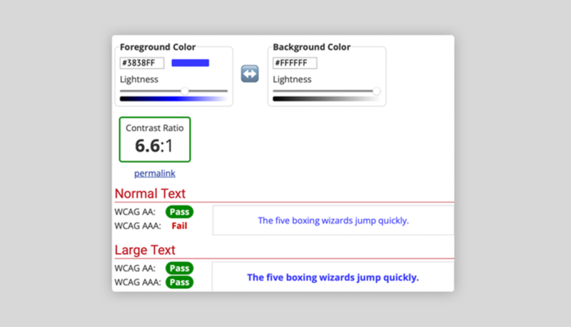
Color contrast can be measured in numerical values. WCAG recommends that text and images of text should have a contrast ratio of at least 4.5:1 for normal text, and 3:1 for large text (18 points or larger).
Use tools like webAIM to check your contrast ratio. If your website offers light or dark themes, you need to ensure that colour contrast in both themes is equally good.
5. Does the site use colour alone to communicate meaning?
Let's say you give the user a prompt like "choose the green option" and offer the following list of options.
- Option A
- Option B
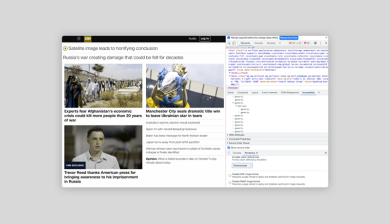
Users who suffer from red-green colour blindness cannot make a selection because they can't distinguish between red and green pigments. You can emulate vision deficiencies in Chrome DevTools.
6. Has alt text been added to images and emoticons?
Blind users rely on assistive technologies when they interact with a website, which interprets and communicates the meaning of graphical objects using alt text.
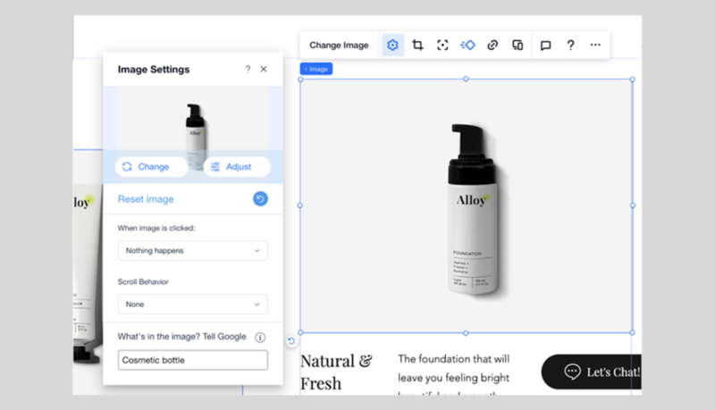
If the alt tag for the image is empty, the screen reader either ignores the element or says "image" without any further details. All you need to do to change the alt text is fill in the alt property of the HTML image tag.
If you're using Editor X, you can change the alternative text in the image settings.
To improve your alt text, navigate your website using JAWS, a screen reader developed for users who have vision loss, to learn how assistive technology reads your page. Add SEO value to alt text by using your article's target keywords.
7. Does the site allow users to control the playback of audio and video?
Users should be able to adjust audio and video playback time of media content, in case they need more time to understand it.
Users should also be able to pause or stop the audio/video to learn its content at their own pace.
8. Have subtitles been added to video content?
Add an audio description with information about what is happening in the video to improve the experience for deaf or hearing-impaired users.
Ensure captions are synchronized with the video.
9. Can users turn off animated effects?
Allow the user to turn off or, at least, minimize the animated effects on a website, leaving only the animation that's essential to the site's functionality.
People who have seizure disorders are highly sensitive to blinking/flashing objects. Avoid using any type of content that blinks or flashes more than three times per second.
10. Is the website keyboard-friendly?
People with mobility disorders, like Parkinson's disease, should be able to experience the entire functionality of a website through a keyboard. No special command (i.e., special combination of keystrokes) should be required to activate keyboard interactions. Show a clear visual indication of the current element in focus.
Typically, a visual indicator looks like a blue frame highlighting the selected element. Use the Tab and Shift-Tab keys to see if you can access all essential elements on a page and the sequence in which you access them.
Design for accessibility, design better products When you consistently think about how people with disabilities interact with a site, you build empathy with users. You start to better understand the problems that people with disabilities experience, which will help you design better products and services. Read the full article in Shaping Design from Editor X
Tags
Related Articles


