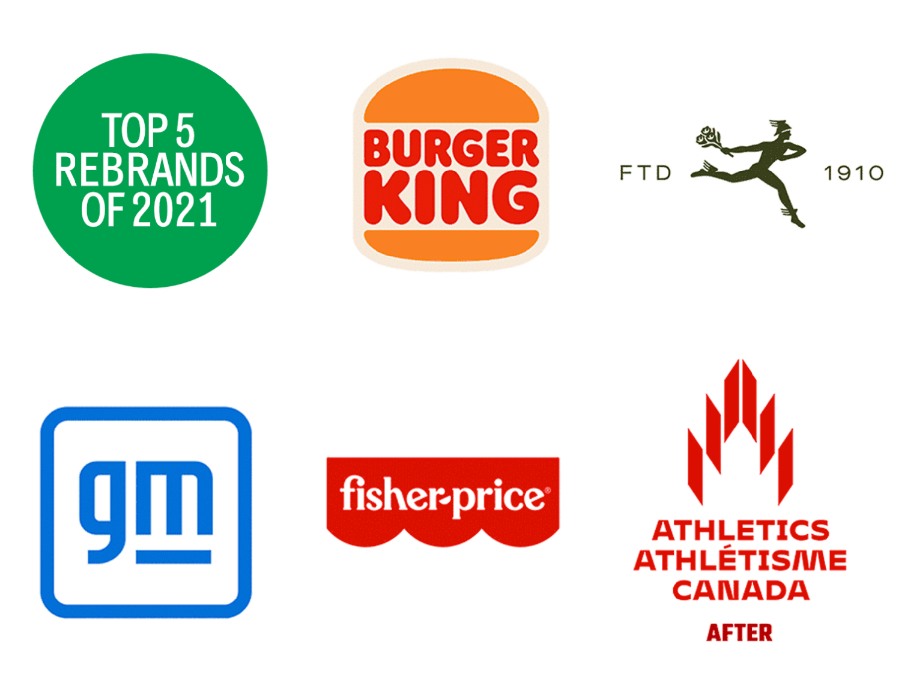
Vida Jurcic RGD reflects on her favourite rebrands of 2021 that pay homage to simpler, gentler times combined with clean legibility and strong typographic personality.
Before I talk about my favourite rebrands of the past year, I must say that despite the fact that it’s my absolute favourite branding system of 2021, I will not talk about the National Gallery of Canada rebrand by Area 17. It has been featured a lot this past year for both controversial and creative reasons. Instead, I have chosen five rebrands from different categories that I feel are highly successful and relevant to daily life. They are all strategic and respectful to their brand’s established equity.

1. Burger King
Although I wasn’t so sure about it at first, the new Burger King identity really grew on me. As its designer Lisa Smith, executive creative director at Jones Knowles Ritchie says “We took it back to where it looked its best.” To look ahead, she looked into the past at the iconic logo from 1969. In my humble opinion, it really looks appetizing, like a squishy burger you can’t wait to sink your teeth into. Removing the blue was a great idea too. The typography is cleaned up from the ‘69 version to look fluffier and fuller and the bun is taller. Overall, the new (old) identity really suits the brand at every touch-point; from packaging to store to digital experience. Yes, it’s trendy, but in the realm of Back to the Future, Stranger Things and all the wonderful nostalgic, comforting things of the 60’s, 70’s and 80’s. It will live on for decades yet! A comfort brand for comfort food.

2. FTD Florists
With over a century of brand recognition, this is a logo that both spans time and language barriers. The FTD rebranding hearkens back to its founding as a non-profit collective. FTD’s creative agency, Base Design, refreshed this well established heritage brand to bring the florists back to the forefront. Base Design’s method included a sequence of brand immersion and brand strategy, as well as several rounds of exploratory design of the key elements including the logo, fonts and colour palette. Working in partnership with the client, they created a beautiful, modern yet very classic look and feel. The Mercury illustrated icon and typography was simplified, but still retains the universal recognition of the 1910 mark.

3. General Motors
Not your dad’s car company any more! GM’s new logo is intended to acknowledge their latest focus on electric vehicle technology and vision for a world with zero emissions. The more vibrant blue tones evoke a blue sky. What I really like about this logo is the fact that it doesn’t fall into the typical automotive logo category. It looks like tech. The in-house design team took a risk and although there is a lot of controversial editorial online, it really works for their future vision as a progressive, technologically advanced, EV focused company. Note the subtle electric plug in the negative space of the “m”. The lowercase “g” and “m” and rounded corner box is also a lot friendlier.

4. Fisher-Price
In terms of brand equity, Fisher-Price is definitely there. You can’t walk into a Salvation Army Store, Value Village, garage sale or flea market without seeing it at least once, probably 10 to 20 times! Fisher-Price is one of the world’s leading toy companies, defining the category in infant and preschool toys and Pentagram did an amazing job at making a good brand even better. The rebrand story on their web page is worth a read. The distinctive wordmark within the red banner was refined and tightened up without any loss of immediate recognition and the simplification of the scalloped bottom edge makes it so much easier for application. All the other fun graphic elements that go with it really help create a playful, joy-filled brand. Well done Pentagram!

5. Athletics Canada
And now for something Canadian! One Twenty Three West really captured the fire and pride ofbeing Canadian with their new Athletics Canada logo. The logo incorporates several appropriate images into its design: the maple leaf which also evokes a burning Olympic torch, the track around its perimeter and an overall shape of the letter “A”. The sharp angles delineating the maple leaf suggest movement and speed and the tiered shapes represent the podium steps every athlete hopes to climb one day. The typography could easily stand alone too. It’s so distinctive and beautifully customized to work with the mark. The fact that there is so much diversity in the letterforms speaks to the diverse nature of athletes, fans and sports. Yes, it’s a logo to be proud of!
Vida Jurcic RGD
Vida Jurcic RGD is a founding partner and Co-creative Director of Hangar 18 Design Continuum, an award-winning Vancouver design and branding firm with a legacy of strategic solutions spanning two decades. She has been an in-house art director/designer at the Hudson’s Bay Company and Woodwards Department Stores and has worked at various advertising agencies, including DDB and BBDO. She has judged many regional and national design competitions and sat on scholarship juries including the BC Arts Council. In addition, Vida currently teaches at the IDEA School of Design, Capilano University and has taught at Vancouver Film School and Langara in the past. She is an avid design history buff and part-time musician/Morris dancer.
Related Articles


Stephanie Strawbridge RGD, John Furneaux RGD, Eric Forest RGD, Raymond Cheah RGD, Ian Chalmers RGD


