
Many consider it one of the most memorable scenes in cinematic history. It occurs at the 19th minute of the film. After enduring a turbulent twister ride, a swirling farmhouse returns safely to the ground. Its lone inhabitant, Dorothy Gale, opens the front door, curious to see where she has landed. During this pivotal moment in The Wizard of Oz, the film transitions from sepia to Technicolour, leaving the audience just as bewildered as Dorothy.
When the film debuted in 1939, Technicolour© was a relatively new process, presenting moviegoers with an intensity of colour they had never experienced before on-screen. By having the audience sit through the first 19 minutes of comforting brown sepia tones, this ground-breaking technology, with its overly saturated palette, carried an even bigger punch.
Sepia has a way of calming the mood by deemphasizing the extreme contrasts typically found in black and white images. Like looking at the world through a filter, this monochromatic effect gives everything equal billing. “Sepia can blur the edges of things,” says Bard College professor Luc Sante, “In a way that mimics the selective softening of memories over a lifetime...” In The Wizard of Oz, sepia tones underscore a simpler, rural life. The hardscrabble farmers, the salt of the earth, are portrayed in brown—the quintessential earth tone.
 Leonardo da Vinci
Sepia—the colour, goes back to Roman times. It was discovered that the ink secreted by cuttlefish produces a pigment, which after being filtered and dried, is suitable for writing. Discharged by the mollusk to create a smoke screen when escaping predators, the ink now had a new purpose. The word “sepia” comes from the Latin word for cuttlefish. Leonardo Da Vinci, among others, used sepia inks when sketching and recording his observations. Some mistakenly believe his drawings turned brown with time, not realizing that this was their original colour.
Several centuries later, sepia was lending its caramel-coloured effect to a new medium. In the early years of photography, artists experimented with numerous chemicals and substrates to capture images. Different camera designs exposed light onto copper, iron or glass plates covered with a silver-based emulsion. Difficulties arose when attempting to halt the development of the photographic image by applying a chemical wash. The trick was to use a chemical that stopped the process and permanently preserved the image. During extensive testing, chemists discovered that the cuttlefish ink’s natural sulphuric compounds changed the silver to a silver sulphide—making for a durable photograph. Sepia-based toners not only slowed image fading, they also added protection. The unexpected bonus was the soothing, warm sepia tones the cuttlefish ink gave the final images.

Mathew Brady, the celebrated US Civil War photographer, liked how sepia’s brown hues eased the shock of his graphic battle scenes – the first war images ever seen by the public. Britain’s Julia Margaret Cameron used the colour to give her portraits of Victorian gentry an ethereal quality. Edward S. Curtis used it to document Indigenous American traditional life, preserved in a collection of 40,000 masterful sepia prints. In the late 19th century, the new process, with its appealing results, empowered photography studios to pop up across the United States. Patrons no longer had to sit for hours to have their portrait painted by an artist. Photography made the experience quick and affordable, even if the sepia likenesses were, at times, unforgivingly honest.
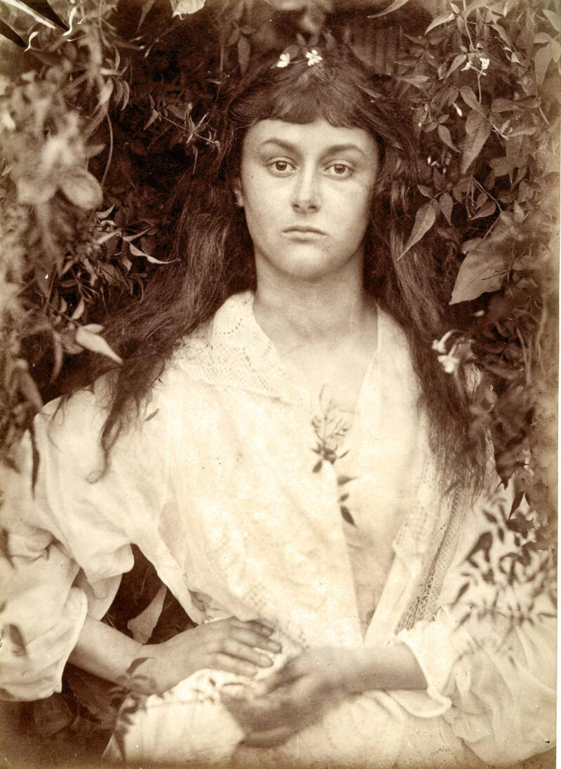 Self-portrait: Julia Margaret Cameron
When Dorothy opened the door of her farmhouse after landing in Munchkinland, she confronted a world she wasn’t anticipating—one filled with dazzling colours. Nonetheless, she longed to return home to a familiar, less chaotic life. By tapping the heels of her shoes, she was back in the comfort of her sepia landscape – surrounded, once again, by down-to-earth people who offered reassurance and evoked deep-rooted memories. Brown, the colour of stability and dependability, touches something very primal within us, keeping us subconsciously grounded and connected to the past.
Bob Hambly RGD Emeritus
After graduating from the University of the Arts in Philadelphia, Bob spent 10 years working as a freelance illustrator. In 1990, he and his partner Barb Woolley formed the Toronto-based graphic design firm Hambly & Woolley. He graduated from H&W after 30 years of collaborating with exceptional designers, artists, suppliers and a wide range of clients. In 2017, Bob was awarded the International Council of Design's ICoD Achievement Award for his outstanding and consistent achievement in the practice, education or promotion of design. He now devotes his time to writing, photography and numerous other pursuits. He continues to champion art and design through various efforts.
Tag
Related Articles


Bob Hambly RGD Emeritus, Donna Darby RGD Emeritus, Michel Viau RGD Emeritus
Sponsored


