
Designers share people, places or things that influenced their design career. In the first instalment of At First Sight, Bob Hambly RGD Emeritus takes us on a journey back to his childhood when the typographical hierarchy, colours, layout of roadmaps intrigued the designer within him.
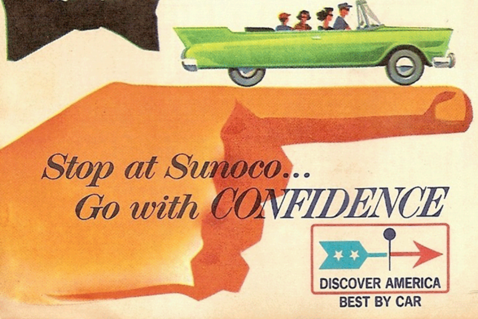
I grew up in a family that went on a lot of road trips — to destinations south of the border mostly. “See the USA in your Chevrolet,” as the jingle urged. Only we were in a Pontiac, a flaming red Grand Safari station wagon. This behemoth was more like a boat than a car. My brother, sister and I carefully prepared for these excursions by amassing reading material and games and toys. Once we had devoured all of the comic books and tired of playing games like “I spy with my little eye,” we resorted to gazing out the window as our trusty land yacht cruised into parts unknown.
When all of these distractions became tiresome, I asked my father to look at the roadmap he was using to chart his course. I love everything about roadmaps — their size, the way they fold, the paper they’re printed on and the elaborate web of information that lies within. Yes, I enjoyed figuring out where we were on a map and how best to get where we were going. But it was the unique visual language of these roadmaps that piqued my curiosity. What did all these lines and symbols mean?
Deciphering a roadmap’s legend of icons was akin to breaking a secret code I was determined to crack. I soon learned that highways were represented by a complex matrix of lines and colours indicating everything from “under construction” to “divided” to “unpaved.” Little red planes pinpointed an airport; blue ones marked military airports. And a blue-outlined plane was for “other airports”. What kind of aircraft was landing there? All configurations of circles, shields, boxes, stars and triangles were at work here, guiding motorists across the landscape.
Along the blue lines that indicate highways, there are circular shapes announcing towns and cities. Markings are found inside some circles, signalling the population of a particular place. A dot means 500 to 2,500 residents, a vertical line means 2,500 to 5,000 and so on. Smaller cities are quietly presented in upper and lowercase. While the big ones boast their location in condensed UPPERCASE BOLD. Italics are reserved for bodies of water and local attractions. So much to absorb. Why had I wasted valuable time earlier with Betty and Veronica? Looking back, I realize just how much these compact guides influenced me as both an illustrator and a designer. Each map presents a unique visual experience. The content, layout, typographical hierarchy and colours working hand in hand to relay crucial data.
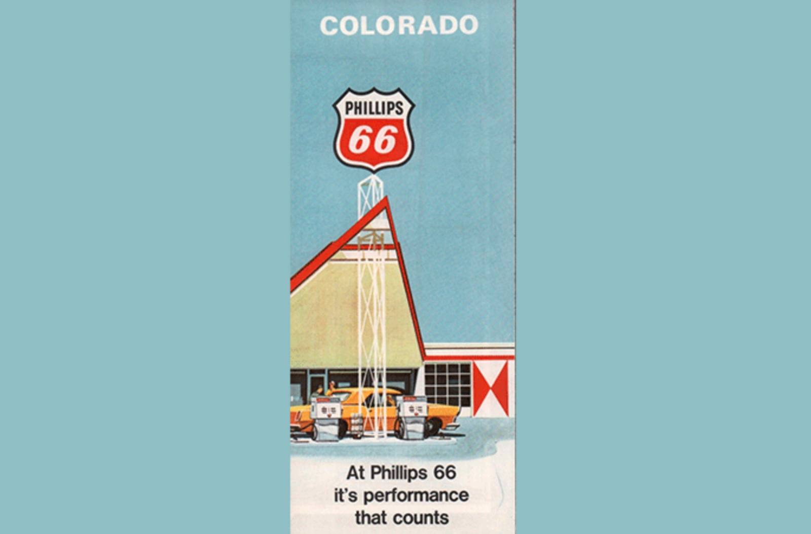
Eventually, I realized that roadmaps come in a variety of colour palettes. Esso, the most common map in our car’s glove compartment, was based around red, blue and yellow. A good primer. Texaco’s more sophisticated pastel hues and the earthy tones of Rand McNally slowly grew on me. Even though multi-page Wiro-bound road atlases contain multiple regions, I prefer the single-focused roadmap. The challenge of folding back those twenty-four panels, finishing with the map cover in the correct location, always brings me great satisfaction.

I’m intrigued at how many additional features can be squeezed onto any given roadmap. Inset city street maps, mileage charts, recommended recreation areas and points of interest all fight for a motorist’s attention. With such limited space, how do they decide what stays and what goes? I guess when you sponsor the printing of a roadmap, you’re allowed to have your motel’s logo peppered across the page. “Dad, it looks like this town coming up has a massive Holiday Inn!”
Some maps are easier to follow, some are nicer to look at. The good ones accomplish both. To this day, I still use roadmaps when I travel. Not long ago, I spent thirty days crossing the USA and never once did I access the car’s built-in GPS. Sure, it’s a practical device and often more accurate than a roadmap, but it’s yet another screen impinging on our daily lives. There’s no substitute for the driving history that a map unknowingly records — well-worn folds, highlighted routes and circled destinations. Roadmaps remind us of the places we’ve visited and the journeys that took us there.
Over the years, I’ve made my share of miscalculations, took wrong turns. But, when I did, I had only myself to blame. It certainly wasn’t the map’s fault.
Certified and Provisional Members who are interested in contributing content to the RGD website via Resource Lists, Top 5s and more are invited to email Vanshika at vanshika@rgd.ca.
Bob Hambly RGD Emeritus
After graduating from the University of the Arts in Philadelphia, Bob spent 10 years working as a freelance illustrator. In 1990, he and his partner Barb Woolley formed the Toronto-based graphic design firm Hambly & Woolley. He graduated from H&W after 30 years of collaborating with exceptional designers, artists, suppliers and a wide range of clients. In 2017, Bob was awarded the International Council of Design's ICoD Achievement Award for his outstanding and consistent achievement in the practice, education or promotion of design. He now devotes his time to writing, photography and numerous other pursuits. He continues to champion art and design through various efforts.
Tag
Related Articles


Glenda Rissman RGD Emeritus, Peter Scott RGD


