
The past year saw a number of Canadian brands launch renewed visual identities and explore how they could either evolve their identity or look to their past to communicate their future. John Furneaux RGD shares 5 most notable rebrands from 2021.
I believe that identity rebrands are one the trickiest projects for designers to “get right.” A new brand carries no preconceived ideas about what it should look like. A rebranded identity is being judged not just against what it looks like and how well it works, but also against what it is replacing. The question of evolution versus revolution needs to be carefully considered so that all audiences, from employees to customers, are able to understand and embrace the new look and feel.

National Gallery of Canada
This identity’s rebrand was probably the most talked about in Canada this year and not necessarily for the right reasons. The National Gallery of Canada’s old logo was a silhouette of the Gallery itself –a common approach for institutions with highly recognizable structures that tends to make the focus about the building instead of what’s inside it. To address this, amongst other provisions, the Gallery asked six firms to bid on the rebranding, only four of which were based in Canada. As commented at length in many forums, including the RGD-led discussion, the rebranding is a complex issue involving a national institution, Indigenous cultures, taxpayer funds, global ambitions and how Canadian designers see themselves. The winning agency, Area 17, is based out of New York and Paris, with three partners, two of whom are Canadian. Through their introduction of a family of visually related, circular icons that evoke First Nations Indigenous motifs without getting too specific, the new logo does reflect the fact that the gallery holds the largest collection of contemporary Indigenous art in the world. However, as I have written previously, while the end product is well thought through and well executed, we may have missed the opportunity for underrepresented Canadian designers to have a voice at the creative table when the ideas were being developed. Just imagine if Area 17 had partnered with an up-and-coming Indigenous-owned Canadian design firm…

CIBC
This has been a rebrand that has been talked about it hushed tones for a while — a launch already delayed before the pandemic even hit. While Lippencott did a decent job on creating a clean identity that harkened back to emblem of the “Bank of Commerce,” it feels dated already (maybe that’s because it reminds everyone of Renault). The new logo brings back the chevrons that first appeared in 1966, but I don’t think many customers would make that connection. And why did CIBC need to look outside the country when Canadians have been creating the foundation for many memorable bank identities? I think that Hans Kleefeld, the creator of both the original BMO and TD symbols, would have been so disappointed to see this happen. Having worked on the development of two of the “Big Five” bank identities myself, I know with certainty that Canadians recognize their banks by colour even before seeing the symbol so CIBC removing the gold from their identity and choosing to only be the “burgundy bank” came as a big surprise. In application, from exterior signage to marketing to the new bank cards, the muted burgundy lends an older, traditional feel to the bank — one that is not ready for the Fintech world.
(Disclosure: I lead the design team who created the previous CIBC identity back in 2002 — which is something I admit to only to friends who won’t judge me, as I was never happy with where we ended up.)

MEC
In the mid-00s when I was at Karacters, one of the things I learned while working on the MEC brand is that you can change anything you want — as long as you don’t change the logo or colour. You can imagine my surprise in 2013 to see MEC abandon its mountain logo for a very Gap-like approach. At the time, the new logo had been presented as an attempt to connect with a broader urban audience. Instead, it represented a loss of direction and abandonment of their unique structure of being a cooperative: shopped at and staffed by members who could vote on its direction. After facing financial losses in 2019 as well as during the COVID-19 pandemic, MEC changed ownership in 2020, selling its assets including the majority of its retail stores – to Kingswood Capital Management, an American company. Many members, myself included, wondered what this meant and wanted to know if they would be getting their $5 membership fee back. In March, Hulse & Durrell re-introduced the old logo, which was supported on the MEC website by the theme, “Return to the Mountain”, marking the evolution of such a simple and enduring icon. I, for one, am glad it did. MEC now needs to do the hard work at restoring the connection with its 5 million members, but if the identity renewal is indicative of their intended direction, then it’s a positive sign.
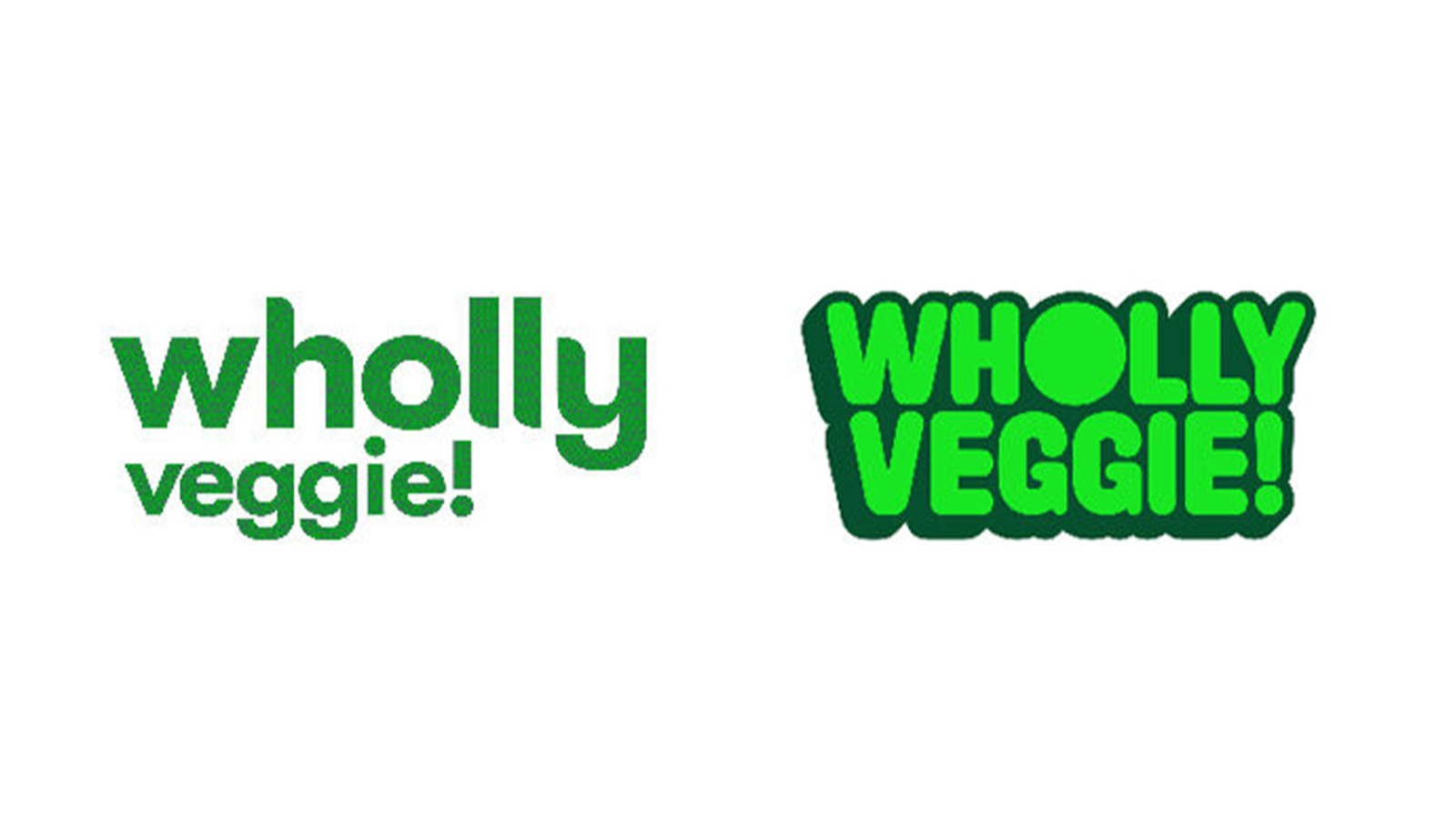
Wholly Veggie
This rebrand, done by Public Address, was the one this year that provoked the strongest reaction at our firm. Established in 2017, Wholly Veggie is a brand of plant-based frozen foods and snacks offering comfort-food-style and snack-friendly products. The previous logo and packaging was well done and was certainly better than what you find with most frozen food brands. That’s why we were rather surprised to see such a huge shift in direction: from building off healthy plant-based ingredients to a focus on the emotion of excitement. While we agreed that design was technically well done and distinctive, the concern was whether this direction would connect with their target consumer. With its bold unnatural colours, tiny photographs and layout that looks more like an album cover than a food package, the package will certainly stand out on the shelves against the competition. The real question is whether consumers will see this approach as communicating “healthy” and “better for you.”

Canada Games
It wouldn’t be a Canadian rebrand year in review if I didn’t include at least one logo incorporating a maple leaf into the identity. Doing something new with that shape is harder than it first appears. Each era of design in Canada seems to adopt its own approach to the maple leaf. From the illustrated versions of the 40s and 50s, as seen in logos like TransCanada Airlines, to the modernist approach of the 60s and 70s that gave us identities like the classic official Canadian Wordmark logo. For the somewhat unfortunate “computer graphics” era of the 80s and 90s, the less said the better – and unfortunately, the previous Canada Games logo was a product of that era. It certainly needed to be updated for the new decade and I think the talented folks at Will Creative did a good job at trying to find an ownable way of representing the maple leaf in a way that still connected back to the previous mark, yet responded to current aesthetic considerations and functional considerations.
John Furneaux RGD
John Furneaux RGD is the Managing Director for the Toronto office of PS&Co Brand Studio, working with good organizations, to unify brand, people and purpose. For over 30 years, John has worked closely with organizations of all sizes — from entrepreneurial start-ups to global leaders. His award-winning experience spans a broad range of brand image and identity programs, as well as the communications and marketing initiatives that bring brands to life. John also teaches at George Brown College in their Design Management Program. He is a Past President of RGD and is an active speaker and contributor in the design industry.
Tag
Related Articles


Yurko Gutsulyak RGD


