Resource List: Data Visualization and Information Design
Written by Anda Lupascu RGD
You may be familiar with this chart….
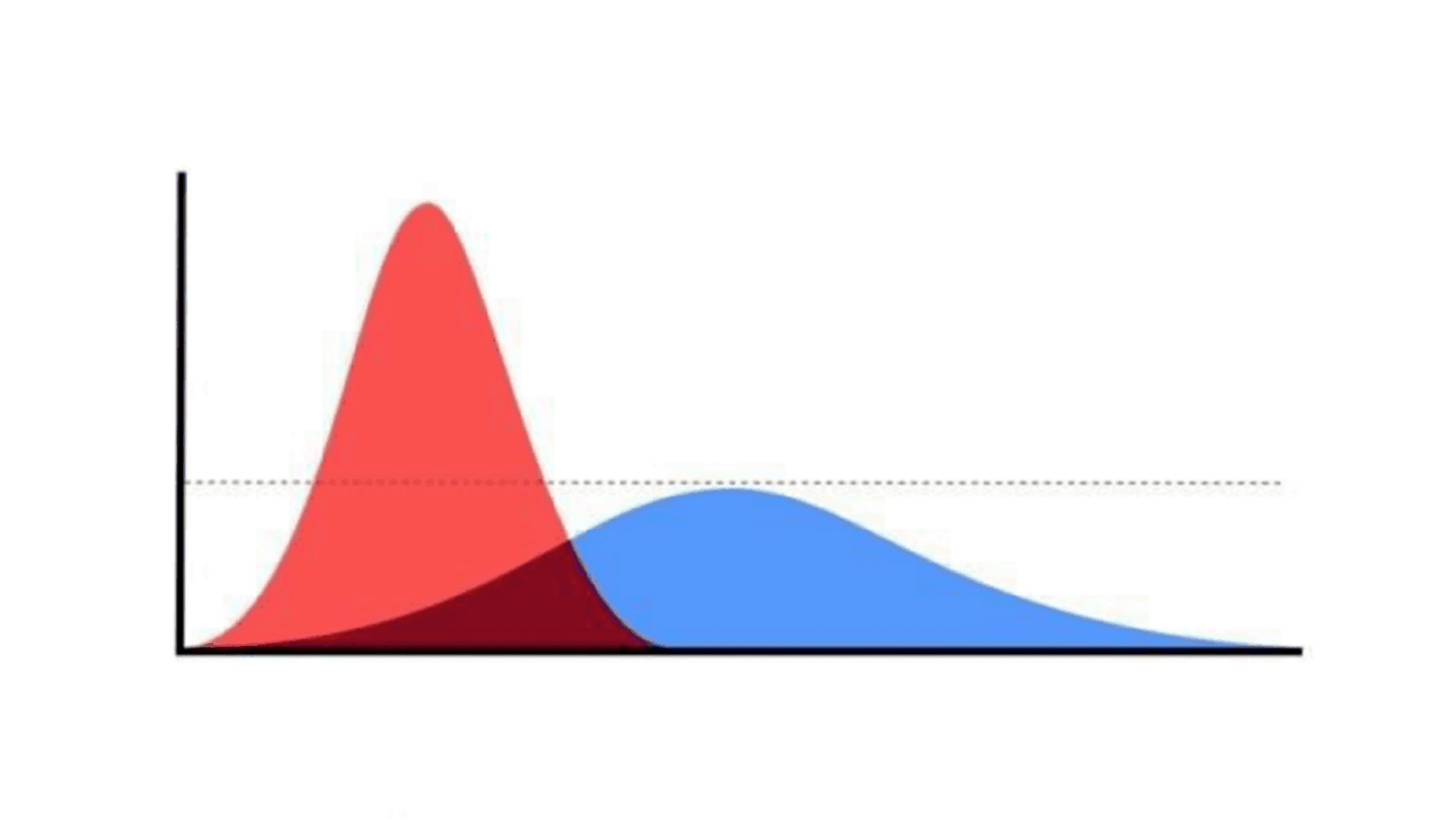
The simple chart has become the ubiquitous symbol of these strange times. It depicts, symbolically, a simple concept - the idea of ‘flattening the curve’ and it works a bit like a riddle. Once you know the answer, it seems pretty obvious. But without seeing the two shapes contrasted against one another, the impact of our required actions (quarantine) was initially, a bit of a mystery.
Charts like this one, COVID-19 dashboards and simplified outbreak explanations (or misleading ones) are just a few examples of the powerful way in which ‘infographics’ or more accurately, datavisualization and information design, have infiltrated our mainstream awareness in the last few months. The unprecedented crisis we are being faced with is quite an abstract one, with an invisible invader that is forcing us to face concepts and ideas that are also quite abstract, certainly intangible, such as ‘flatten the curve’, ‘basic reproductive number’ and ‘the collective good’.
Information Design and its more established cousin, Data Visualization have been lurking beneath the surface of both the design and scientific worlds for quite some time now, but they had not quite broken through to the mainstream. Now, due to our repeated exposure to the data associated with COVID-19, general audiences are becoming more accustomed to seeing information visualizations in their daily lives. One particular individual, aware of the inherent power and authority of DataViz and dubbed ‘the first data visualization president’, has already found ways to squeeze it to his own advantage.
In hopes of being preemptive against such future misuses and more importantly, to give you a glimpse into the very diverse and exciting world of Information Design (beyond the standard graphs and dashboards) this list of resources has been curated to serve as an easy entry point for you, the reader, into this sometimes dense field. Use, peruse and discover at your pleasure:

Some people
Giorgia Lupi is the brilliant intuition behind the concept of data humanism.
Ekene Ijeoma is pushing the boundaries of the forms data visualization can take with projects like, a counting and wage islands.
WEB Du Bois is an exceptional historical figure who, like Florence Nightingale, used early Information Visualization to strengthen his activism and anti-racism work.
Mona Chalabi is a Data Journalist who creates infographics for the people, accessible and relevant.
Some projects
Face of a Nation is a selection of portraits of world leaders, not as you would expect them.
Library of Missing Data Sets highlights that for all the data we have, there is a surprising amount we do not have and the areas where the data is missing are quite instructive.
In case you ever wanted to know, here’s a visual introduction to Machine Learning.
From pandemics to machine learning, visualization is a powerful tool for deep understanding.
Ever wonder what nearly all the books in the western cannon look like? This Ocean of Books might be a good start.
If you really want to geek out, follow the talks that come out of this Finnish conference Visualizing Knowledge, whenever it happens again!

Some Conversations
First Things First with Jessica Bellamy is a fascinating (and short!) chat about the power of datavisualization for community organizing.
Data Stories is a regular podcast about all things data viz. Jovial hosts and great questions.
The Data Visualization Society has a very lively Slack channel to engage directly with the community.
Explore Explain is a YouTube series that deep dives into specific data projects, from methodology to execution.
Some Fresh Content
Datalands is putting out fresh visuals for the land of data, on the reg and staying on their toes.
The #datahumanism hashtag gets regular updates and is of course, open to everyone.
Nightingale is a publication by the Data Visualization Society with regular content, interviews and is open to submissions.
The Pudding explains ideas debated in culture with visual essays. (Wait Buy Why would also classify here).

Some books
Dear Data by Giorgia Lupi & Stephanie Posavec
The NIB magazines by Matt Bors.
Data Feminism by Catherine D’Ignazio & Laurie F Klein (there’s an upcoming discussion)
Am I overthinking this? By Michele Rial
Information Anxiety by Richard Saul Wurman
Certified and Provisional Members who are interested in contributing content to the RGD website via Resource Lists, Top 5s and more are invited to email Rushika Shah at pr@rgd.ca.
Tags
Related Articles


Rupsha Mutsuddi Associate RGD
Sponsored


