Top 5 Innovative Wine Packaging Designs
Written by Yurko Gutsulyak RGD, Gutsulyak.Studio
Wine label and packaging design is among the most inspiring creative fields, allowing designers to push boundaries and turn branding into pure artistry.
Much like winemaking itself, great design captures deep human emotions and offers a refined sensory experience. Today, the range of implemented creative concepts in wine packaging is astonishing, making this industry highly competitive.
Beyond striking visuals and unique shapes, designers impress audiences with unconventional materials for labels, such as wood, cork, mirror, metal and fabric. Some bottles are even coated with paint, gold, sand, wax or marine growth. However, most of these ideas have been repeated over time and are not unique. As a designer, I believe true innovation is the essence of great design. It’s what inspires me and drives my work at Gutsulyak.Studio, where I strive to create something new rather than follow trends.
Here is a list of five one-of-a-kind extraordinary wine packaging projects that ignite my creative energy.
Nine by Backbone Branding


This design masterfully combines label design with architecture. The bottle represents the earth, its uneven surface mirroring natural landscapes, while geometric concrete forms emerge like buildings. The two concrete pieces also shape the number 9, reflecting the client’s logo. Produced as a limited series for an architecture firm, this concept challenges traditional materials and offers a striking balance of simplicity and amusement.
Umeshu The Amber by P.K.G. Tokyo


Inspired by traditional kimono patterns, this label design features intricate cutout lacework made from Japanese paper, covering most of the bottle. Beyond its cultural significance, the concept highlights delicate beauty and craftsmanship. The precision of the production process and the bold emphasis on noble fragility make this project stand out in the world of wine packaging.
Six Three Estate Echizen by PLANE co.


Many designers have experimented with wine bottle shapes and their connection to the region of production, but this project takes it to another level by redefining both form and ritual. Made from ceramic in one of Japan’s oldest kilns near the winery, the bottle is instantly recognizable—even without a label—thanks to its extraordinary silhouette. The design extends the concept of terroir beyond the grapes, incorporating the very soil of the region into the packaging itself. This seamless fusion of tradition, craftsmanship and innovation makes it a remarkable example of authentic, place-based design.
Piquentum by Studio Sonda

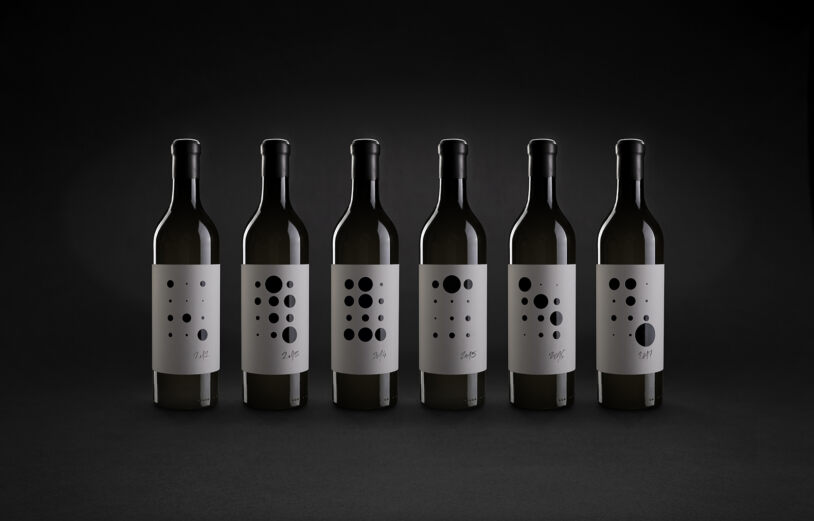


This minimalist design integrates science with branding. Collaborating with the Croatian Meteorological and Hydrological Service, the studio created labels that feature precipitation charts for the vineyards each year. Since weather influences grape quality, the infographic provides a unique glimpse into how climate shapes the wine’s character. Beyond its striking contemporary aesthetic, the design educates consumers about nature’s role in winemaking.
Crate by Denomination
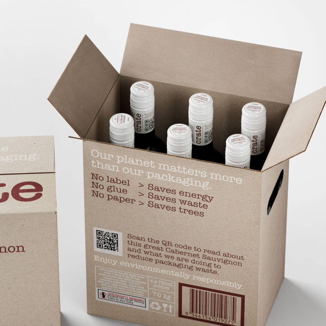


This project redefines sustainability in wine packaging. Instead of a traditional label, all required information is printed on the capsule, with a QR code for additional details. The bottle is made from transition glass—produced when manufacturers shift between glass colours, typically resulting in discarded material. This bold, thought-provoking design reduces waste and sparks a conversation about sustainability in the industry and carbon print.
These five projects prove that wine packaging is more than just branding— a fusion of art, culture and innovation. They push boundaries, challenge conventions and remind us that great design, like great wine, is constantly evolving.

Yurko Gutsulyak RGD
Gutsulyak.Studio
Tag
Related Articles


Yurko Gutsulyak RGD


Sponsored


