Exploring national identity through design: Yurko Gutsulyak's Blue-Yellow Series
Interview with Yurko Gutsulyak RGD, Gutsulyak.Studio
Few projects in graphic design capture the essence of cultural identity as poignantly as Yurko Gutsulyak's Blue-Yellow Series. This collection of silkscreen-printed posters offers a masterclass in how design can be a powerful tool for exploring and expressing national identity, especially during times of significant societal change.
Yurko Gutsulyak RGD, a Ukrainian-born designer now based in Toronto, has built an impressive career spanning two decades. His work with Gutsulyak.Studio, which he co-founded in Kyiv, has earned over 100 international awards, including the prestigious Red Dot, European Design Awards, Epica Awards, Pentawards, Dieline Awards, Communication Arts and Graphis. Now, with the Blue-Yellow Series, Yurko demonstrates how branding principles and visual communication can be applied to explore deeper national identity and resilience themes.
The Blue-Yellow Series ingeniously deconstructs the colours of the Ukrainian flag using a blend of technical expertise and cultural insight. From representing the wavelengths of light to depicting chemical compositions of pigments and sign language gestures, each poster in the series offers a unique perspective on how the combination of colours and their meanings can be translated across different mediums.
The series revolves around a premise: "When no colours are left, the Ukrainian flag is still waving." This idea probes the persistence of national symbols and identity, even when reduced to their most abstract form. It showcases how design can transcend aesthetic appeal to convey nuanced concepts and stir emotional responses.
The interview was conducted by Violetta Petrova of Saint Volodymyr Institute (SVI). It will help you delve into Yurko's creative process, exploring how his experiences as a designer working across different cultural contexts have shaped his approach to this deeply personal project.
Highlights from Reception Evening
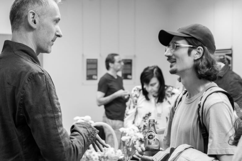
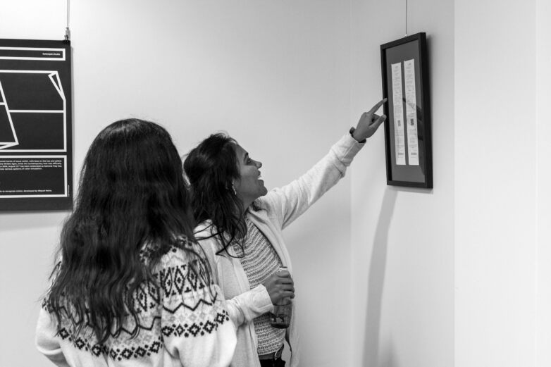
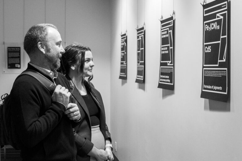
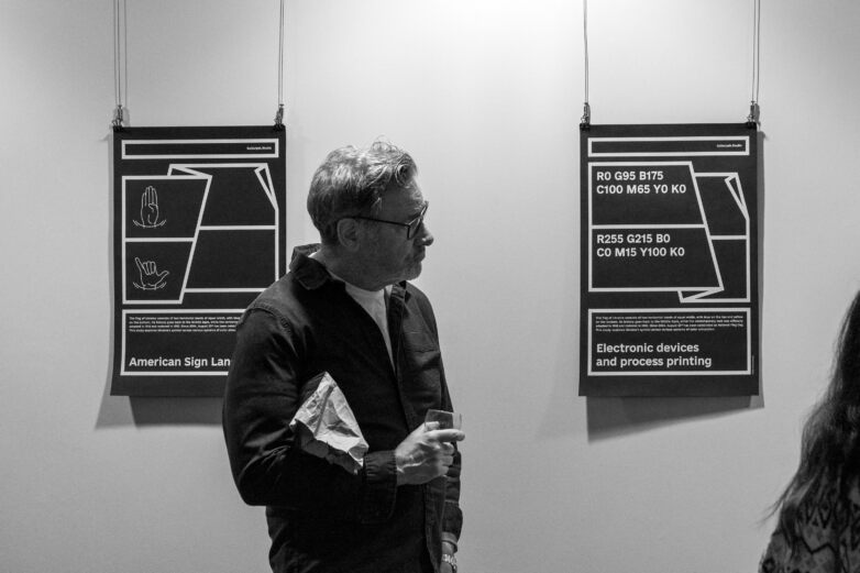
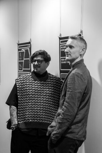
When did your immigration journey begin? Has it influenced your work?
Yurko: I arrived in Toronto in 2017, so I've been here for seven years now. The idea of moving to Canada wasn't really about immigration; it was about gaining new experiences. I had worked in Ukraine for a long time, and my sister and I founded our own design studio in Kyiv in 2005. After working in Ukraine for a while, I wanted to gain some international experience and see how the design industry, specifically graphic design, functions in the West and in other countries.
I have travelled extensively in Europe and the United States, but living somewhere is quite different from visiting for a short time for a conference or meeting. That's why I thought it would be valuable to live in another country, work there, and observe how graphic design operates overseas.
Violetta: I'd like to talk more about the Blue and Yellow Series. Generally, your studio work is focused on brand identity, but this project seems different. The Blue-Yellow Series of posters explores Ukrainian identity through individual interpretations of state symbols, particularly the flag. The series is presented as an artworks collection, as opposed to design.
How did the idea of working on the art project come about?
Yurko: Branding and packaging design have been the main activities of our studio since 2005. However, we have also initiated many self-initiated projects. These go beyond commercial design and aim to showcase the possibilities of design, demonstrate a unique perspective, or inspire others in the industry. They are meant to popularize design, so they often cross into the realm of contemporary art. The Blue-Yellow Series is one of these projects.
The idea came to me a long time ago. For years on social media, I posted short messages on Ukraine's Independence Day, using various schemes and formulas to represent the Ukrainian flag. This year, I decided to turn that into a series of artworks.
I chose the poster format as the medium. I gathered the most interesting ideas and felt that the current moment, especially given the war, made this project particularly relevant. First, we are celebrating the anniversary of Ukraine's flag and second, with the war, I've noticed a heightened sense of national identity among Ukrainians. People around the world, wherever they are, have become more attentive to whether others display the Ukrainian flag in support. They consciously or subconsciously look for this symbol. Additionally, Ukrainians now recognize even just the combination of blue and yellow in the world around them. Early in the war, there were a lot of advertisements in Western countries that used blue and yellow, often unrelated to Ukraine, but the combination became a trend. I liked the idea of this search for identity through the recognition of these colours, which led me to develop this project.
I wanted to explore these colours beyond just visual perception, trying to engage with them intellectually or emotionally. The slogan of the series is, "When no colours remain, the Ukrainian flag still flies." This reflects the tragedy of the war—many people have metaphorically lost the ability to see colours because their world has been irreversibly changed. It's impossible to return to the way things were before the war. Many now live in a metaphorical black-and-white world.
Yet, even in this grayness, the Ukrainian identity persists, symbolized by the continued presence of the blue and yellow flag. Currently, the series consists of six posters, but I have more ideas, and the series will likely expand in the future.
Would you like to explore other mediums for this project?
Yurko: Yes, because there are many ways to represent colour, far beyond what I've done so far.
Violetta: What you just said about a heightened sense of national identity resonates. My eye has been trained to recognize blue and yellow. There's even an Instagram page called "I see UA flag everywhere" that became popular after 2022. It's an archive of reposts of people's photos spotting random blue and yellow objects together—completely unrelated to Ukraine, but people still gravitate toward it.
Yurko: Yes, and there are several such groups on different platforms. These archives are growing with an enormous amount of visual information featuring blue and yellow.
Violetta: But your series is black-and-white. Every colour carries emotional weight, and black-and-white is a prism through which many Ukrainians now view the world, especially in the last two or three years. At the same time, it broadens the ways we understand Ukrainian identity, with or without colour.
Yurko: Metaphorically, it's like searching for a new Ukraine, a country that now touches every aspect of human life and is present everywhere. It's a vision of a future Ukraine.
As a designer living in Toronto, do you feel a certain responsibility to talk about Ukraine in your work? Is it important for your practice?
Yurko: Absolutely. I think it's incredibly important, and it's something I've consistently done while I've been here. It's important because Canada has a significant Ukrainian population, and Ukrainians have contributed greatly to this country. Every wave of immigrants brought something valuable — whether they were laborers or intellectuals, they all made important contributions to Canada's development.
However, I find it unfortunate that Ukrainian culture remains niche here. It's not integrated into the national cultural scene nearly enough. Despite the large number of Ukrainians or people of Ukrainian descent, they know very little about Ukrainian art. If they do, it's usually the classic folk art that was established decades ago. They lack awareness of how it has evolved or what's new in Ukrainian culture.
I want to fill that gap. I know I can't do it alone, but I make the effort to introduce contemporary Ukrainian design and art to Canada, to highlight Ukraine's place in the world and in people's hearts. We need attention, we need support and we have something to offer in return.
What were your impressions when you arrived here? What did people think of Ukraine, and was it different from your perception of Ukraine?
Yurko: The move to Canada gave me a lot to think about. When I relocated, I began to see both Ukraine and Ukrainian culture, as well as Ukrainian design, differently. When you're inside something, you have one perspective, but when you can look at it from a distance and compare it in a different context, your perspective changes. This change doesn't mean it's necessarily negative or positive—it's just different. You start seeing things from a more global perspective.
I was able to assess Ukrainian culture within the framework of global culture and compare it with other cultures, especially in a country like Canada, which positions itself as multicultural. You realize how important the contribution of Ukrainian culture is. You also start to understand how to communicate Ukrainian culture more effectively because there are, of course, cultural differences, different traditions and even different cultural policies between countries.
Often, the approaches that Ukrainians find relevant in Ukraine don't work in Canada, the U.S., or the Western world. Each country requires its own approach, not just in terms of how to get attention but also how to genuinely engage local communities with something Ukrainian.
How has this exhibition been received so far?
Yurko: This is the first time these works are being exhibited. They were created and presented in August — just a month ago — so I haven't had much time to gather feedback. The responses I've received so far have been positive. People appreciate the complexity and depth of the concept. Those who have responded to the exhibition did so because it's largely intellectual — it's an exhibition meant to provoke thought, to give people something they can continue to unravel over time. It's not just a series of images to look at and forget.
How do you think we, Ukrainians living in Toronto, should communicate with international audiences to draw attention to us?
Yurko: First and foremost, we need to be modern and relevant to the contemporary world. We need to be open and communicate extensively with the local audience, not just the diaspora or recent immigrants, but primarily with locals. We should try to engage through cultural channels, perhaps even participate in national festivals or events. This will make us visible, and once Ukrainian culture becomes visible, we can then shape our messages more effectively.
Do you have any ideas for future exhibitions? You mentioned wanting to evolve and expand this exhibition. How do you envision that?
Yurko: It's not so much about expanding this particular exhibition—it's self-sufficient as it is. It's currently being shown here at Saint Volodymyr's Institute, but perhaps after the exhibition concludes, I could bring it to other locations. I'll do my best to invite as many people here as possible, but there are specific venues where locals, particularly Canadians, go, and I'd like to bring the exhibition to such places.
Regarding expanding it, this exhibition is called the "Blue-Yellow Series," and as I mentioned, there are countless ways to represent the Ukrainian flag. Over time, I'll add new pieces, but that doesn't mean the exhibition is incomplete or needs expansion. It's primarily about representing the Ukrainian flag without physically showing the colours—it's about interpreting the concept of colour.
One last question: What role do you think designers and artists have in the current crisis in Ukraine during the war? What goals should artists set for themselves?
Yurko: The only goal is to be visible, to make Ukraine visible. Since you're asking about creative people, artists—our role is to make Ukraine visible through culture and art. It's about using soft power to promote Ukraine.
Many Ukrainians have already realized that communicating about Ukraine through pain doesn't work as effectively in the West because it tends to push people away and create barriers rather than fostering understanding or empathy. Instead, we need to speak to the world through the value of our country's contribution to the global cultural heritage.
Experience the intersection of colour and sound with our Blue-Yellow Playlist, a curated collection of 12 songs that explore the emotions and associations of blue and yellow—six songs about blue colour and six songs about yellow colour.
Listen now: https://open.spotify.com/playlist/3Y2IF0bQ7caKazJFblf2SM?si=7pxHr42aQc2nTgQa500MFg&pi=u-WiMcvD5XRmiY.

Yurko Gutsulyak RGD
Gutsulyak.Studio
Yurko Gutsulyak is an accomplished design wizard with over 20 years of mastery in the field. He is the Creative Director and Co-Founder of the award-winning Gutsulyak.Studio, globally known for its exquisite design, focused on identity and packaging. Yurko Gutsulyak's expertise and success led him to launch the studio in North America and Europe, operating between New York, Toronto, and Kyiv. Gifted with an inventive mind, Yurko Gutsulyak has taken part in creating hundreds of unique projects that have earned over 150 reputable awards, including Red Dot, European Design Awards, Epica Awards, Pentawards, Dieline Awards, Communication Arts, and Graphis. He is also a passionate advocate for pushing the art world's boundaries, sharing his insights and inspirations through articles, talks, and workshops. His interviews have been published in leading print design magazines, including Novum (Germany), idPure (Switzerland), +design (Greece), idN (Hong Kong), telegraf (Ukraine), Font (Czech Republic), and Brand (China). Countless others have appeared in digital media. His expertise and achievements have earned him a place as a respected design judge in the United States, Canada, Ukraine, Poland, Slovenia, South Korea, Taiwan, and other countries. Additionally, several of his iconic works have been exhibited in museums around the globe.
Tag
Related Articles


Yurko Gutsulyak RGD, Rachael Seatvet RGD, Preet Soni Associate RGD, Liz Wurzinger


