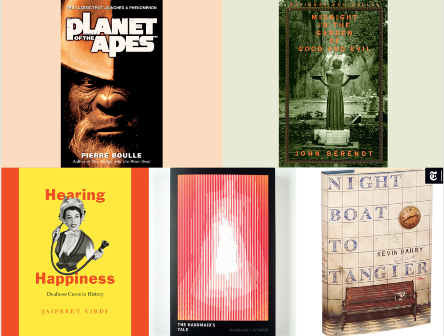
Top 5 book covers that define creativity, contrast and connection in design
Written by Wendy Tabor RGD
You've probably heard the saying, "Never judge a book by its cover." It comes from George Eliot's The Mill on the Floss (1860) and was popularized in the 1940s by Lester Fuller and Edwin Rolfe. But as graphic designers, judging is what we do! We're curious interpreters of all forms of visual language.
Books, which are one of our earliest introductions to design, are no different. The books on this list span genres and eras, but all utilize strong design elements to connect with readers without spoilers.

Hearing Happiness by Jaipreet Virdi
Hearing Happiness has an electrifyingly bright cover! Isaac Tobin, the designer, nails the balance by using contrasts without making it overwhelming. The bright yellow beckons you to the shelf, while the black-and-white vintage illustration hints at the depth of history inside the book's pages. The bold sans-serif title anchors the type hierarchy, leading the eye to the subtitle, author and review, while white space and smart sizing keep the yellow from overpowering the design. It's an example of how contrast and white space work well together in a limited space.

Midnight in the Garden of Good and Evil by John Berendt
Sometimes, all it takes is one unforgettable photograph. Carol Devine Carson's cover image for Midnight in the Garden of Good and Evil features the Bird Girl statue from Savannah's Bonaventure Cemetery, capturing the Southern Gothic mood. Muted green tones against the high-contrast serif typeface and the balance of the statue amplify the symmetrical layout. Though many interpret the statue's arms as symbolizing good and evil, the bowls were intended for water and food for children and birds. The eerie ambiguity and common misinterpretation reflect the blurred lines of the story. Fun fact about the impact of literature and design: This book and the cover, in particular, brought so much attention to Savannah, Georgia, and this statue that it became known as "The Book" to locals.

Planet of the Apes by Pierre Boulle
Designed by David Drummond for Restless Books, this Planet of the Apes cover shows how minimalism can pack an emotional punch. The custom distressed sans-serif type, reminiscent of Bebas Neue, sets a raw, uneasy tone that echoes the story's primitive themes. It also worked well for the North American version of the story used in the films from the 1960s and 70s, as well as later books, creating visual continuity for French and North American audiences. The contrasting, sepia-toned, angled close-up of the ape soldier dominates the layout, casting long shadows that suggest control and intimidation. The sepia tone hints at the golden hour, otherwise known as the "dawn of a new age" ruled by apes. Through posture, shadow and isolation, the design evokes a sense of fear. Bold contrast and simple composition prove that restraint often makes the strongest statement.

Night Boat to Tangier by Kevin Barry (2019 Canongate/Hardcover)
Night Boat to Tangier, designed by Jon Gray for Canongate's 2019 hardcover, demonstrates how atmosphere can effectively convey the emotion of a story through its cover. The full-bleed photo of a weathered wall and empty bench perfectly captures the novel's setting, where two friends wait for the daughter while confronting their pasts. Earthy tones and rough textures reflect their emotional and moral wear without the need for humans on the cover. The absence of people invites readers to imagine the characters for themselves, complementing the author's ability to create fully-realized personalities with just a few words, which is a skill few writers master. The rough typography reinforces the mood of fatigue and strains of time, much like graffiti in an alley. This cover is a powerful example of how tone, texture and restraint can speak as loudly as the story itself with few words.

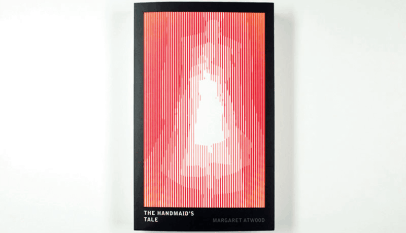
The Handmaid's Tale 1988 UK Vintage Futures edition
This edition of The Handmaid's Tale, designed by Penguin's team, is one of the most experimental covers I've seen. Created as part of Penguin's short-lived 1980s series, this edition was meant to be an experience. It includes a removable lenticular acetate sheet tucked into the back, which overlays the front cover to reveal Gilead's female castes of Handmaids, Wives and Marthas in warm reds and oranges, adding symbolic depth and tactile interaction. The design is sharp and intentional: a heavy black border suggests containment and control, echoing the novel's themes, while the back features a spiky black-and-white pattern and the quote, "What I must present is a made thing, not something born," alluding to Offred's story and the artificial world she inhabits. Clean, carefully-kerned sans-serif typography reinforces the structure without distracting from the striking visual concept.
I was thrilled to find a copy of the novel with this cover in a used bookstore, and I was even more excited to find that the acetate sheet was still attached to the back! It sits on my bookshelf with pride of place.
These five covers demonstrate how much design can do when given space to convey the story. Whether through bold typography, unexpected materials or a quiet use of space and tone, each one goes beyond simply looking good. They invite the reader to feel something before the first sentence is even read. From the gritty realism of Night Boat to Tangier to the interactive lenticular overlay of The Handmaid's Tale, these designs prove that a cover can carry meaning, mood and even moral weight.
For designers, this is a reminder that great book covers aren't just decorative; they also serve a functional purpose. I've always believed function is key in design, and book covers are a great example of creativity used purposefully. They set the tone, hint at the theme and sometimes even challenge the reader to think more deeply about the subject. The best covers don't just wrap the book; they become part of the experience. So experiment. Play with materials. Consider the physicality of the design. When form and content work together, a cover can be just as memorable as the words inside.

Wendy Tabor RGD
Do you know the expression, "Variety is the spice of life?" I continue to live by that every day. Since 2014, I have explored the many beautiful facets that graphic design, instructional design, and marketing have to offer.
I have created a space for myself through generalism in highly regulated industries like finance, healthcare, and technology. Working in these kinds of industries, I have learned the unique art of taking highly technical information and translating it through visuals into engaging material that many people can understand.


