Heuristic analysis in UX audits
A practical starting point for designers

Is there anything more wonderful than the opportunity to do a full website redesign?
Okay, sure—maybe a crisp autumn bike ride with friends or attending DesignThinkers. But when it comes to projects that land on your desk, a full website redesign is about as good as it gets. It’s a rare chance to rethink the user experience from the ground up, push creative boundaries and bring a fresh vision to life.
Unfortunately, not every project comes with that kind of freedom.
Recently, I worked with a client frustrated with their site’s performance. The site was only two years old, and they knew a full redesign was out of reach so I suggested a UX audit.
Rather than assuming everything was broken, we took a focused look at usability. Through heuristic analysis, we uncovered small but critical issues—friction points, inconsistencies and missed opportunities—that were likely undermining performance. The audit gave the team a clear list of priorities: quick fixes to improve the experience now, plus evidence to support a case for future redesign work.
While a UX audit doesn’t replace user testing, it’s a cost-effective way to surface usability issues and heuristic analysis, in particular, provides a structured, practical framework for evaluating design decisions.
What are heuristics?
In the early 1990s, Jakob Nielsen, a prominent usability consultant and researcher, formulated a set of general principles for user interface design based on extensive research. His 10 heuristic principles have since become foundational in the field of UX.
Nielsen’s 10 heuristics include:
1. Visibility of system status
The system should always keep users informed about what is happening through appropriate feedback within a reasonable time.
Example: Imagine submitting a form and... nothing happens. No loading spinner, no confirmation message, just silence. You’re left wondering, did it go through? Should I click send again? A simple “Your submission was successful.” can instantly reassure the user and keep them in the loop.

2. Match between system and the real world
The system should use language, concepts and visuals that are familiar to the user, following real-world conventions.
Example: When you want to delete a file, you shouldn’t have to decode a cryptic icon or wonder what “remove instance” means. A trash can icon paired with the word “Delete”? Instantly clear. Real-world metaphors help users feel at home.

3. User control and freedom
Users should have the ability to undo, redo or exit actions easily, allowing them to recover from errors.
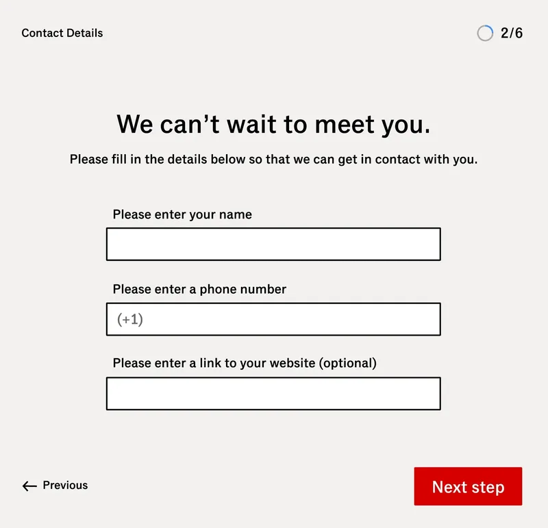
Example: You’re halfway through signing up for a service when you realize you typed the wrong email in step one. Without a “Back/Previous” button, you’re stuck or worse, you have to start over. Giving users control helps them feel confident, not trapped.
4. Consistency and standards
Users shouldn’t have to guess whether different words or styles mean the same thing. Consistent language and UI patterns help build trust and reduce confusion.
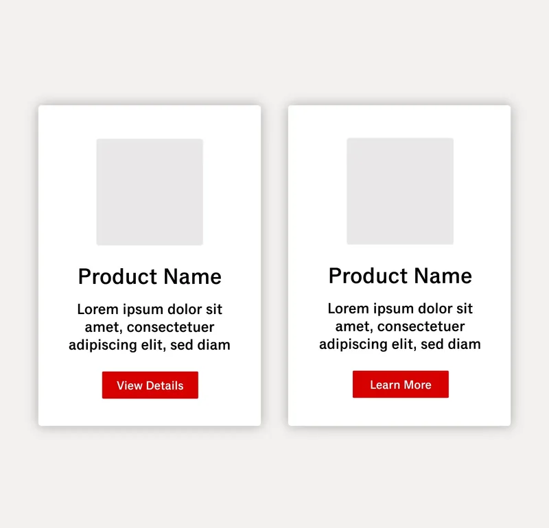
Example: You’re browsing a site and see a button labelled “View Details” on one product card. Next to it, a similar-looking card says “Learn More.” Same shape, same context, slightly different wording. Are these buttons doing the same thing? Should you expect a different result? Small inconsistencies like this add up, forcing users to slow down and second-guess what should be obvious. When labels and patterns stay consistent, users can move confidently through your site.
5. Error prevention
Design should prevent problems by offering clear instructions and confirmation options before users commit to actions.
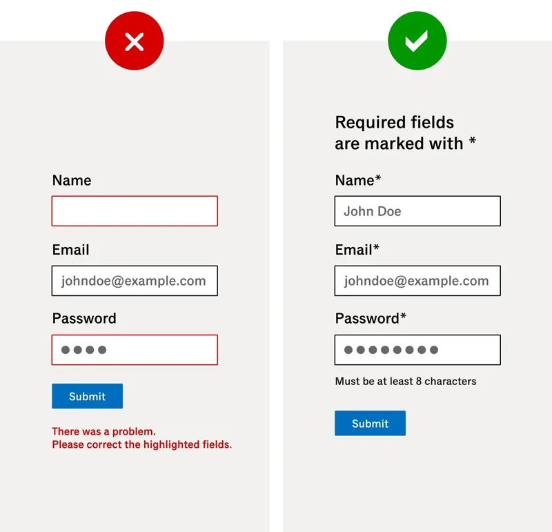
Example: You’re filling out a form and click “Submit,” only to be met with an error message: “There was a problem. Please correct the highlighted fields.”—frustrating! Now imagine the same form with clear, upfront instructions: required fields marked with asterisks, the password field labelled “Must be at least 8 characters” and helpful hints that appear as you type. By making expectations clear before submission, the design helps users avoid errors altogether, saving time, frustration and form abandonment.
6. Recognition rather than recall
Minimize the user’s memory load by making objects, actions and options visible. Users should not have to remember information between different parts of the interface.
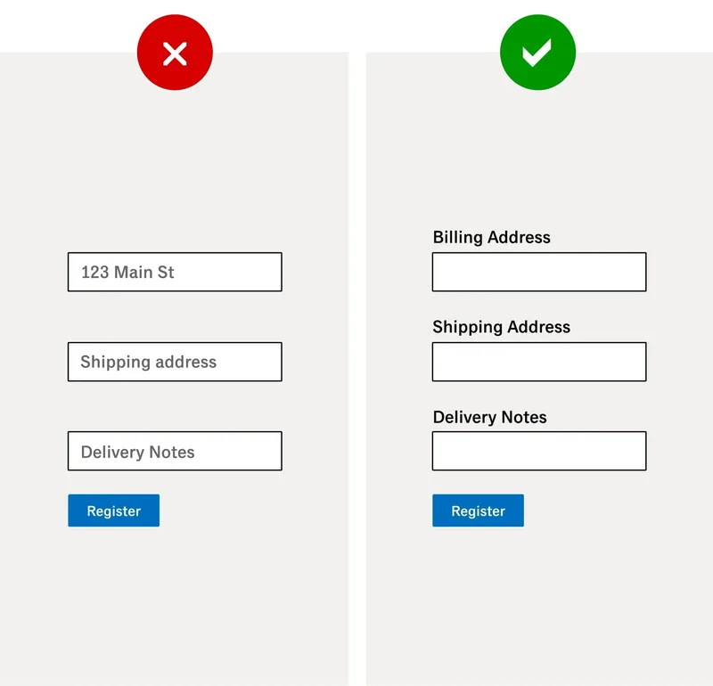
Example: You’re filling out a form. You start typing and—poof—the placeholder text disappears. A few fields in, you're second-guessing: Was this meant for the delivery address or billing? When labels are placed outside the fields rather than inside the fields, they stay visible, reducing confusion and uncertainty.
7. Flexibility and efficiency of use
The system should cater to both novice and experienced users by providing shortcuts and customization options for frequent actions.
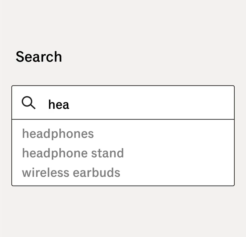
Example: You visit your favourite online retailer to find a new set of headphones. As you start typing into the search bar, the system predicts what you're looking for. You spot the item instantly so no need to finish typing or navigate through menus. Small conveniences like this may seem minor, but they go a long way to streamlining the experience.
8. Aesthetic and minimalist design
Interfaces should not contain irrelevant or rarely used information, as every extra unit of information competes with relevant content.
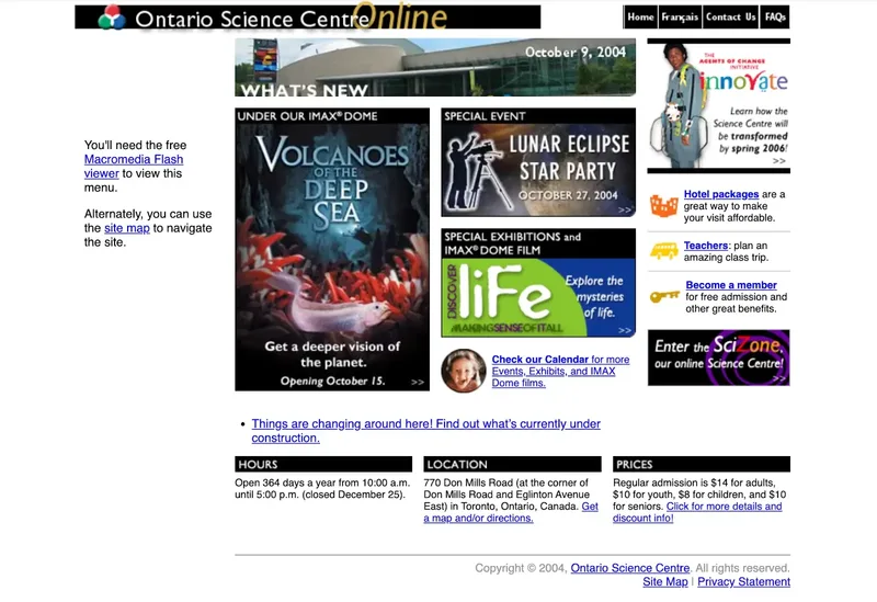
Example: Compare the Ontario Science Centre website in 2004 to its 2025 redesign. The earlier version overwhelms with visual clutter: numerous banners, clashing font styles and a dozen or so blue hyperlinks all competing for attention. With little visual hierarchy, it’s hard to know where to start.
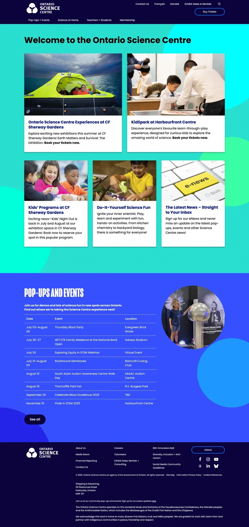
Fast-forward to 2025, and the experience is completely transformed. The modern design is clean and focused, using consistent typography, ample whitespace and thoughtful hierarchy to guide the user naturally. By removing distractions and simplifying the layout, the interface makes navigation and discovery much easier.
9. Help users recognize, diagnose and recover from errors
Error messages should be expressed in plain language, indicating the problem and suggesting a solution.
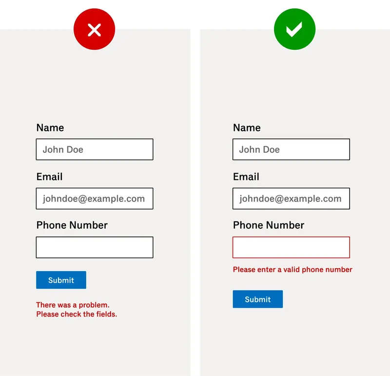
Example: You hit “Submit” on a form, and a vague error message appears beneath the button: “There was a problem. Please check the fields.” No clue what went wrong, no direction on how to fix it. Now imagine instead: the phone number field is outlined in red with a clear message, “Please enter a valid phone number.” Instantly, you know what the issue is and how to correct it. Clear, contextual error messages reduce frustration and help users recover quickly.
10. Help and documentation
The system should provide easily accessible and concise documentation to help users understand tasks or resolve issues.
Example: You’re entering your credit card details during checkout and see a field labelled “CVV.” You’re not sure what that means. On one site, there’s no explanation, just an error message if you get it wrong. On another, a small icon next to the field shows a tooltip when hovered: “3-digit code on the back of your card.” That tiny bit of built-in help.

So how do these principles go from theory to practice? Through a process called heuristic analysis.
What is a heuristic analysis?
The Interaction Design Foundation defines a heuristic evaluation as “a process where experts use rules of thumb to measure the usability of user interfaces in independent walkthroughs and report issues. Evaluators use established heuristics and reveal insights that can help design teams enhance product usability”.
One of the key benefits is that it is often far less resource-intensive than other forms of UX evaluation, such as user testing, A/B testing, focus groups and interviews. While it does not replace these methods, it serves as an essential starting point by identifying potential usability issues early in the design process.
For organizations with limited budgets or constrained resources, conducting a heuristic analysis can be a cost-effective alternative. While it may not capture the full spectrum of user behaviour, a well-executed heuristic evaluation is far better than doing nothing, allowing teams to identify and address critical usability issues before they escalate.
In fact, it often acts as the first step in many of these more extensive endeavours, helping UX practitioners:
- Prioritize issues for further testing: Pinpointing high-impact usability problems that should be validated or explored through additional user research.
- Identify quick wins: Highlighting low-hanging fruit—simple, high-value improvements that can be implemented immediately.
- Define hypotheses for A/B testing: Formulating hypotheses based on identified pain points to test with real users.
- Inform user testing protocols: Guiding the development of test scenarios and interview questions by focusing on areas of concern.
By surfacing usability challenges early, heuristic analysis empowers design teams to kickstart optimization efforts with clarity and confidence. It helps teams make informed decisions, prioritize next steps and refine their digital products more efficiently—often before investing in more resource-intensive research or development.
In part 2, we’ll cover how to run a heuristic analysis step by step, how it fits into a broader UX strategy, and how it can guide deeper research and optimization—helping teams build stronger digital experiences from the ground up.

Aaron Neilson-Belman RGD
Brafton Inc.
Since 2010, I’ve been working with clients and teams to strategically develop and communicate their brands on the web. My expertise lies in leveraging user research, data analysis, and design thinking—combined with a deep understanding of UX principles and web best practices—to drive brand growth and digital performance. I’m fueled by a passion for exploration in all aspects of my work, deriving deep satisfaction from understanding and meeting user needs. Just as importantly, I find great purpose in mentoring colleagues—offering guidance, sharing knowledge, and fostering a culture of curiosity and continuous improvement.

Ana Juarez Associate RGD
The Walrus
I’m a multidisciplinary designer based in Toronto, born and raised in Mexico City. A true believer in lifelong learning, a cinephile, book lover and a swimmer at heart. I have a Master’s in Arts and Design specializing in Visual Communication and Design from the National Autonomous University of Mexico (UNAM). After freelancing for over six years, I made the move into the publishing industry and have since worked with Penguin Random House Canada, and Harlequin / HarperCollins Canada. These experiences deepened my love for editorial design. I’m currently a Designer at The Walrus, where I get to work across a range of projects—including digital and motion design, editorial design, typesetting, marketing campaigns, and editorial illustration.

