
Associate RGDs receive grants to attend DesignThinkers 2026 in Toronto

Seven Associate RGD Members were selected this year by sponsoring studios to receive DesignThinkers Toronto Development Grants, chosen for the strength and ambition of their submitted work.
Each recipient receives free registration to DesignThinkers Toronto 2026 and money to help cover travel and accommodation costs. Their work will also be highlighted on the main stage screens during conference breaks.
This year's grants were awarded with the support of sponsoring studios, with a shared commitment to nurturing emerging design talent across Canada.
Thank you to this year's Grant Sponsors: Cinnamon Toast, Davis, Fusion, One Twenty Three West (123w), Pixels and Pencils, Pound & Grain and Razor.
Below, we share the submitted work of our recipients:
Alessandra Alas Associate RGD
Project: Monsaic Chronic Illness Management Application
Grant Sponsor: Fusion


Monsaic is a branded, youth-first companion app that helps young Canadians manage chronic illness alongside significant mental health demands. Roughly half of Canadian adults live with at least one major chronic disease, and the app was designed for digitally fluent people in their late teens, twenties and early thirties navigating education, early careers and the shift from pediatric to adult healthcare. Highly customizable and easy to navigate, Monsaic lets users journal symptoms, energy and mood in a few clicks, organize health paperwork and care teams, and generate a templated PDF summary to bring to appointments. The app detects patterns in the data users log and sends reminders for appointments and prescription refills. Its bold pink and burgundy palette, softened by calmer complementary tones, aims to make users feel respected and empowered without being defined by their illness.
Preview the Monsaic project here
Becca Lowe Associate RGD
Project: Sled Island 2026
Grant Sponsor: Pound & Grain


Sled Island is a five-day, multi-venue music and arts festival held each June across Calgary's Beltline, championing emerging artists and encouraging festival-goers to discover both new music and the city itself. Each year the identity needs to feel distinct while staying recognizable, so rather than using literal imagery tied to any one genre or stereotypically Albertan visuals, the 2026 system leans into an abstract visual language: bold custom hand-lettering, vibrant colours and interconnected shapes bursting with kinetic energy that represent the pockets of music and art waiting to be discovered across the city. The connections between the shapes reflect the sense of community between Sled attendees and artists. Built out into a flexible identity spanning digital and print collateral, the 2026 campaign helped the festival sell out completely for the first time and draw its highest attendance in its nineteen-year history.
Priya Shukle Associate RGD
Project: Your Ability, Your Way
Grant Sponsor: Davis


AdaptAbility is a small, local accessibility products retailer in Calgary whose limited budget and reliance on inconsistent Canva templates were undermining brand recognition, leaving its University District storefront looking sterile and easy to walk past. Site visits confirmed the problem: passersby weren't sure what the store was, with some mistaking it for a sports or medical retailer. Rather than a full rebrand, the response was a tiered, illustration-led system designed to roll out in stages within the store's real budget constraints, starting with social media templates and building toward window vinyls and an exterior mural. A modular cast of illustrated characters, each individually detailed to reflect the diversity of AdaptAbility's customers, can be placed independently or in groups across every application. The tagline "Your Ability, Your Way" pairs with the retailer's existing teal and navy colours and wordmark, offering a simple, welcoming way into the brand's mission of supporting independence for people of all abilities.
Kevin Mai Associate RGD
Project: Re:IGNITE Creative Technology Awards
Grant Sponsor: Razor


Re:IGNITE is SAIT's Creative Technology Awards, a 260-person event bringing together three academic programs to celebrate student work each year. The event had previously required a full rebrand annually, since there was no system separating a lasting institutional identity from each year's specific campaign, and awareness of the event was uneven across the three programs it served. Chosen from a cohort of design students to lead the visual identity, the designer built a two-layer brand architecture: a master identity called The Prism, built around the metaphor of students entering SAIT as raw potential and graduating having refracted that potential into a visible spectrum, paired with an annual campaign layer that can shift from year to year without touching the underlying system. Beyond posters, signage, digital screens and ticketing, the designer identified an awareness gap between programs and independently developed an email flyer and printed pamphlet to reach students in the two programs least familiar with the event. The system was approved without major revisions and helped drive more than 260 attendees and over 100 student submissions.
Preview the Re:IGNITE project here
Lucy Pan Associate RGD
Project: A Wolf is A Wolf
Grant Sponsor: Cinnamon Toast


A Wolf is a Wolf began as a class assignment to design a proposed film festival identity for Metrograph, an independent cinema in New York, for a festival of twentieth-century Japanese animated shorts drawing on war, folklore and mythology. What started as a two-piece brief for a poster and website grew, independently, into a complete festival system spanning social media, a printed program, merchandise, popcorn packaging and cinema screen graphics. The identity takes its name and central image from one of the featured shorts: an illustrated wolf chasing a group of rabbits, whose predator-and-prey relationship introduces a sense of pursuit and movement throughout the system. Because Japanese text can be read both horizontally and vertically, the typography shifts between orientations depending on the format rather than repeating one fixed composition. On the website, visitors can move illustrated characters around the screen, triggering hidden dialogue when characters from the same film are placed together, an interaction translated into a sticker page in the printed program. Small details from the designer's own visits to Metrograph, like its hand-labelled popcorn packaging, informed a set of stickers for the festival's concessions.
Preview the A Wolf is A Wolf project here
Phoenix Mounce Associate RGD
Project: Wicked Kitty
Grant Sponsor: Pixels and Pencils
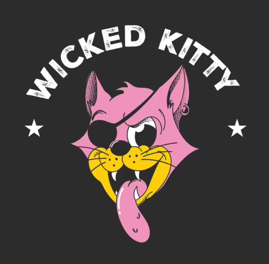
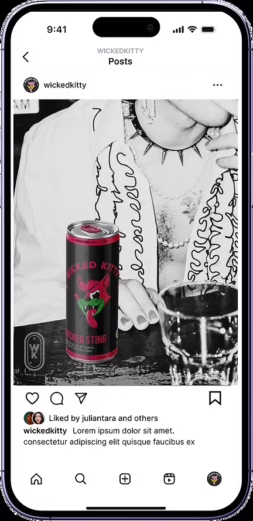

Wicked Kitty is a fictional organic, vegan energy drink brand built to answer one question: what would a brand look like if its personality were rooted in something real. A competitive analysis of established players like Alani Nu, GURU and Celsius surfaced a market that felt visually repetitive and generic in tone, and Wicked Kitty was built as a rejection of that: an anti-establishment brand for a consumer who wants their energy drink to stand for something beyond synthetic ingredients and hollow marketing. Drawing on research into health-conscious Gen Z and Millennial consumers, the visual identity is anchored in punk and rockabilly culture, with a logo derived from classic tattoo flash art traditions and retro illustrated animals that give the brand an outlaw, lived-in quality. Hot pinks and vibrant yellows, paired with rough stamp and typewriter typography, keep the brand feeling bold and playful without losing a premium edge. The full system, developed independently across packaging, a landing page, an email campaign and social content, positions Wicked Kitty as a challenger brand with a personality that feels authentic rather than manufactured.
Preview the Wicked Kitty project here
Helen Nguyen Associate RGD
Project: Lua La (Lụa Là) / Lovitage
Grant Sponsor: One Twenty Three West


Developed during the post-COVID period, Lua La (Lụa Là) / Lovitage began with a question: how can cultural experiences stay accessible when people can't always experience them in person? The project explores the Áo Dài, one of the most recognizable garments associated with Vietnamese culture, through its history, craftsmanship and evolving role in contemporary life, imagined as an immersive exhibition that lives both physically and online. Its Vietnamese name reflects the elegance and silk heritage of the Áo Dài, while Lovitage, combining "Love," "Viet" and "Heritage," makes the project more approachable to a global audience. Research included a visit to the Áo Dài Museum in Vietnam, where the designer photographed garments and documented the stories behind each piece, informing a logo that combines the letter "L" with the flowing layers of the Áo Dài's silhouette inside an oval frame representing timeless classicism. The resulting website brings the exhibition together through curated collections, garment details and an interactive, horizontally scrolling timeline titled "A Look Back in Time," available in both English and Vietnamese, letting visitors explore the garments' history and details from wherever they are.
Applications for the next round of Development Grants will open in the new year.
Related Articles







Sponsored