
Calgary Wild
Element Award Winner — Motion & Logo/Wordmark
Daughter
Calgary, Alberta, Canada
Client: Calgary Wild FC
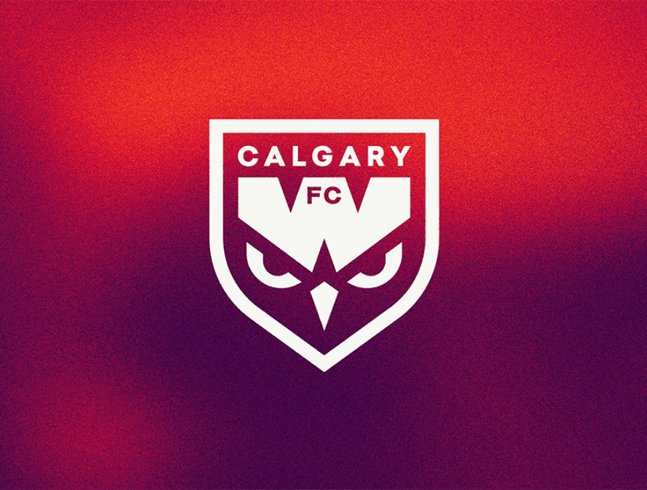
Calgary Wild FC launched as part of the inaugural season of the Northern Super League. They needed a crest that could establish an immediate presence for a brand new professional club while reflecting the identity of Calgary and the energy of women’s football in Canada. They also needed a motion system to establish instant recognition, emotional energy and a strong sense of identity across digital, broadcast, stadium and social platforms. Early exploration focused on symbols tied to focus, movement and predatory energy, leading to the owl-inspired eyes that anchor the identity.

The structure of the “W” draws inspiration from Alberta’s winding rivers and sawtooth mountain ranges, while the pentagon shape references the Five Nations of Treaty 7 territory. The motion approach was developed alongside the broader identity system, with flexibility and scalability guiding every decision. A custom variable typeface was created to move fluidly across touchpoints, adapting in weight, width and rhythm to create energy and consistency throughout the brand experience. The result is a crest and motion system that helps Calgary Wild FC stand apart within women’s football while strengthening the club’s connection to supporters through energy, storytelling
and atmosphere.

Credits
Designers: Holly Gallacher RGD, Ben Gough, April Zabos
Design Director: Holly Gallacher RGD
Copywriter: Paul Little
Art Directors: Keli Pollock, Scott Wilson
Account Director: Wendy Chiu, Miranda Thorne
Chief Creative Officer: Keli Pollock
Sponsored