Trailblazer Award Winner: Cody Garcia

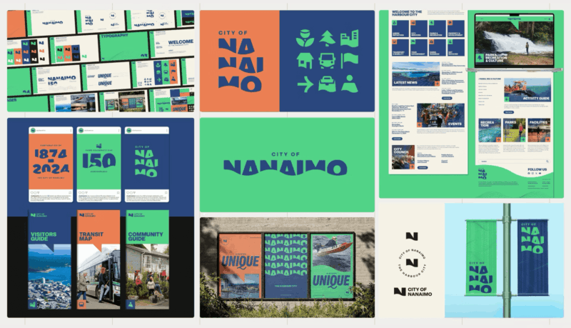
City of Nanaimo
The City of Nanaimo’s rebrand was created to unify and modernize its identity for residents, visitors, businesses, staff and investors while reflecting the spirit of its coastal community. Timed with the city’s 150th anniversary, the new system replaces a dated serif logo and rigid layout with a flexible, geometric wordmark inspired by ocean waves. A modular design system supports sub-brands and applications across signage, digital and print while vibrant coastal colours and flowing motifs evoke movement and connection. The result is a cohesive, future-ready identity that honours Nanaimo’s roots and captures the energy of a growing waterfront city.
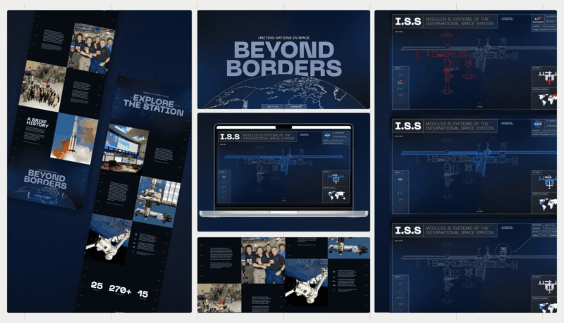
Beyond Borders: Uniting Nations in Space
Beyond Borders is an interactive educational experience designed to make the story of the International Space Station accessible to students, educators and curious learners. Aimed at those who value clarity over complexity, the site transforms dense scientific information into a structured, visually engaging journey. Using a vertical scroll that moves from Earth to orbit, the design mirrors the ISS’s story through clear pacing, layered content and interactive diagrams. Built in Figma as a proof of concept, it prioritizes legibility and comprehension, turning complex data into an intuitive, exploratory learning experience for a broad non-specialist audience.
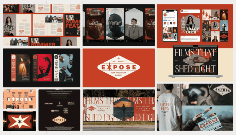
Expose Films
Expose Films is a Canadian production company dedicated to amplifying BIPOC filmmakers and reshaping cinema through diverse, authentic storytelling. Designed for film enthusiasts aged 18–35 who appreciate artistry across genres and eras, the brand identity celebrates the craft of independent filmmaking through motion, texture and imperfection. Analog-inspired animation, dithered visuals and mid-century film aesthetics evoke both nostalgia and contemporary energy. Animated genre icons extend the system across platforms while the tagline “Films That Shed Light” anchors the brand’s purpose — illuminating underrepresented voices and stories. The result is a dynamic, human identity that moves with the rhythm of modern cinema.
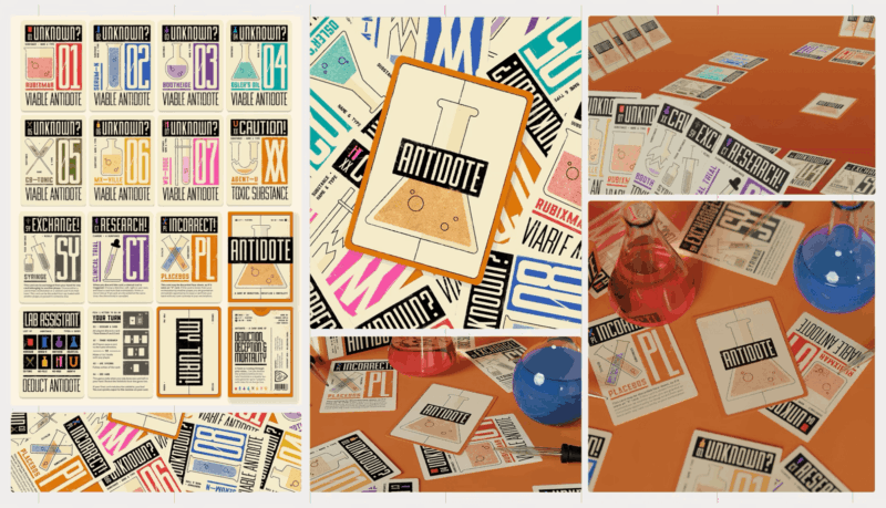
Antidote
Antidote’s redesign reimagines the game’s visual identity for modern players who value strategy, storytelling and design excellence. Aimed at board game enthusiasts and collectors, the project enhances usability, clarity and immersion without changing gameplay. Drawing inspiration from mid-century scientific graphics and Russian Constructivism, the new system uses bold shapes, industrial textures and strong composition to heighten tension and atmosphere. A refined colour palette reinforces function and urgency while redesigned typography and iconography improve legibility. The result is a cohesive, visually striking identity that balances accessibility with narrative depth, giving Antidote a modern edge on and off the table.


