NorQuest College Brand Identity
NorQuest College
Edmonton, AB
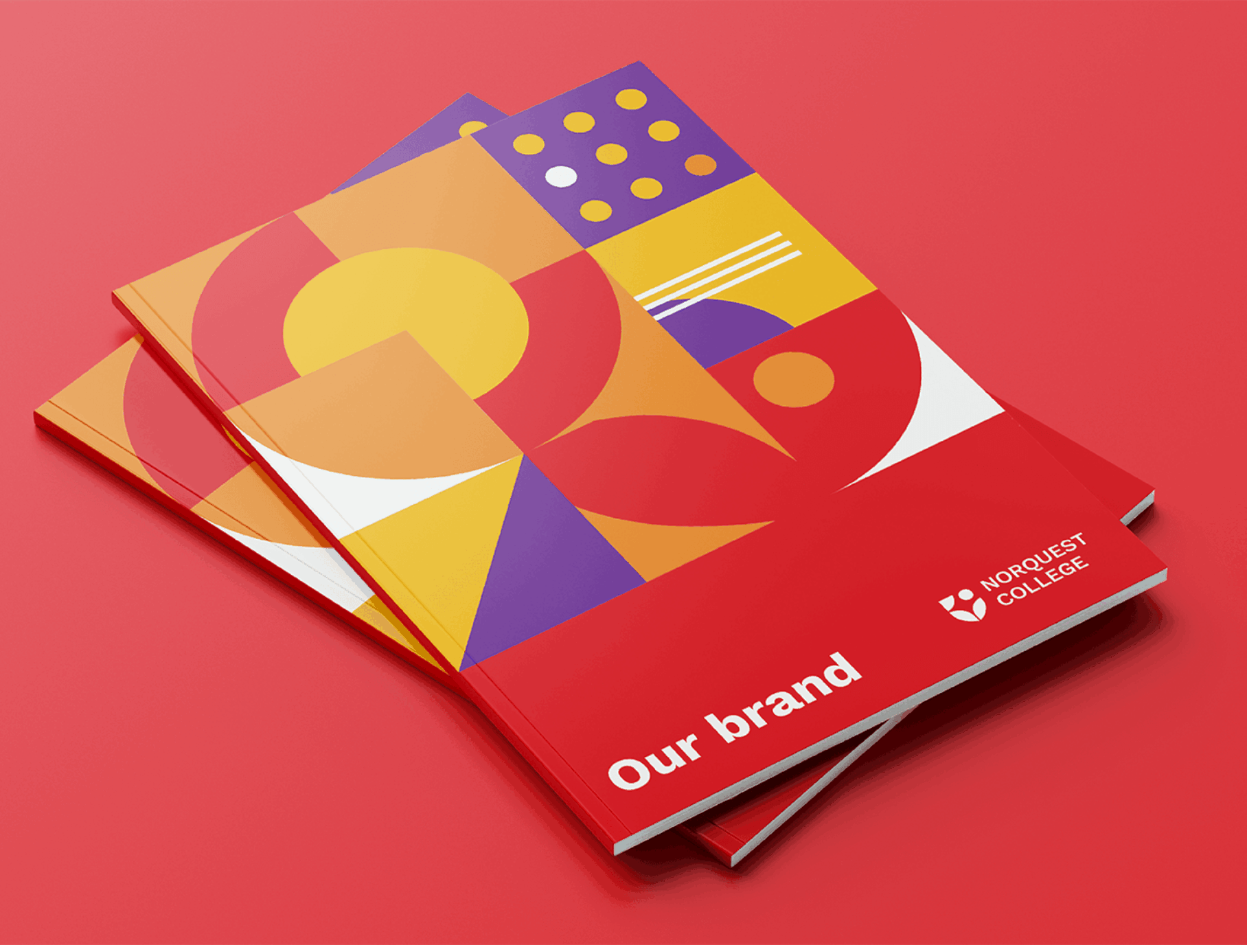
The goal of the NorQuest College rebrand was to redesign the visual identity to reposition the brand with a bold new look and feel—dramatically changing how people view the college. Key objectives included creating a strong sense of belonging within the NorQuest community and visually leading in the post-secondary space by challenging traditional college “looks.” Improvements to typography and alignment of the logo were made to increase legibility and accessibility. The colour palette was streamlined by removing conflicting colours and testing colour combinations against international accessibility standards. The team researched to determine the most accessible font by developing their own font accessibility criteria based on factors including legibility, distinctness and the availability of a complete font family. To leverage expertise within the college and create buy-in, a brand working group ensured diverse perspectives and expertise regarding accessibility and EDI were considered in design decisions. NorQuest’s digital brand asset library gave staff access to logo files, graphics, templates and photos, resulting in 15,000 visits from 82% of staff (1300 people). Staff across the college shared excitement for the rebrand and described how it would attract learners and align with the college’s strategic focus.


Credits
- Senior Creative Lead: Hilary McHale RGD
- Manager, Communications & Creative Services: MJ Fell
- Multimedia Production Specialist: Joseph Siracky
- Photography: Laughing Dog Photography
Sponsored


