Canadian Tire Brand Design System
Canadian Tire
Toronto, ON
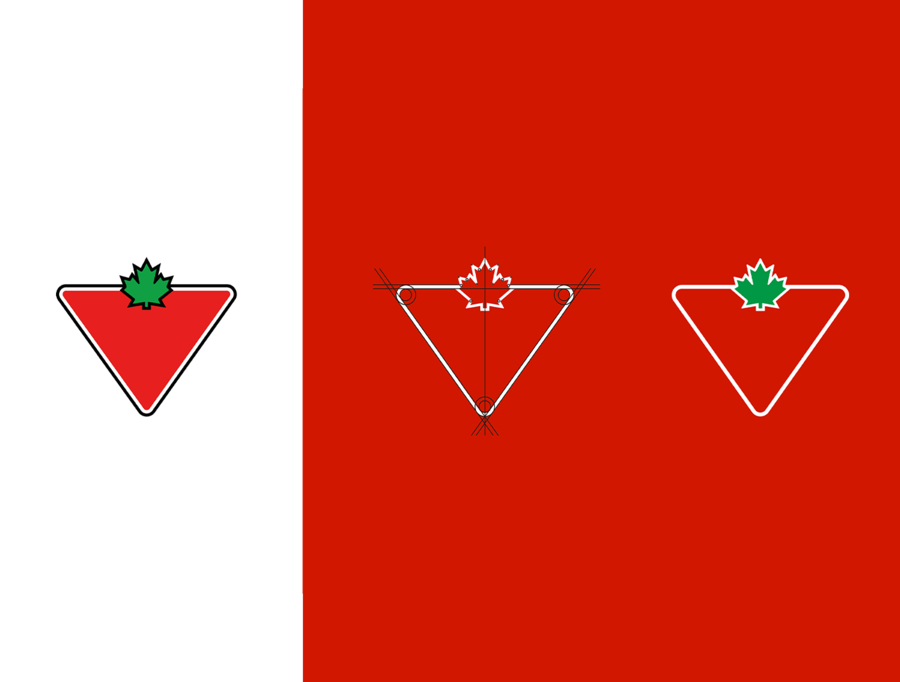
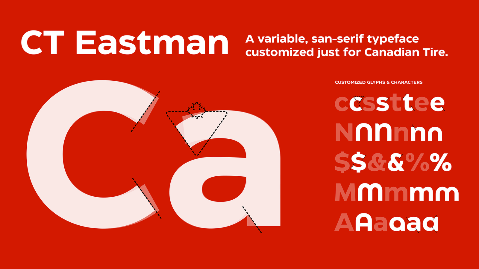
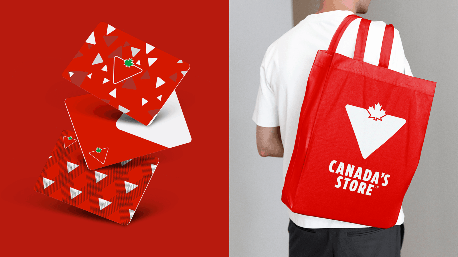
Canadian Tire’s Brand Design System aims to reinforce trust in the brand with a unified design language for every customer touchpoint. Customers had begun to experience the brand as a complex multi-channel retail ecosystem that was not always visually consistent, creating the need for a modern, scalable design solution. As part of the system design, the iconic Canadian Tire Triangle logo, in use since 1968, was refined. Building upon this, the recognizable equity of the Triangle motif was extended into a modern, ownable visual language. A new custom typographic voice for the brand was created, with humanist aesthetics and functional versatility. Additional tools and rules for colour, photography, event structures and universal assets rounded out the omni-channel design, ultimately creating a foundation that extended into detailed templates and guidelines for every part of the retail experience. The design system portal is now used across the organization, providing a single source of truth for the brand’s visual expression. The new logo, typeface and graphic language have elevated and modernized the brand, providing a consistently ownable expression in every channel, helping to reinforce Canadian Tire’s position as one of Canada’s most reputable brands as it evolves into the future.
Judge’s Pick
Kevin Hawkins, Head of Design & Research at Amenitiz, Barcelona, Spain
“Perfect. Perfect. Perfect.”
Credits
- Canadian Tire Creative Team: Simon Clancy, Caroline Bruckner RGD, Amit Khera, Eva Yenovkian, Toni-Marie Ippolito, Maddy Hanson, Peter Robertson, Christian Steffan, Elisa McLellan, Mona Saedi, James Lai
- Canadian Tire Program Management: Cathy Kim, Joanna Jamison, Dan Renaud, Shikha Lovel, Melissa Hart, Vahini Nadesan, Tommy Chan


