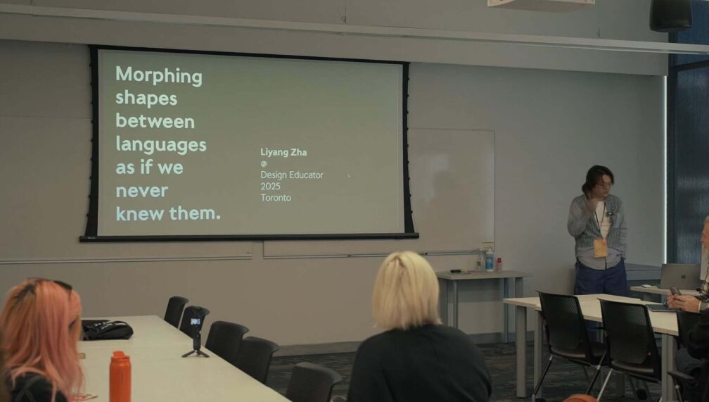
Morphing shapes between languages as if we never knew them
Liyang Zha
About this video
Description
To serif or sans to serif, that is the question for ye who design in English. At least that’s what we think about both concepts when they have been around for a long while before the year 1982.
But 1982 was the first time the legendary type designer Xu Xuecheng defined “Sans Serif” in Chinese type design with a typeface. As Xu introduced his 无饰线体 (“Sans Serif Type”) as a modern take on the traditional, print-oriented type style, he credits his inspiration to “the rising popularity of sans serif typefaces in the Western world”. Revisiting this inspirational typeface and its pitch in 2024 made me think: what would this kind of appearance-based alteration mean for the English and Latin alphabet? Can I reintroduce a concept to whom it came from? And if so, what would it look like
This presentation walks audiences through a year-long type design process of revisiting marginalized typefaces, constant code-switching and endless reflections on technology and human behaviour, to discuss a core question in multilingual design: how will we shift our shapes to appropriately present our message to different audiences?
Liyang Zha


