
Top 5 projects by DesignThinkers speakers
Written by Dominic Ayre RGD, Hambly & Woolley Inc.
Happy DesignThinkers season, everyone. This is my third year writing this article, and it only gets more exciting every time I do it.
I use it as a way to focus in on my own interests and hopefully turn you on to some of the incredible work of the speakers coming to Toronto.
With all of the conversation happening in the world around AI, this one is focused on artists who use their hands, or traditional design methods, or just make cool things that are… things.
DesignThinkers takes place in Toronto on October 20 & 21. Register now!
Erika Barbieri, Co-Founder, OlssønBarbieri
Theaterbaren identity

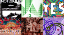
I have a soft spot for designers who can take something as dry as "heritage" and make it flirt with you. OlssønBarbieri's identity for Theaterbaren, a new bar tucked into Oslo's Nationaltheatret, does exactly that. The building is a century-old mash-up of Neo-Baroque grandeur, Rococo interiors and Art Nouveau flourish, and instead of tiptoeing around all that history, the studio leaned all the way in: curtains, mirrors, chandeliers and florals reimagined as a loose, theatrical visual language, with Benjamin Gómez's incredible swooping Cordier Script doing the heavy lifting across menus and signage. It's ornate without being precious, cinematic without being kitsch, and it proves you can respect 125 years of architecture. I'm obsessed. This is one of my favourite visual identities ever.
Temi Coker, Visual Artist, Coker Studio
The Jackets

I have more than enough black t-shirts and band hoodies, so when a jacket makes me feel something, I pay attention. Temi Coker's Coker Studio pieces—the Work Jacket, For The Lovers, the Good Fathers varsity—repurpose his Afrocentric pattern-and-colour language from the poster onto your back, and somehow lose none of the joy in the translation. This is a guy who built a whole practice on the belief that celebrating your culture loudly is a design strategy, and it shows in every stitch. Though I am sure, seconded by my partner, that I could not pull these pieces of art off, I still dream of a world where more of these are out in the streets.
Bráulio Amado, Graphic Designer & Illustrator
The Good Room Posters

Bráulio Amado is one of my design heroes, nuff said. In an industry that is often perfecting the clean vector line, Bráulio spent years cranking out a poster a day for Brooklyn's Good Room that look like they were scrawled onto the wall five minutes before doors opened. Hand lettering, cockroaches, Despacito references, whatever chaos was rattling around his brain that week, all of it gloriously, deliberately unpolished. Seen individually, these shouldn't work as brand consistency and yet they absolutely do; you'd spot a Bráulio flyer from across a subway platform. In a design world that's gotten increasingly obsessed with perfection, Bráulio's entire body of work is a reminder that mess, drawn by an actual human hand, is still the fastest way to make people feel something.
Edel Rodriguez, Artist & Author
The Constitution Prints

Edel Rodriguez has spent his career proving that editorial illustration can still throw a punch. His TIME, The New Yorker and Der Spiegel covers are built on bold, urgent, unmistakably hand-made marks. These new screenprints take that same energy and point it at the USA's founding documents: LIBERTY carved in red across a dove's face, FREEDOM rendered in shackles and reaching hands, LIFE, LIBERTY + THE PURSUIT OF HAPPINESS run through a halftone screen. It's protest poster and civics lesson all at once. Edel does these the old-fashioned way, layer by layer, by hand, on an actual press. (Edel's bringing his 2023 memoir Worm, on growing up Cuban-American and finding his way into American visual culture, and he'll be signing copies at DesignThinkers.)
Valentina D'Efilippo, Information Designer
The Palestinian Data Painting

I don't take this entry lightly. Valentina D'Efilippo has spent her career proving that data, handled with care, can move people the way art does. Her recent Palestinian data painting is the piece from last year that has stayed with me the longest. Where so much data visualization keeps human suffering at a clinical distance, this work refuses to let the numbers stand in for the people behind them. It's the kind of design that doesn't ask to be admired so much as witnessed and felt. I've spent 30-plus years looking at design that's meant to sell something or make someone smile, and every so often a piece comes along that reminds you design can also just make you sit with something difficult. This is one of those.

Dominic Ayre RGD
Hambly & Woolley Inc.
Dominic graduated from The Bournemouth & Poole College in the UK and has worked in Toronto as a designer for more than 25 years. As the Creative Director at H&W, Dominic focuses on high-level strategic initiatives with clients such as York University, Caseware, University of Toronto, Canadian Chamber of Commerce, Horizon Trading Solutions and RTOERO. Hambly & Woolley is also the publisher and creators of Find: A Journal for the Curious. Currently on faculty at George Brown College, Dom is an enthusiastic mentor to new designers and is well known within the design community for his expertise in branding, typography, web platforms, design trends and popular culture.
Related Articles




Sponsored


