The year 2024 was filled with creativity and bold choices in packaging design, featuring everything from innovative formats to nostalgic elements.
Whether by rebranding established names or introducing fresh, trendsetting concepts, these top designs captivated attention and sparked conversations. Amanda DeVries RGD shares her selection of the five most exciting packaging designs of 2024.
Drizzle Drizzle
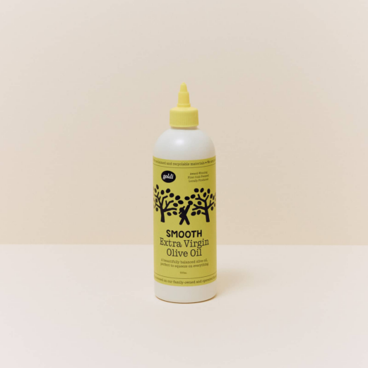
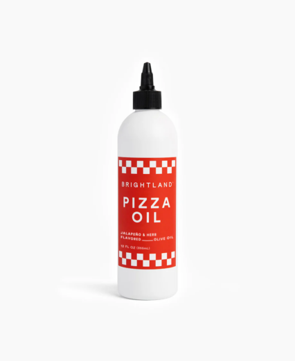
Although this brand launched in October 2022, 2024 was the year everyone talked about Graza.

It’s well known that chefs use narrow-nozzle plastic bottles for everything from dressings and marinades to water. The precision and control you get from such a versatile format is a no-brainer in the culinary space.
When Graza Founder Andrew Benin took his first trip to Spain, he experienced the taste of true olive oil. Inspired by this discovery, he knew he needed to bring this flavour to North America in an innovative way. With significant investment in the brand and unique packaging, he set out to transform the single-origin olive oil market. His success has been so remarkable that several copycats have been called out for trying to ride on Graza's coattails.


Source: https://brightland.co/products/pizza-oil and https://tastegoldi.com/shop/smooth
A legacy ethnic brand is rehauled.
In the early part of the year, the buzz in the packaging world was the refresh of the iconic brand Manischewitz by creative agency Jones Knowles Ritchie (JKR).

A 136-year-old company that Rabbi Dov Behr Manischewitz started in a Cincinnati neighbourhood, Manischewitz offers many staples cherished by those who follow Jewish customs. It also controlled a whopping 80% of the Matzo market in the US at the time of the rebrand.

Source: fb101.com/manischewitz-unveils-bold-new-packaging-and-new-products-just-in-time-for-passover/
This new identity and packaging features a bright orange palette, fun illustrations reminiscent of Jewish cookbooks and prayer books from the 1950s and a bold, lively typeface that stands out on the shelf.

Source: expresscheckout.beehiiv.com/p/the-manischewitz-2024-rebrand
Through this rebrand, the company hopes to introduce Manischewitz to a wider, younger audience while maintaining a connection to its Jewish-American heritage.
Home-Grown deliciousness
Over on this side of the border, we love our Canadian celebrities. And Matthy Matheson, the multidisciplinary chef/restaurateur/actor/ internet personality, is no exception. Matty started as a chef, and since then, his resume has expanded considerably, most notably as an actor and producer in the show The Bear.
So it made sense that after countless cookbooks and other accolades, he would turn to his own product line. And there was no better choice to brand this new product line than another Canadian favourite, Wedge Studio.

Source: fastcompany.com/91077138/matty-mathesons-new-food-brand-is-unapologetically-nostalgic
I personally love following Wedge’s work, as they put distinct thought and care into every project they take on. From typography and colour palette to unique packaging formats (who can forget the sunscreen Vacation they helped launch?), they are a studio to watch. Dieline agreed, naming them Studio of the Year for 2024.
The Matheson Food Company is the perfect hit of nostalgic charm and will be in the comfort food of Canadians for a long time to come.
Continuing on the Nostalgia Theme, Yassified Mayo
If you want to know what’s current in the CPG world, subscribe to Andrea Hernández’s newsletter, Snaxshot.
Recently Andrea covered the launch of Molly Baz’s new line of mayonnaise called “Ayoh” (how perfect is that name?!)

Source: center.design/project/ayoh/
It’s true that mayonnaise is one of the last condiments to be fused with delicious flavours, and yet it is such a staple in American households.
So this line of mayonnaise by Center Design just hits right. The cute sandwich characters and the handy squeeze bottle are a serious upgrade to the current mayo game, and I’m here for it!
Fonts in Use
Fonts in Use is where I typically go for typography sensory exposure. This blog features thousands of lovely projects from around the world, is a haven of colour and photography and has, as its name implies, a searchable font engine.

So, playing around here, I stumbled upon this project, which delighted me. With such a unique bottle shape, typeface and colour palette, I can immediately picture myself sipping this agave-based vodka in a beach chair, surrounded by cacti and a big blue sky.

Amanda DeVries RGD
Eye Candy Design
Amanda DeVries is the principal and creative director of Eye Candy Design, a boutique branding and packaging design firm that creates fresh, iconic work for food and beverage companies. She has nearly 20 years experience as a brand consultant, art director and graphic designer. Amanda spent the first 10 years of her career in Ottawa, where governmental agencies kept her busy but not terribly inspired. In 2010, her family moved to southwestern Ontario to start an organic vegetable farm and this presented her with the opportunity to work directly with entrepreneurs and business owners. She also enjoys sharing her knowledge through various teaching gigs and mentoring younger designers. She is the mother of 3 children who share her love of good food, vintage shopping and travel.
Tag
Related Articles


