The vibrancy of design for social change: 10 examples from 2022
Written by Jay Wall RGD, O2 Planning and Design
Alongside the growing wave of social justice movements, the global design community is increasingly stepping up to support causes such as climate action, racial justice and health equity. In recent years, more and more designers are devoting their creative energy to inspiring change.
New generations of designers are also bringing a more intersectional approach. This is exemplified by the First Things First 2020 manifesto, a pronounced evolution of the original manifesto written in the 1960s.
With that, I’d like to highlight 10 vibrant and culturally cognizant design projects from the past year that seek to advance social change. From brand identities to websites, from publications to campaigns, these examples from 2022 offer insight into the trends that we will see more of in 2023.

Be Equitable
By For The People
Be Equitable is on a mission to build a more inclusive, diverse, equitable and accessible world—starting with the workplace. This rebrand by For The People celebrates uniqueness, featuring custom type by Tré Seals (Vocal Type) that plays off funky illustrations by Edward Ubiera. Combined with unapologetic copywriting, I admire the confidence of this design system.

Black Power Kitchen
By Ghetto Gastro and New Studio
When Rodrigo Calderon, my fellow Creative Director at Briteweb, told me to check out a cookbook, this isn’t what I expected. Really, it’s part cookbook and part manifesto for a culinary collective. The dramatic photography and bold typography—punctuated by handwriting—creates a compelling tone for this celebration of Black culture.
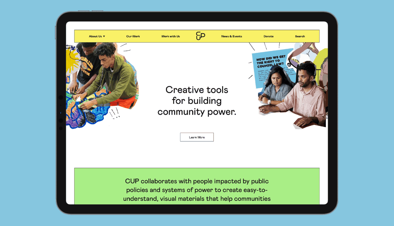
Center for Urban Pedagogy
By Hyperakt
The Center for Urban Pedagogy (CUP) is a nonprofit that leverages the power of design and art to support meaningful civic engagement. As a longtime fan of CUP, I was curious to see their revamped visual identity and website. Hyperakt struck the perfect tone, reflecting the organization’s mission of collaboration, education and accessibility. The hand-drawn illustrations and photo collages evoke CUP’s hands-on approach to building community power. The vibe is undeniably CUP.

The 519 Media Reference Guide
By Loop
Located in Toronto, The 519 is a 2SLGBTQ+ community centre and service agency. The 519’s Media Reference Guide website mobilizes respectful media representation with 2SLGBTQ+ communities. I enjoy Loop’s retro-inspired graphic motifs that reference Pride flags. The web design utilizes colour blocking and strong information hierarchy to enhance the UX of this valuable digital resource.

Stacey Abrams
By Wide Eye
I was drawn to Stacey Abrams’ political campaign design as she ran for governor of Georgia. Collages of hopeful imagery are paired with unifying messages and cameos of Georgia’s iconic peach symbol. Wide Eye worked with Frere-Jones Type to create a custom typeface and with Vocal Type on the wordmark (yes, Tré Seals was everywhere in 2022). The colourful campaign walks the line between serious and inviting.

IPCA Knowledge Basket
By Design de Plume
This is not your typical minimalist site and for good reason. Design de Plume brought to life an immersive sensory experience packed with symbolic imagery and audio content in different languages. It all comes together to uplift Indigenous-led conservation. Rooted in cultural teachings, the design honours a diversity of lands, people, animals and cultures.

Planted
By LIT Create
My colleague David Arias tipped me off to this startup in Germany. Planted makes it easy for individuals to offset their carbon footprint with a monthly tree-planting subscription. LIT Create embraced a playful direction for the branding. The neon palette and fun characters go against the grain of eco-future stock photos that often represent green initiatives. The messaging is all good vibes. I applaud Planted for this shift in tone that will attract new audiences to contribute to climate action.

Toronto Metropolitan University
By Toronto Metropolitan University
Ryerson University was named after an influential figure in the “residential school” system in Canada. After prolonged calls from Indigenous communities and others to change the problematic name, the university finally rebranded to become Toronto Metropolitan University. There’s nothing particularly notable from a graphic design perspective, but don’t let that apparent simplicity fool you. This one makes my list because of the tremendous amount of courage and process required to change the name of a large institution, as detailed in a TMU Magazine article on the topic. Following recent re-naming of sports teams—such as the Edmonton Elks, Washington Commanders and Cleveland Guardians—we will surely see more name changes for teams, public spaces and institutions.

Giiwedin
By Big Nish (Mike Blackbird)
Stepping into sports culture, I love this infusion of Indigenous design into the apparel line of Toronto Raptors’ player Fred VanVleet. In collaboration with Casey Bannerman, Big Nish reinterpreted the Raptors jersey in the Woodland art style. The lettering reads “Giiwedin” meaning “North” in Anishinaabemowin (Ojibwe). In a similar vein of improving representation, Sandeep Johal pulled off a stunning redesign of the Vancouver Canucks jersey for Diwali.

Arts Midwest
By Briteweb
I’ll end this list with a shout-out to my team at Briteweb. As one of our favourite projects from 2022, we guided an ambitious cultural organization through a strategic rebrand and launch of a new website. Arts Midwest supports, informs and celebrates Midwestern creativity—building community and opportunity. Their new verbal and visual branding is inspired by movement, amplification and energy. I’m excited for Arts Midwest to continue making waves across their region and beyond.
Curious to dive deeper into the world of design for social change? Watch this webinar series that I hosted in partnership with the RGD for the 2022 So(cial) Good Design Awards.

Jay Wall RGD
O2 Planning and Design
👋🏻 Hi, I’m Jay Wall. I’m a Creative Director dedicated to social change and city-building. ⚡ Over the past 15 years, I have guided the design of brand identities, websites, campaigns, and publications that help organizations to tell powerful stories and inspire action. I was the founder of RallyRally, a design studio that merged with Briteweb, a B Corp-certified creative agency focused on social change. I have since joined O2 Planning and Design, where I lead communication design on urban planning and landscape architecture projects across Canada. ✏️ I’m a certified member of RGD. I have been recognized with the RGD UltraBold Award—which celebrates designers making a positive impact in the design community and beyond—as well as several So(cial) Good Design Awards. I’m also a part-time professor at the George Brown College School of Design in Toronto. 🚲 I’m a dad, cyclist, and advocate for building healthy cities. Spacing Magazine named me one of Canada’s top public space champions and the US-based Next City selected me as a Vanguard fellow as an emerging civic leader. 🧡 Based in Guelph, Ontario, I respectfully acknowledge that I’m a settler on the ancestral territory of the Anishinaabeg (Mississaugas of the Credit), the Haudenosaunee, and the Attiwonderonk. Through my roles in business and education, I strive to honour the treaties and support truth and reconciliation. ✨ I’m open for projects alongside my team of graphic designers and engagement specialists at O2, as well as occasional freelance design/consulting projects. I'm also available for public speaking and workshops. Feel free to reach out for a conversation.


