GOOD Company rebrands Fort Calgary with approach that captures the essence of place
Written by Chris Wharton RGD, GOOD Company
Context
Formerly known as Fort Calgary, the Confluence Historic Site & Parkland is located at the meeting point of the Bow and Elbow rivers. For centuries, it has been where narratives intersect—where Indigenous Peoples gathered long before the North-West Mounted Police (NWMP) built their fort in 1875 and where the city of Calgary itself began to take shape. Yet, for far too long, the focus had been on only one part of the story—the colonial one.
While the NWMP and the establishment of modern Calgary are integral parts of this site’s history, a larger piece of the story was missing. The team recognized this and rebranded the Confluence Historic Site & Parkland to embrace its full depth and richness. The rebranding process was a profound experience that involved unique design challenges, such as creating an identity that could bridge Indigenous histories with colonial legacies and honour a complex past while shaping its future.

Methodology
The process began with a comprehensive engagement phase led by our partner, Stormy Lake Consulting. Over 1,500 interested parties, including Indigenous communities, the RCMP and local residents, participated in workshops, consultations, surveys and one-on-one discussions. This extensive engagement process was crucial in shaping the strategic direction and would serve as the foundation for the visual identity and all subsequent branding efforts.
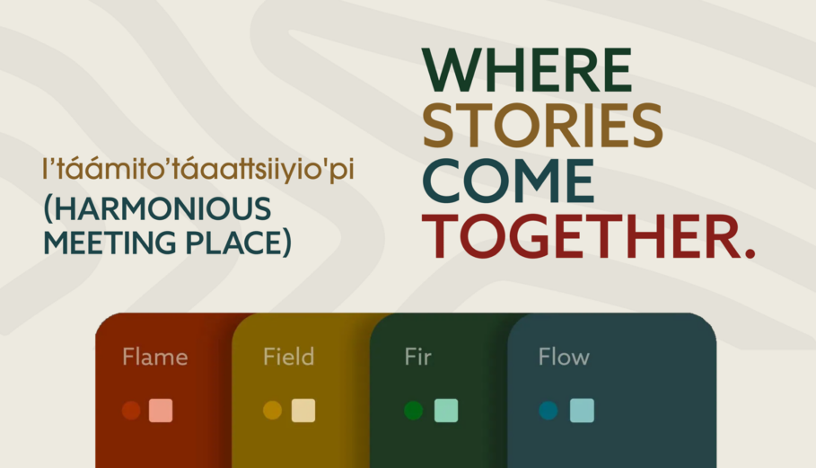
As the strategy work progressed, it became clear that a new name was needed, as the existing name did not serve the broader purpose of representing the site’s multifaceted history. The new name references the geographical confluence of the Bow and Elbow Rivers and reflects The Confluence’s role as a caretaker of the land and its stories. Also significant was the bestowal of the Blackfoot name I’táámito’táaattsiiyio’pi (Eeh-daah-mee-doh-daat-tsee-yoop), meaning "harmonious meeting place," further anchoring the site in its Indigenous roots and bringing long-overdue recognition of the land’s deep cultural legacy.


Process
After a rigorous couple of months of exploration, a tagline, brand story—and the core identity components were completed.
We pitched a single concept, which was immediately well received, with only a few minor tweaks requested. The logo, a topographic view of the river's confluence designed to resemble a fingerprint, became the foundation of the visual identity. It represents the physical landscape and the metaphorical convergence of peoples, stories and time. The wordmark features custom letterforms that connect and curve, echoing the flow of the rivers. It’s evocative while remaining legible and connects to the logo to create a cohesive visual language. Inspired by the area’s natural environment, the colour palette reinforces the connection to the landscape.
The visual identity spans multiple touch points, including interior and exterior signage, interpretive displays, printed materials, digital communications and the overall visitor experience.

Results
At first, the design challenge appeared to be developing a visually compelling identity that authentically represented Indigenous cultures while also relating to an audience accustomed to colonial design norms. These challenges were layered with significant complexities, yet the goal extended beyond avoiding risk. It had to result in a design that resonated with everyone, allowing individuals from all backgrounds to connect with the new identity—now and into the future. Ultimately, it became clear that the site’s many histories and perspectives, each deserving recognition, could not be easily captured in a single visual expression.
But then, a pivotal realization: The people who gathered on this land, regardless of what brought them here, were part of something that transcended their individual stories, cultural remnants and the interpretations applied to them. The land, the rivers, the gathering of people and the passage of time remained constant and indifferent to the narratives surrounding them today.
This shifted the design approach from relying on specific cultural associations to capturing the essence of the place—the enduring natural elements and shared human experiences that transcend cultural boundaries. It needed to reflect not the individual threads of history but the underlying fabric that connects us all to this place. The new brand reflects the complexity of the site’s history and is more than the sum of its parts. It has been well received, and we've heard that it has inspired an understanding of the site's history and evolving story.
Click here for more information.
Credit:
- Chris Wharton, co-principal, GOOD Company
- Gillian Hickie, co-principal, GOOD Company
- Nicolette Beharie, writer, GOOD Company

Chris Wharton RGD
GOOD Company
After graduating from Alberta University of the Arts (formerly ACAD), Chris left for New York to continue his studies under world-renowned designers at the School of Visual Arts. For more than 22 years, he has worked in various agencies in New York, Vancouver, and Calgary. In addition to Chris’ role as co-Partner of GOOD Company, his creative role covers direction and design; with a focus on visual identities and web design. He has led multiple complex branding projects for organizations such as CAWST, the University of Calgary and Calgary Arts Development. He created and continues to manage the brand for the community-led Beltline Urban Murals Project (BUMP), which has gained international attention, as well for Tourism Calgary’s Chinook Blast – one of Canada's largest winter festivals. He has also overseen the creation of large-scale digital projects, such as websites for National Music Centre’s Amplify and Vivo. Chris has served on the boards of TEDxYYC, VoteKit (a volunteer-led engagement initiative), and Mayor Naheed Nenshi’s Civic Engagement Committee. In his spare time, he competes provincially and nationally in pickleball.
Tags
Related Articles


Nick Shinn RGD Emeritus


John deWolf RGD


Tejashri Kapure RGD


John Godfrey


