Looking Back: DesignThinkers 2017 Branding with Rethink
Written by Ian Grais RGD
Ian Grais RGD, Founder & National Creative Director at Rethink, reflects on the branding for DesignThinkers 2017, "Perspectives".
1. What did taking on the DesignThinkers conference branding mean to you and your team at the time?
Working on the DesignThinkers branding was an amazing opportunity for our entire team. Not only to flex our creative muscles, but to share our unique approach to design with the rest of the community.
2. Explain your concept and how you and your team got there.
Our concept was centred around an iconic eye – a symbol of the common thread between all visual designers – and the theme of "Perspectives". Much like the DesignThinkers stage, the iconic eye became a singular place for infinite perspectives to be expressed – adapting in form and style to reflect new points of view.

3. What was your biggest challenge being the Design Partner for DesignThinkers?
The challenge we were given at the onset of the project was that DesignThinkers was expanding beyond Toronto – to include Vancouver as a second host city – for the first time.
To express this shift – and reach two markets with very different levels of brand recognition – we created a flexible identity that unified both events under a single theme. And since the conferences in Vancouver and Toronto were several months apart, we crafted the identity in a way that could be activated over a long period of time with substantial impact and reach on social media.
4. How did it feel to present your work to a bunch of designers? And then see your work live during the event and witness people's reactions to it?
It was great! We had a very rigorous peer review process – where our entire team of designers could weigh in and help push the work further – so when it came time to share our work with the entire Canadian design community, we couldn't have been happier with it.
5. What are you most proud of from your own experience? Is there anything you would have done differently?
I'm most proud of how the team at Rethink rallied together and keep pushing for better and better work. Whether it was the 2000+ individually designed name badges, the doodle app, or the many other extensions of the identity, the team poured into each and every piece of the identity.

6. What has been your favourite DesignThinkers branding, besides your own, and why?
Strategically speaking, the theme from 2018 (Speak the Truth) was perfectly timed. Also, the stark, type-driven identity was a smart contrast to the graphic/symbol centric identity we established the year before.
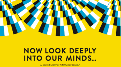
Read more about Rethink's 2017 DT branding here and see more images here.
Stay tuned for more insights into DesignThinkers branding from the past 20 years.
Tags
Related Articles


Tina Mackenzie RGD Emeritus
Sponsored


